Reflection
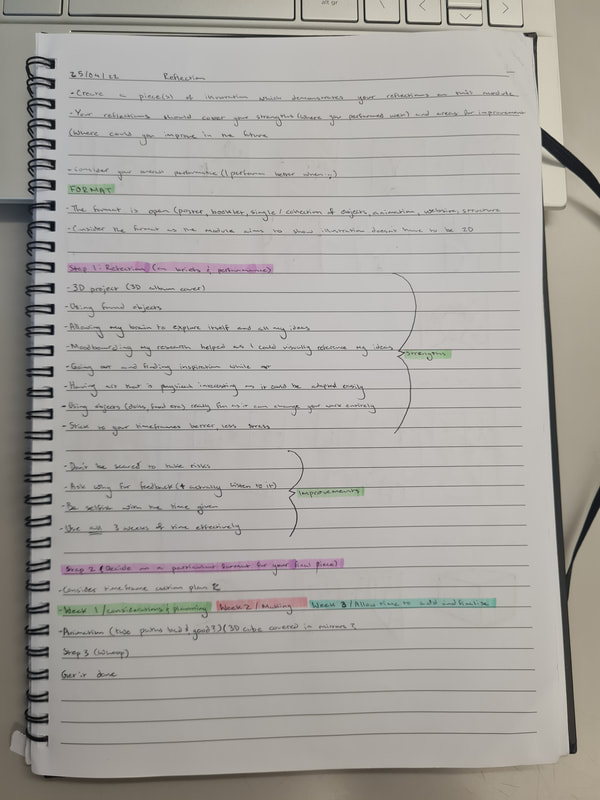
For the last part of the multi-dimensional illustration module, we were given the project based on "reflection". For this we were allowed to create any type of final piece, as long as it fit with the theme of reflection. Specifically on our strengths and weaknesses on the last semester of work. This was a challenge as there was many strengths I felt that i had from semester two, but also lots of weaknesses I identified. So coming up with an ide of what to revisit and try again was difficult at first. Though after thinking about it I had identified that the 4D project was the project I had struggled with the most. I decided that my reflection would be presented as an animation because I felt this would allow me to address some of the things I struggled with when working on this project originally. It also meant that I could use the three weeks provided to their entirety and make something that I was proud of.
Idea generation
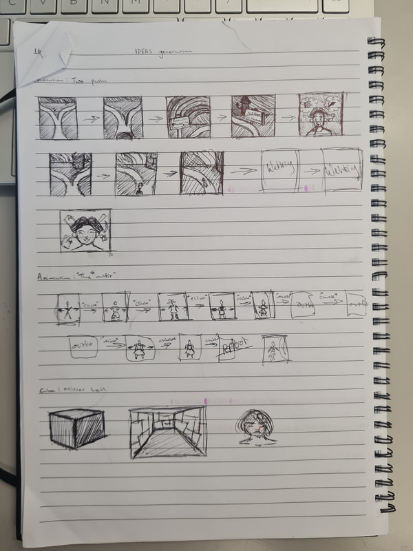
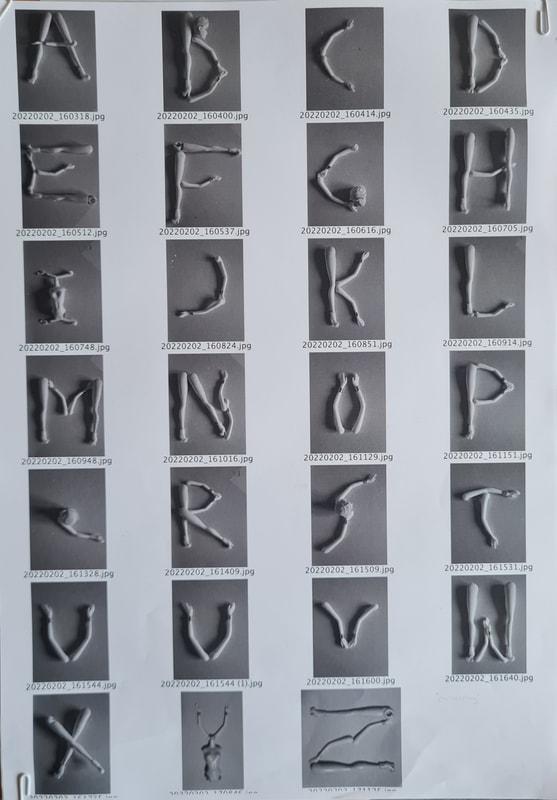
When it came to thinking of what I wanted to reflect on from my last semester I had a hard time coming up with some ideas because reflection is such a broad theme. I found it useful in the first week to look at my website and the work from the 2D, 3D and 4D projects. I took down some notes on what aspects I feel that I did well in and how I did that. For example in the 3D project I found it useful to thumbnail my ideas before spending time on properly sketching them out. In the 2D project I nted that I had a lot of fun experimenting with non commercial materials, like using doll parts to make a typeface. From the the last project, 4D i noted that i should've used my time more wisely and injected more of my personality into what I presented. Taking this all into account I thumbnailed six ideas. Mainly focusing on the 3D and 4D projects. I enjoyed the element of making a physical piece in the 3D project and I enjoyed learning how to make moving images in the 4D project. I realised from my sketches that my ideas for an animation were much stronger then my ones for making a 3D piece.
What idea?
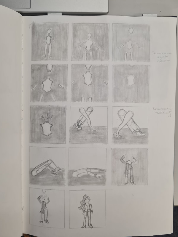
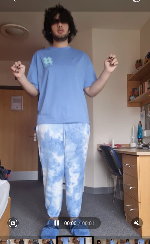
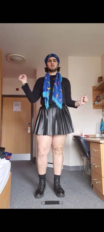
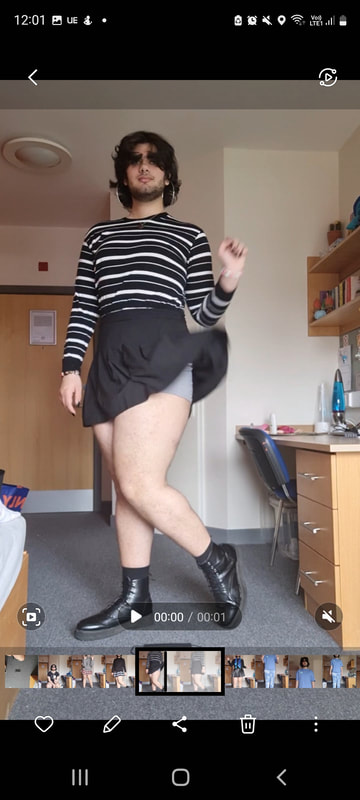
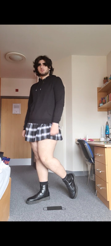
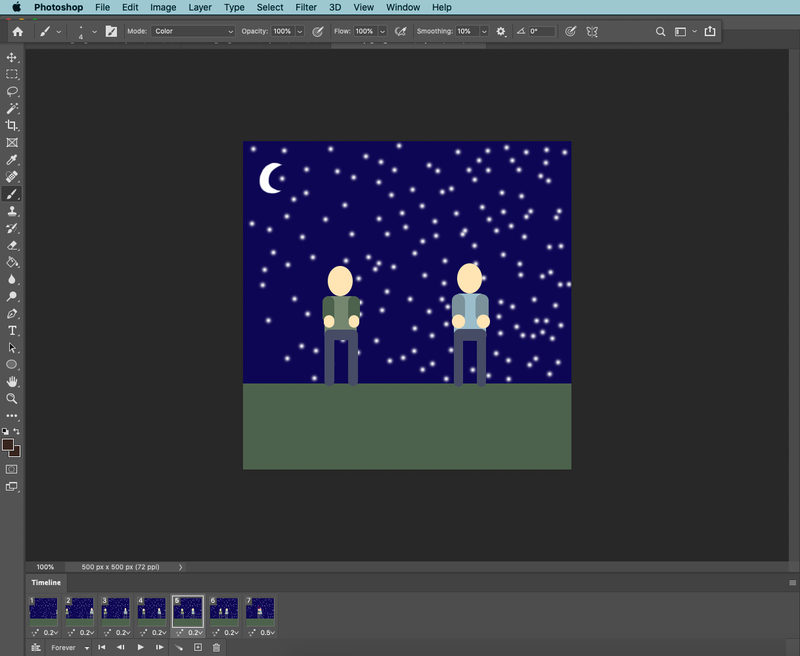
After presenting my ideas for feedback I decided I would create an animation, I felt like these two ideas were my strongest so I had to decide between them. "The outfit" being an animation showing off a morning in my life, in reflection I felt that when I dressed well last semester I had more confidence in what I was doing, being able to change style, attitude and approach to the day and the work. It was said in feedback that I reminded someone of a chameleon, at that I had the idea to try and implement music into my animation as an overlay, to show my personality I was debating using the song "karma chameleon". I ended up not using that song and used a song I felt worked better for me but I had fun learning how video editing and overlaying music works. The other idea I had was to create an animation based on work from the 2D project. I still have the doll from that project and my idea was to have the doll slowly sperate and come back with different parts, reflecting on my non-binary identity and the fact that I gave up with using gender stereotypes last semester I felt this could be an interesting way to reflect on the last semester. However I did realise the way i wanted to create this was by using stop motion and the way I wanted to animate certain parts of this would require the doll parts to be malleable which they aren't. The way to do this would be to heat up the plastic and obviously that isn't safe unless you're in a heavily ventilated area. It felt that making "the outfit" animation was the best way I could present my reflection, while also getting to improve my skills in making animations and also video editing.
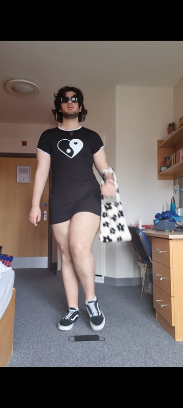
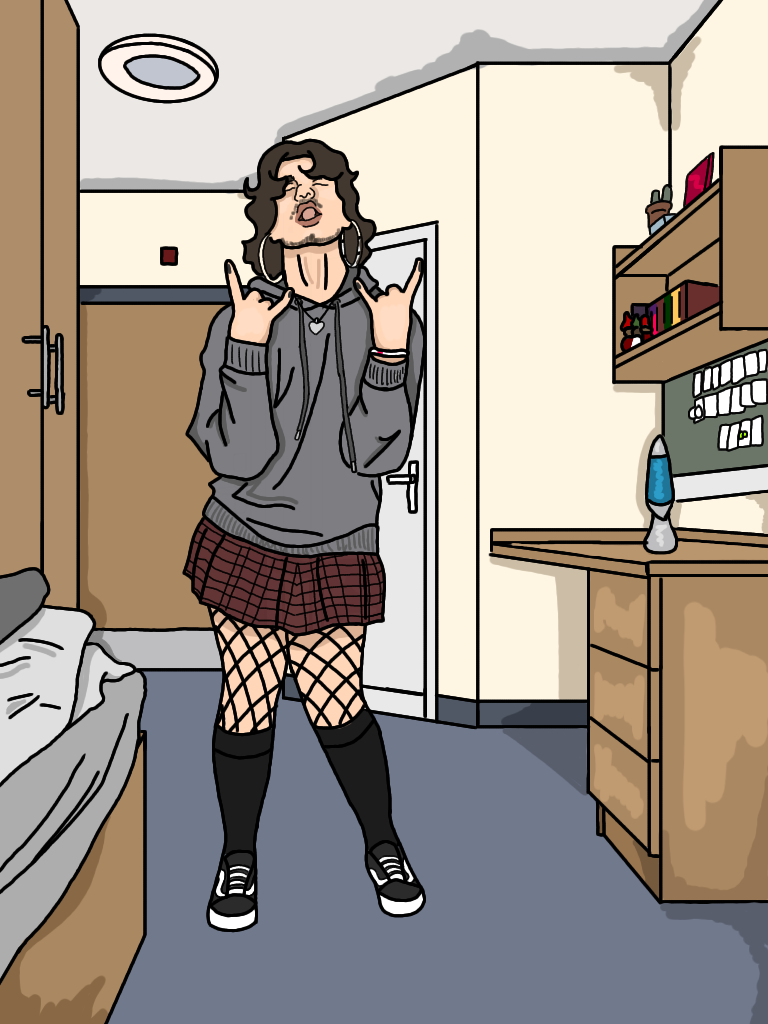
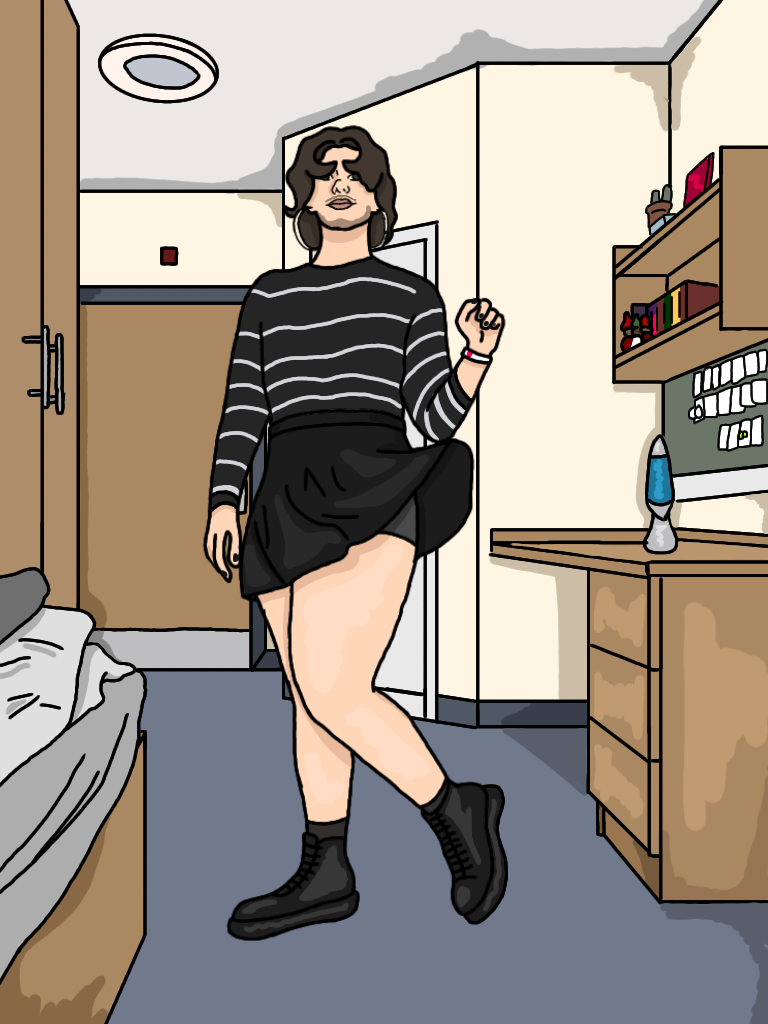
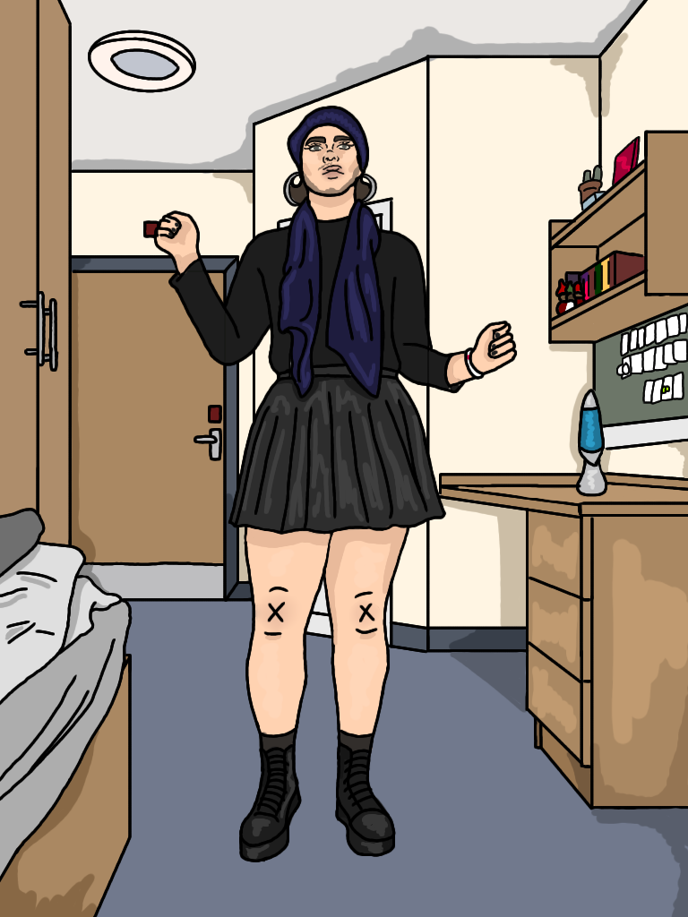
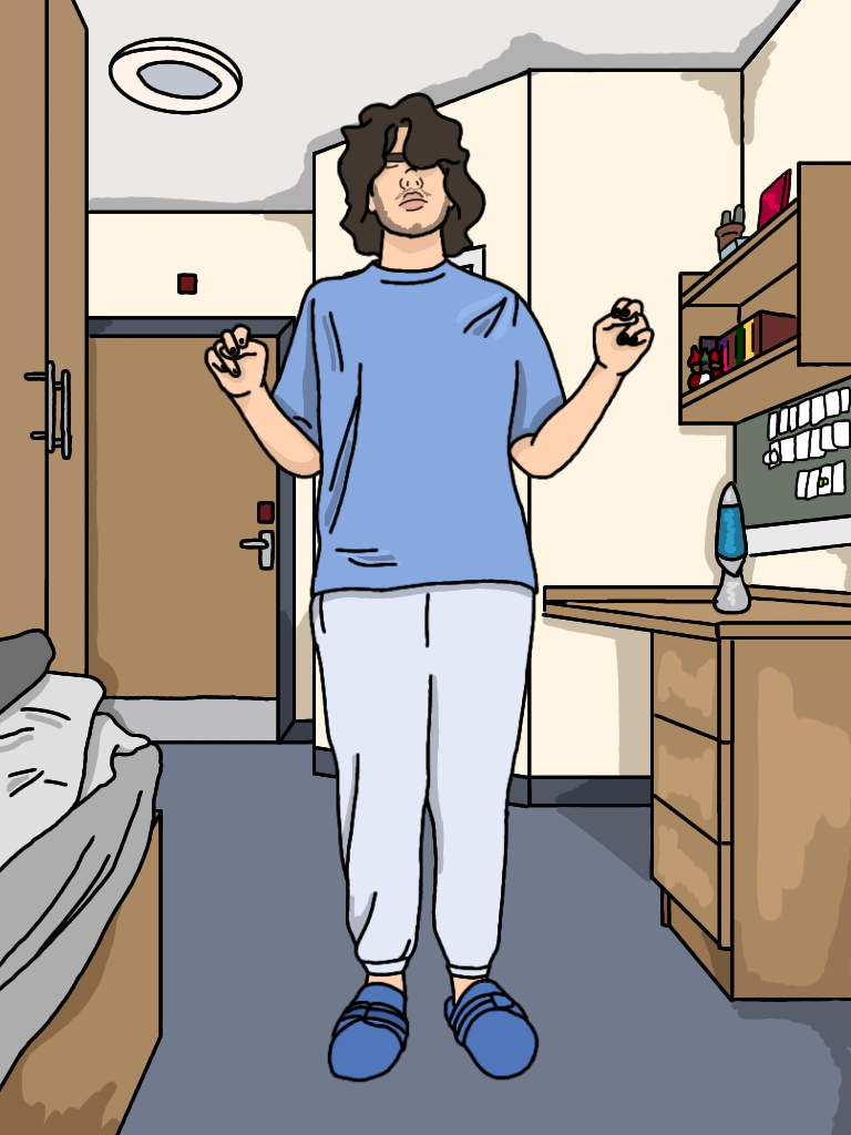
To make this animation, I watched some tutorials online on the best way to do this type of animation with transitions, I found a couple and took down some tips from each. One was to have a place marker on the floor, this is to make sure you're in the same position for each transition shot. Another was to keep your movements simple, as a beginner its better to keep your animation simpler so you can get the basics down then experiment once you're a little more confident. I found that filming a video was the best way to keep the frames as fluid as it possibly could. I decided to show the process of changing into five outfits, each a different style choice to represent the idea of my day to day clothing choice as being a "chameleon". for each video I shot a video where i changed poses. For example in the first video I'm wearing pyjamas, I then hold up my arms and the character changes its outfit to the next one, keeping the same hands up pose at first then switching to its own. I repeated this process for all of them and it proved to be the best way of doing it, The floor marker helped when I had to end each video as I had the place where I was just standing. After shooting these videos I then screenshotted the video, this helped as I was able to capture each movement and draw them later. Allowing for me to capture even the most subtle of movements, I think in the end doing this helped because the video moves in a believable motion.
The background
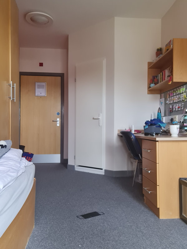
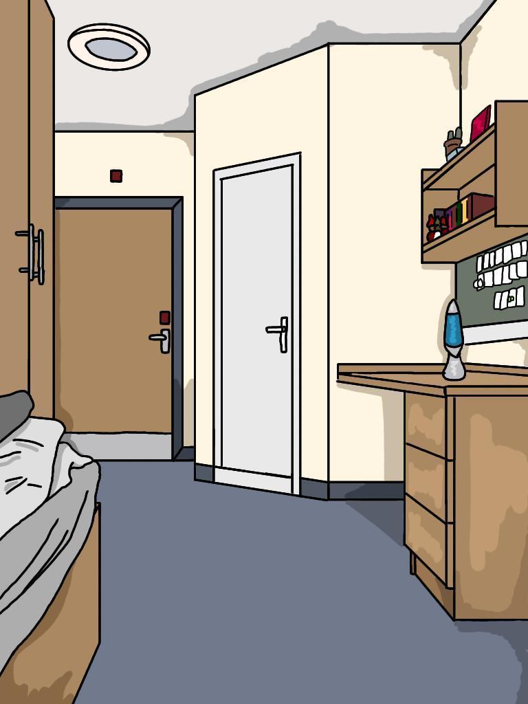
For the background I decided to illustrate my dorm room, I wanted to get better at placing my character in settings compared to not having the. This is typically what my room looks like so it felt more genuine and accurate. I took the photo before filming the videos, and I just drew over them to get the proportions correct and all the different perspective lines . I then illustrated all the different details and added things in that better suited my style and approach to art. I personally really enjoy the simplicity of modern cartoons and the use of black lines and more muted colours. In comparison they look brighter and not as sickly as children's cartoons do.
Making the animation
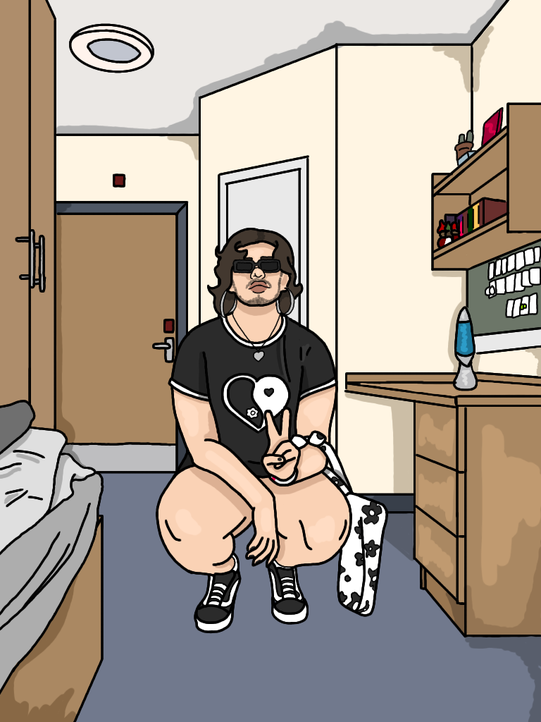
For each outfit I tried to experiment with illustrating a certain material, texture or style. For example I added fishnet tights to one of the outfits to learn how to draw them in a realistic way for different poses. I found that following the curve in the leg helped, I found adding parts in meant I was teaching myself more about art and hopefully this will help in my future work. Another think I experimented with is drawing materials. On of the skirts I wore is made from a faux leather material so illustrating this was a fun task as it was shiny and has texture so i wanted to recreate this. To illustrate each frame I decide to draw over the photograph and then add or take away certain aspects. I did this to be conscious of time because I designated week two of this project to drawing and animating the piece. I felt that animating this way was a lot quicker and allowed me to get through all 25 frames of this animation in this time. I decided to draw an outfit a day, as some of the outfit segments had about 5-7 frames. I think i used my time efficiently as I got this done in the time I wanted to. Having decided that week three would be reserved for making and uploading the animation.
My animation: The outfit
|
|
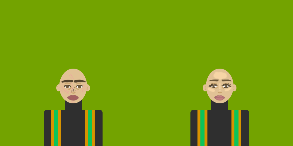
For my final piece I created an animation of a morning in my life, when I looked back on the last semester I realised that one thing was clear. My outfits. Depending on the day my style changed and i felt good in each outfit, I chose to reflect this way because I felt that semester two was a big waking up point for me. After a feedback session on semester one it was clear that my tutor didn't think I actually wanted to be there, which wasn't true. I feel like one of the ways I reflected was by changing my attitude towards my work ethic and being more organised. One of the ways I did this was to plan my outfits ahead of time. This helped me because I felt confident in how I appeared and I'm a firm believer that that makes you a more confident in what you're doing, saying and in your attitude. I chose to animate because in reflection I realised that by the time we were doing the 4D project I had become a little bit more unmotivated again, for reasons outside of my university work. Thinking about this I gave animation another shot in an attempt to teach myself something new, and I'm glad I did. I'm very happy with the way this animation turned out, its how I wanted it to look. The song "material girl" by Saucy Santana was used here. In a nod to how much i was able to re stock my wardrobe as another way I improved was to stop going out every weekend, initially so I could catch up on work. But I liked how I was saving a lot of money and was able to buy new clothes as I like them. The song just felt accurate to the animation. The youtube algorithm messed up so my animation starts at 0:18 and ends at 0:25.
4D design and illustration
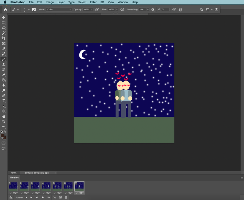
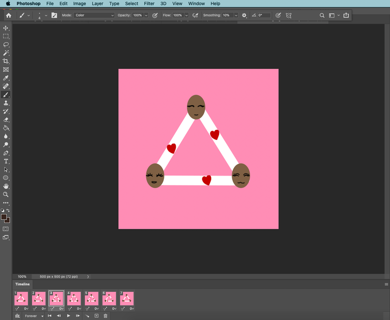
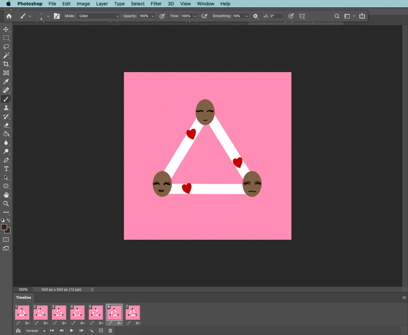
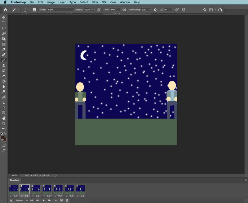
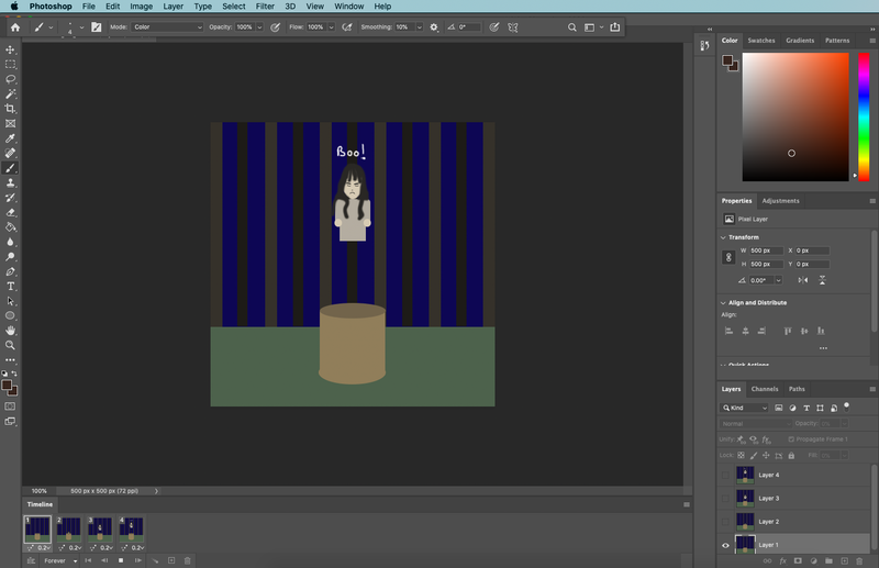
For the 4D illustration project we were asked to create 10 gifs, x3 low frame gifs, x3 medium frames and x4 high frame gifs using Photoshops create frame animation tool. The difference between each type of gif is the number of frames used. for low frame gifs we were asked to stick between 2-4 frames, for the medium frame gifs we were asked to use 5-8 frames and for high frame gifs we were asked to use 8+ frames. Each gif had to be 500x500 pixels. We were asked to make our gifs based on film tropes, e.g. walking away from an explosion etc.
x4 High frames (8+ frames)
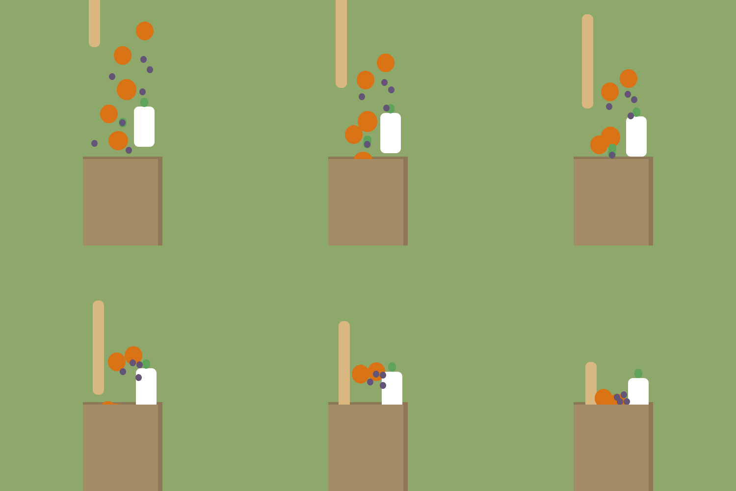
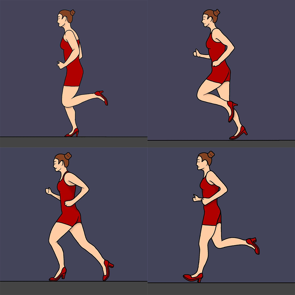
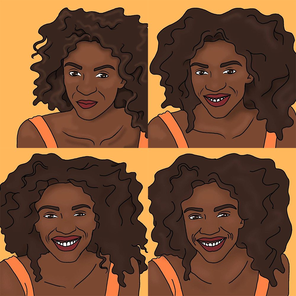
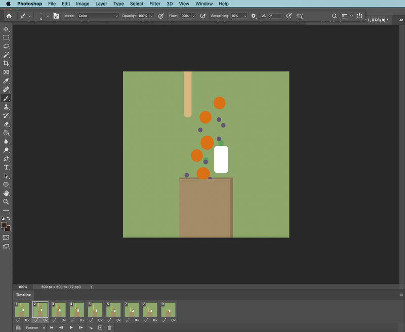
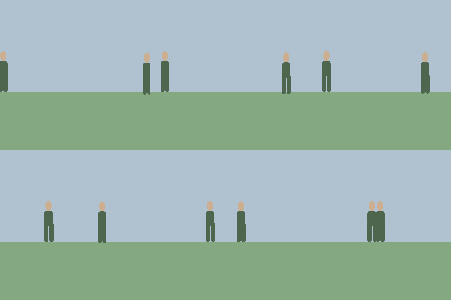
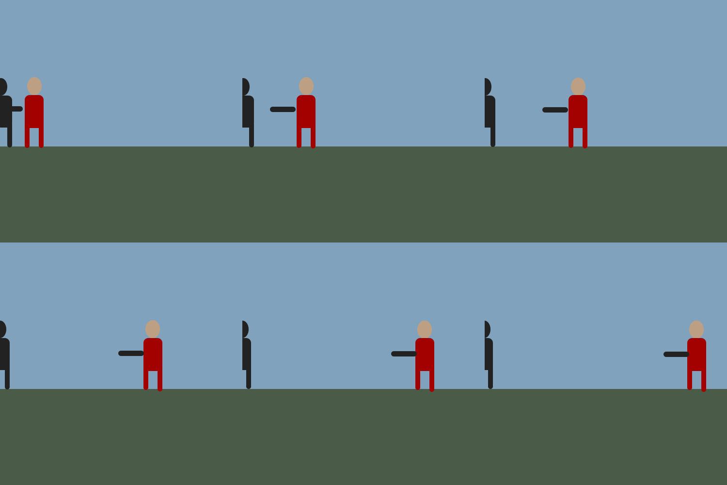
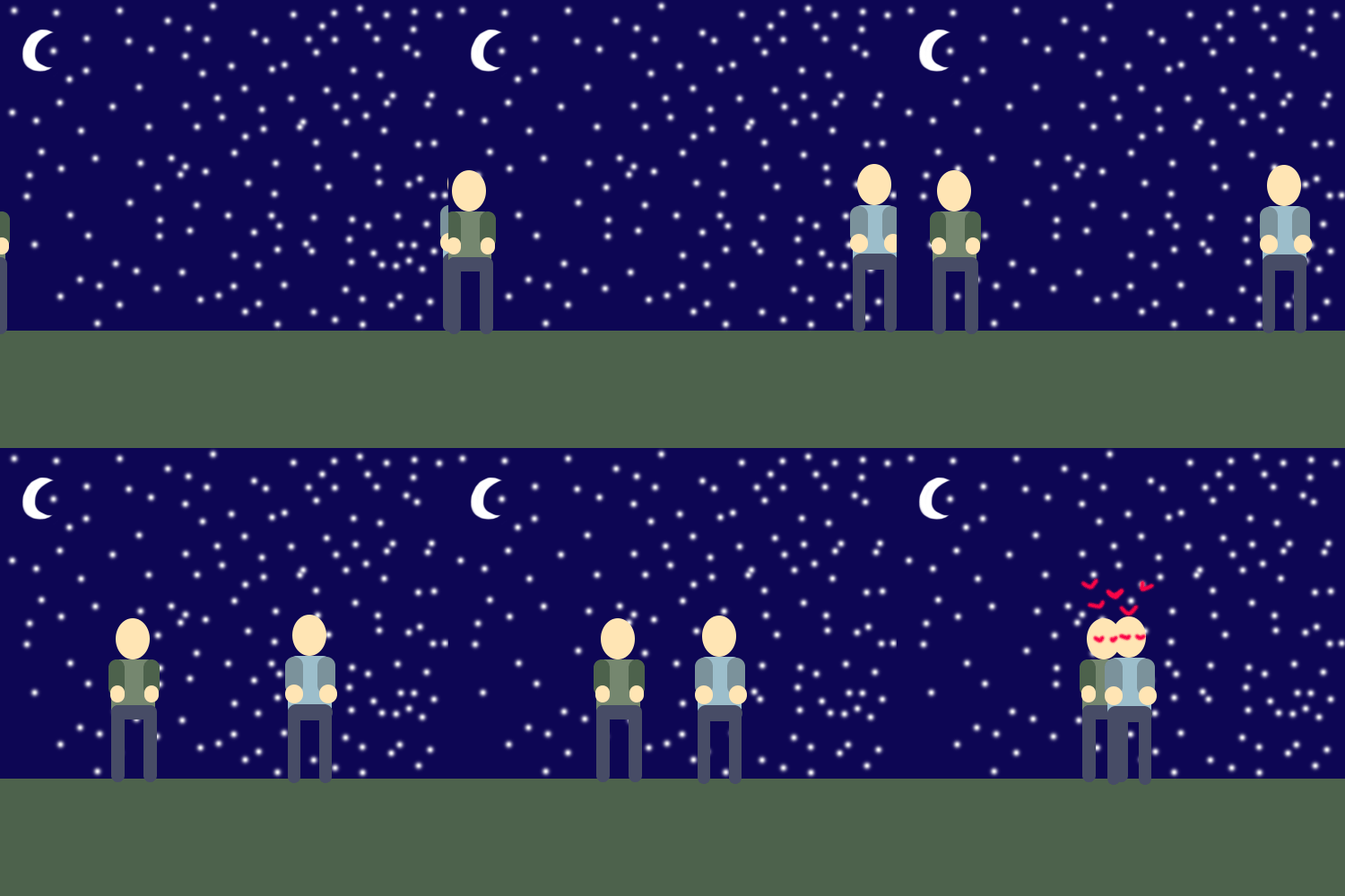
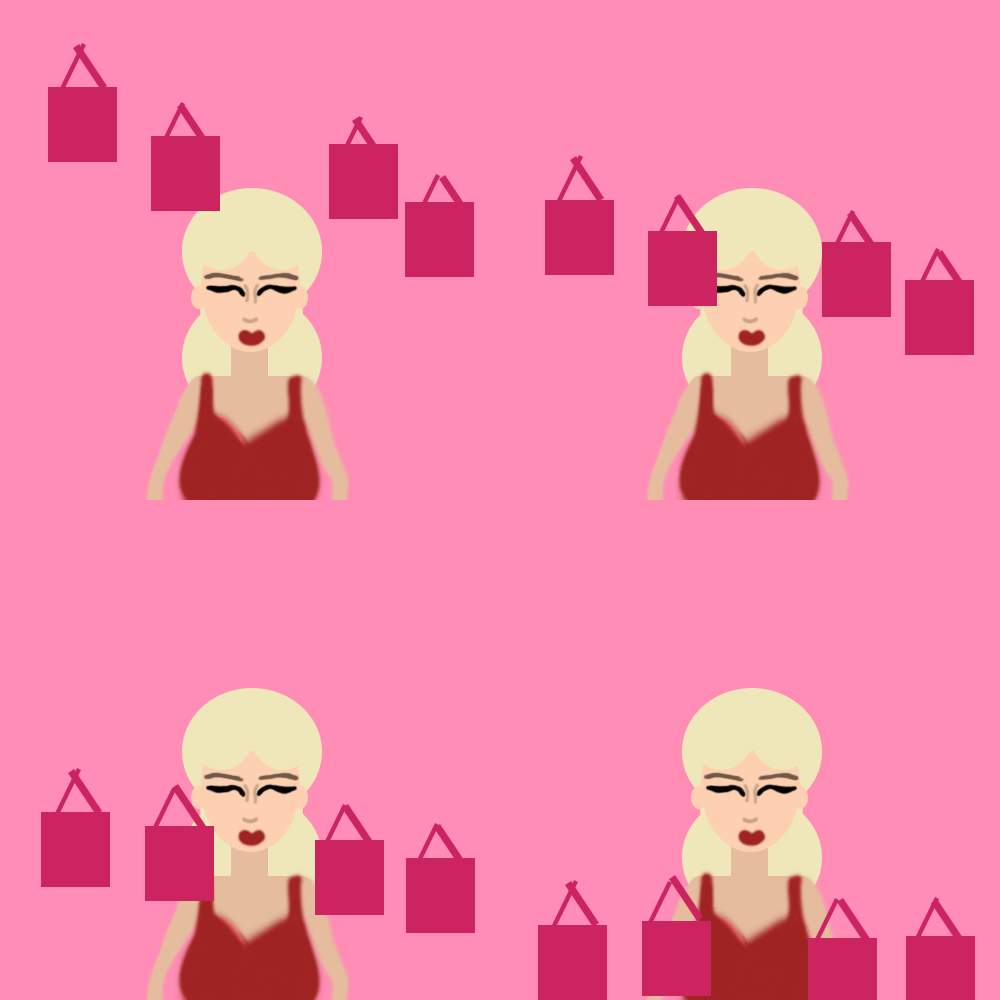
For my high frame gifs I went with "woman running in high heels", "happy memory", "food in a shopping bag" and "the dead character". For these I wanted to use both photoshop and digital art techniques to making gifs because I'd experimented with using both at this point. For "camcorder" and "shopping bag" I used photoshop because it is more simple to make the shapes required to pull off these tropes. I think that photoshop offers an interesting look as its shapes are more block coloured. I like the simplified shapes for these gifs as they aren't major plot defining tropes but I think the simplicity works for them. For the "woman running in high heels" and "happy memory" and "dead character" movie trope gifs I used IbispaintX because I liked how the "old to young gif turned out. Using this drawing app allowed me to implement more of my own style and personality to my work. I was worried if they'd work in the same fluid motion as my "old to young" gif had. In the end I think they both worked and I like how they have a sort of playful essence to them. I found it interesting making the gifs this way as I've never thought of drawing out a character frame by frame. I think these gifs have an old animation feel to them as you can tell they were done by hand, but I quite like that. I think that if I was re-doing this project I would have experimented more with this type of gif making.
Experiments
x3 Medium frames (5-8 frames)
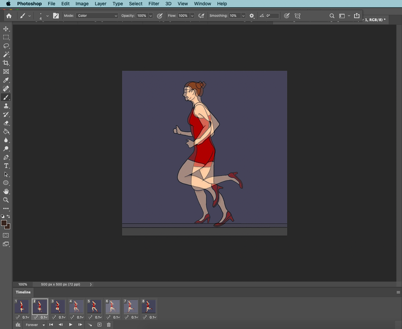
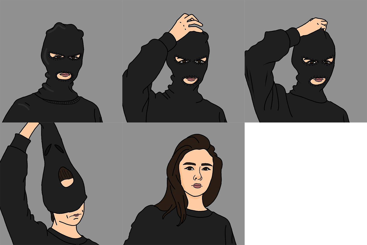
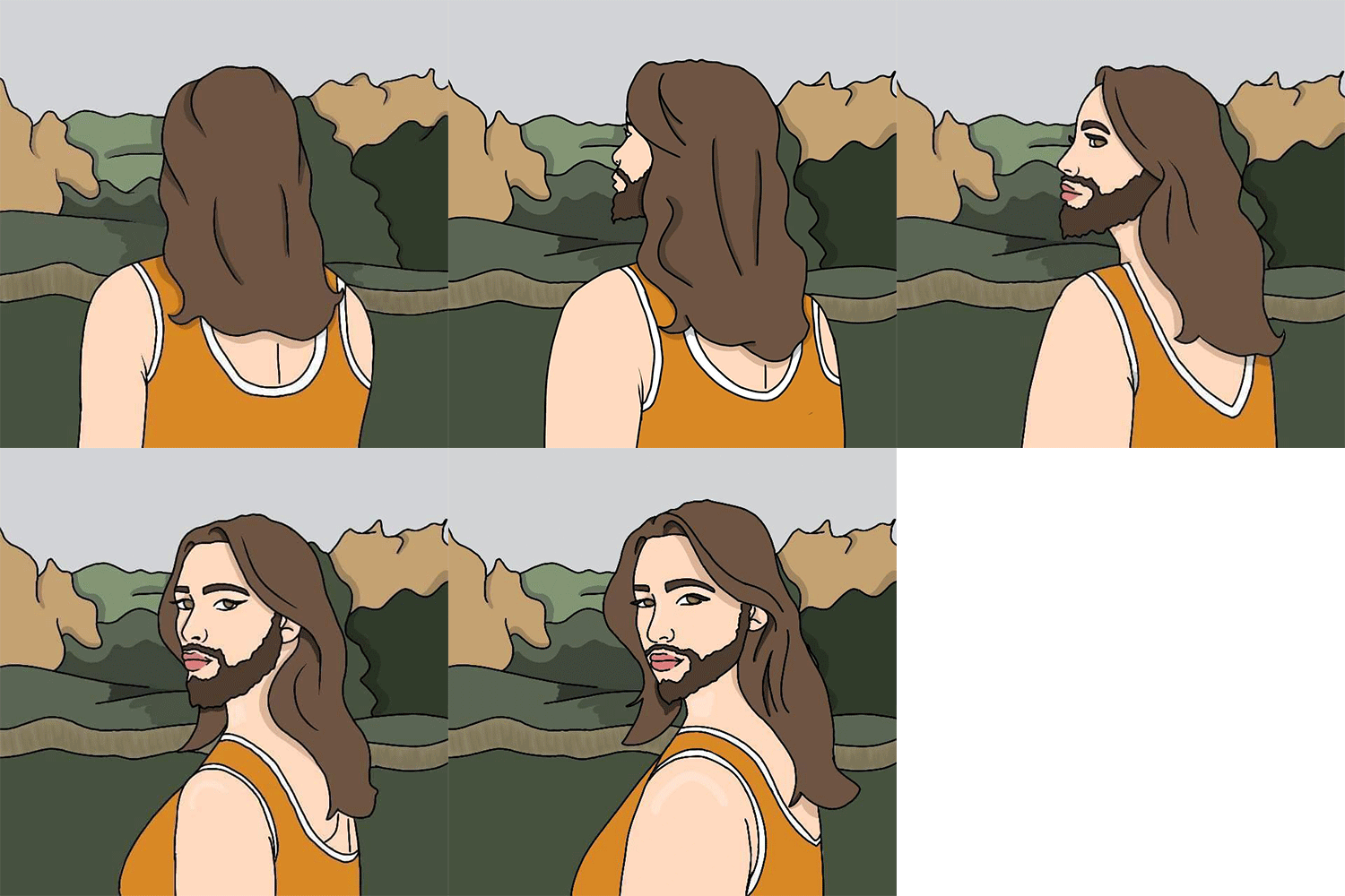
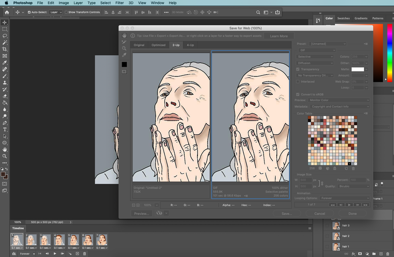
For my medium frame gifs I went with the movie tropes of "mask reveal", "old to young" and "a surprise" I tried to use a different method of making these gifs. I used a digital art app called IbispaintX on my tablet to draw each gif frame by frame. Creating gifs in this way takes a lot longer, however I'm quite happy with how thy turned out. I feel these show my personality a lot more then the gifs I made only Photoshop. All these gifs have 5-6 frames and took about 1 and and a half days to draw each. Out of them I really enjoyed making the "surprise" gif. Not only was it a first time drawing a beard but I enjoyed drawing the environment she is in. Once I was done drawing each frame I exported them from my tablet to my laptop, then uploaded each to photoshop, again using the "create frame animation tool". Using this method meant that Photoshop worked a little different as well. I found the creating a new frame and also implementing each drawing as a new layer was the easiest way to make the gifs work fluidly. I also found that with each new layer the previous frames would all change to show the newest layer. I found that linking the layers to the corresponding frame worked the best and allowed the animation to run properly. In a feedback session my tutors asked for my gifs to be made a little more exciting, For them to show my personality, this is my response to that feedback and I definitely agree with the feedback. "mask reveal" and "a surprise" replaced two gifs I made that are now in my experiments section.
Process
Experiments
x3 Low frame gifs (2-4 frames)
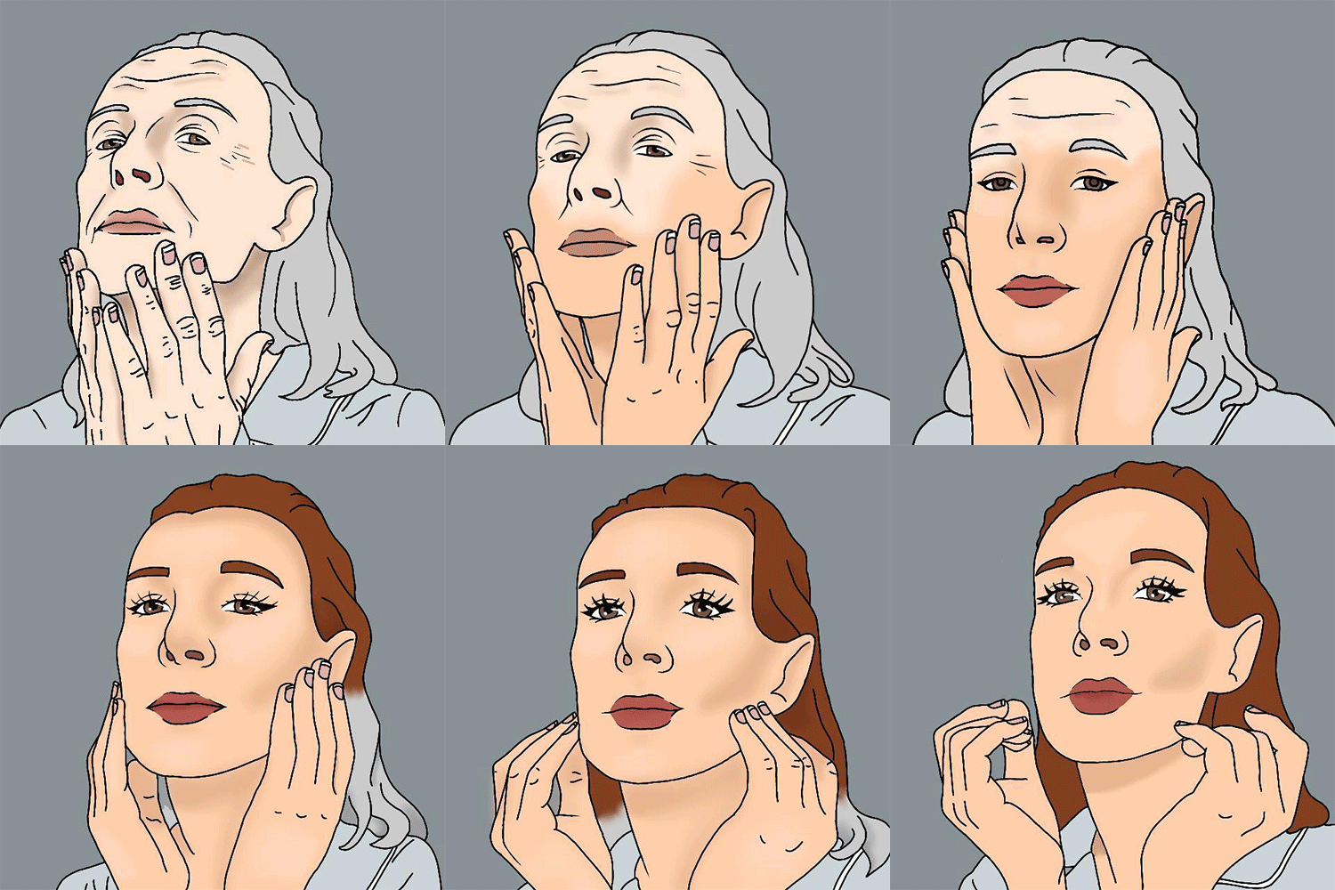
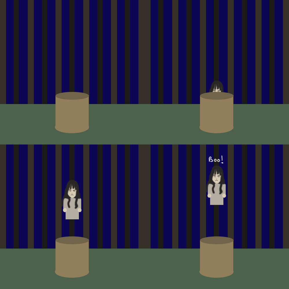
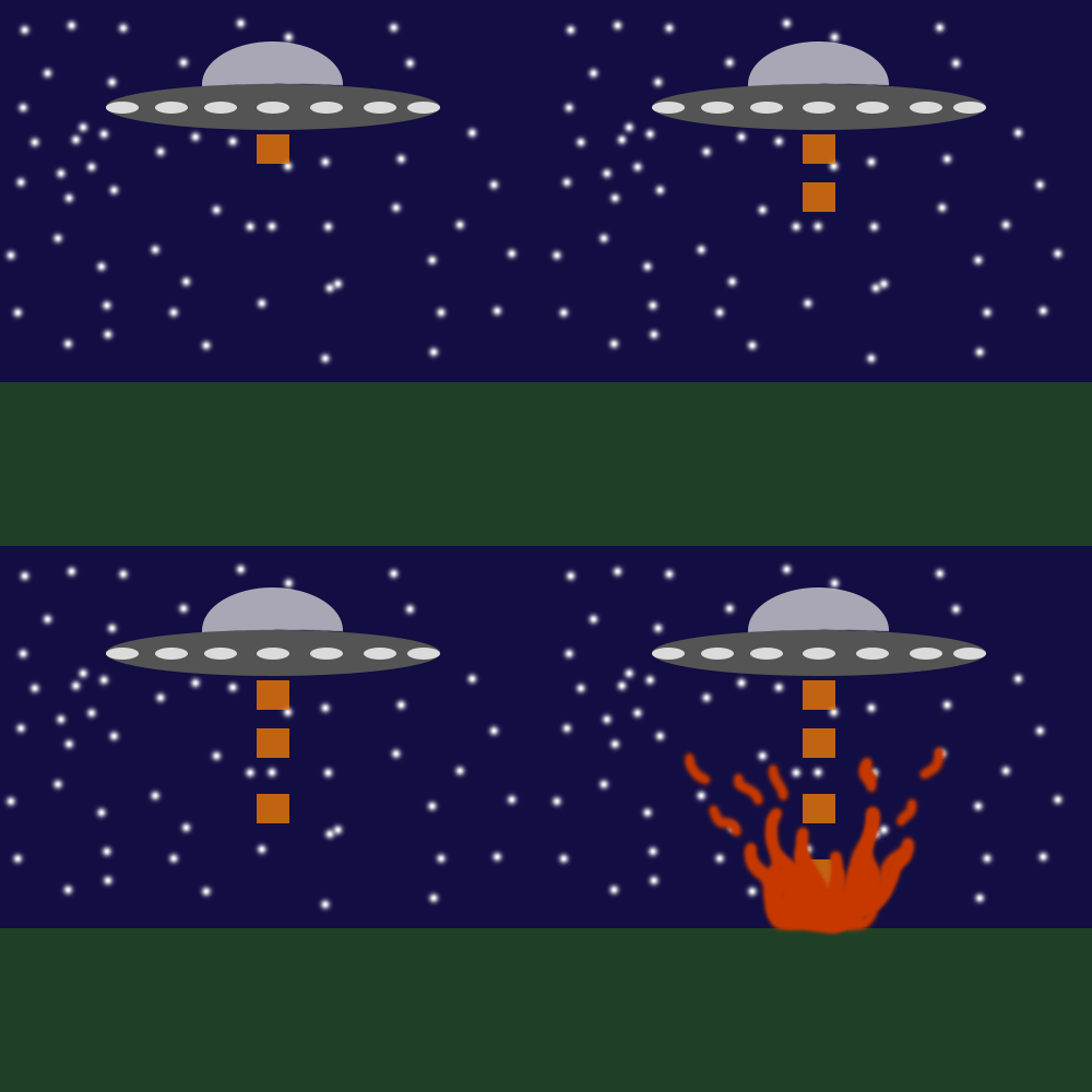
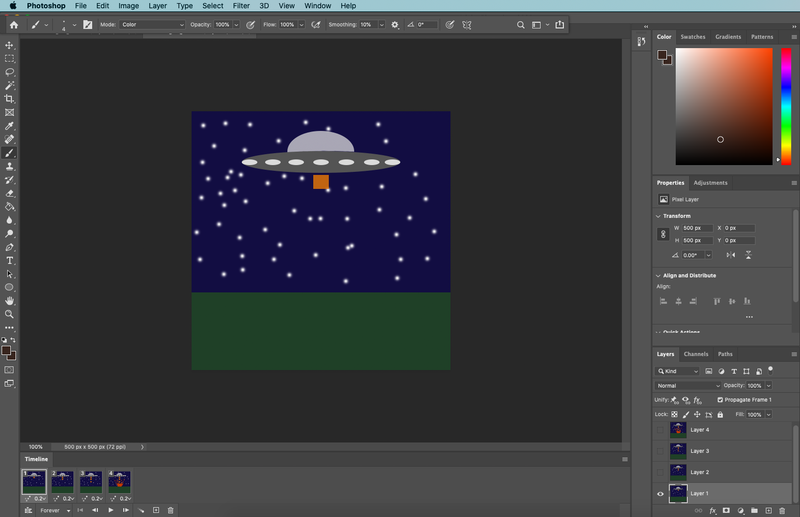
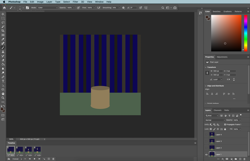
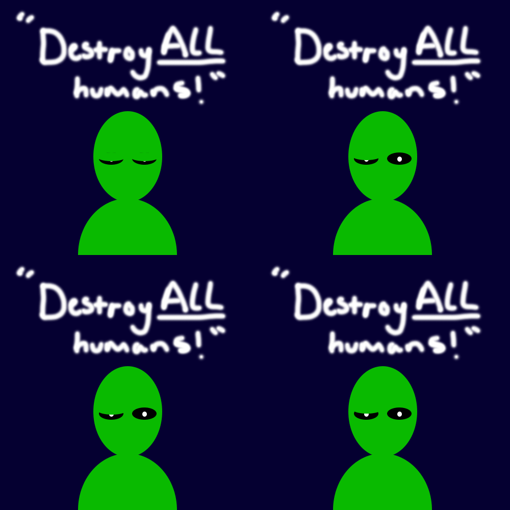
For my low frame gifs I went with the film tropes "makeover", "evil character reveal" and "aliens". Originally I went with the "trophy wife" trope but I felt it wasn't strong enough compared to the other tropes I used. When thinking of what tropes to use I found it useful to sketch my ideas out frame by frame. This way I could get an idea of what tropes fit in with a certain frame limit, it also helped with deciding what tropes worked in a gif format and which did not. For my low frame gifs I used the shape tool on Photoshop to create basic shapes to create my scenes, this made it more easy to move the shapes around as I was abled to use the "merge visible" tool so each part could move together. For example the "reveal of an evil character" shows the character levitate out of a well. Using the layers tool I made the characters layer below the wells layer. This is so the character could hide behind the well in the first frame. For the second frame I just moved the characters layer to above the well. Using the "tween" tool on photoshop I was able to create the frames between of the character levitating out of the well instead of doing it myself, using this tool I made two frames in the middle to show the gradual levitation. It just sped the process up a lot more.
Process
Experiments
3D design and illustration
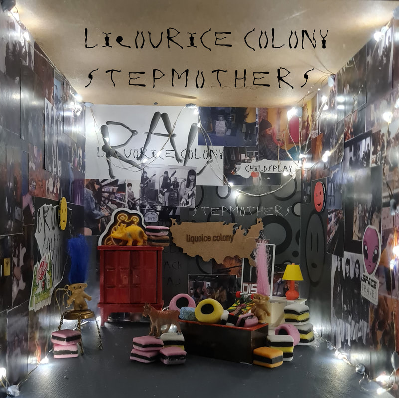
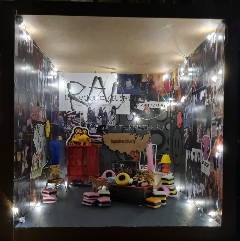
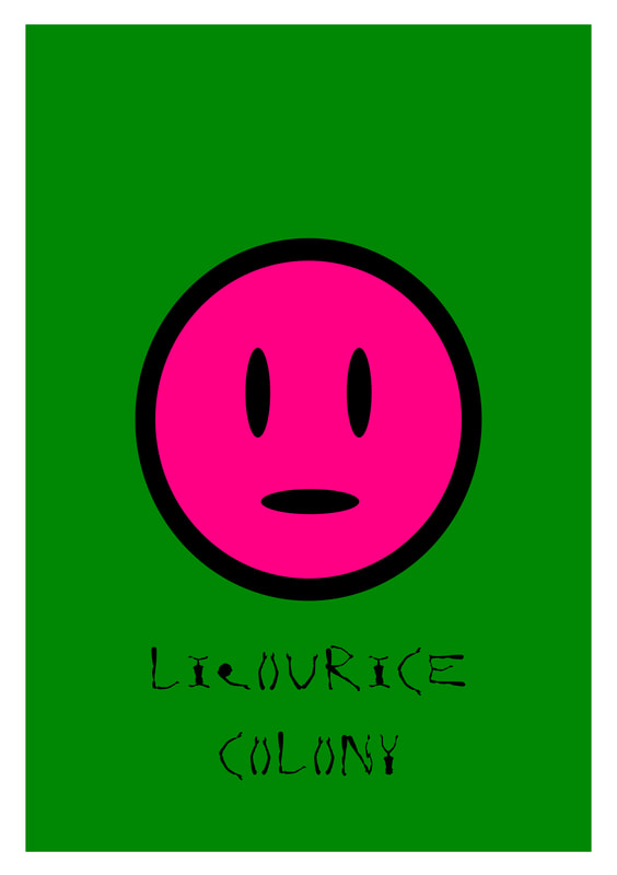
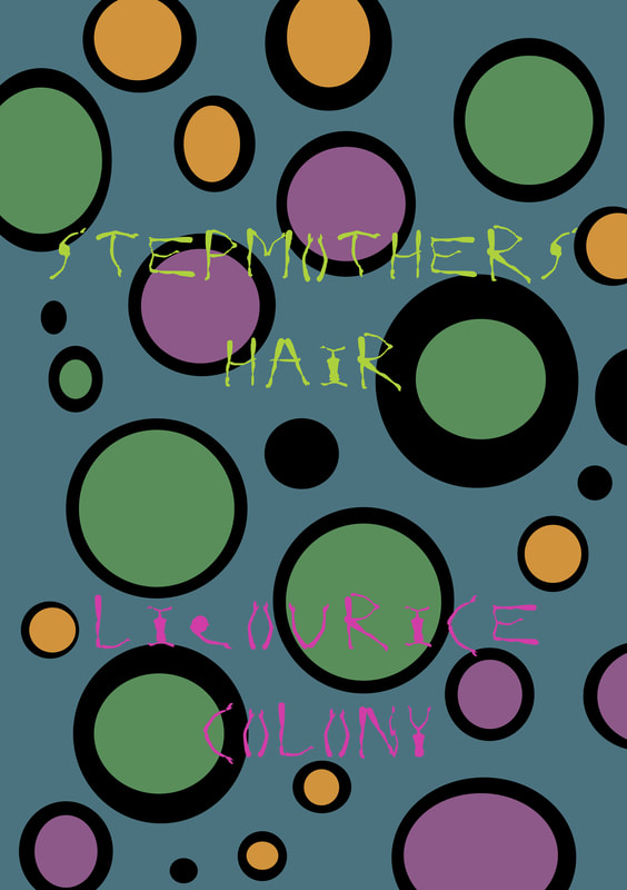
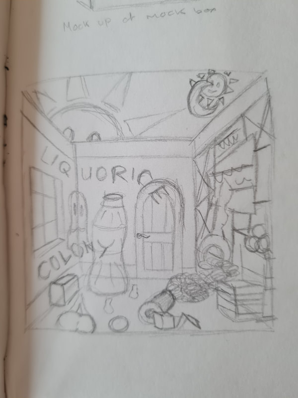
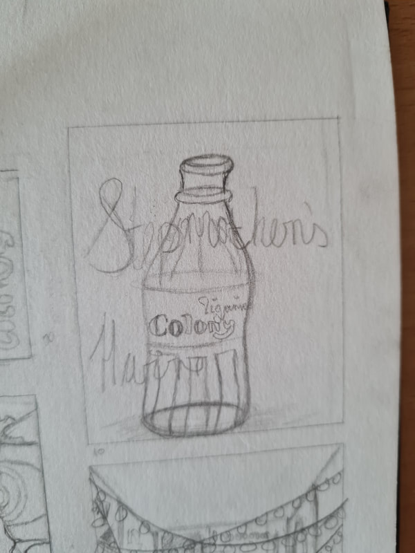
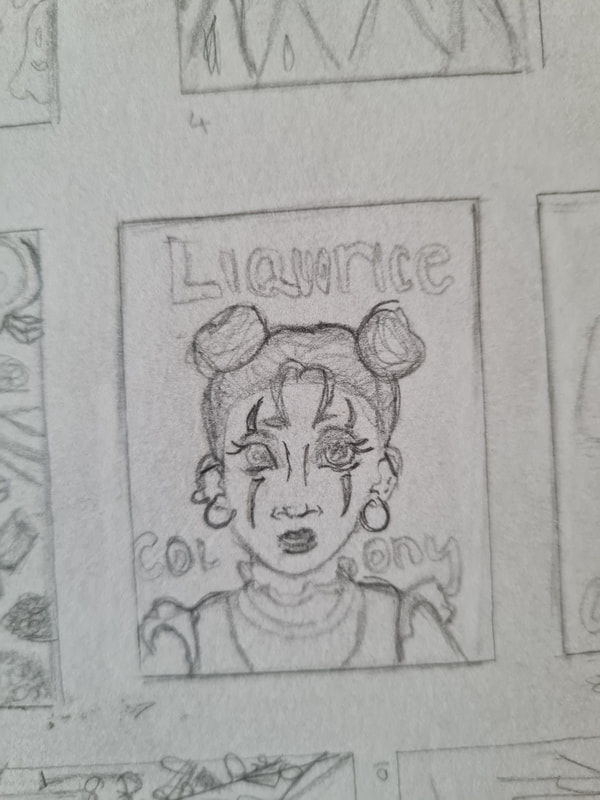
In the 3D illustration project we were asked to create an album cover for an undiscovered band. this band was made up and given to us with a genre and album name by a generator. My band was called Liquorice Colony, they're a garage rock band and their album name was "stepmothers hair". We were asked to make something eye-catching and to include our personality into whatever we made. In this we were asked to construct a box to create the album cover in. The measurements given were 12"x12" the average size of a vinyl album cover. Again we were asked to think creatively with what materials we used, another thing that was important was how materials can be used to convey a certain genre or type of music.
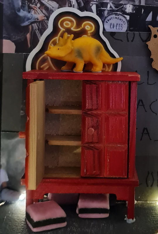
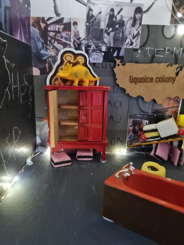
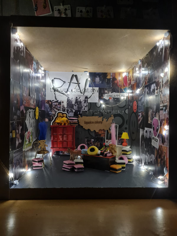
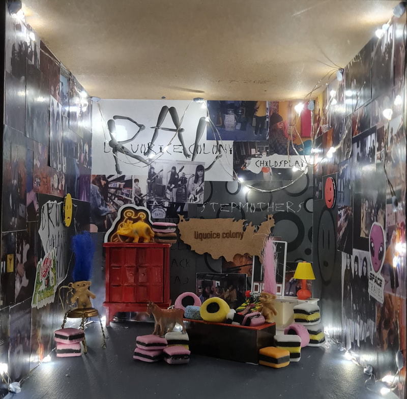
These are my front and back album covers, I love how the turned out. I feel like every time I look at it I notice something different, it definitely turned out how I wanted it to. I feel like it gives off that maximalist chaotic energy that seems common in Garage rock. The box is made out of thick recycled wood i found in the woodwork studio on campus. It is held together my 40 mm nails. I found this quite interesting to make as I've not made a box before. The material is thick enough that it was easy to transport from my accommodation to university but not too light that it blowing everywhere in the wind. I made the liquorice colony map sign out of MDF on the laser cutter and etched the words onto the wood. I took the l took the photos at night so it was dark enough for the fairy lights to be the only light source. For the song titles i just used a word generator. The barcode was also made using a generator.
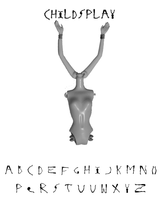
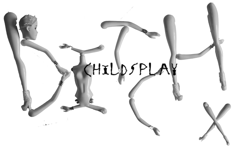
For the garage I wanted to make some posters myself, I used the typeface I made for the 2D illustration project called Childsplay which was made out of broken doll parts. I thought that the band would like them and think they were cool. I also used the cut out letters to make one of the posters say "RAD" because this is American slang that was popular in the 1980s and 90s which is when I set this band to be in.
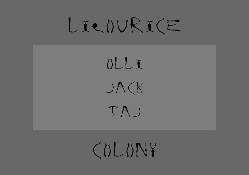
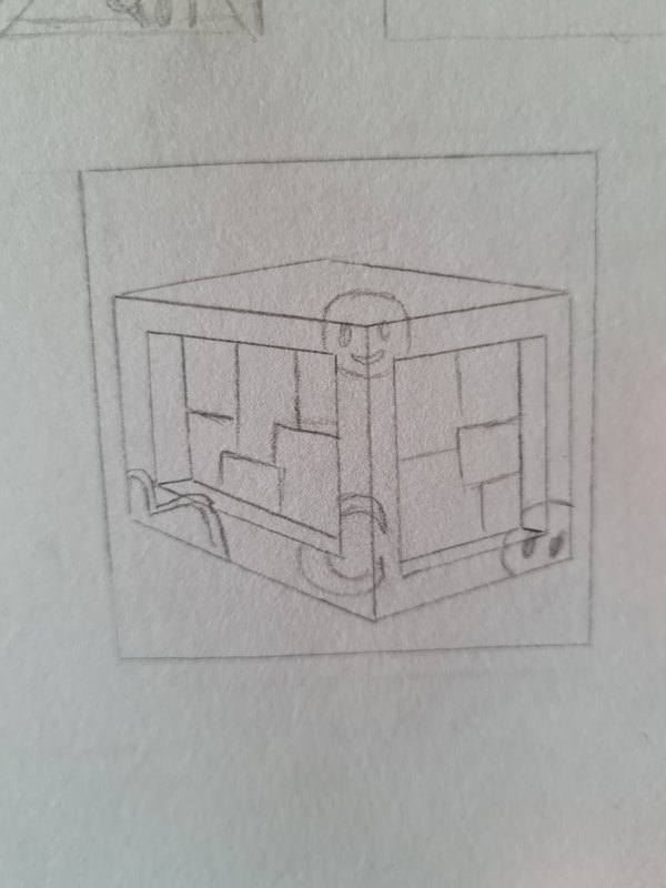
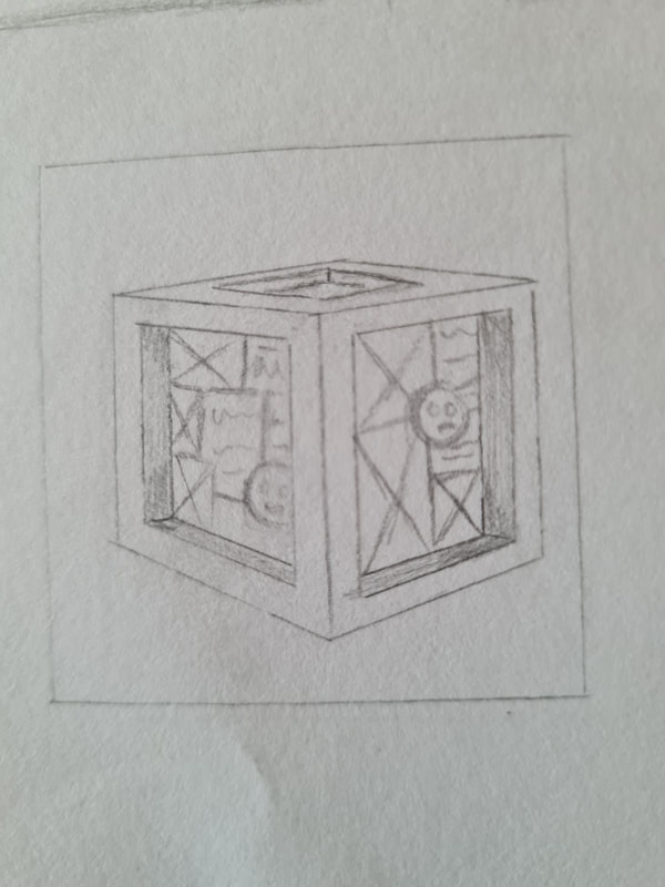
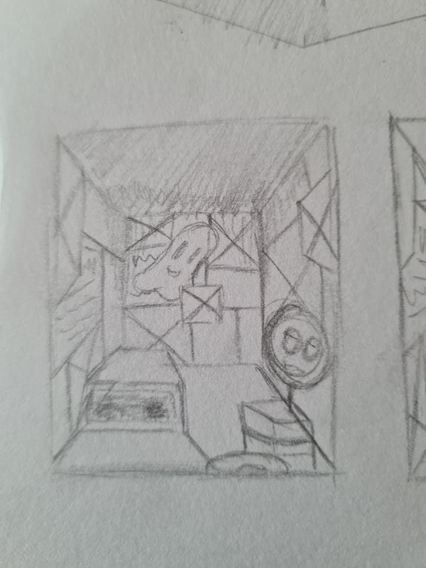
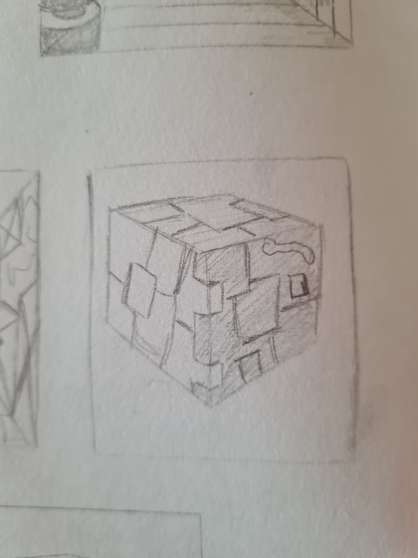
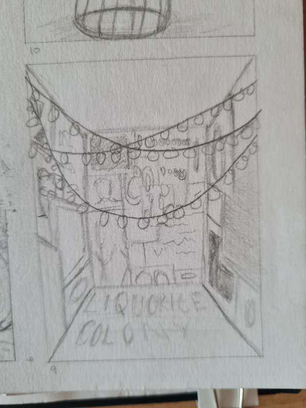
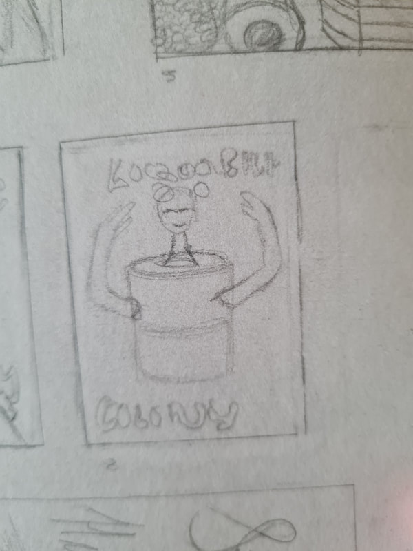
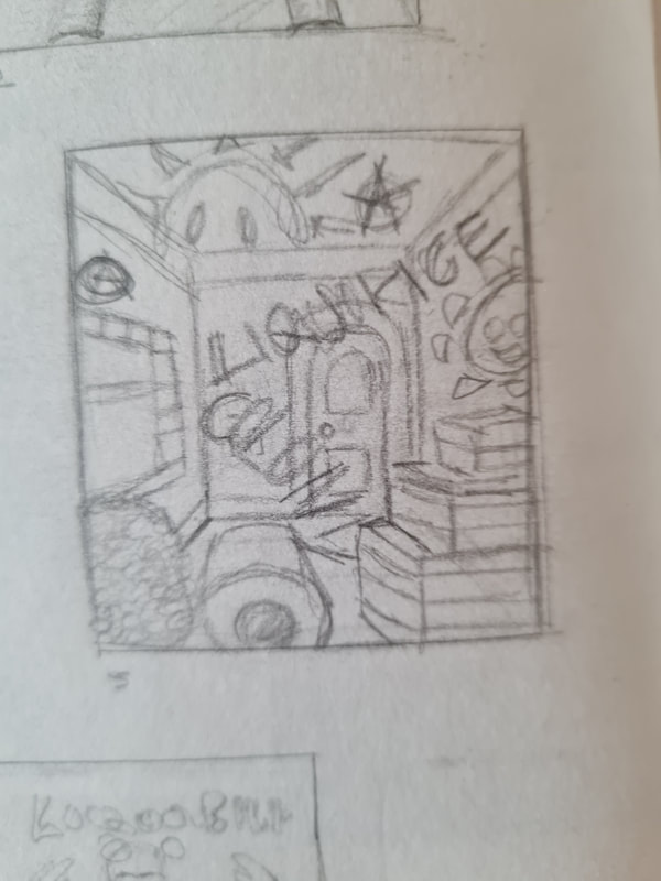
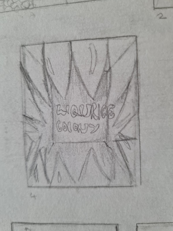
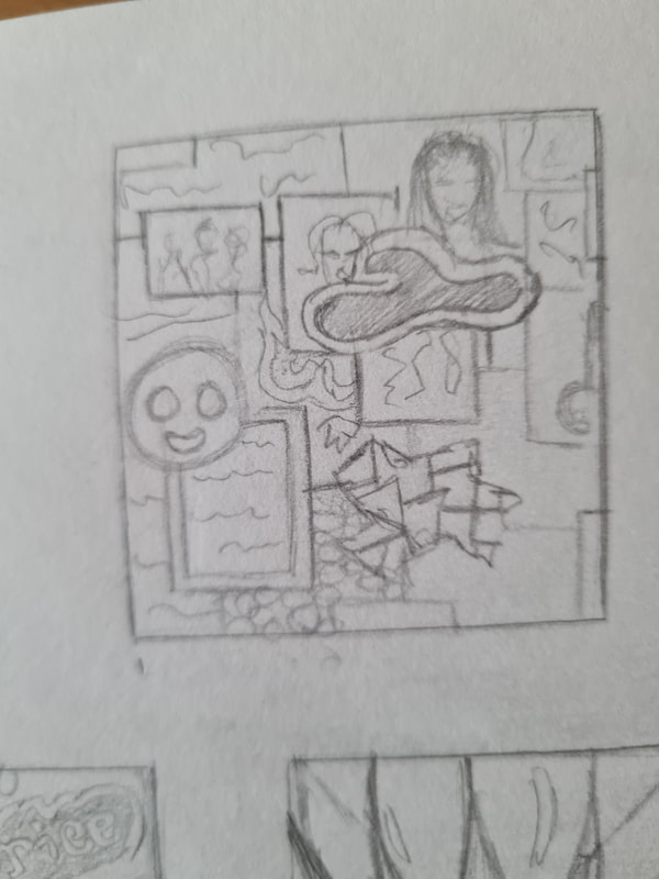
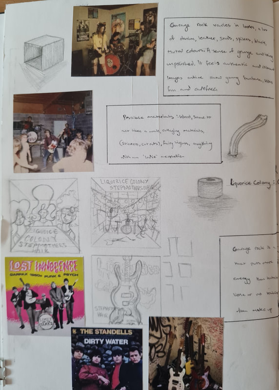
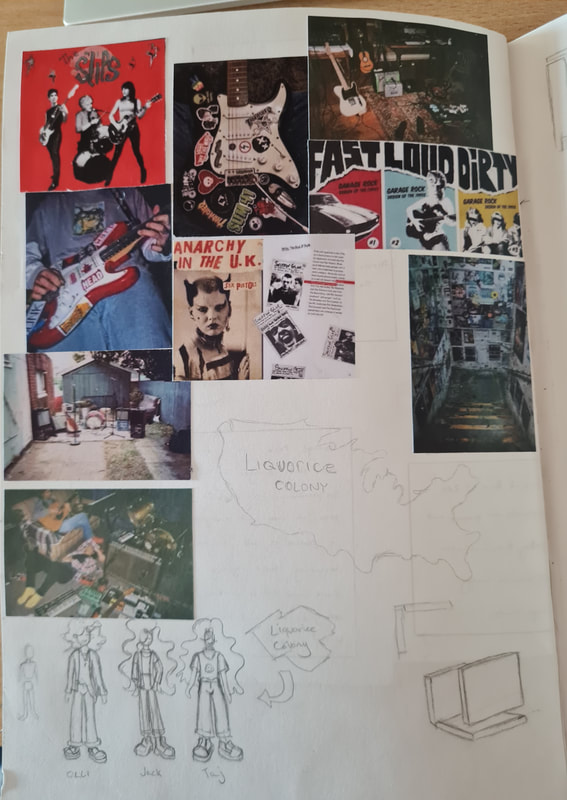
These are my plans for what my album cover box could look like, I had sketched my ideas always thing of using the interior of the box and not the outside of it. So i experimented with what what that could look like. However I didn't think it was an effective way to make it as the viewer would have to look at the cube face by face. So I thought that using the interior would be a better way to use the space. I thought of who might be in or like Garage rock and thought that older teenagers and young adults were probably the right demographic. I then thought of my characters I sketched Taj, Jack and Olli. I thought that it was be interesting if the box was designed to look like a garage that the band had taken over and covered in posters, liquorice and old furniture.
Over the weekend after getting this new project, I went back to London to visit some friends. I found myself in Brick lane a lot and in Camden market while back. I felt really inspired by these two places, both have this rough exterior to an outsider but if you have been before its magical and beautiful. There's so much colour and life, so much noise and the people? They're themselves, it was interesting to be back in. On the train back to Carlisle I sketched out eleven ideas for the album cover to show to my tutors. My initial ideas were inspired by the many back street charity shops in Camden. Some had exposed bricks that were painted over, the walls covered in spray paint, Some had normal walls that were covered in photos and posters. The only light coming from fairy lights, LEDS or bare bulbs. I really loved that raw and authentic vibes these places had. I found myself talking to the people who worked in one, they had that carefree and energetic vibe that I liked, so when I was mood boarding and drawing my initial ideas I had them in mind for any potential characters. I made the band consisting of Olli, Taj and Jack.
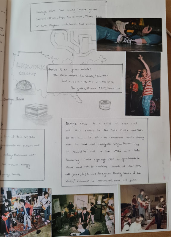
At first I researched what Garage rock is, as I had never heard of it before. I soon learned that is a child of rock and roll and emerged in the 1950s and 1960s in America and Canada. In the 1990s it got revived and the Indie influence took over the genre and created the Indie garage rock sub-genre. It combined doo-wop, cool jazz, R&B and blue grass. I found it puts more emphasis on energy and passion rather then technical ability. Therefore a lot of Garage rock musicians have little to no training. Giving the genre a raw and authentic feeling. When researching the genre I noticed a lot of denim, leather, studs, spikes and rougher looking materials. at first I thought that using lots of texture and different things would be a good idea for an album cover, I then thought about implementing liquorice as a nod to the bands name. One thing I thought of from the start was the band being American teenagers in the 1990s. As that was what came up a lot in my research and it just felt right,
2D design and illustration
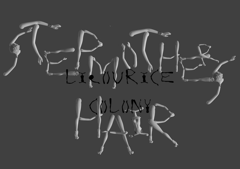
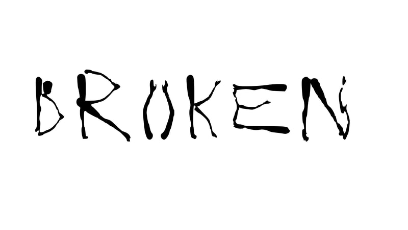
This is my work from 2D illustration, part two. This where we made our alphabets into digital copies. For this I used photoshop to make contact strips. I found this the quickest way to do this as it ordered the letters correctly. I then explored with the colour filters photoshop offers. Especially with contrast. After doing this I had to choose a type face to make into a useable font, with feedback I felt that the doll typeface i mad was the coolest and there wasn't a type that looked like it. The next part of digital work was to convert these contact sheets into actual type faces, using a program called 'Calligraphr'.
We were asked to make two posters, with the specifications of A3 landscape or portrait and they had to be black and white or greyscale. Poster one was a creative presentation of our alphabets. Poster two was a creative presentation of the process of creating the letterforms. For mine I went with simplified designs for poster one so the emphasis was on the shapes of the letters and not anything else. For poster two I tried to replicate the action and words I muttered to myself as I took apart the doll to create the letters, I found this quite interesting and made me look at already existing letters to get a feeling of how the artists used the space available.
2D illustration part one
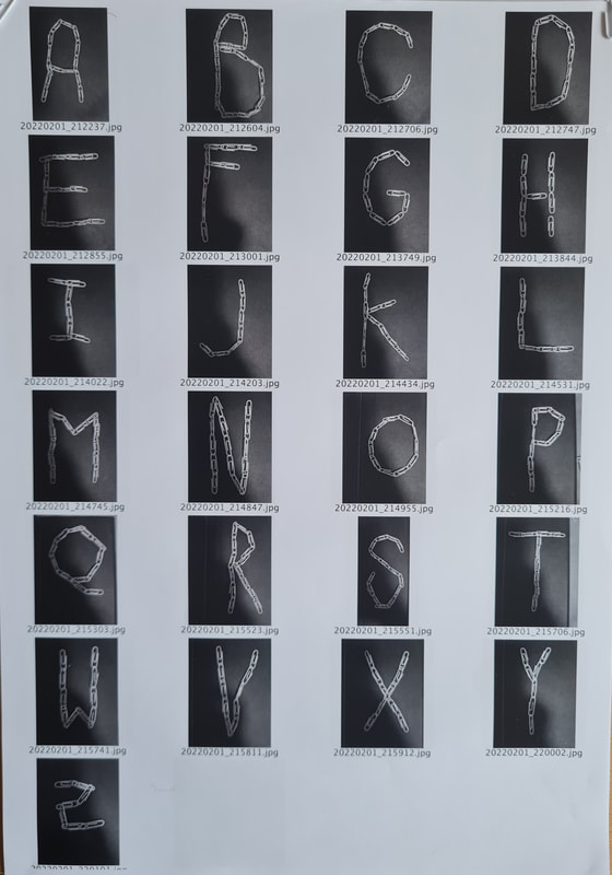
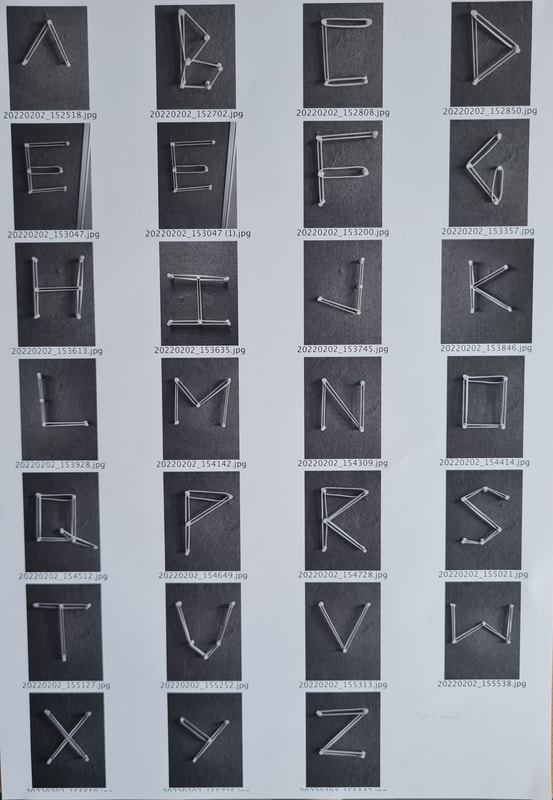
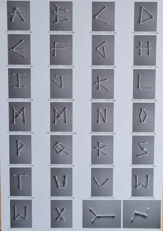
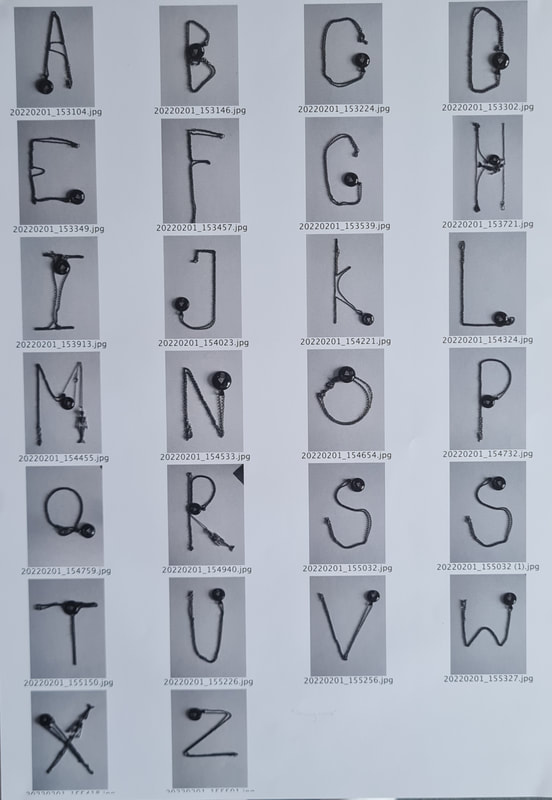
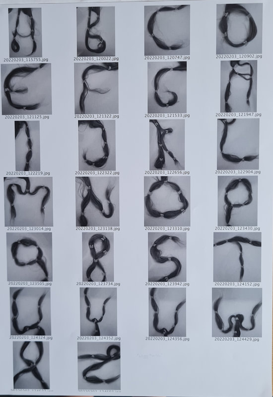
This is my work from 2D illustration, part one. This is where we collected different materials to make alphabets with, were asked to think in an eco way and reuse objects we found. One thing we were asked to also do was use materials that weren't too obvious, To use objects that other people might not think can be made into letterforms. This was definitely interesting task and made me think in a more creative way, it has also made me see letters in just about anything I see out and about. This was a really interesting project as I learnt how letterforms and typefaces are created and what goes into making them for our use.
|
|
|
|
|
|
|
Site powered by Weebly. Managed by 34SP.com
