Project Three: Society, Politics and Culture
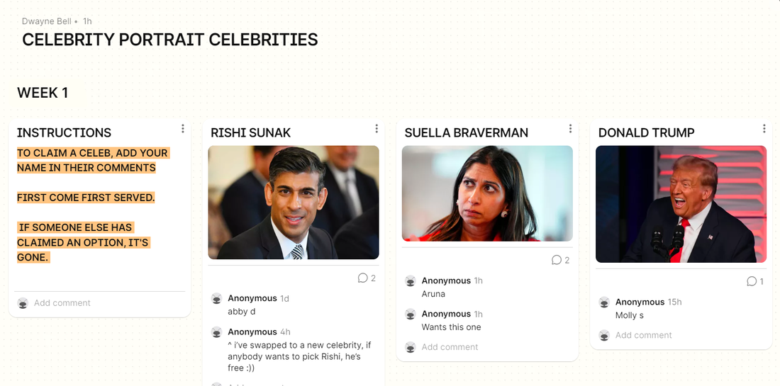
Project three is based on the concept of society, politics and culture, the project brief is to tackle the wider task of including politics in illustration. I chose this time to do Editorial portraits, this project is to choose one person a week and illustrate either a complimentary or a critical portrait of the subject.
Week one: Suella Braverman
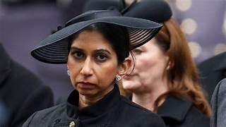
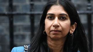
Suella Braverman was my choice for week one, her stance as a conservative party member as a woman of colour is controversial. She stands with outdated views on immigration, working class people and her tolerance of social minority groups. SHes a big figure in the UK news ground as she has recently been fired by the prime minister, stated as being a "cabinet reshuffle". Her stance on the right to protest, immigrants and trans people are also reasons why shes seen as a hated figure.
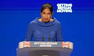
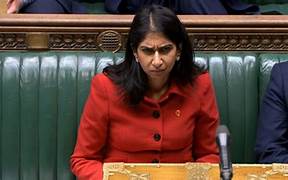
Reference images
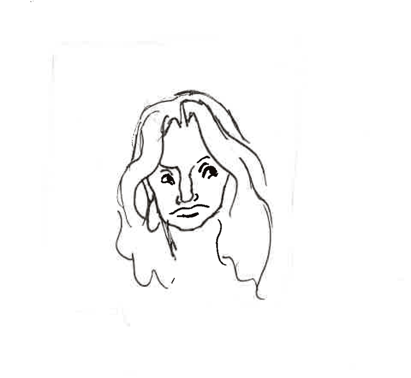
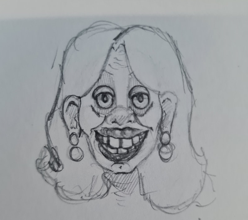
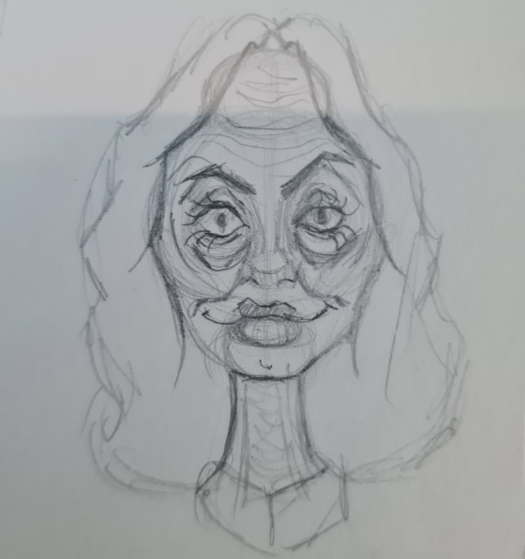
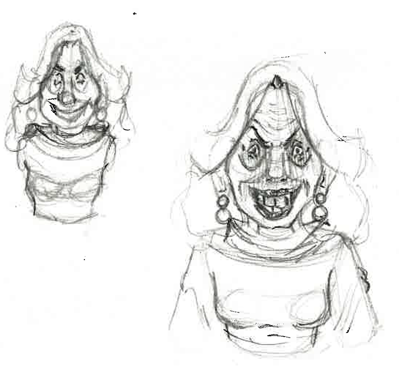
I can say now I will be illustrating a critical editorial illustration of Braverman, I don't view her as a peaceful political figure. Her outspoken, outdated, far-right political terrorism means I don't respect her. I think shes genuinely one of the worst people in the UK political arena. However project must prevail, so I will be sketching her face and picking out key features before moving onto a style or specific material.
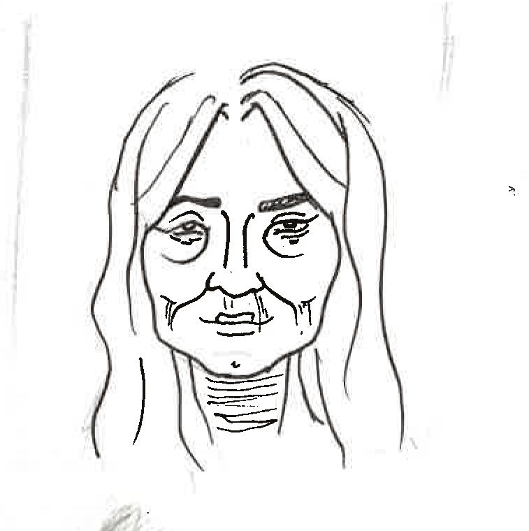
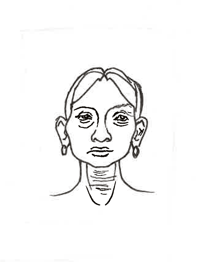
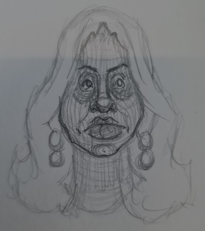
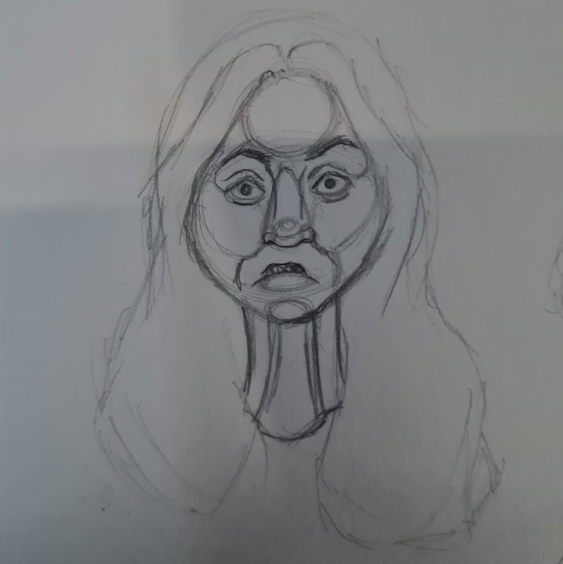
Some general face studies of her face, pulling out key features.
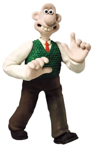
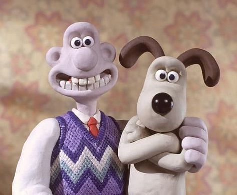
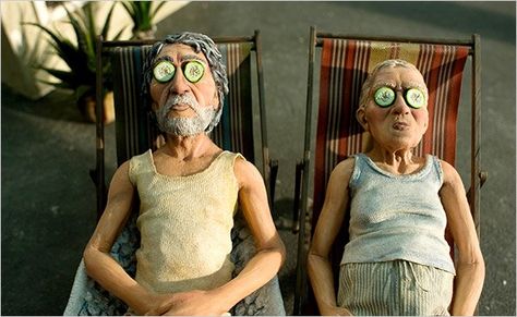
Thumbnail 1- Aardman
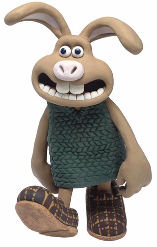
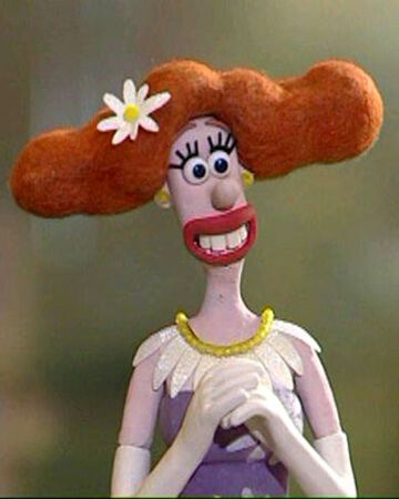
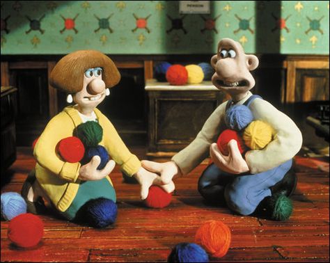
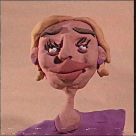
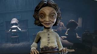
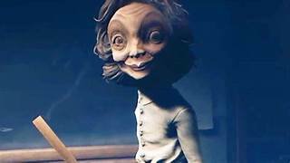
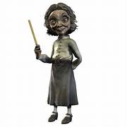
When I first saw Braverman after sketching her out in pencils I thought about Aardman claymation characters. Theres something very simple about how they create characters that you can relate them to someone from your own life. I think they play on British facial stereotypes that they really do look relatable to real people. I think they pull on insult but playfully. I think something that exaggerates features such as clay made portraits would work for this project nicely.
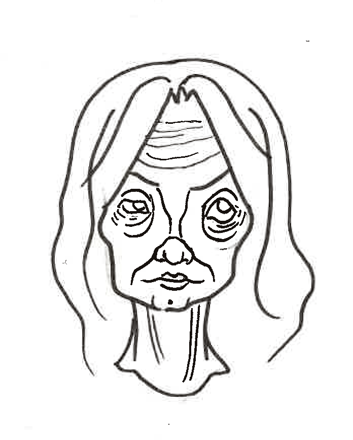
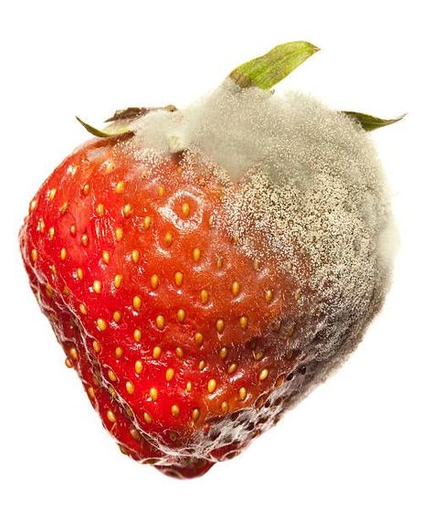
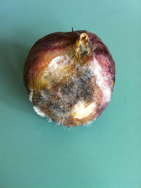
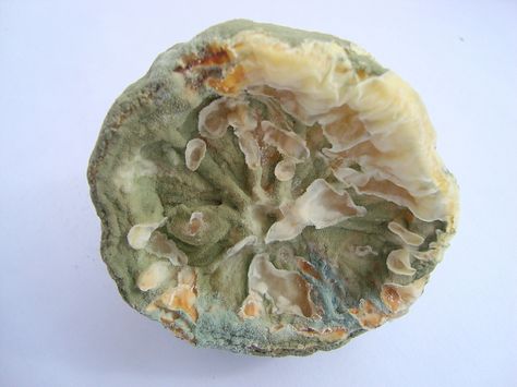
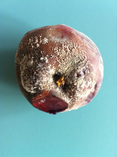
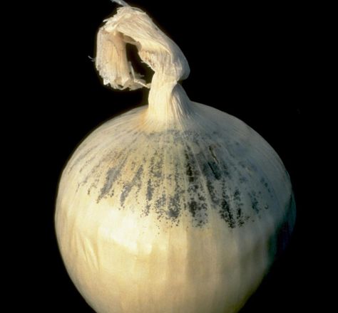
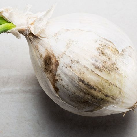
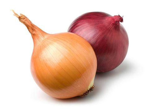
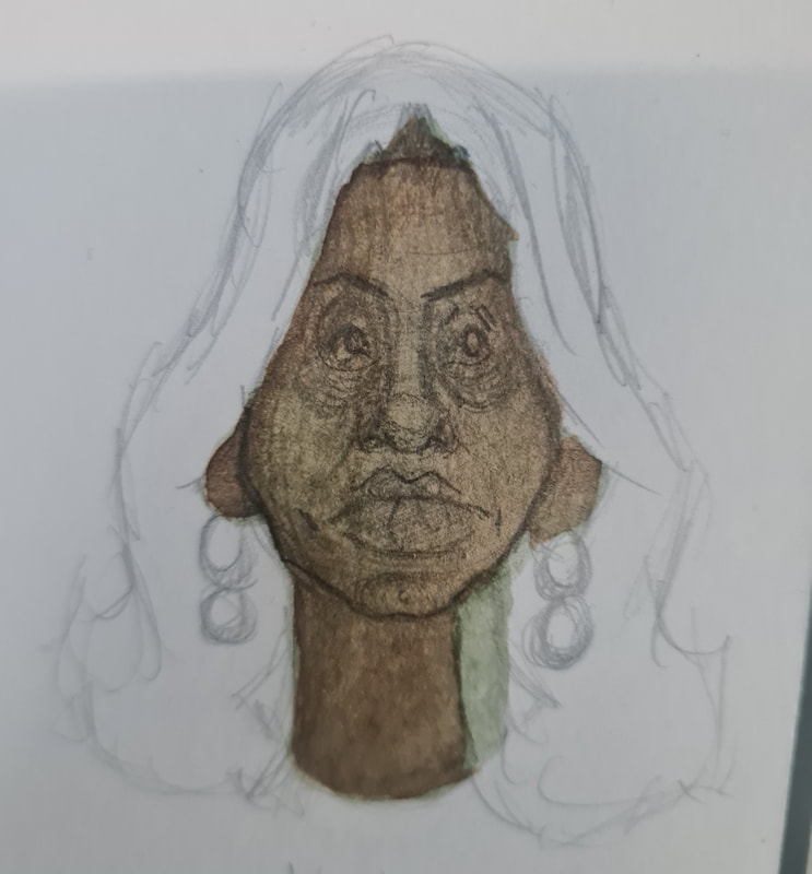
Thumbnail 2- Moldy Onions
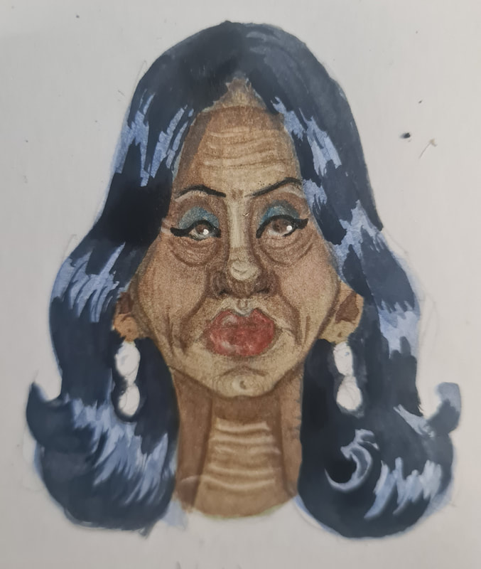
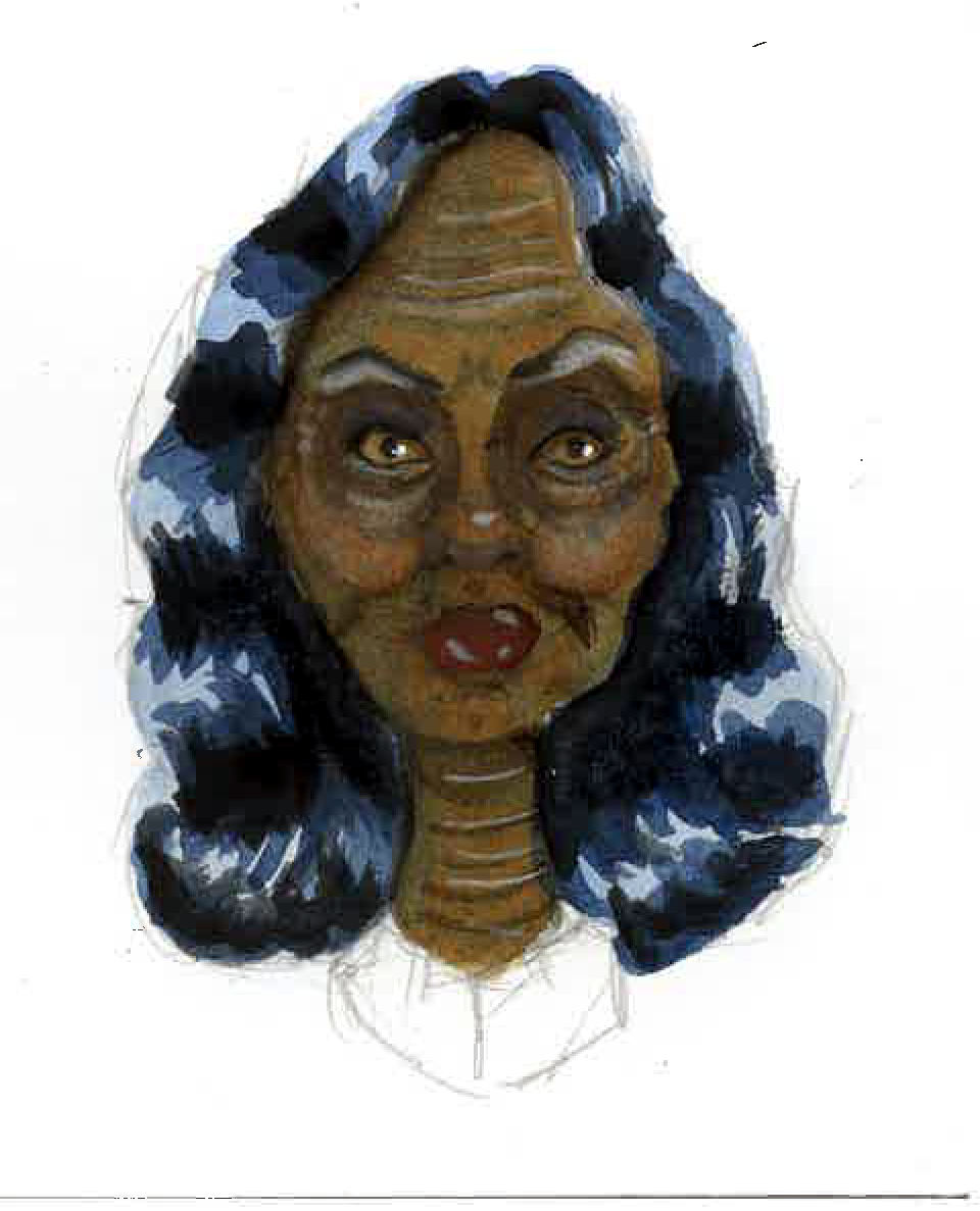
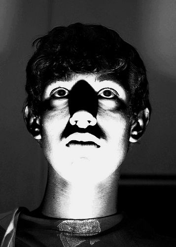
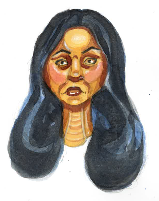
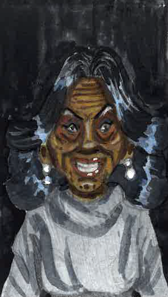
When I see her face shape she looks like a molding old piece of fruit, she has a very worn aged face then makes her permanently scowl.
Creepy Gothic watercolour character
|
|
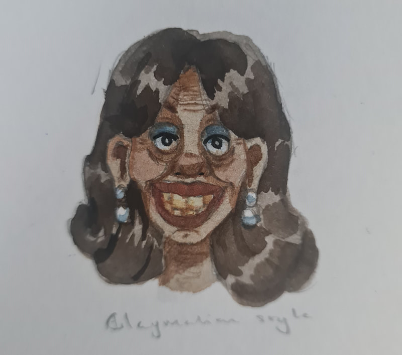
I had an idea to illustrate a watercolour creepy Suella Braverman, it would play on the cooler undertone of Bravermans skin tone. This would be done by under painting with blues and greys then painting orange-browns on top.
|
Evil graphic watercolour painting
|
|
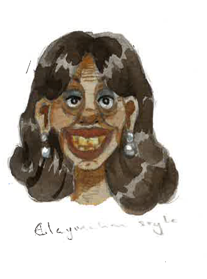
I like these more graphic and bold layered watercolour paintings. I think layering reds, blues and pinks allows for a retro graphic design choice. I could use it to make an evil illustration of Braverman. WHich would be fitting I think.
|
For each of the paintings I used undertone paintings, Braverman is a brown skinned woman and I wanted to represent that properly. She has a warmer undertone in person meaning her skin has warmth to it. However I wanted to paint her with a slightly evil look, so I used blue, green and grey to neutralise the oranges in her skin.
Selection
During group feedback with friends and family my aardman, graphic watercolour and the moldy onion approach ranked highest in stylisation and idea. With some help from further critique I will be going ahead with the moldy onion approach. This is because her head shape and certain characteristics read more to Suella in real life. The aardman was too charactueristic and the graphic watercolour was too pretty for my idea. I will be pushing her evilness in the final design though however.
Political caricature
I was told to look at some political caricature artists so I could set my portrait in a mood or setting, I found Horsey on a Washington post about political art and like the way he pushes features but you can tell who it is.
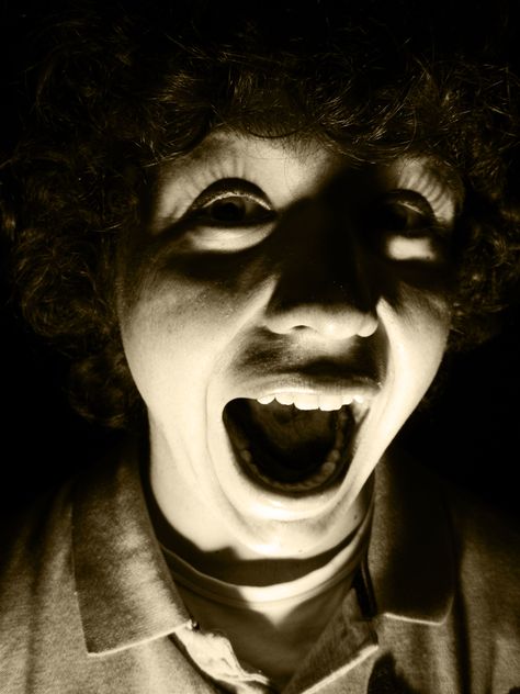
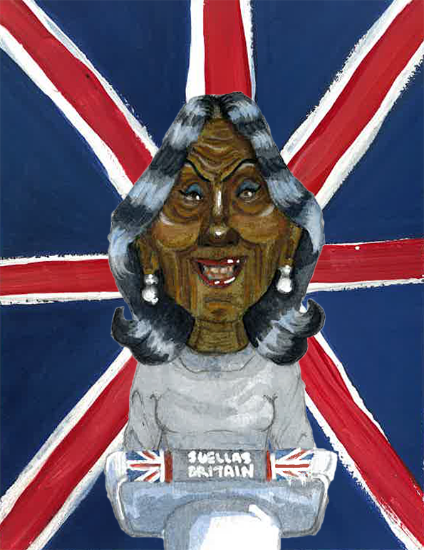
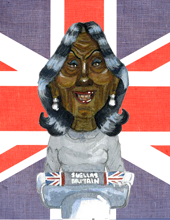
I want to create a portrait combining these elements of Braverman, her at a press conference, looking down with an evil grin and dramatic lighting. But using the rotten look i got in my mock up.
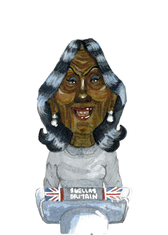
I made a mock-up of the idea for this portrait, it would be Suella at a press conference, grinning a great big smile, I want to exaggerate her smile and use lighting to make her look derranged. Not that it'd be difficult to do that. For the background i will be painting a union jack and using it to represent what shes destroyed, the country. Probably will destroy it as well and graffiti on it with what is one it. Maybe some of the things she has done.
Making the final
|
To make my final for week one I decided to paint the background and the subject separately. This was to prevent the paint mixing ant also because I wanted to use Gouache for the background and watercolour for Suella. I made the frame size half of what the final size was supposed to be: 10.5cm X 13.6cm. This is because i tend to work better at a smaller scale and I can resize the piece digitally.
|
|
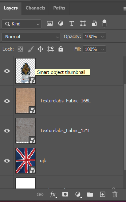
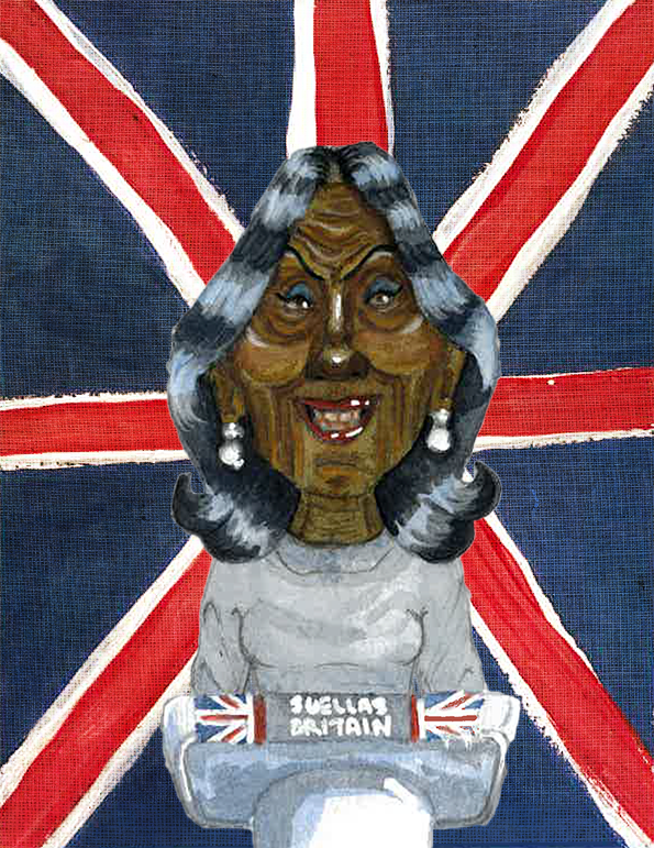
I scanned in the pieces separately then used Photoshop to make the final. I began by cropping the background to the correct size. I then used the quick selection tool to cut out the painting of Suella at the podium. Then I made a new canvas at the measurements: 210mm x 272mm. and began layering each piece. I wanted the flag background behind Suella to look worn and distressed, so I found a texture pack for distressed fabrics and over layered two.
|
With vs. without texture background
I definitely think that the fabric texture adds to the tone of this piece, I was aiming to show how evil Suella Braverman is, an added essence is how her and the Tory government have destroyed the country.
Rework
|
It was suggested to knock back the background illustration so the foreground and background weren't fighting each-other. So I lowered the opacity by 20% to 30%. I also got a more even Union Jack for the background by using the graphite tracing trick and edited it to look like worn fabric on photoshop.
|
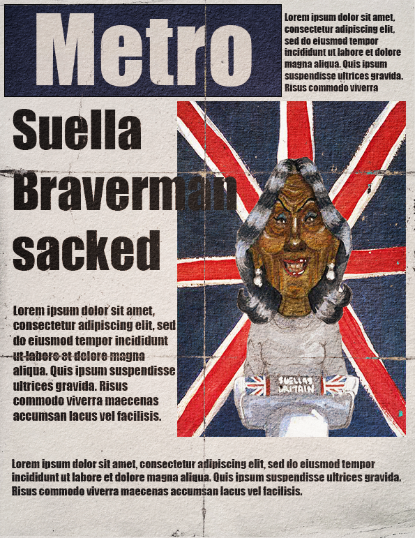
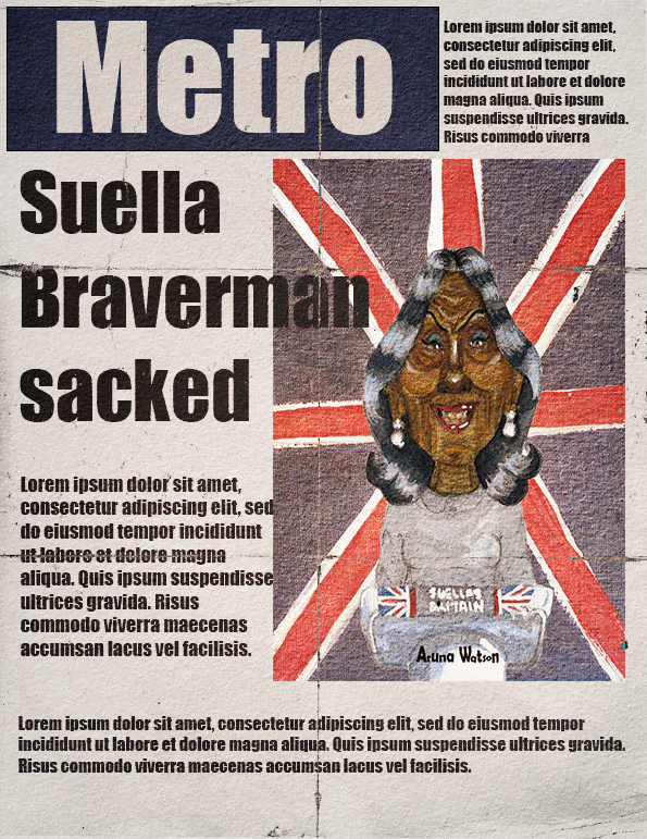
Final mock-up- week one
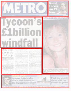
For the final submission I made a mockup of a newspaper front page for Braverman, coming from London the Metro newspaper is my most known newspaper so I went with that.
Week two: Grace Jones
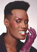
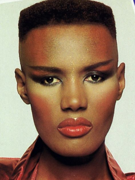
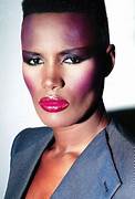
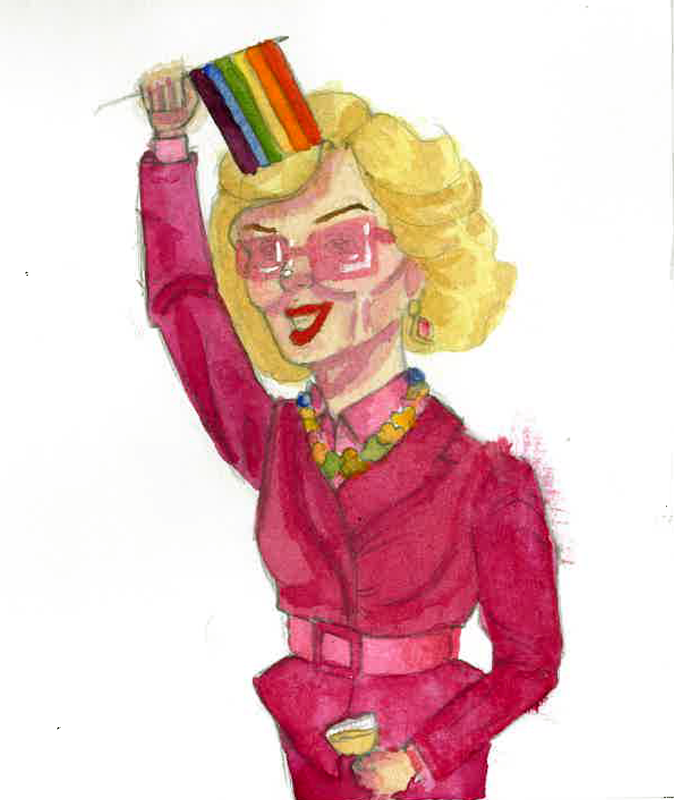
Week two focused on culture, in particular music. For this project I chose one of the most striking faces in music, Grace Jones. For this week I wanted to work more in terms of celebration. Grace Jones for some context is a model, singer and actress from the 1970s and 1980s primarily, though she still works now. She is most known for her striking features and androgynous appearance.
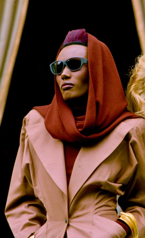
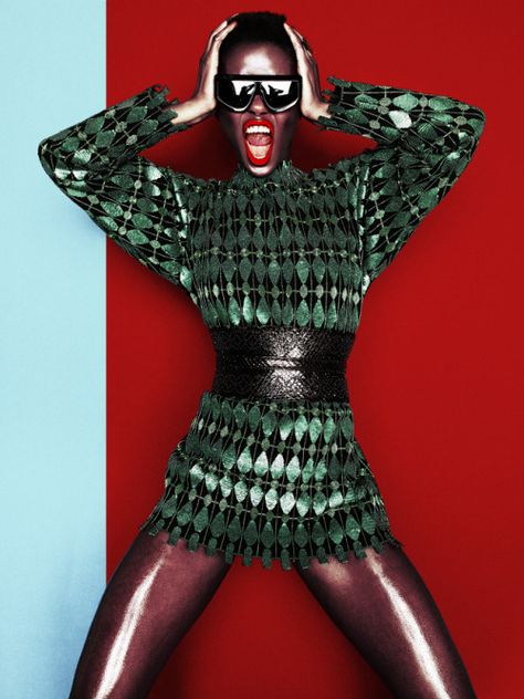
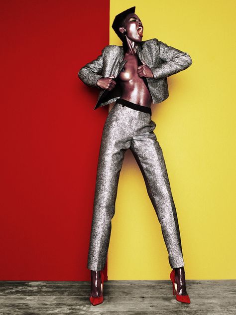
Reference images
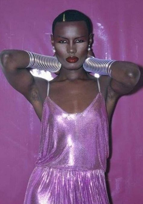
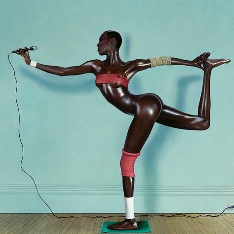
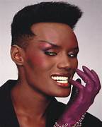
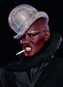
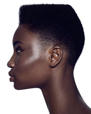
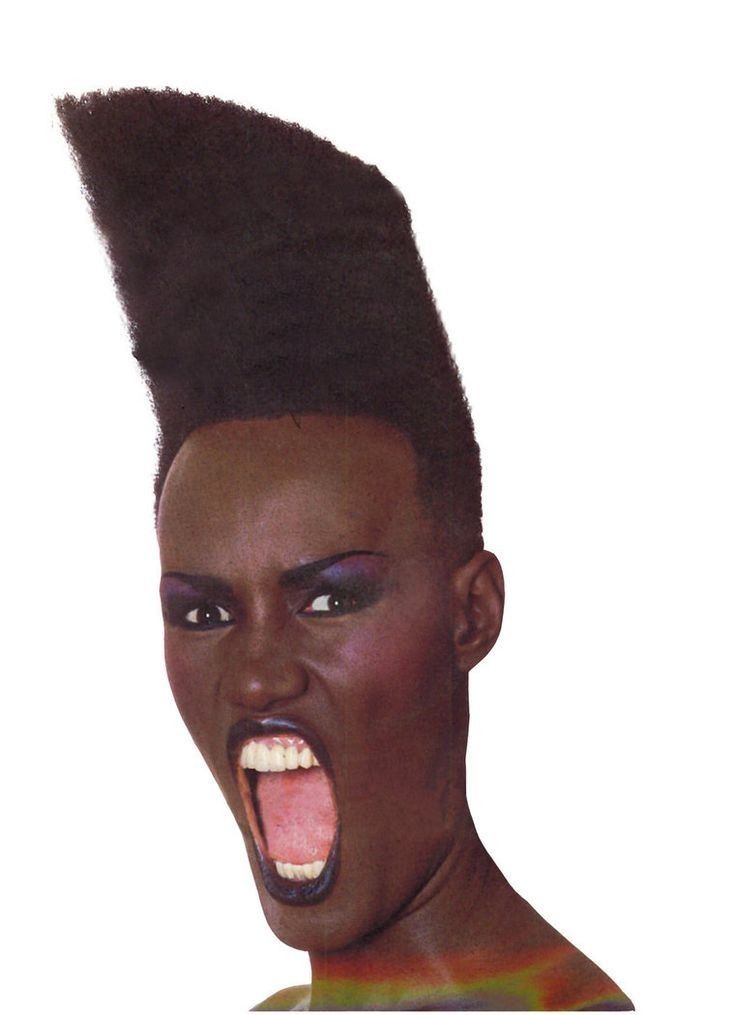
Due to Grace Jones being an androgynous model, she has many faces and many versions of her appearance. I wanted to choose a few of these looks to illustrate and hoping for these to inspire the style of the portrait.
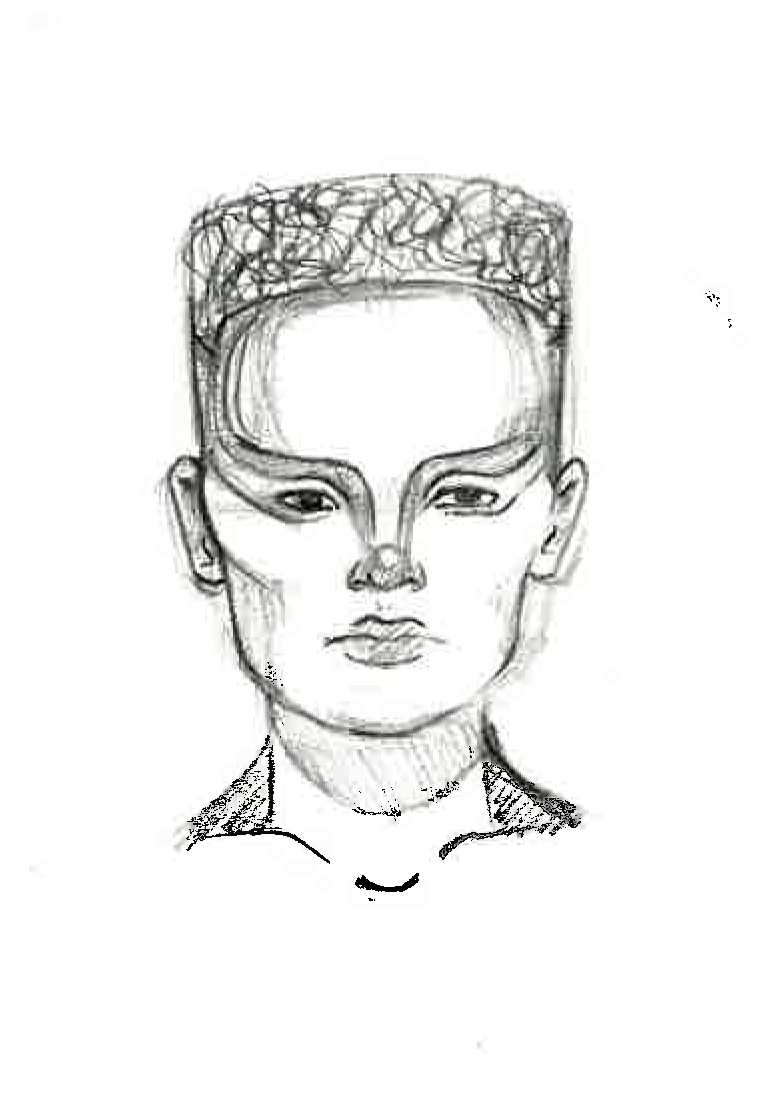
Sketches
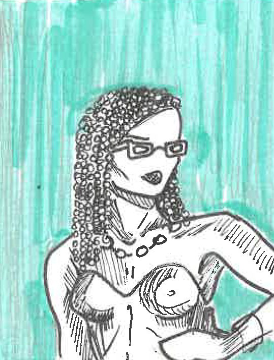
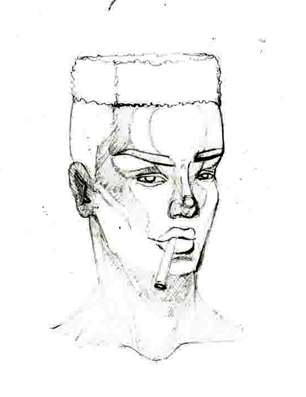
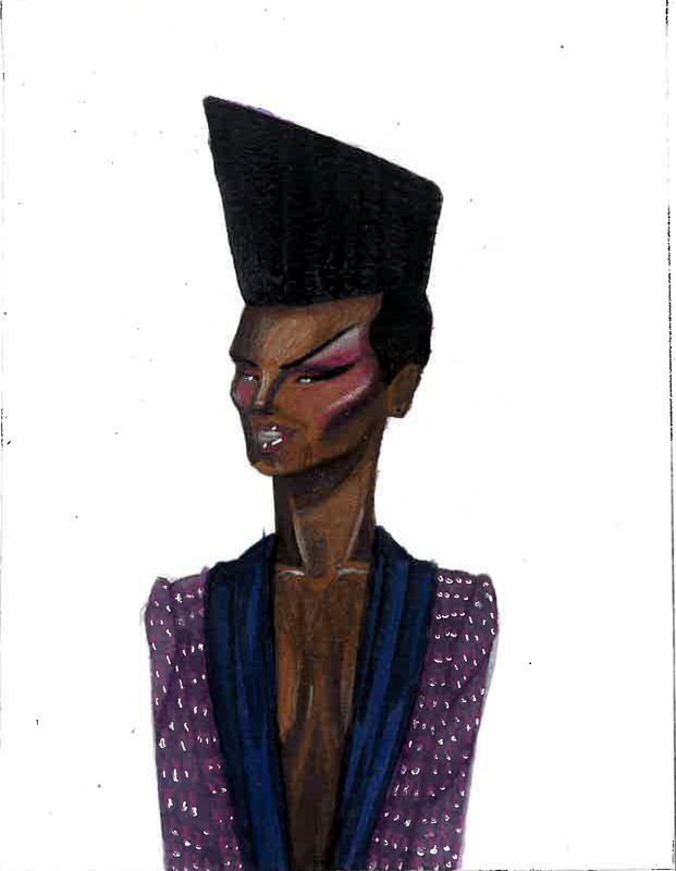
I created four quick pen sketches of Grace Jones, this helped me in week one so I wanted to do it again. I was able to get Graces key features, which are her angular face, scary look and her irregular hair style. It helped to pull these images apart to then put together as an illustration.
I was told to use reference photos of Grace Jones that accentuate her angular features, photos that pull on her chosen aura. I think she uses her scariness as an advantage, she is striking and uses that to be memorable. It was helpful to think about because I was lacking inspiration I found in week one.
Advanced thumbnails
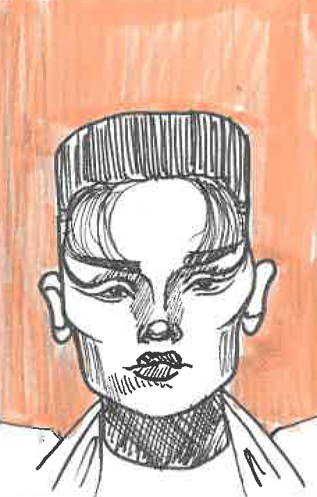
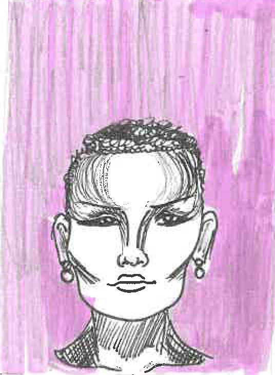
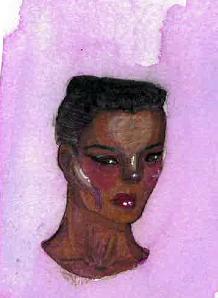
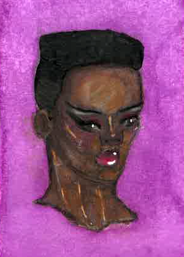
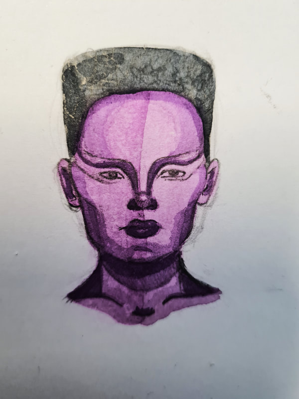
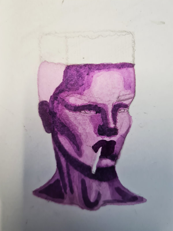
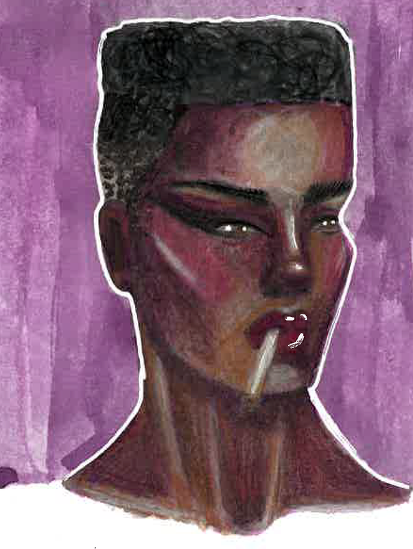
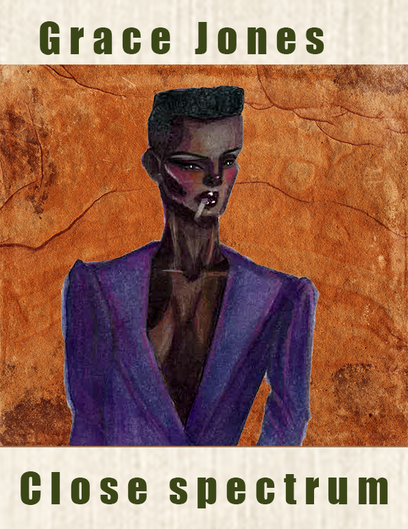
I used the same style I went for in week one, though of course this portrait was made complimentary not as a critique. This time I under painted the right side portrait in purple, and on the left I painted in purple on top to add shadows, In crit this the illustration on the left was more apparent as Grace Jones, with the angularity being obvious. I however thought that the purple underpainting turned out better in style.
Advancing illustration
I started sketching out some more angular illustrations of Grace Jones, trying to get that mix of scariness, seduction and unique personality right.
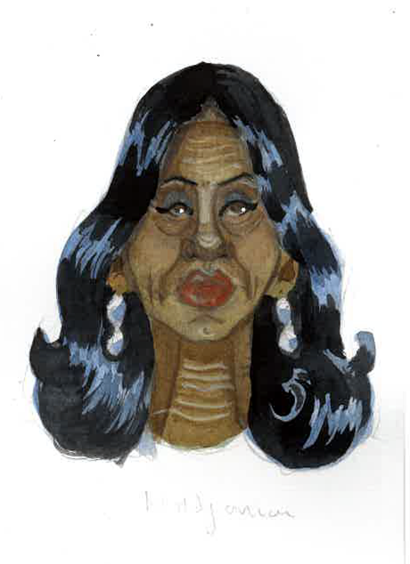
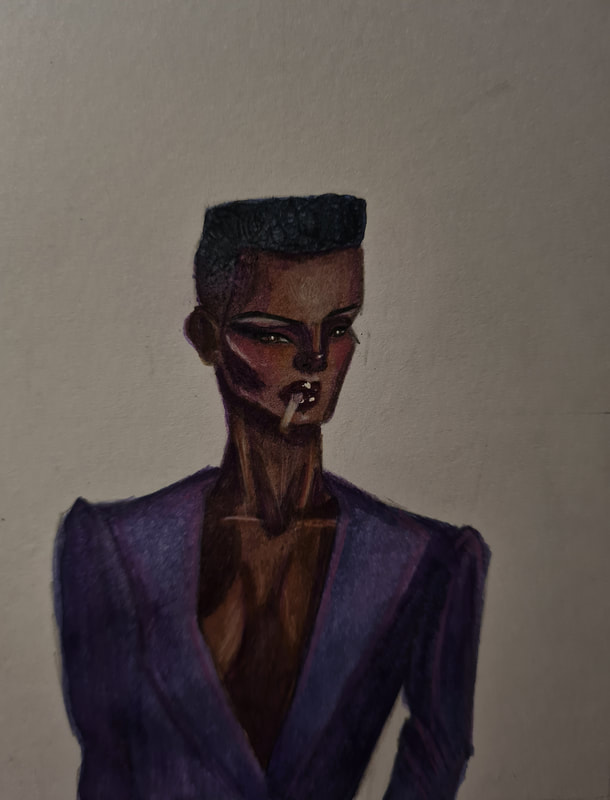
I under painted Grace in Purple, in the reference photos she has a dark cold skin tone, i thought a deep purple would help neutralise the warmth of brown.
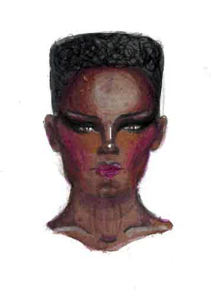
I used purple under painting to neutralise the orange warmth in the brown colour I used for Grace Jones' skin. With pink, purple and orange pencil crayons I gave more definition to the angularity of Graces face. I think to get a Grace jones accurate portrait its all in the eyes, she focuses in on something and its captivating.
Making the final
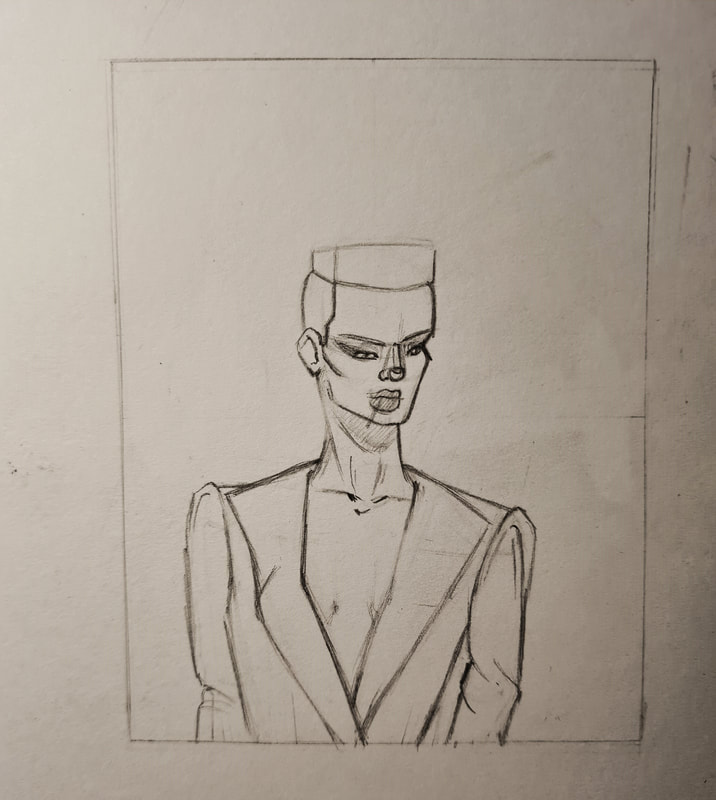
Like any painting I started off by sketch out my subject in graphite pencil, i used a 2B and a 4B pencil to sketch Grace Jones. I decided early on I wanted to play off of her angular features so i used sharper shapes. I then moved on to under painting in three transitional shades of purple to build up shadow and highlights. Then finished off by painting her skin brown. I again used pencil crayons in black, browns and purples to add texture and different colours to her portrait.
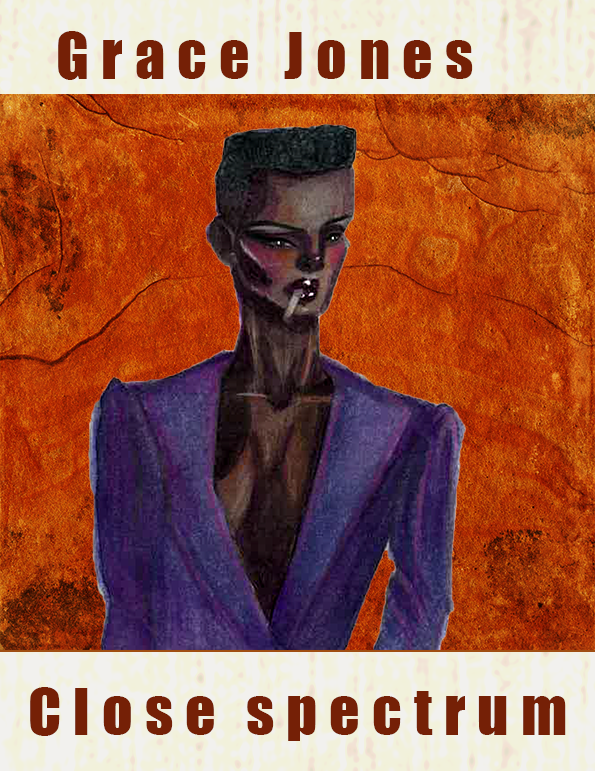
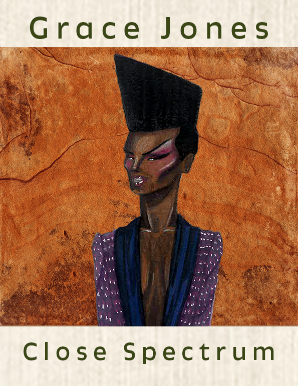
I used many texture overlays to help with getting the right look for this portrait, for week two I wanted to make the portrait look like a poster. This is to reference Grace Jones illustrious music career.
Poster mock-ups
Since I painted Grace in a purple suit and with purple and pink undertones I wanted to make the background of the poster a contrasting colour. Using a stone texture I thought gave a fierce yet pretty texture and s reminant of Grace Jones.
Making adjustments
I was told i didn't get the right emotion for this portrait which i can see now. I think this is good but I feel like it could be pushed to be a little more exaggerated to match the style of week one. It was kind of hard to do that exaggeration style for a complimentary portrait.
I had a look for illustrations of Grace Jones, to see what about her as a person stands out and how I could compare what I liked about them compared to mine. Something I noticed about each that I liked was the angular shapes that make up the face. It was also reasurring to see the colder undertones of her skin in certain photos.
I choose to push the angular features of Grace Jones' appearance, she uses it to scare people its part of her appeal. I also wanted to exaggerate some of these features, as the original felt too realistic (at least for my own preferences.)
|
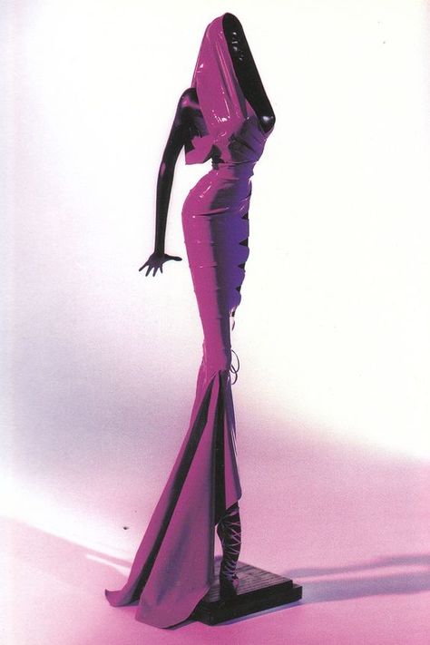
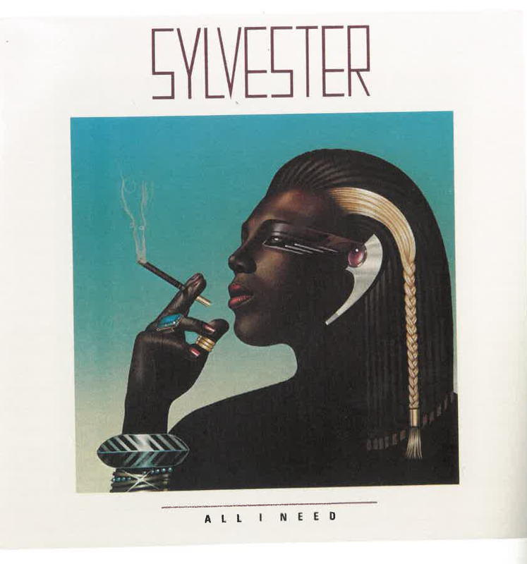
I also found this album cover from Sylvester, it was releases in 1982. The reason it caught my attention was the layout of the cover. I liked the clean angles of the piece. I also thought this retro design from when Grace Jones was creating was also very helpful. The lighting and arrangement of the piece I also really liked. However I think for mine Ill be focusing on Graces androgyny, scariness and sex appeal.
|
Final portrait
Final mockup
Week three: Liz Truss
Week three was a bit of a mix of political. social and cultural figures, I chose to illustrate an editorial portrait of Liz Truss former prime minister.
References
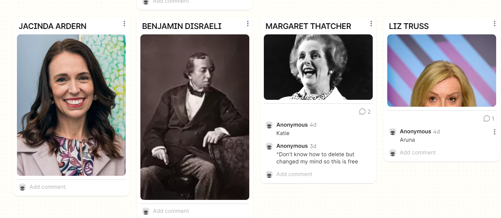
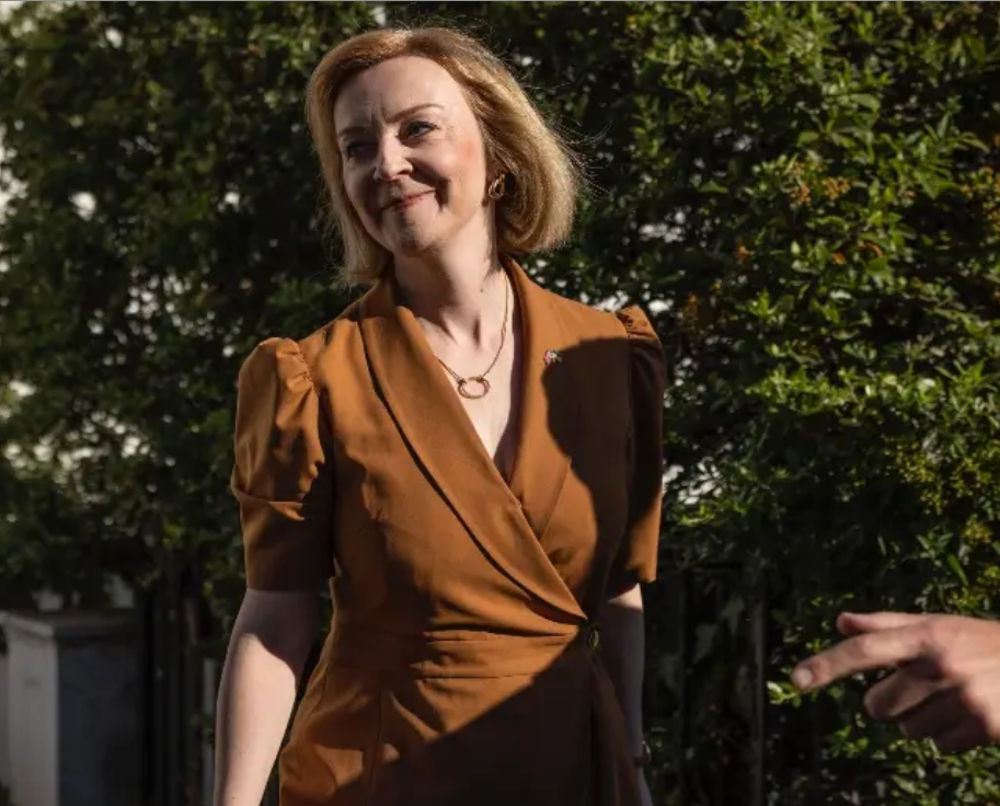
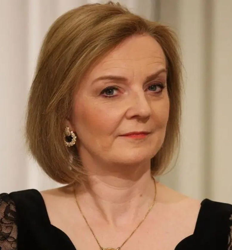
I found some references of Liz Truss, it was to sort of gauge where she sees herself as a person.
Thumbnails
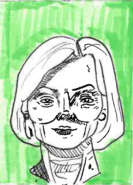
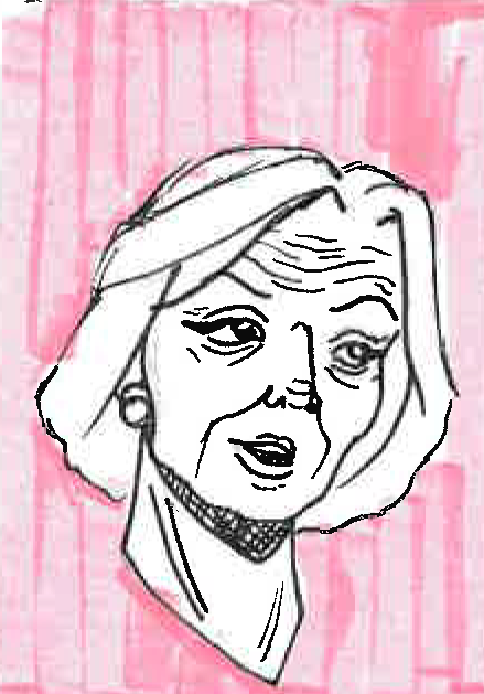
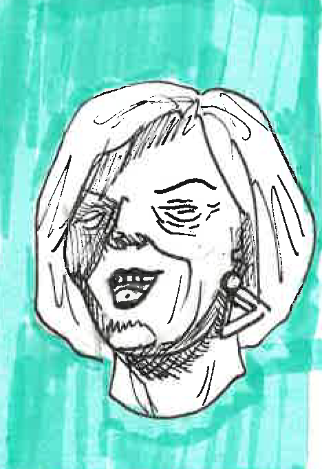
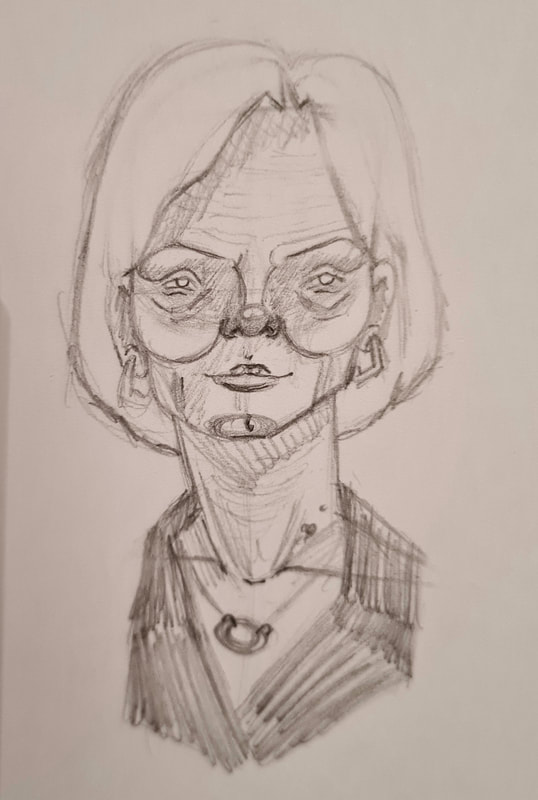
I quickly thumb nailed some illustrations of big Liz to get her key features. These were her pencil thin eyebrows, her bob, red lipstick and wide smile. Doing these illustrations really help me focus on these recognizable qualities of each celebrity,
After talking to tutors I decided on a vibe to go with, to me it is very obvious that Liz Truss is someone who is concerned about her appearance. Her physical appearance is considered well, she looks prim and proper - well in a conservative way I guess. something else Liz Truss has done in her time is constantly trying to reach to different social minority groups, i.e black and brown people, the homeless and LGBTQ+ people
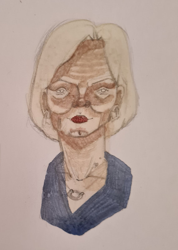
Using my initial thumbnails i then moved on to some more proper visuals, using a 2B and 4B pencils I created these portraits. I noted her eyes are rounder and wider set, she has a short blonde bob and she has thin lips with a wide smile. Shes also usually in blue or red with natural shades of make up with red lipstick.
Testing portraits
3/4 to the left
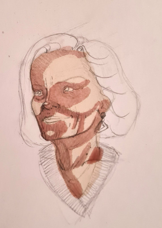
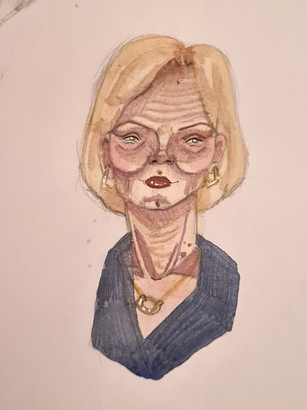
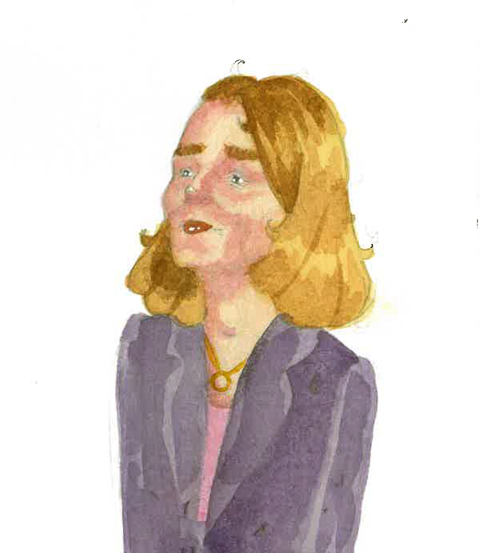
For the first portrait test I painted I went with Liz faces 3/4 to the left, I started off by painting in a flesh tone , yellow for the hair and a red tone for her suit collar. To add shadows I used a mixture of pink and purple. I've been liking how these non human colours give the skin a realistic look.
looking at you
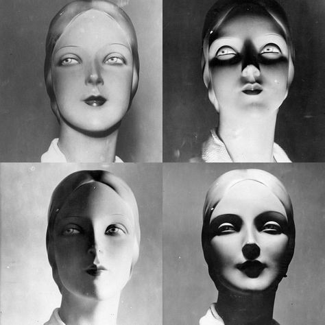
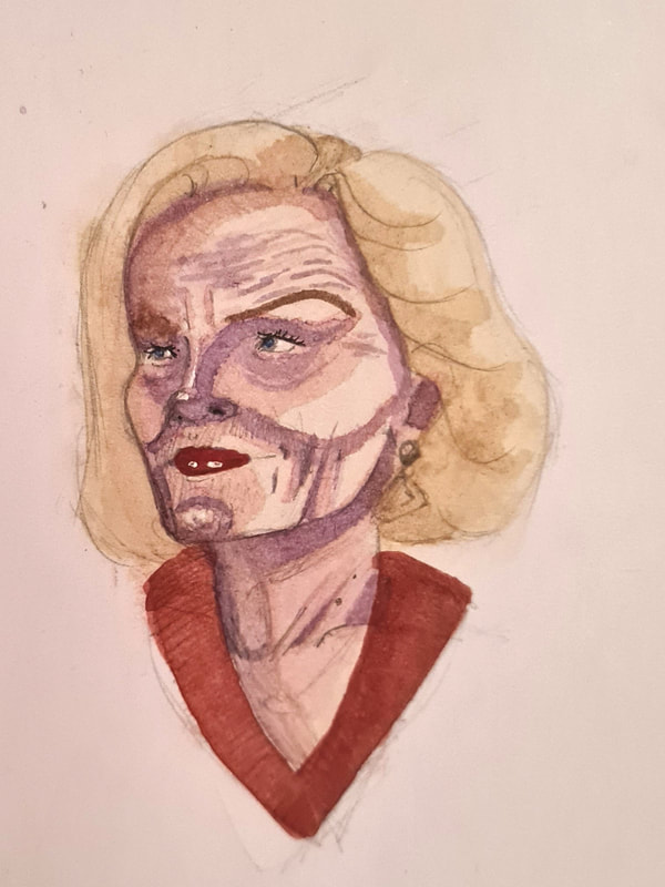
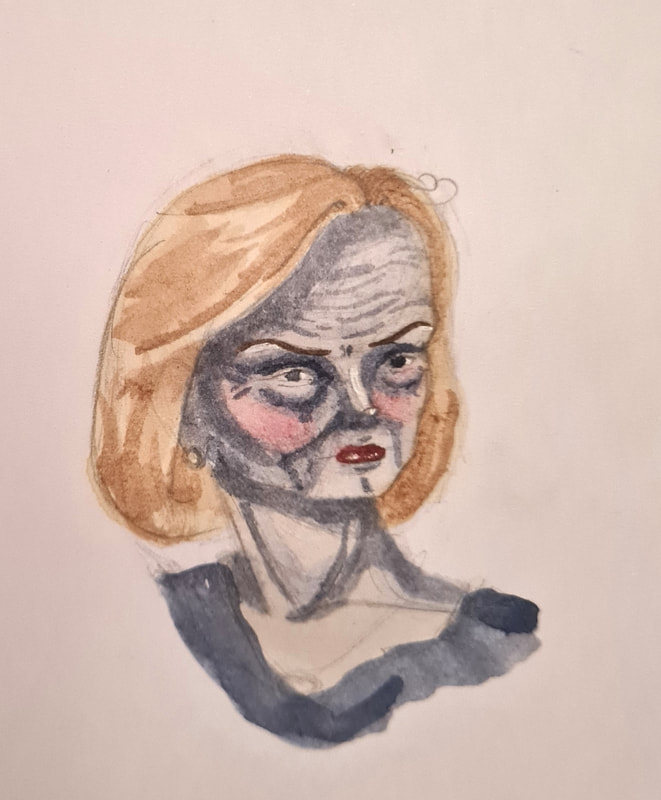
For the second portrait test I wanted to go with more of a fantasy idea. Showing Liz truss looking more like a zombie rather than a human. this would be to reference her short career as rime minister. I started off with washes of blue to build up depth.
Full face portrait
For my third portrait I went more with a serious look for Liz, I tried to replicate her wide smile that she has when she thinks shes done something. I started with washes of pale flesh tones, blue for her collar and pale yellow for her bob. I again used purple and pink to add shadows to her face, however on this test I used a darked skintone shade under the pink and purple.
portrait idea
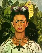
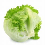
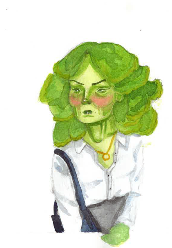
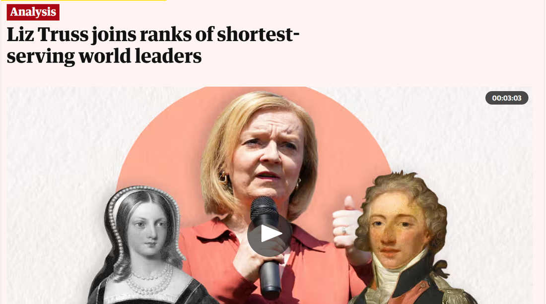
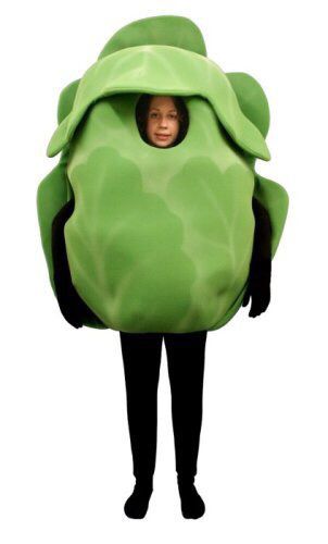
Something I think about when I think about Liz Truss is her short run as Prime minister in September 2022. At the time there was doubt on her validity as a prime minister and if she was just a scapegoat. A news outlet mockingly ran a story on if a lettuce would outlive her as prime minister, it did. This then made me think of Frida Kahlo's "self portrait with thorn necklace and hummingbird". Behind her figure we see leaves. Green leaves tend to symbolize a renewal or life so to have them behind a portrait a bout death is to contradict and fight it. I thought itd be funny and a nod to real life events to take this idea but instead have lettuce leaves surround Liz.
Portrait idea 2
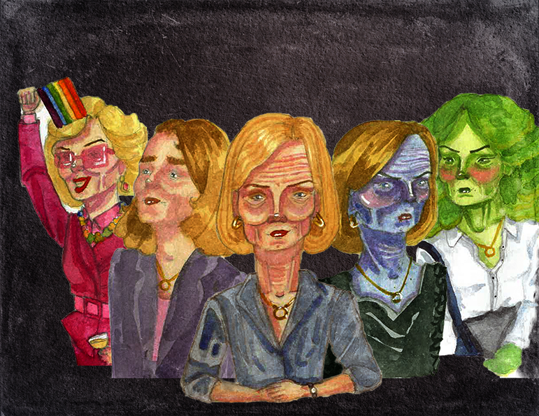
My second idea was to have a 360 degree line up of Liz Truss heads, the idea to represent the different versions of her that she put forward to different social groups during the election period.
https://www.manchestereveningnews.co.uk/news/greater-manchester-news/top-tory-liz-truss-filmed-21774565
Trials
I painted some portraits for this concept, I would probably arrange it in this order. I liked this concept to show off how Liz Truss' public appearance changes. In this concept are:
- Liz at a gay club in Manchester
- Younger Liz as Lib Dem candidate
- Liz as a Prime Minister
- Liz Truss' failed run as PM
- Lettuce Liz, she was outlived by the lettuce.
I based each mini portrait off of these reference images of Liz Truss, I thought they perfectly showed how they looked in my head.
Mock-up
I made a digital mock-up on Photoshop of what I was wanting the image to look like, this really helped getting the idea for the final illustration out of my head.
Sub-choosing
After some deliberation and time off the project I can back and was unhappy with this idea. I liked each illustration separately, but together it felt too chaotic. I spoke to some friends and family about this and decided to choose one idea that focused more on Liz Truss' public opinion. I think this shift helped conceptualize each week together.
When I was thinking about what I could make for my Liz Truss portrait I thought about public perceptions about her. I found it easier to go back to what I did in week 1 and make it about her career. It was then that I remembered Liz is one of the shortest running Prime ministers in UK history, only lasting 45 days. This Ladies, Gentleman and my others provoked an idea.
- A portrait showing how short her prime minister role lasted.
Visual research- Road safety adverts
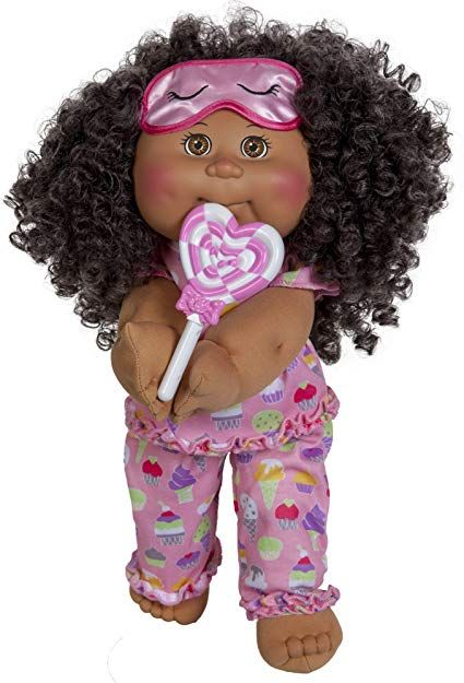
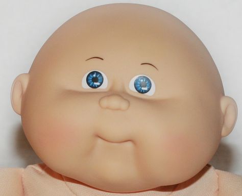
Visual research Cabbage patch dolls
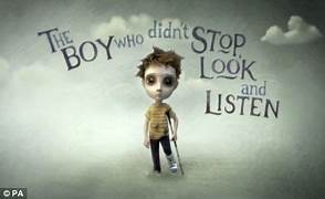
I thought a mix of these two concepts worked well, the spooky aesthetic of the road safety adverts made me think about painting a "political safety advert" maybe Liz avoiding lettuces or something. It then made me think about Cabbage patch dolls, something about them is so ugly, it felt right.
Final 1
|
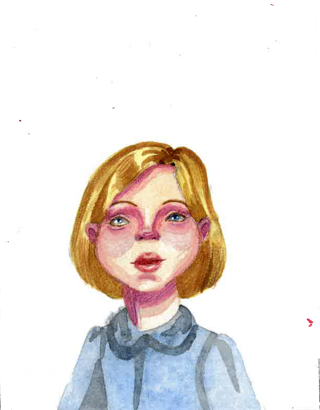
I painted the concept of Liz Truss in the illustration style inspired by cabbage patch dolls. I thought the end result was decent, I thought that mocking her short run as prime minister made sense. However It ended up looking too cutesy.
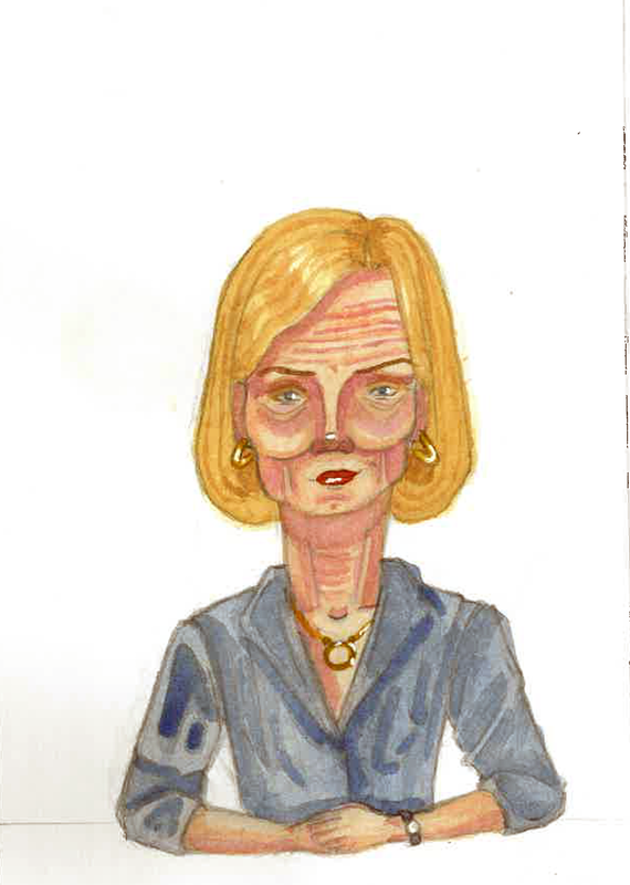
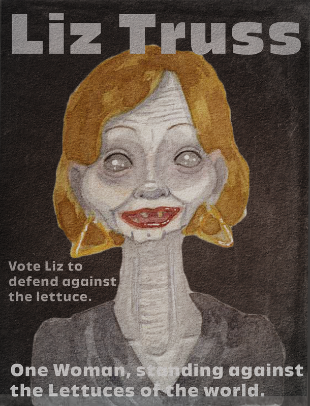
I was running out of ideas at this point, so I went back to my older weeks and thought about how I did those. I then selected a more critical style for Liz and it turned out way better. |
Finalised portrait
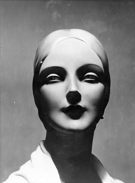
Some reference photos I collected to Illustrate a more dead and gaunt look.
Final Mockup
FINAL 3
What I have learnt
To name a few things I have learnt from this project:
- when illustrating someone look for iconic features that translate as that person
- using underpainting and washes can help create mood.
- I hate Liz Truss more
Site powered by Weebly. Managed by 34SP.com
