Project two: Science
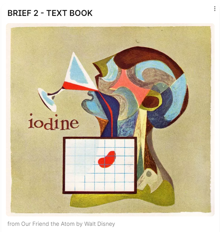
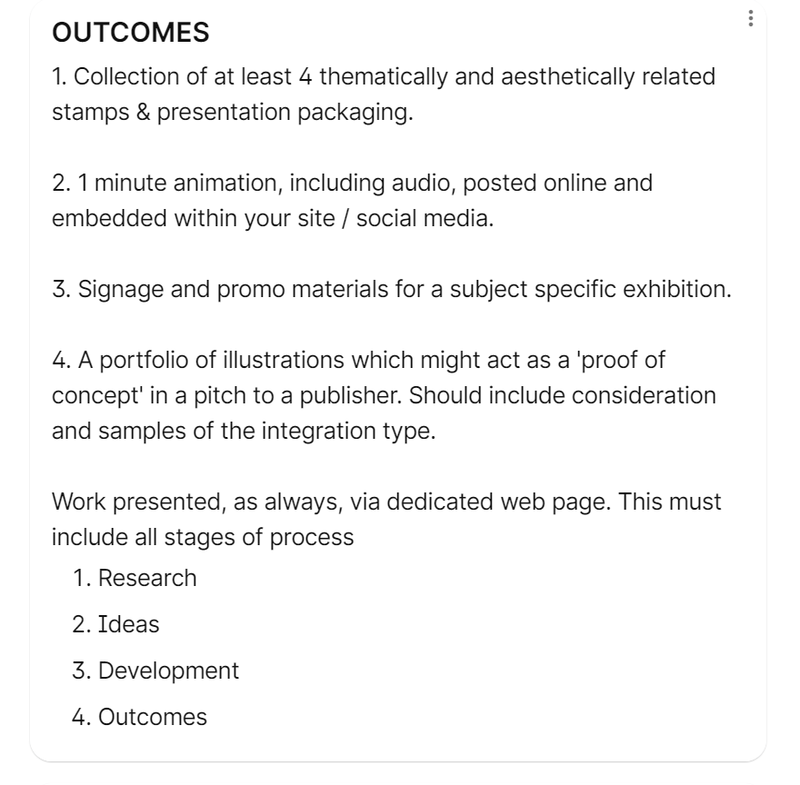
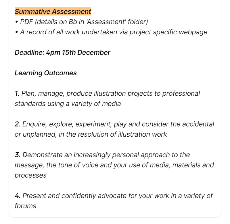
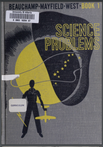
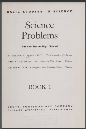
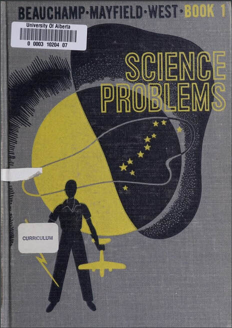
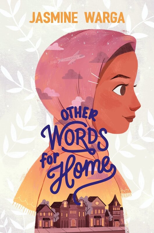
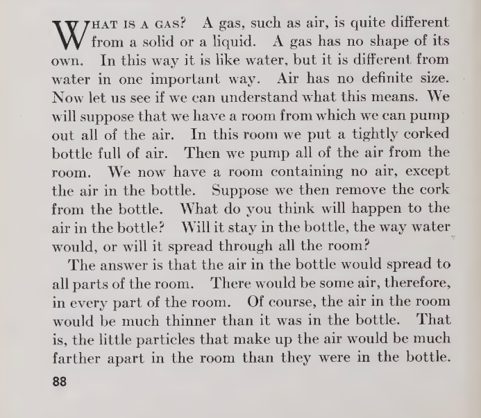
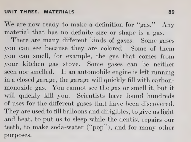
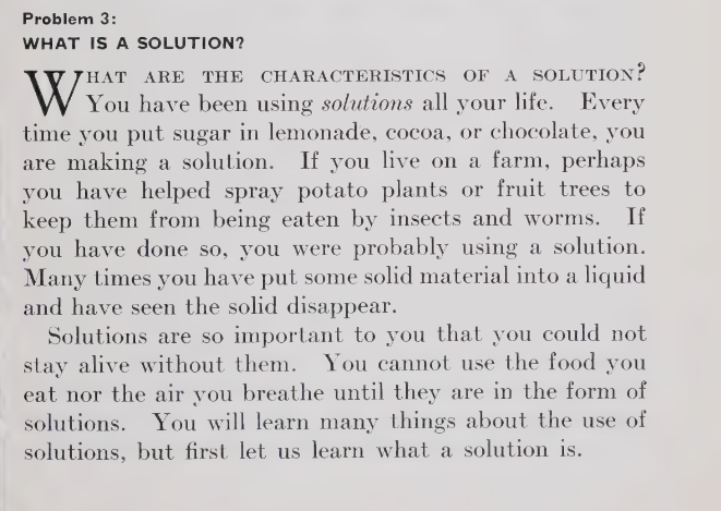
For this second project I chose to produce another book, this time however it is a scientific textbook this time. The specific textbook I was given was based on questions facing scientists.
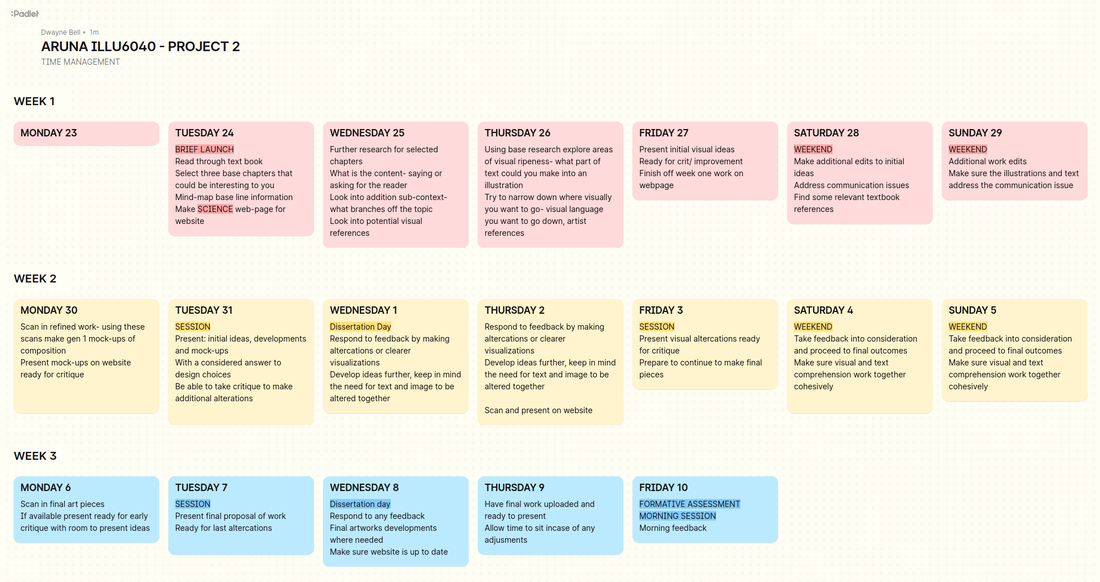
To help with time management it was suggested as to make a weekly planner for each week of the project. I have done this before and find it helps keep me productive but also is fun to tick things off the list to do each day.
Textbook: Science problems
I wasn't sure what direction to go in for this textbook, science is such a broad subject divided by Biology, Chemistry and Physics. Each having their own visual style, After reading through the chapters of the book I decided to focus on the states of matter, a chemistry chapter. The states of matter being solids, liquids and gas. This helped form some ideas in my head.
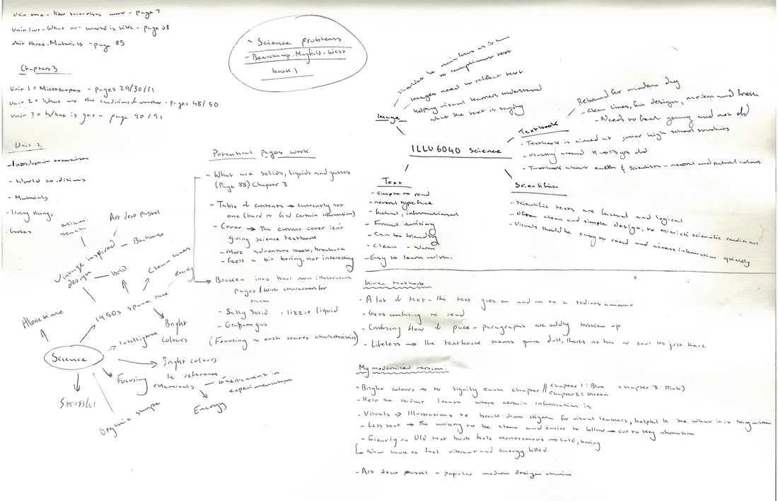
I mind mapped my thought process out, which I found helpful because I initially struggled with finding what I was going to produce for this project.
Visual research
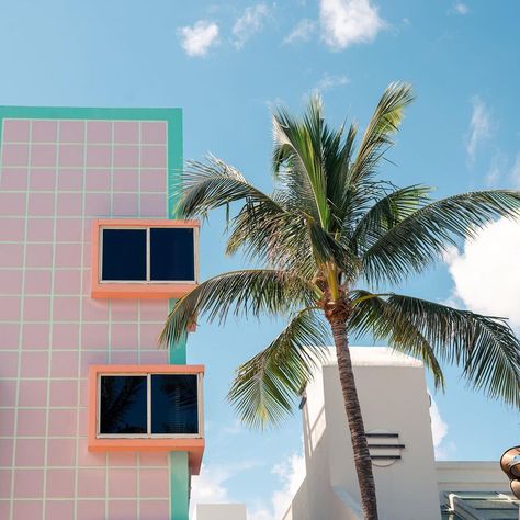
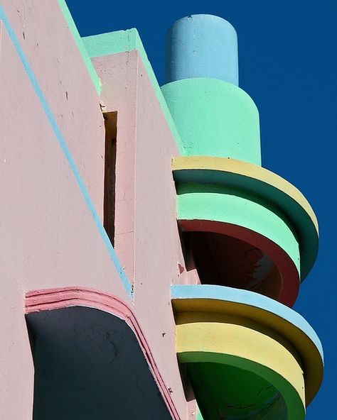
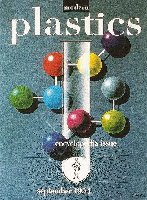
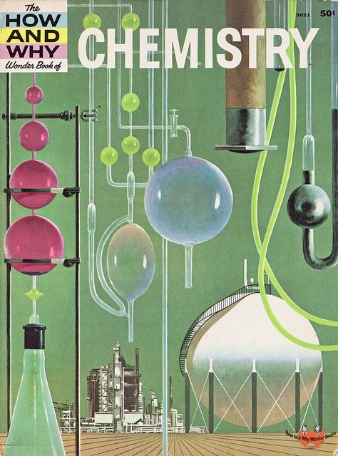
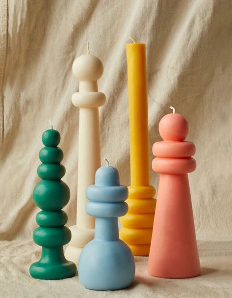
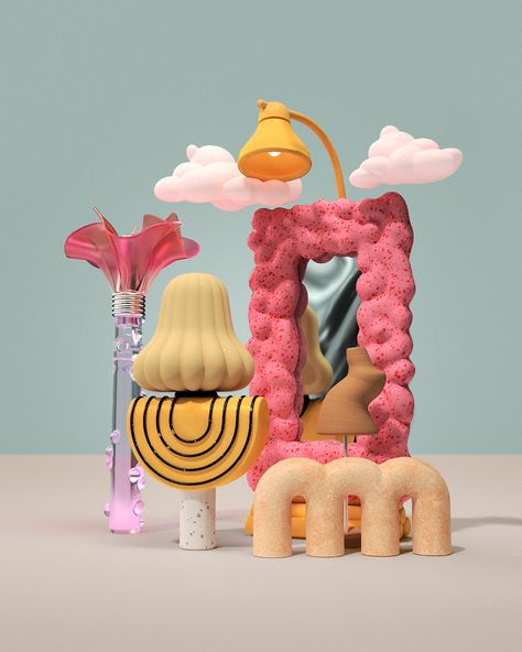
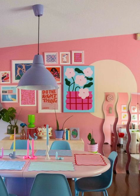
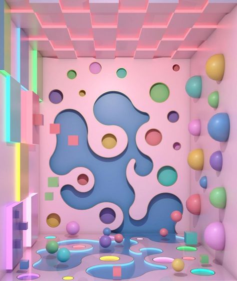
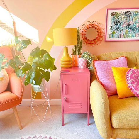
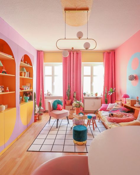
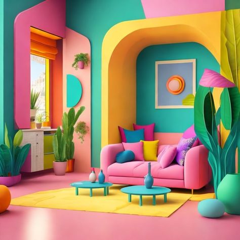
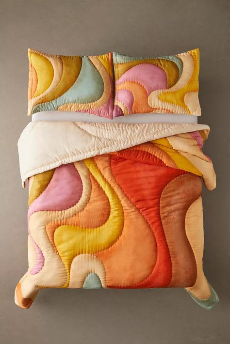
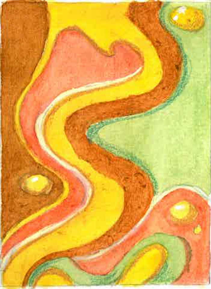
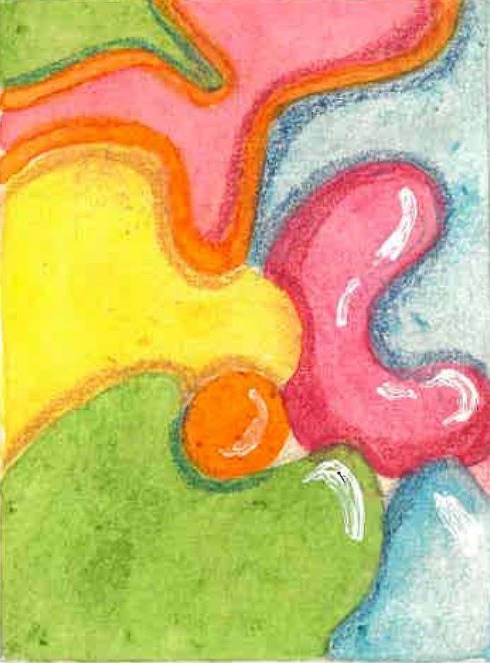
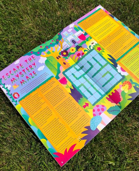
When I think about science i think of organic shapes, bright colours and excitement. The book felt the opposite little visuals, dull and boring. I wanted to make a science textbook that would be interesting to me if I was back in secondary learning these subjects again. For visuals I thought of Miami beach, pastel art deco and 1960s space race illustrations. These are mostly formed by interior design trends I see but i thought the shapes and colours could be transferred to a book design easily.
Bookcover
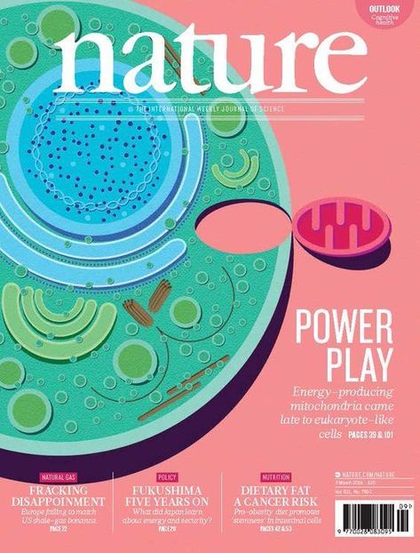
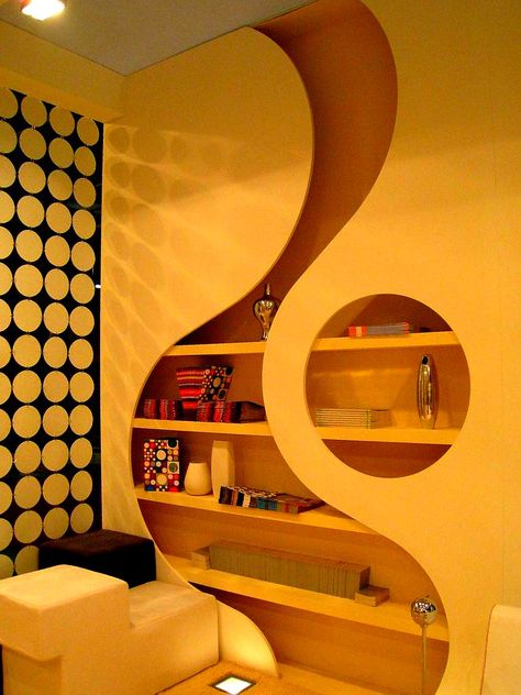
On the same branch of thinking I looked at interior and architecture that referenced organic structures, forms and shapes. I found trends that followed Scandinavian retro, psychedelic style, Miami beach and pastel art deco the most helpful for this. I always think that bright organic shapes represent science, from germ cells, cells, blood cells, specific science equipments.
Solids, liquids and gasses
When I found the states of matter in the textbook I had strong visual ideas for how I could illustrate the interior pages. I had the idea to make three characters based on the matters of states, this would be fun way to incorporate illustration to academia, it would also help visual learner audiences learn about the states. Its important to me to produce pieces that would be accessible to a wider range of people. The idea of each character showing off elements of each state. I.e solid being a more blocky shape and gas being more loose and transparent.
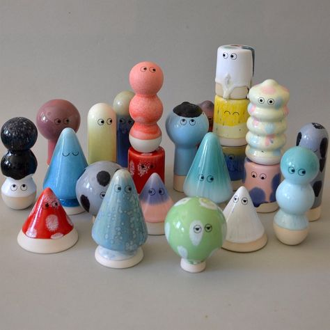
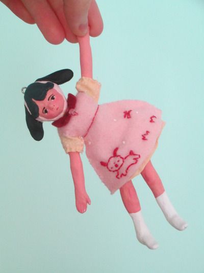
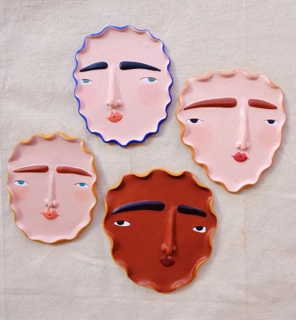
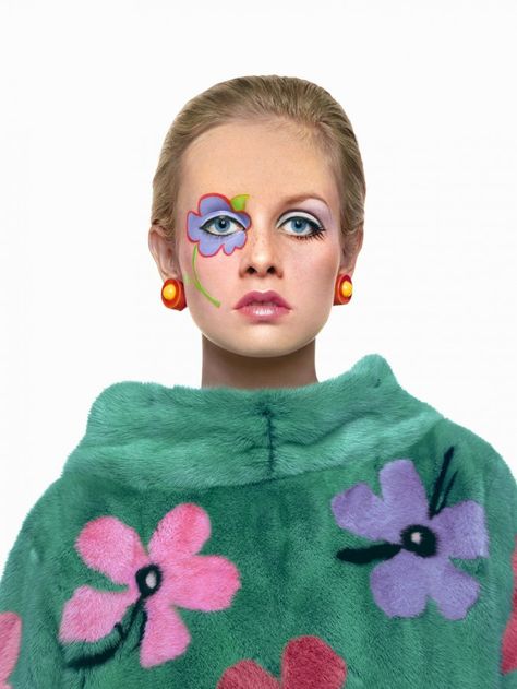
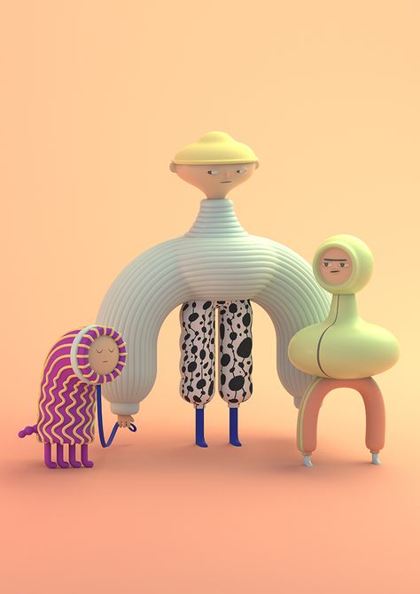
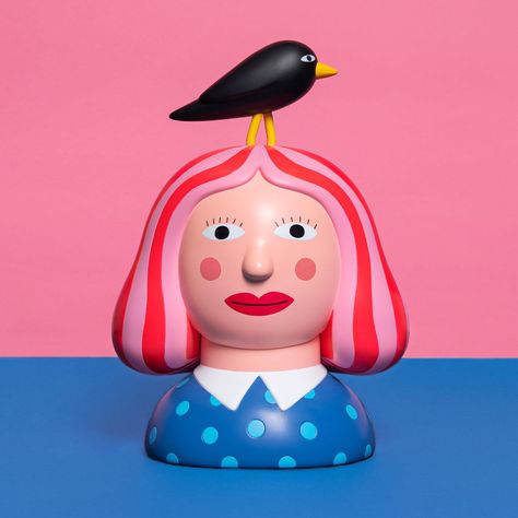
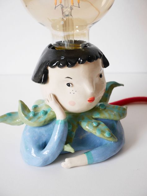
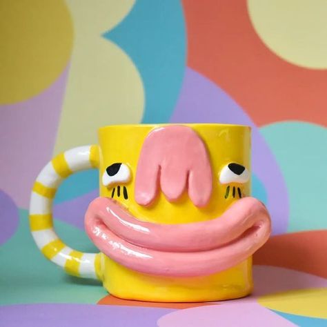
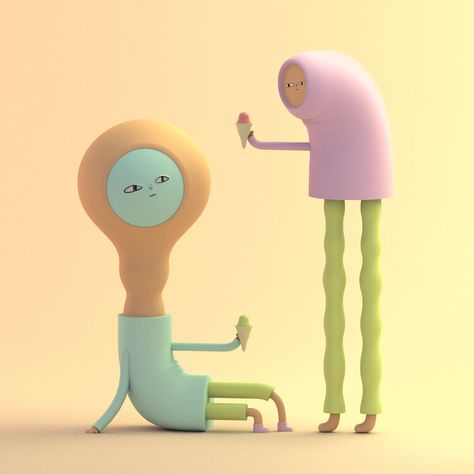
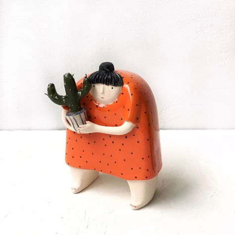
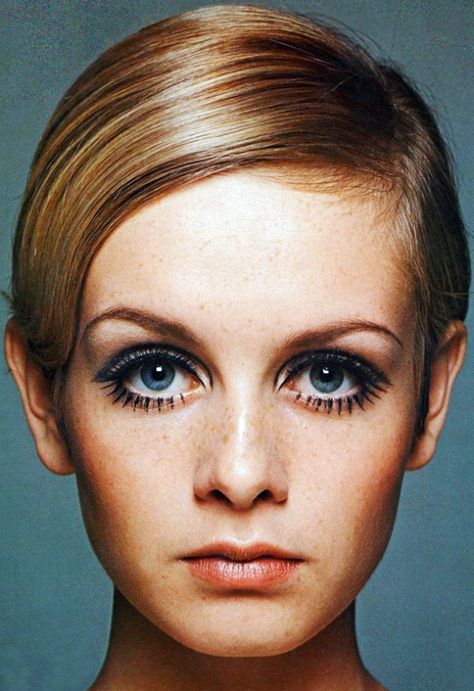
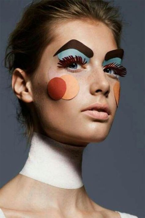
A mix between 1960s mod makeup, paper mache face masks and organic ceramic makings matched what was going on in my head for my characters. Im currently going through a style shift, i want to include more odd things to my illustrations which are inspired by these things.
Thumbnails
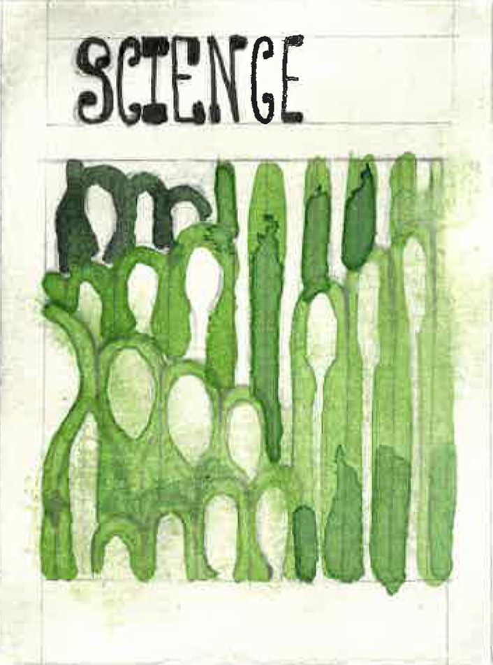
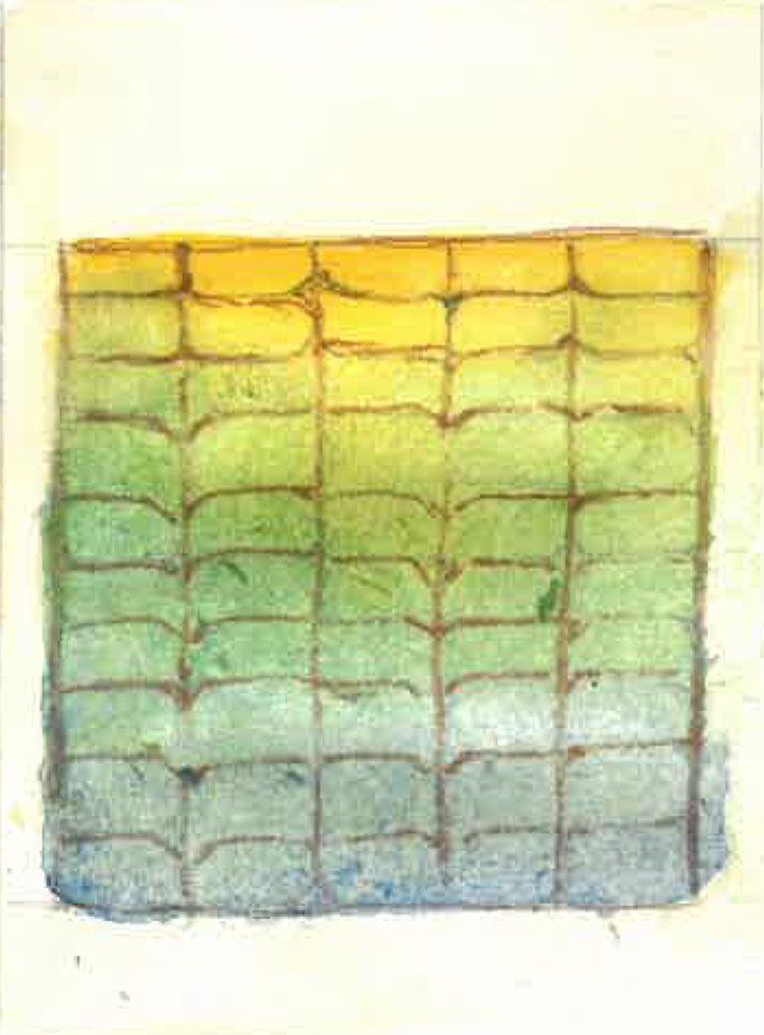
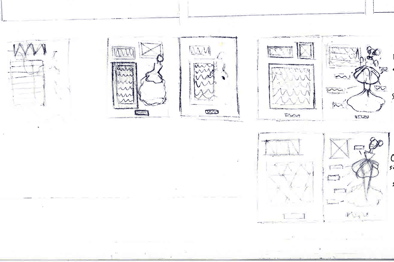
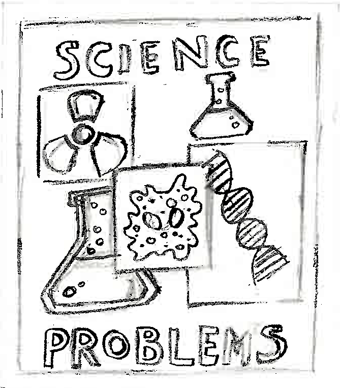
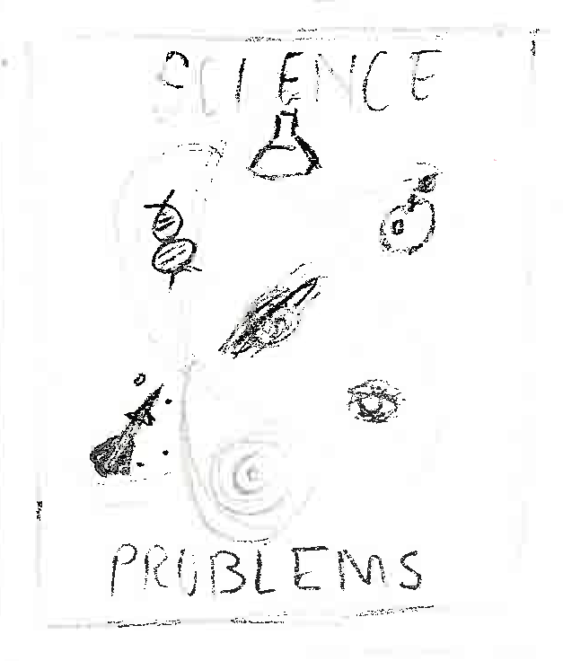
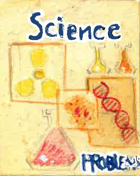
These were a few of my ideas for a book cover, The main ideas being inspired by the organic interior design trends. I tried to keep in mind that these ideas were for a modern science textbook so altered my sketches to fit this. The idea would be to use a complimentary colour for a bold text over negative space done digitally. The physical piece was be done with watercolour and gouache and put together in a decoupage way of layering. From asking for group feedback I found most people preferred the blue behind the pink, the checkerboard or the free form lines. This helped with developing what looked good to a wider audience.
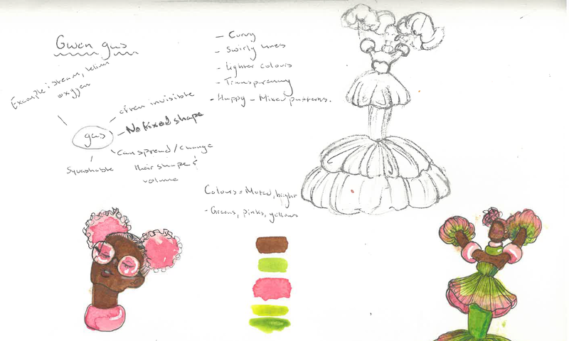
I quickly mind mapped some idea for these characters, including colours and shapes. I wanted to use shape theory to convey the key elements of the states of matter.
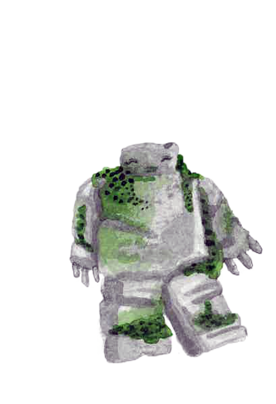
Saskia Solid
|
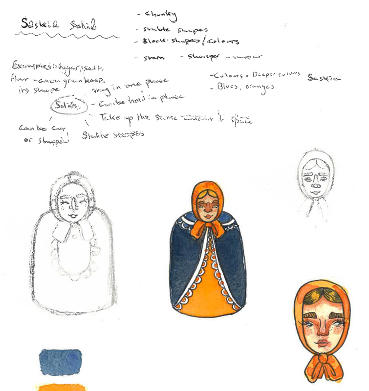
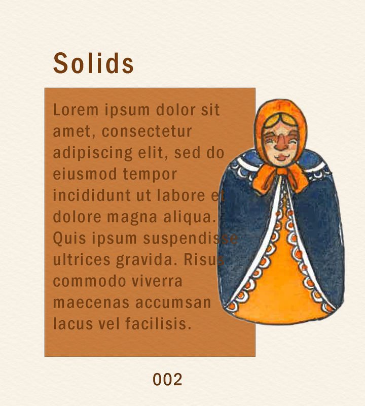
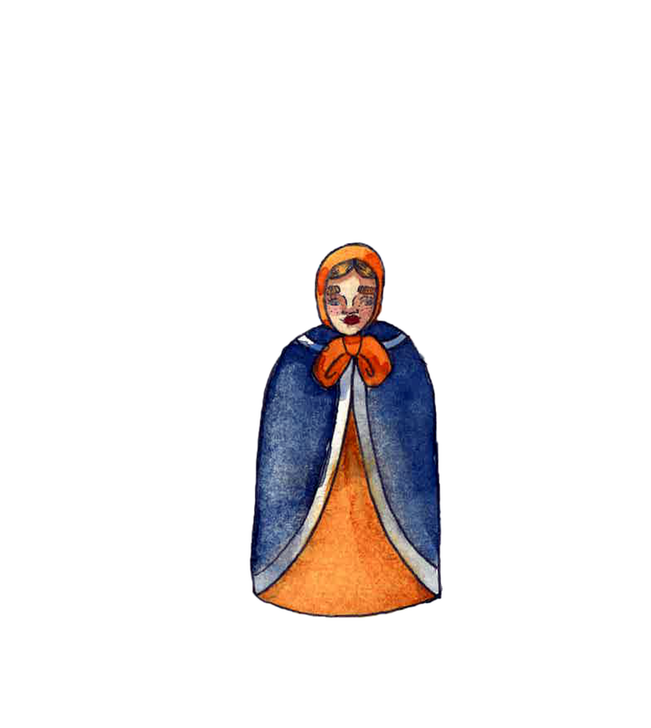
When I think about solids, I think about heavy objects, bold deep colours and shorter more stable shapes. By definition solids stay in one shape, they don't free form like gasses or liquids. Solids also take up the same amount of space. To me that reads as a short stature, heavier close shapes with thicker lines.
I thought of Matryoshka dolls, or Russian nesting dolls. They have a stronger structure, and usually are quite a bulky form. I associated rich complimentary colours with a "solid" character. I liked the blocked colours with little pattern or intricacy. To me that represents a solid character. Bold, rich colours and strong forms. |
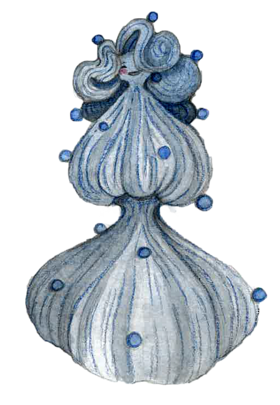
Leela Liquid
|
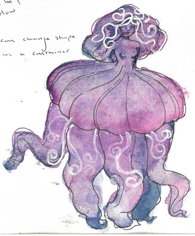
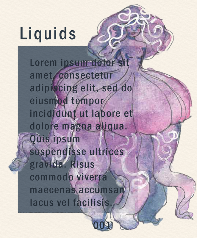
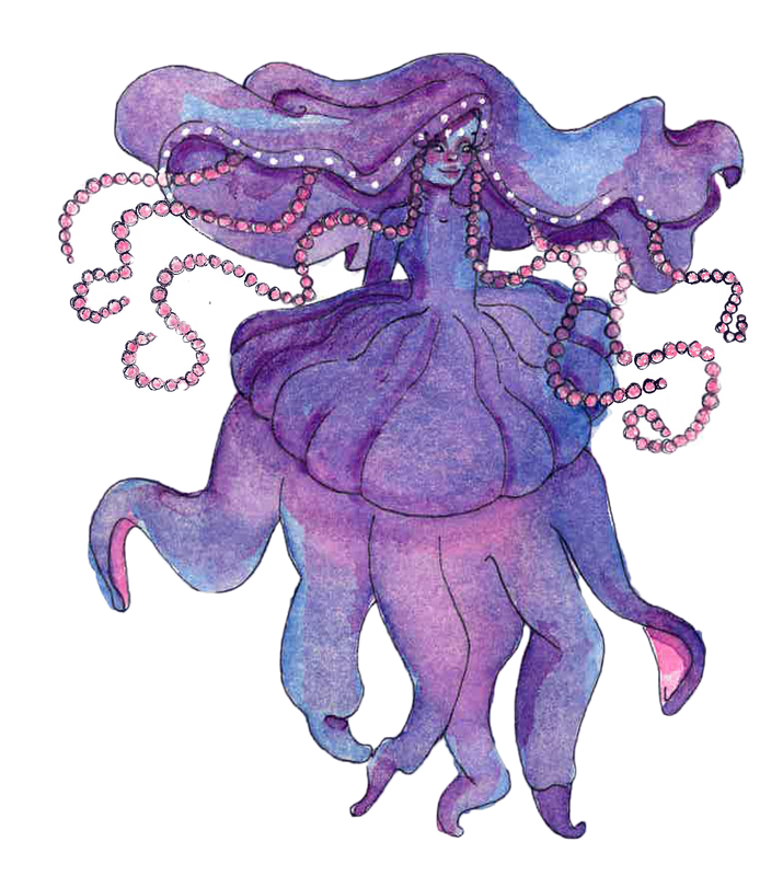
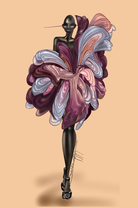
For liquid I think of overlapping shapes and freedom in form. By definition Liquids can change shape depending on the container they're in. They keep their own volume no matter where they are.
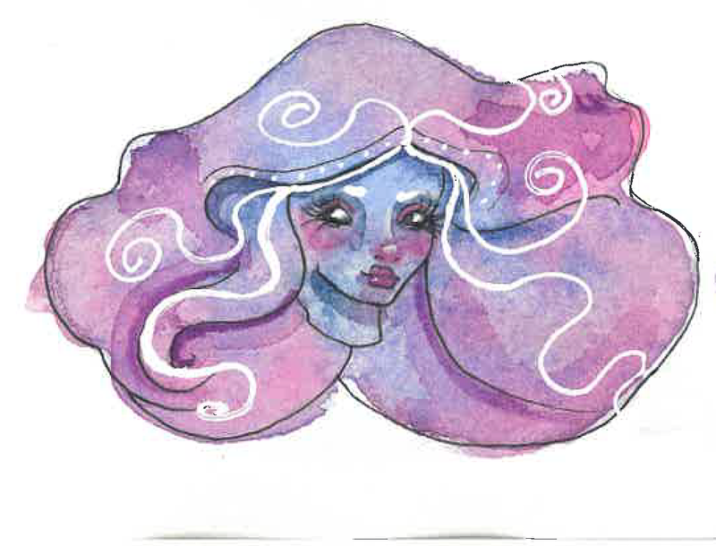
Liquids were a bit hard to illustrate, the most common liquid we encounter is water. However it can be a light and purified state, while also being a heavy or scary thing. I referenced jellyfish in this concept, to me they've always been too liquid like for a physical creature, they're beautiful but terrifying. I associate deeper blues and purples referencing the beauty and mystery of liquids. The contrast of shapes of the spiraling white lines in her design, compared to the heavier shapes of the tentacles and cap on the head. |
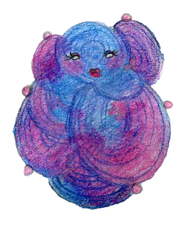
Gwen Gas
|
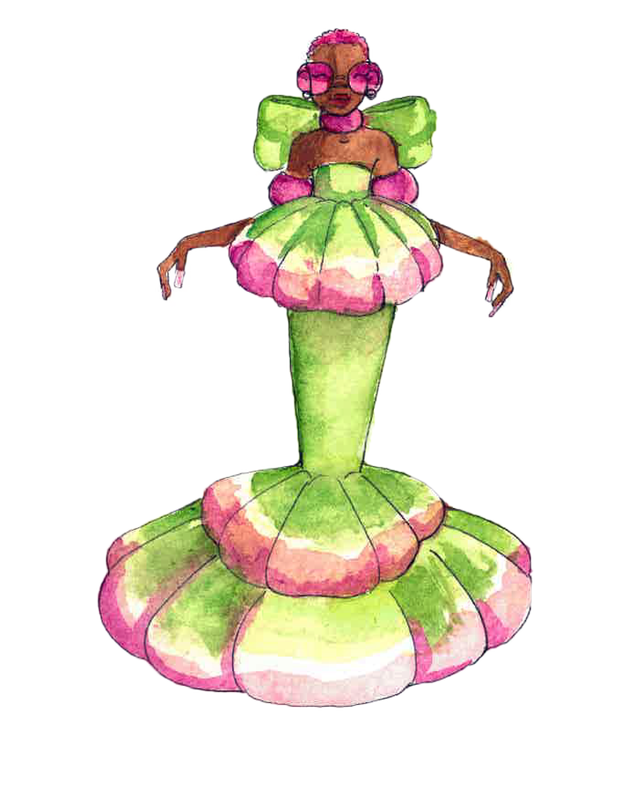
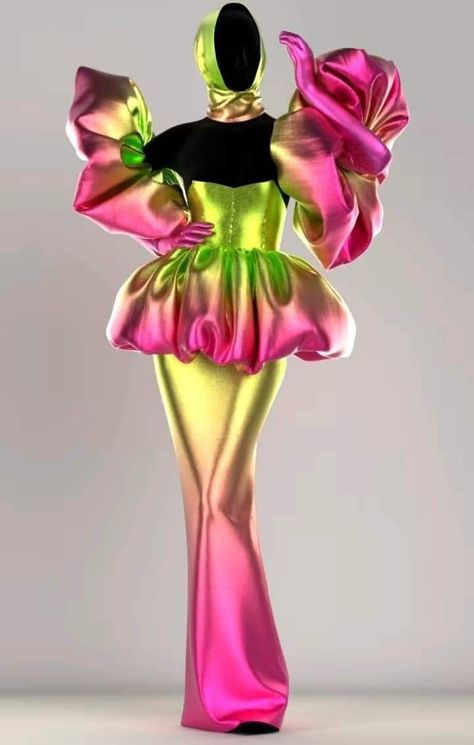
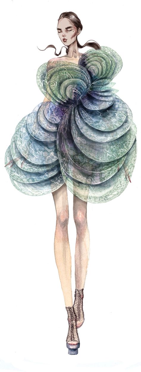
When I think about gas, I think of free forming shapes. Forms that go from smaller to larger shapes. I think of more rounded shapes that sort of billow. In the actual piece I'd make her to be more transparent and have her colours flowing freely out.
I thought of organic nature inspired fashion design. A lot of elegant lighter fabrics draping and forming over each other. |
Gouache Trials
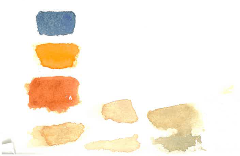
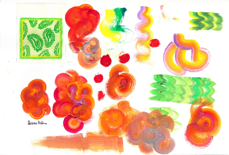
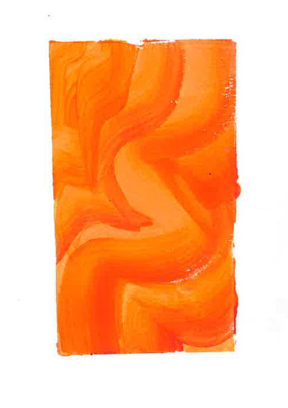
I got a gouache set sent to me and i thought it might be a good material to use for the cover and for solid. Due to Gouache being a more opaque texture.
Interior page ideas
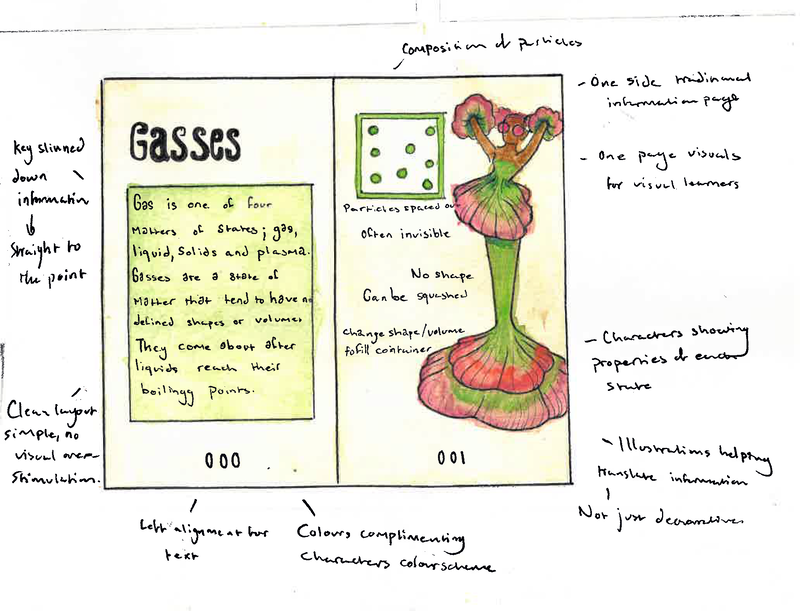
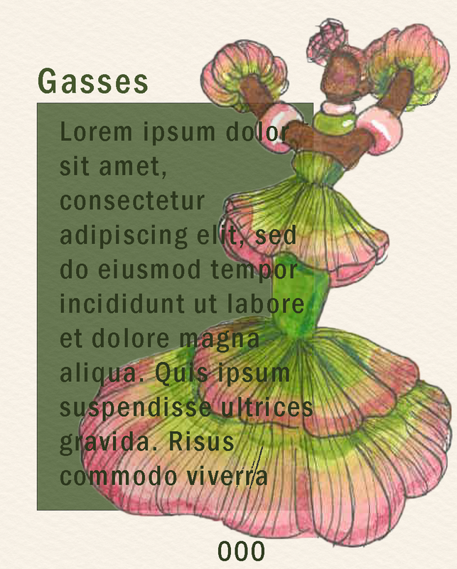
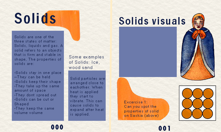
For my page layout, I wanted it to be laid out simply and in a composition that was easy to read, I found that the original book had too much text sand was laid out weirdly and was hard to read. With a recommendation to turn down Gas and Liquids opacity digitally to simulate how these state occur in real life. After making these mock ups I think they're a bit cramped so I'm going to make double spreads for each of the states, one side being more text and the other being visuals.
Artist influence: Henri Matisse
|
|
|
|
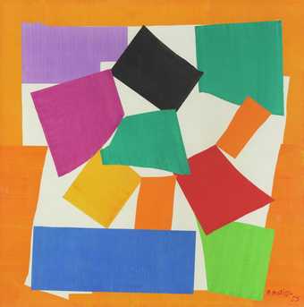
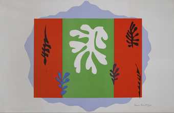
I wanted to look at Henri Matisse as an influence for how the book cover could look, some of my favourite pieces by the artist are his cut-outs. I find it inspiring that he adapted his practice to continue while experiencing disabilities. I also find it intriguing that he only used watered down gouache paints and a pair of scissors to cut out the painted paper.
To clarify I will be making my own collage cover, however influenced by Matisse' practice not remaking any of his pieces.
To clarify I will be making my own collage cover, however influenced by Matisse' practice not remaking any of his pieces.
Artist influence: Tim Burton
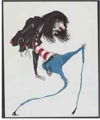
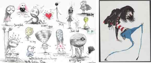
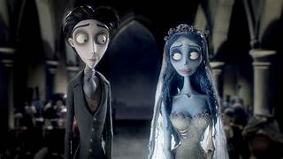
While I don't agree with his opinions of poc characters I've found the way Tim Burton uses colour fascinating. He uses blue, pink, purple or a watered down red to add highlights and shading to his characters. It gives them a non realistic Gothic look that I've always found beautiful. So i think referencing this in my character designs will be helpful, to make them feel more alive. Ironic because Tim Burtons work often revolved around death.
Making of finals- Cover
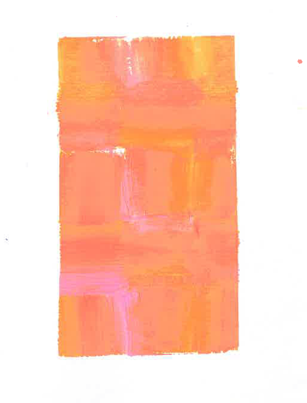
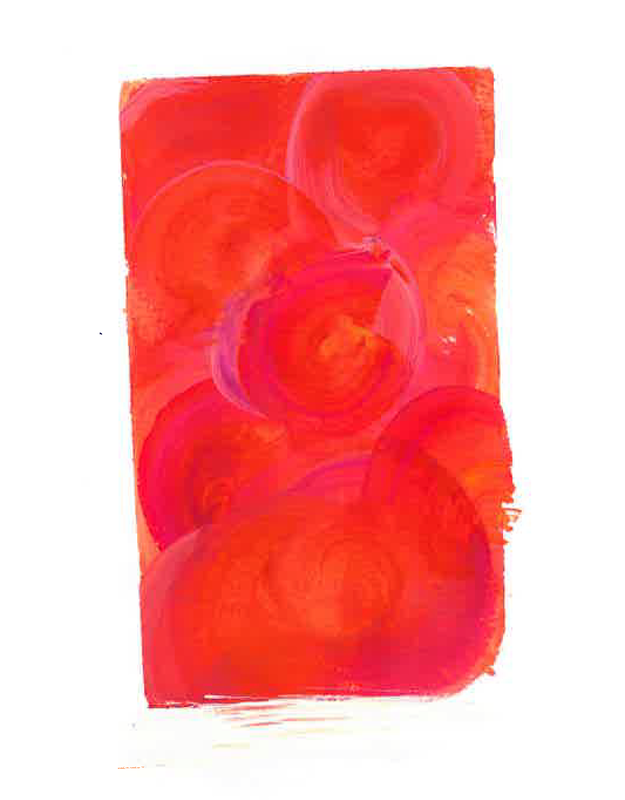
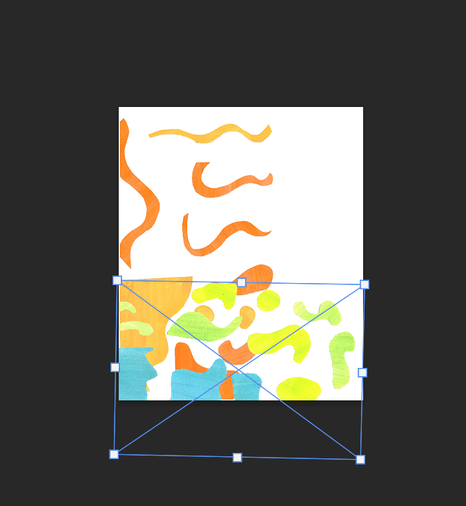
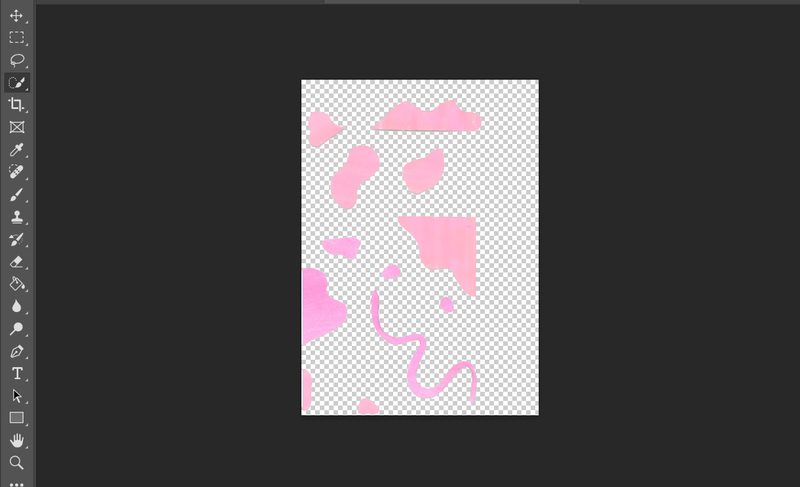
To make my final cover I painted sheets of white paper with watered down gouache, using a pair of scissors I then made matisse inpired cut outs. I scanned them in using the scanner in group depending on their colours. I then took each sheet into photoshop and using the cut out tool i then selected each shape into its own png. I organised them into their own folders and began making a digital collage.
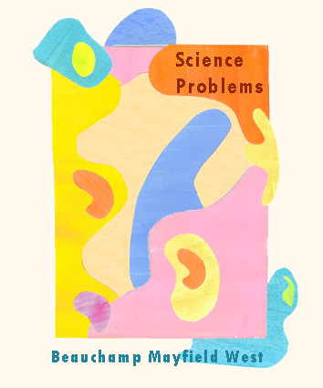
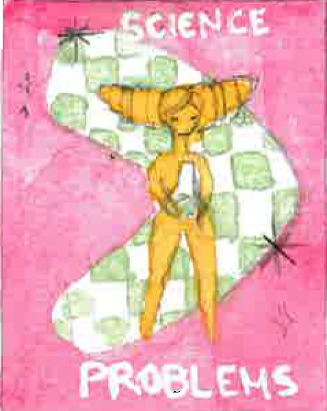
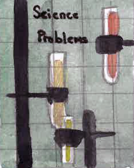
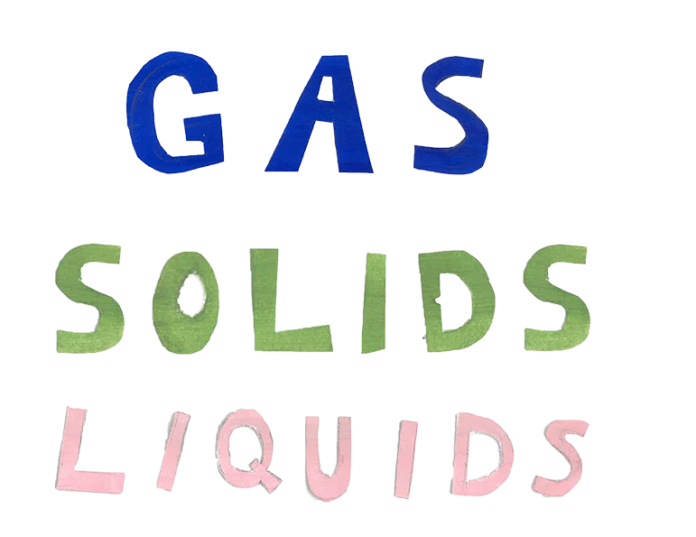
This is how it tuned out at the end, I enjoyed how organic the shapes turned out and how brightly it looks. The cream background is a part of the design but i did it in a function so that If it need to be cropped it can be. Compared to the original book cover I really enjoy it. I think it references a more modern take on retro design and i can imagine would catch the eye more. The only thing Im not too sold on is the type face. Its legible but I dont think it matches as well.
Making the finals- Interior pages
I made three characters based on one of the chapters from the original book, from the physics chapter I saw a states of matter section. Following the states Solids, Liquids and Gasses, in the original book the states are all in one page with not titles so they bleed into each other. It made reading the book was difficult. So in my modernisation I separated them into their own double spreads with a simple layout.
Making finals
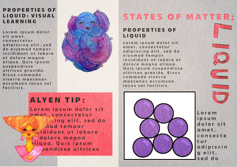
I used photoshop to layout double spread pages for each of the states. On the left side there is more traditional informationn about the states. Their descriptions, examples and their properties. On the right hand side I placed the characters and their particle arrangements for an excercise idea for students to label the properties of each state. This would be beneficial to visual learners as well as each characters design takes influence from these properties.
Re-submission
|
Next steps:
|
I decided to revisit this project, I wasnt happy with the end result and felt it was rushed and didn't match my initial visions. I will be keeping a few elements though:
Some initial points of the original design that I noted down was:
|
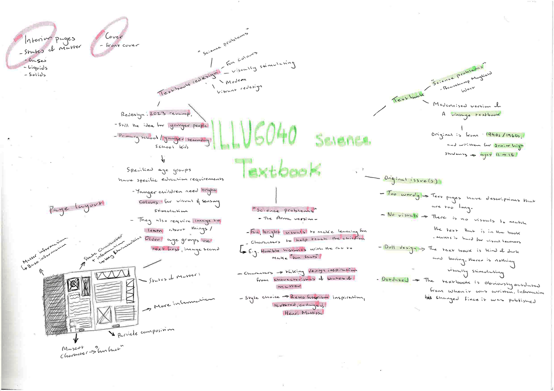
Before I started anything I began by mind mapping, it helped get the web of ideas out of my brain. I listed what my thoughts of my original submission and also the original book. As well as the ideas for my new piece.
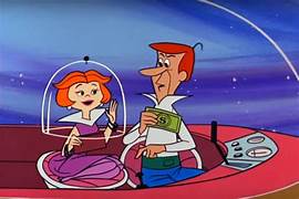
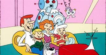
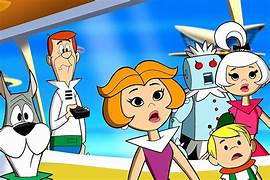
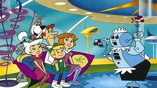
Visual research- The Jetsons
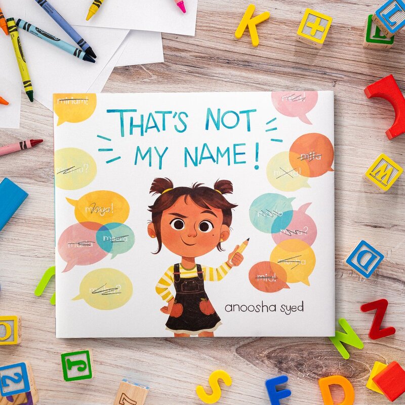
Visual research- Anoosha Syed
|
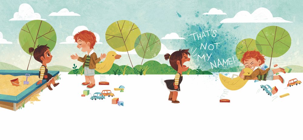
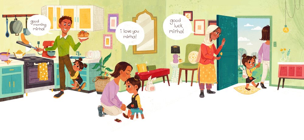
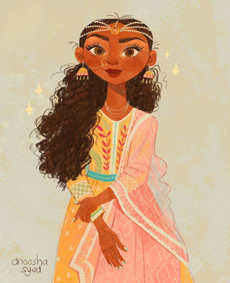
I wanted to keep in mind that the audience for this book will be younger teenagers. Anoosha's style works a little more for younger children, however I like the way she uses bright, muted colours in her illustrations, I also find it helpful to look at text and image placements, as I think she got the balance right.
|
Text book content
I selected the interior pages for my redesign, my choice was from chapter 3 and was on The States of Matter. I made this choice because it was a simple set content and something I already know about. It meant that I would be creating three interior pages in a similar theme.
Initial references
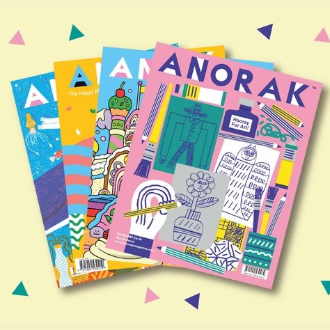
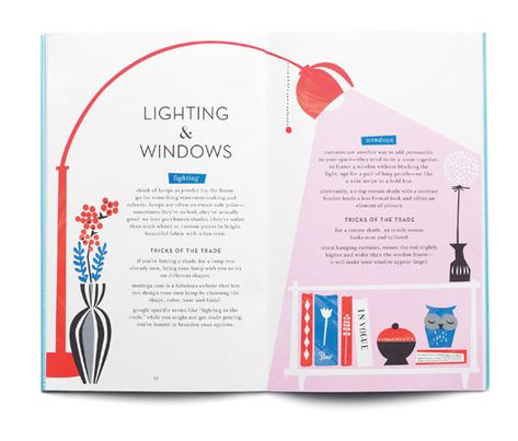
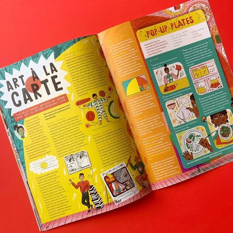
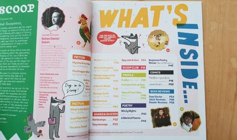
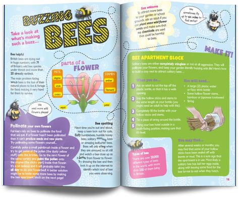
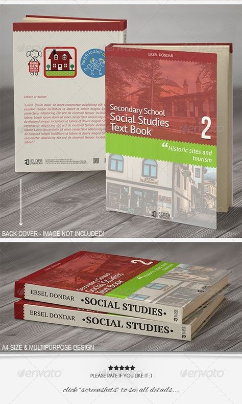
I tried to find already existing textbooks and science based magazines that are geared toward younger teen audiences, to see what I could do for my redesign. I found it helpful to think about the book being on a shelf and what makes a book stand out.
Video research
|
With the internet and social media being so popular I also looked at some online material one what the properties were of the states.
|
|
|
|
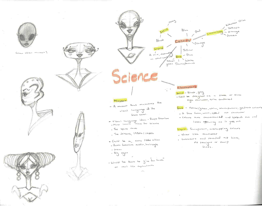
I also liked the idea of having a mascot to maybe give some "fun facts" These characters tend to be kind of helpful for getting quick information in your brain.
Thumbnails- Cover
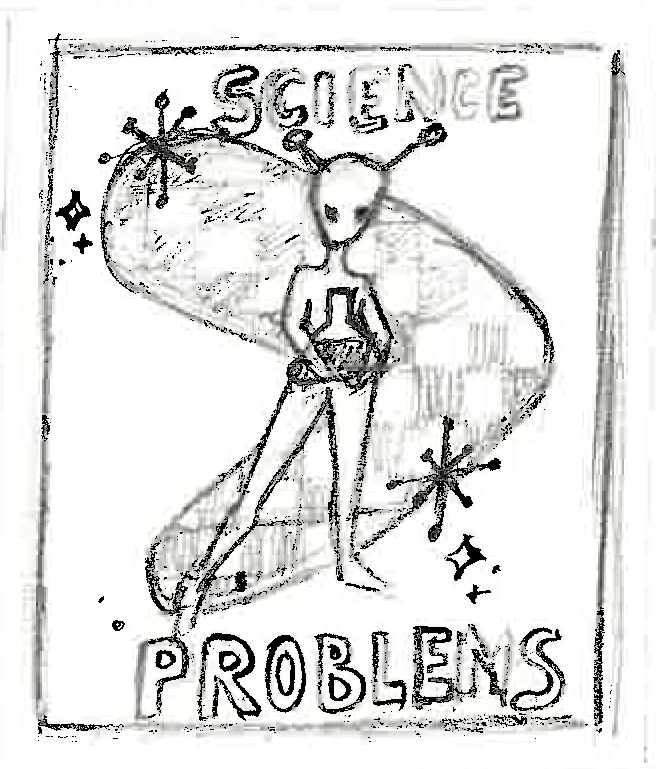
Thumbnails- Mascot
Thumbnails- States of Matter characters
(Due to time constraints when I was doing this re submission I wasn't able to complete multiple variations of each character. I instead took the original characters and redesigned them, using shape and colour theory to convey what each state of matter is.)
I started off by creating a mindmap of what I wanted my mockups to look like, these initial ideas really informed the visual language I was creating for this redesign.
Visual developments- mascot
|
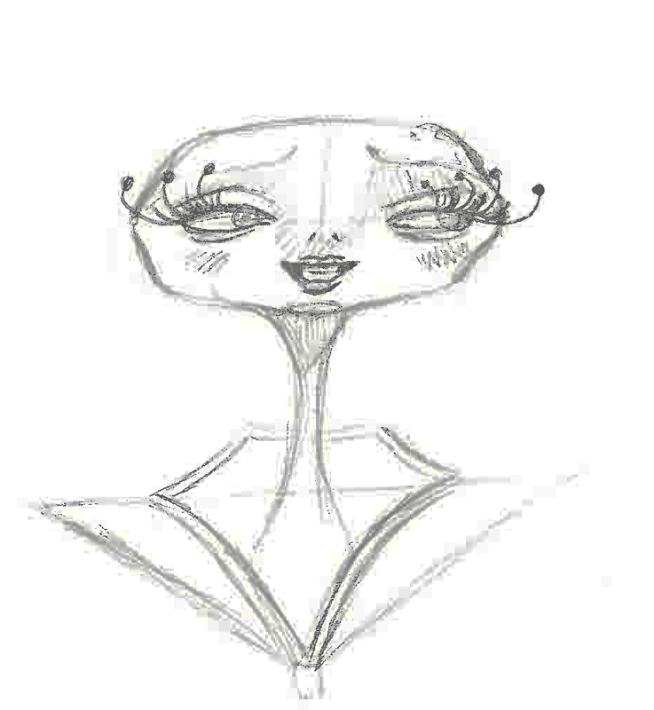
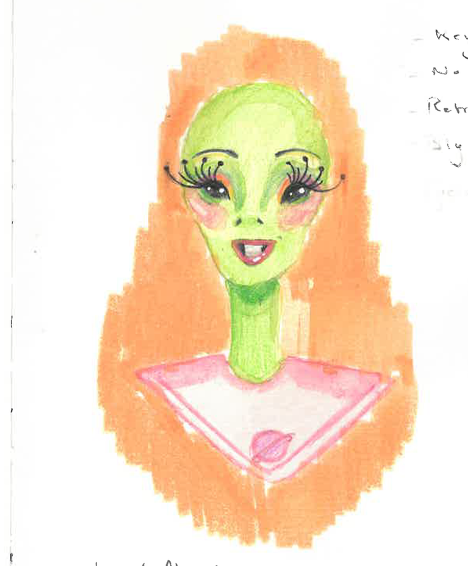
I took my two favourite thumbnails for my mascot character and developed it. Initially I wanted to go with the sterotypical little green alien, but then I had the idea for a gilier character. I think this definitely helped with colours aswell. I asked a few people what colour came to their heads when I said the word science:
|
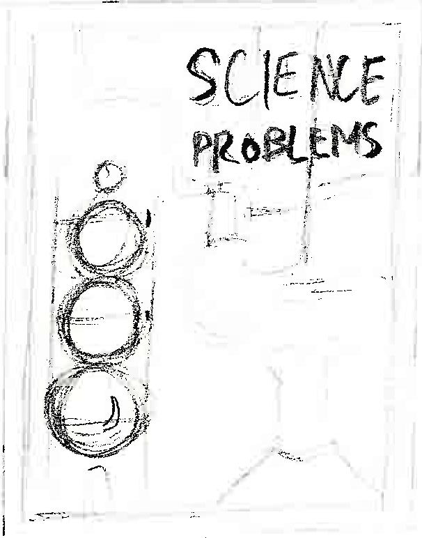
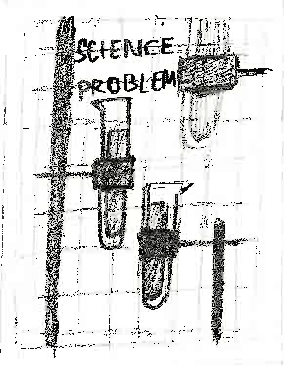
Visual Development- CoverI chose my three favourite cover ideas, the decision of which were my favorites were decided based on what read more as science in terms of visual languages. I used similar colour palettes on each: orange, yellow, greens and some pinks. These colours are prominent in scientific laboratories, as well as the retro-futurism design I was going for. For these ideas I imagined making the real cover using mixed media collage.
|
Visual development- Characters
|
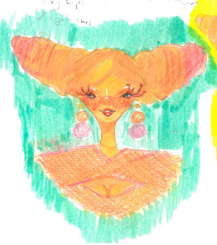
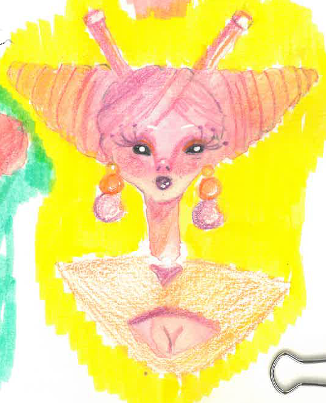
These are the re-imaginations of the states of matter for this re-submission. Their character designs are influenced by the properties of each state:
|
References
Gouache Type
Final Mockups
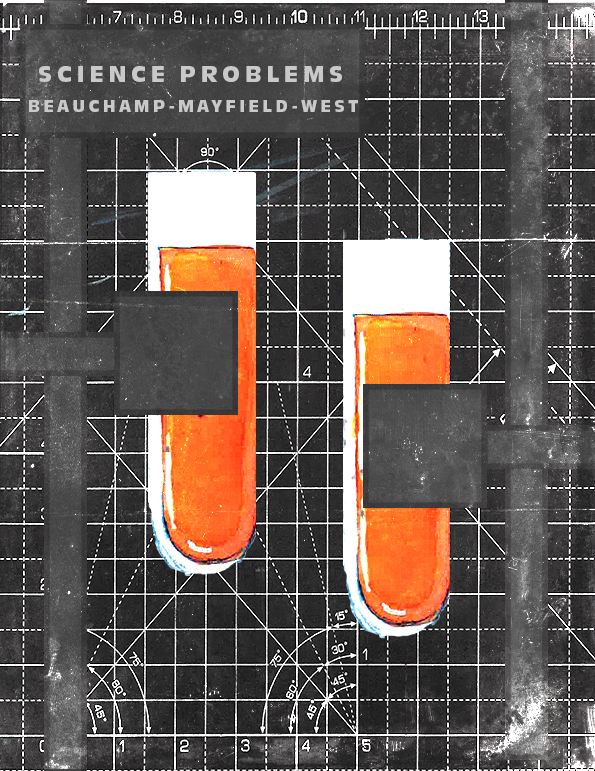
The final mock ups for this project, For the cover I used a scan of my cutting mat, I felt it looked mathematical enough to read as science. I painted the vials and their stands I used the shape tool on Photoshop. I then Added a glossy but grundged up texture to mock real textbooks. The interior double spreads are A3 (x2 A4 pages). I trued to include lables for each informational piece, "Lorem ipsum" text boxes are were the actual information would be . I included my mascot ALYEN to give off tips, this would be real life examples. I also included particle compositions. I tried to make my revamp inclusive of those, like myself who are visual learners, with the illustrations and also keep important information for those who arent.
What I learned
- To keep VISUAL LANGUAGE in mind, how can I use existing language to improve my ideas.
- Keep things fun, for long and sometimes boring projects keep an element of fun and personality it
Site powered by Weebly. Managed by 34SP.com
