Picture book for early readers
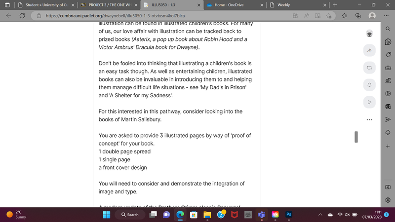
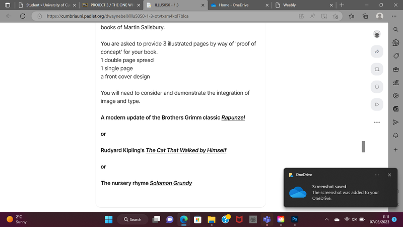
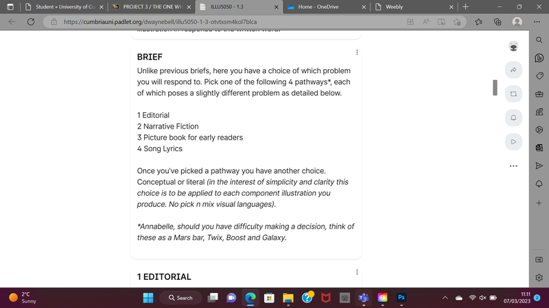
For this chosen project I decided to follow the children's book brief, it seemed the most interesting project in what was being asked for and I had some clear visions of certain pieces I could create. For this project i decided to illustrate for Rapunzel by the Brothers Grimm. I have fond memories of reading this version of Rapunzel as a child so it felt right to illustrate for this story over the other options.
Initial research
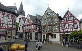
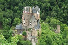
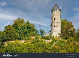
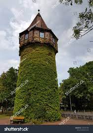
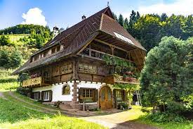
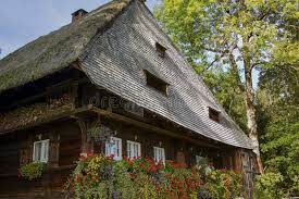
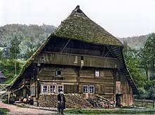
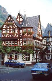
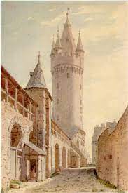
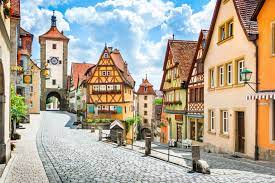
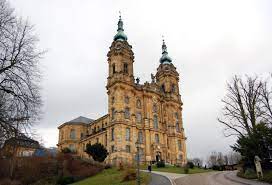
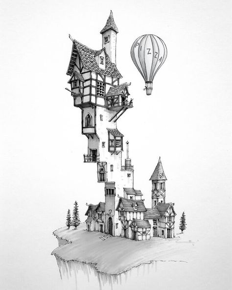
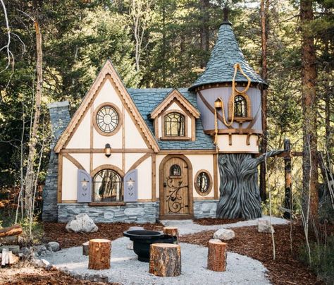
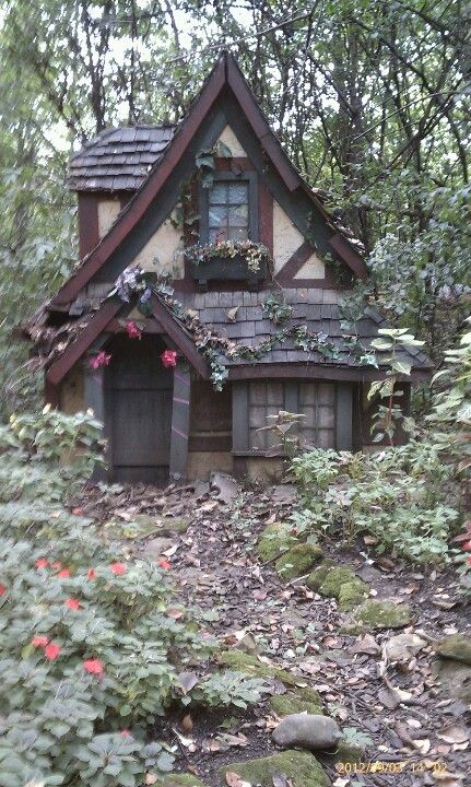
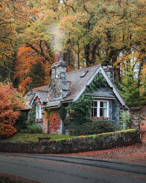
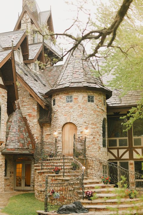
My initial research and own knowledge of the brothers Grimm helped me find good secondary research, I wanted to illustrate a German Tudor setting. The text mentions that the man and woman live in a home that from the back of they can oversee the sorcerers garden. I thought that potentially I could illustrate the backs of these houses that oversee the garden and in particular the Rapunzel lettuce so desired by the wife. I also thought of the old stone castles, towers and turrets that occupy the German forests and towns and how this could be good reference for the tower that Rapunzel is locked in. I like the idea of the contrast of the cold stone and a flourishment of greenery to reference Rapunzel's youth and vitality.
Initial thumbnails
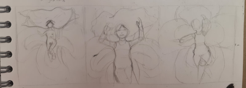
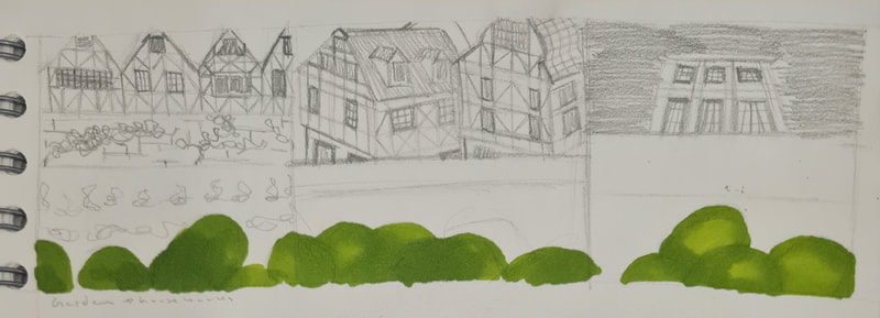
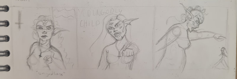
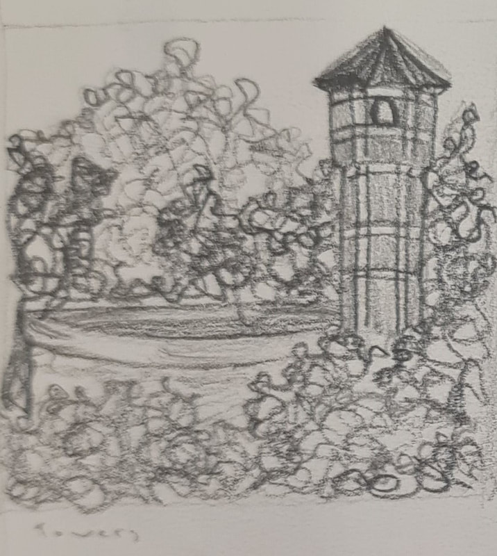
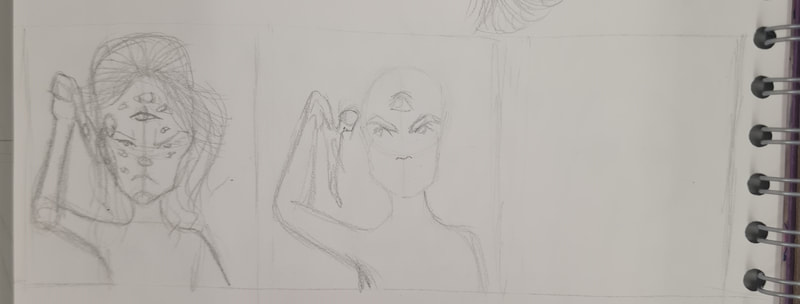
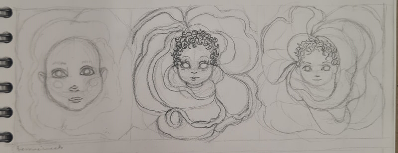
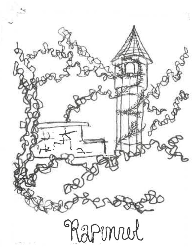
For my thumbnails I find it easier to trial out different compositions instead of different ideas, once id read this text I picked out certain text that I thought could be translated to a visual. Such as the sorceress' garden, the tower, the sorceress finding the man. For others I went more conceptual with them, for example I found the idea of the Rapunzel lettuce interesting, I had a vision of the grown Rapunzel on a bed of lettuce, I also played on the childish myth that babies come from a vegetable patch so had the vision of a babies head surrounded by lettuce leaves or the lettuce growing from children's heads.
Reference images
Looking at artists
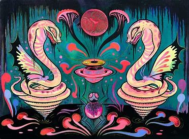
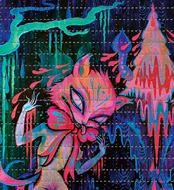
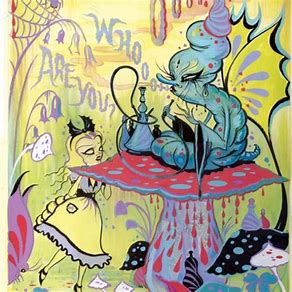
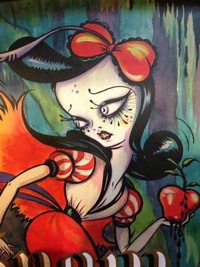
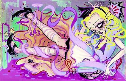
While I thumbnailing I was thinking of two artists in particular, Jan Pienkowski and Camille Rose Garcia. Both have had an effect on how I draw and both have worked on children's books without simplifying their styles for a children's book.
Jan Pienkowski
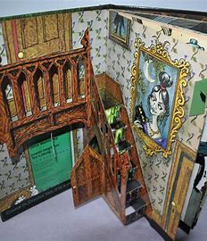
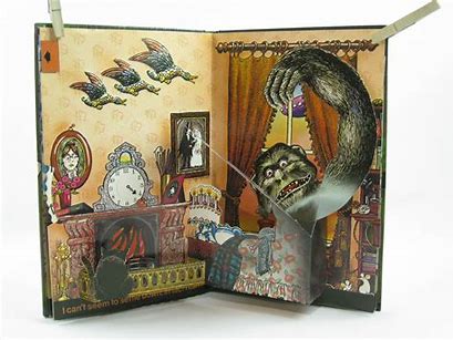
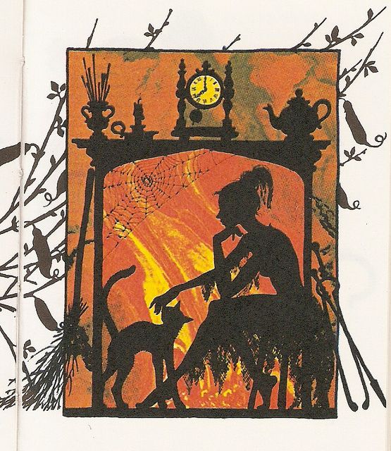
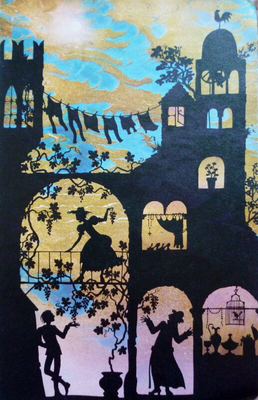
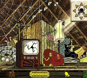
Jan Pienkowski was an artist most known for his series Meg, Mog and Owl as well as his pop up books, however I love how he was able to use such vivid and intense colours alongside black lines or silhouettes and they complimented each other. I find his use of line technique in his haunted house book the most beautiful, using different line weights and techniques to bring certain objects their in life textures really helps bring them to life. I also really like his knowledge of how light interacts in rooms. For example the illustration of the attic is illuminated and brought to life by the stream of light coming from the window on the right. It allows for a ambience and vibe to be seen in the scene he was depicting.
Camille Rose Garcia
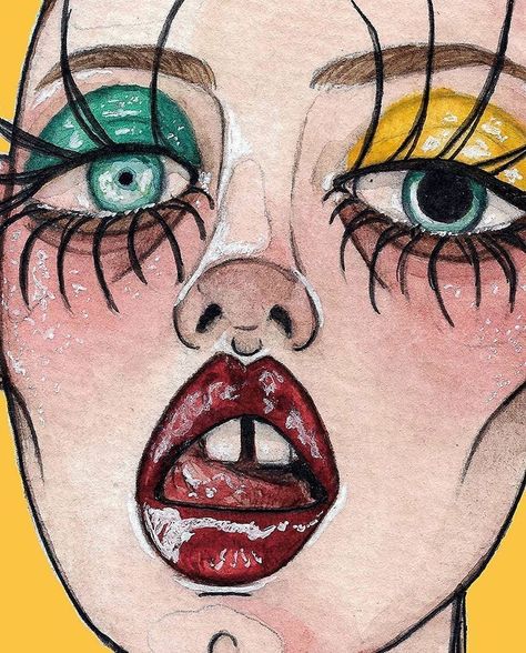
The other artist I looked at is Camille Rose Garcia, she paints in a low brow surrealistic style which is almost dreamlike in the way she she depicts certain scenes and characters. I really enjoy her unique was she used colour. The foreground includes such bright and vibrant colours while in the background they look slightly washed out or faded giving a dreamy, blurred imagination of these scenes. I think as a child if I would have seen these illustrations I would've been obsessed. I like how whimsical and subtly gothic they are. Its Garcia's iconic style for a book targeted at a younger audience.
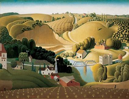
Grant Wood
I looked at Grant Woods depictions of landscapes, in particular I like how he paints the American Midwest. In comparison these landscapes might not be that visually interesting but the way Wood paints make then seem gorgeous and unhuman like. In particular I love his trees, they look like broccoli or clumps of cotton wool stuck together. I thought maybe that could be cool to depict the towers landscape with. I also thought that because the trees look like broccoli maybe the child audience would like that.
Getting into materials
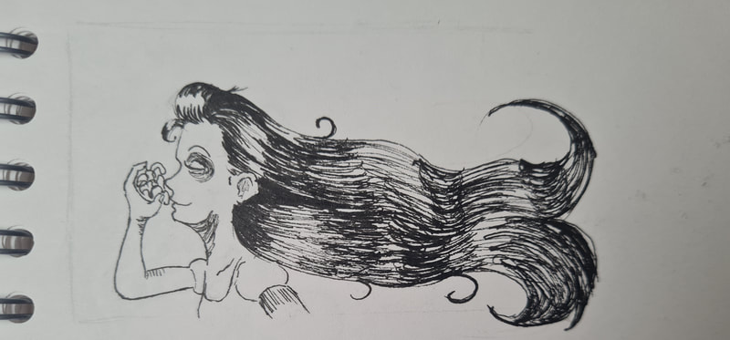
I knew I wanted to use a mix of fine liners and watercolours in this piece, I was inspired by Garcia's gothic approach to illustrating books and I knew I could get the look I wanted by using watercolours to accompany them. Above is my experiments with stylisation and the aesthetic I wanted. I thought of what I would've liked to look at as a child, Anything fantasy or creepy, I liked supernatural things but also had a fascination with stronger female characters, especially villains.
Using Colour
When I was experimenting with colour I was trying not to look ad the disney adaptation of Rapunzel. While I think its a beautiful adaption I also think its a rip off to just copy its visuals. So where I could I tried to differ. I was inspired by the colour palettes Garcia uses in her work, they're psychedelic and give off a trippy aesthetic that I adore in her work. For other visuals I tried to take inspiration from Pienkowski and used muted colour whilst using higher impact lighting to make a scene a little more dramatic.
After some feedback it was clear that I should try and reference some of the darker undertones of the story. I thought of how someone might do that and keep the imagery appropriate for a younger audience. I obviously identified that for my visuals I needed to implement the forced imprisonment of Rapunzel, the sorceress taking her away and the danger Rapunzel had if she did escape, the thorns awaiting her around the tower.
Time for a re-work
With the feedback in mind I took into consideration how i could improve these designs so they'd pass as actual illustrations for a children's book.
Single spread
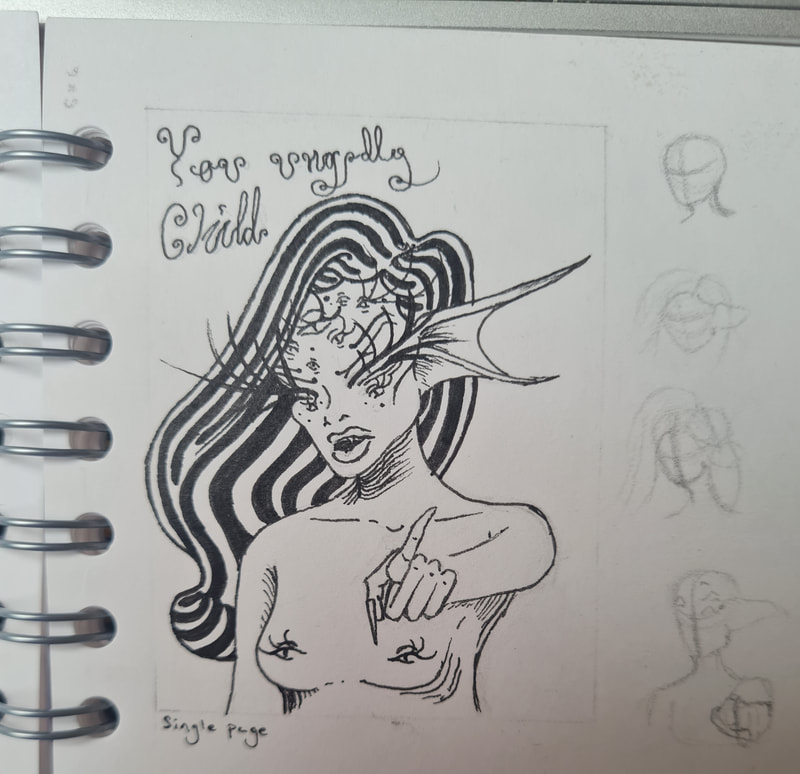
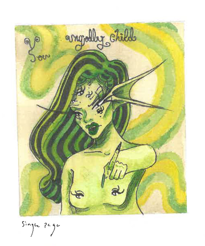
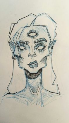
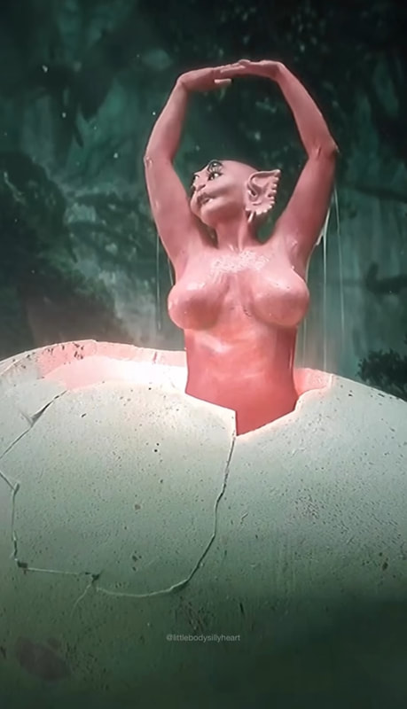
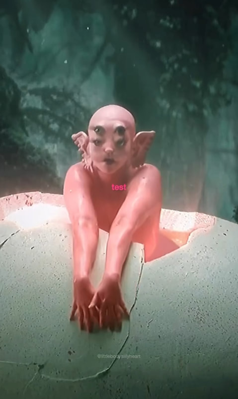
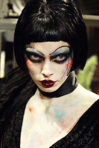
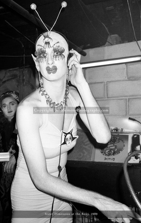
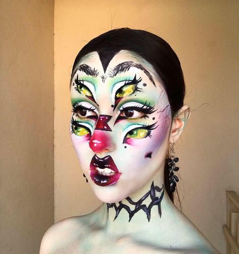
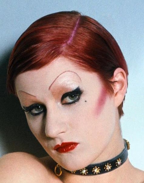
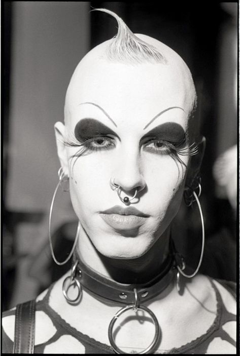
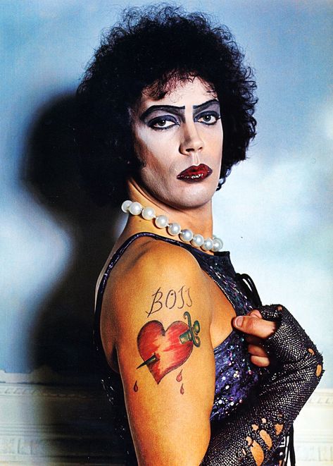
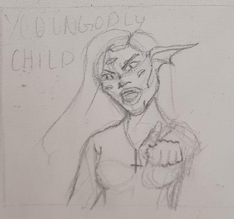
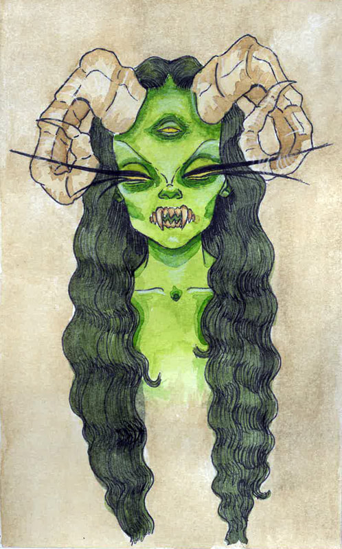
My single spread illustration was going to be for the line where the sorceress calls Rapunzel an "ungodly child". With feedback wanted to keep her concept similar but alter her look to read more as an evil witch not a green fish creature. I took inspiration from rocky horror, 90s club kid makeup and a music video by Melanie Martinez. I didnt want the sorceress to read as being human, I liked the idea of her being a creepy corrupted character, something that Rapunzel would be scared of.
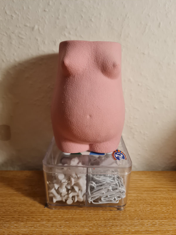
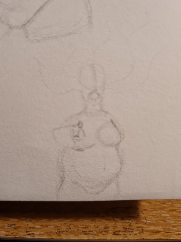
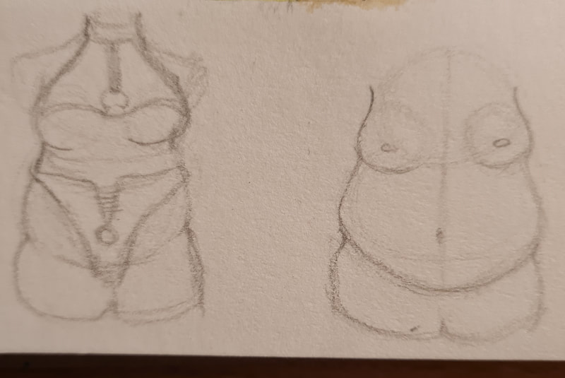
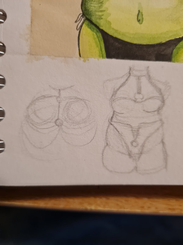
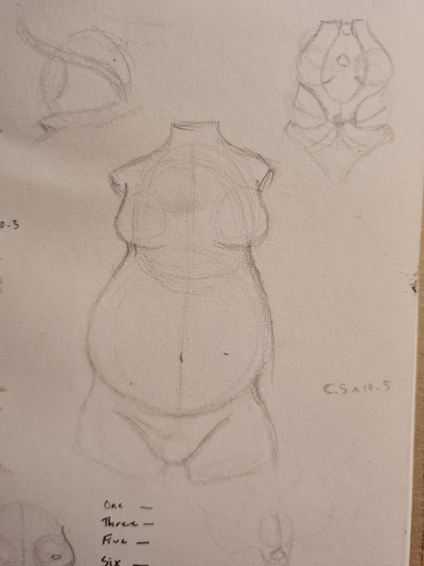
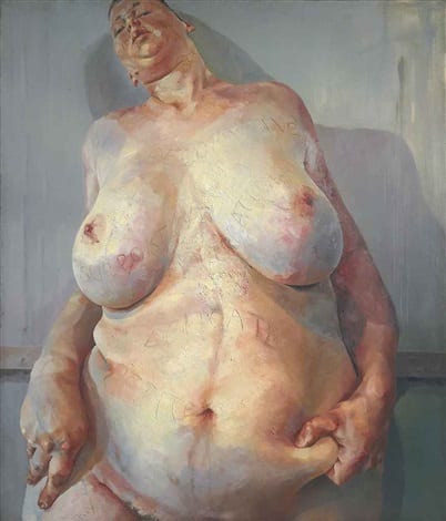
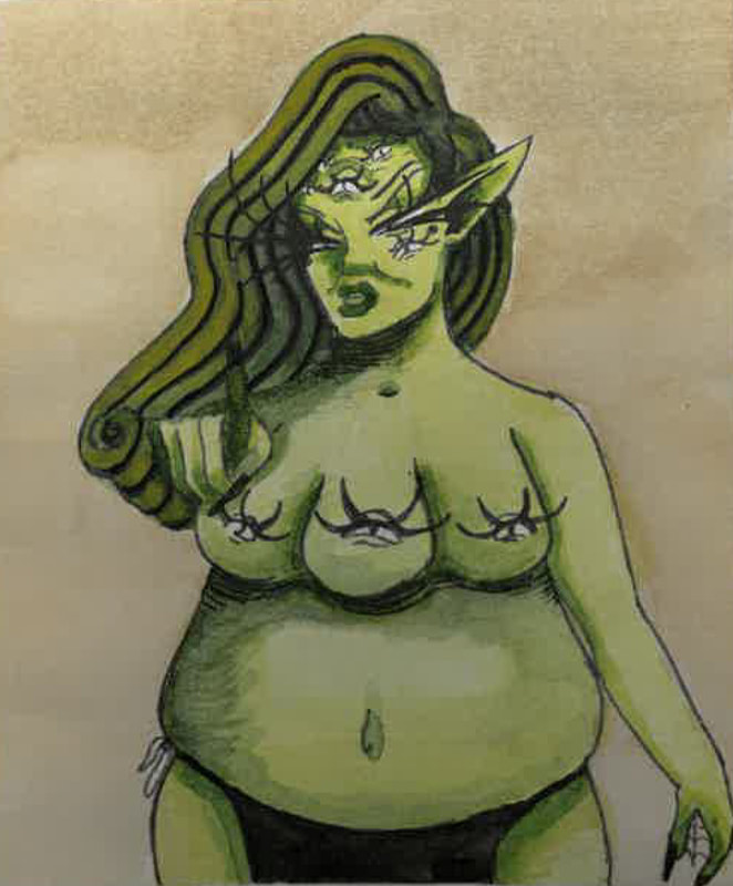
For the Sorceress' appearance I wanted to play around with her body type, as the book is for children I wanted to make it diverse. I thought that a fuller figure would be useful in her design. To reference the power difference between her and Rapunzel. Imagining that Rapunzel in comparison would be smaller and weaker. I also referenced how Jenny Saville uses scale in her work to paint fuller figures. In this I thought that my paint brush holder, a female figure would be good reference.
Jenny Saville influence
I looked at Saville to try and learn how to use scale to replicate the beauty of a fuller figure.
Clothing?
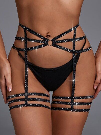
Controversially I have chosen to allow for the sorceress to have her breasts out, this was a troubling decision. I on one hand can understand not wanting to show explicit nudity to children. However in her design the Sorceress doesn't have nipples, she has eyes in their place. After talking to a few people I came to conclusion this isnt a bad thing. Her three eye breasts is integral to her design and covering them felt worse. I also share the belief that the view on feminine nudity being an issue is a misogynistic, outdated view on something that isnt sexual. However I did consider clothing and thought that a harness and chain look could work if it was desperately needed.
From Thumbnail to final
This is my favourite part of the design process, is seeing how your illustration grows and develops over the time you work on it. I'm very happy with how she has ended up, she reads as a ferocious character. I would've loved looking at this as a child. She is painted green to represent the colour of jealousy, I also like the contrast of her palette to what I used for Rapunzel.
Double spread
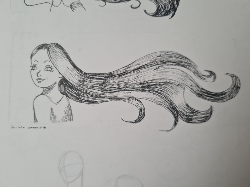
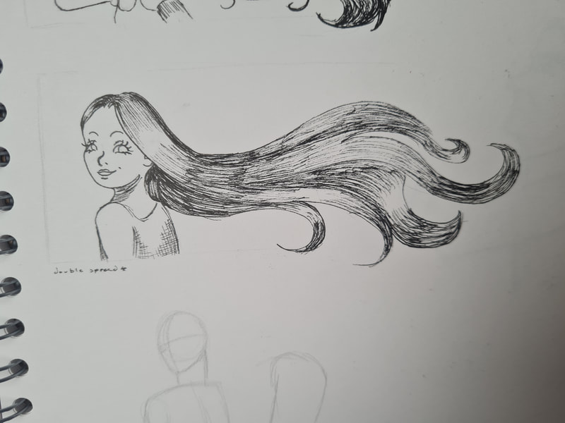
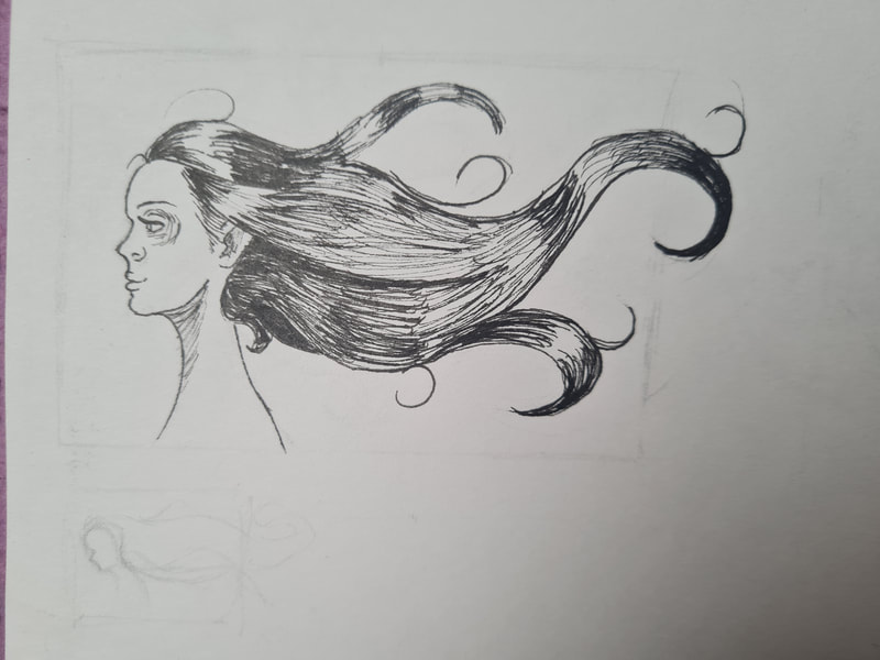
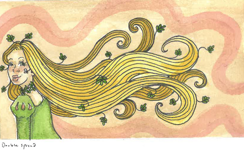
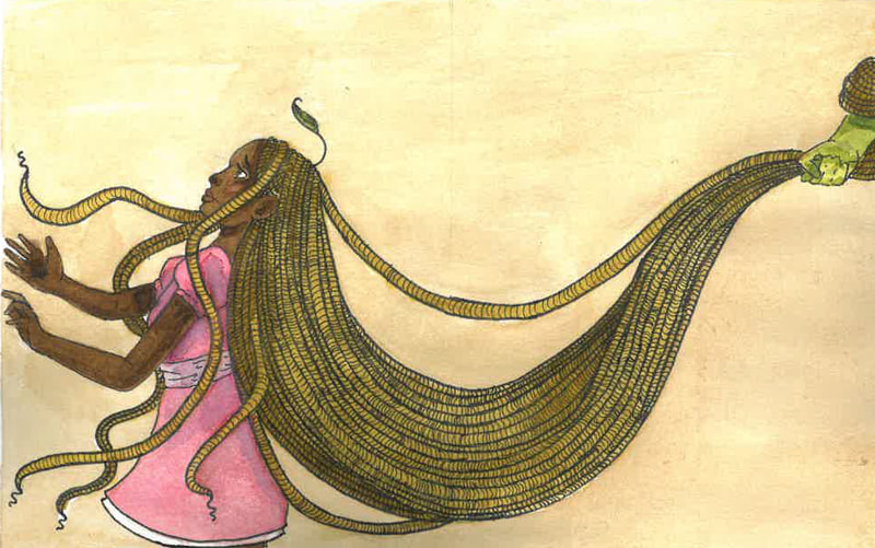
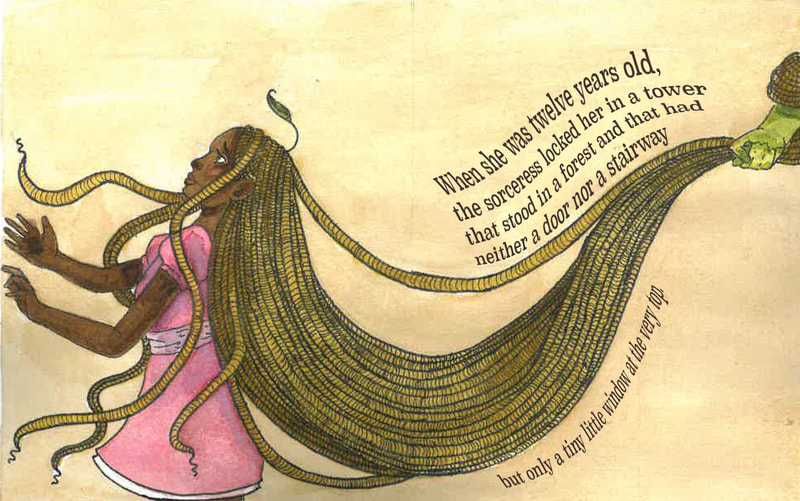
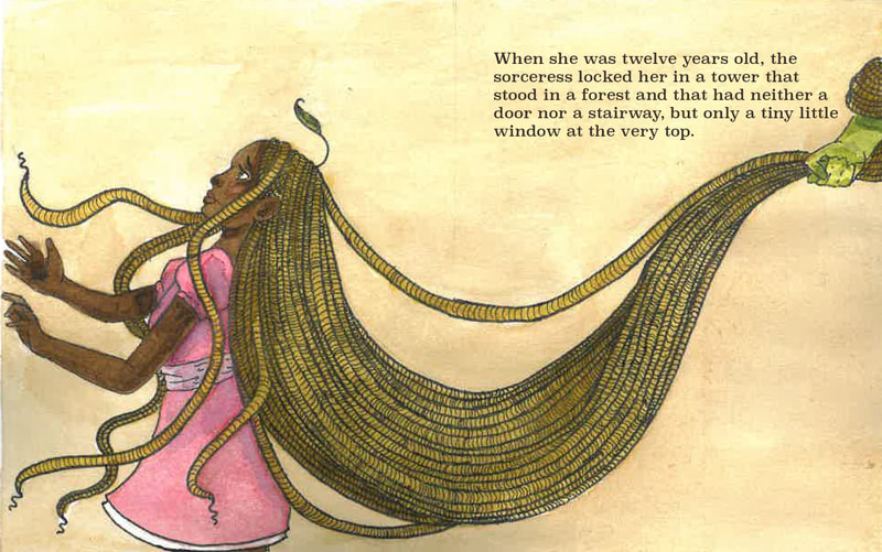
For my double spread idea i thought that a good compositional idea could be to have Rapunzel's hair being shown spanning from her head to the corner of the other page. I also was told to reference the darker undertones of the story, being that Rapunzel didn't willingly go she was taken. In my effort to represent a diverse depiction I also chose to redesign Rapunzel as a black character. It dawned on me that like many other children of colour I never saw characters who looked like me. I know from the wider community there's a smaller portion of black main characters. Knowing this pushed me to overhaul Rapunzel entirely.
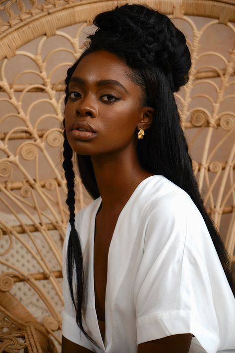
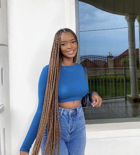
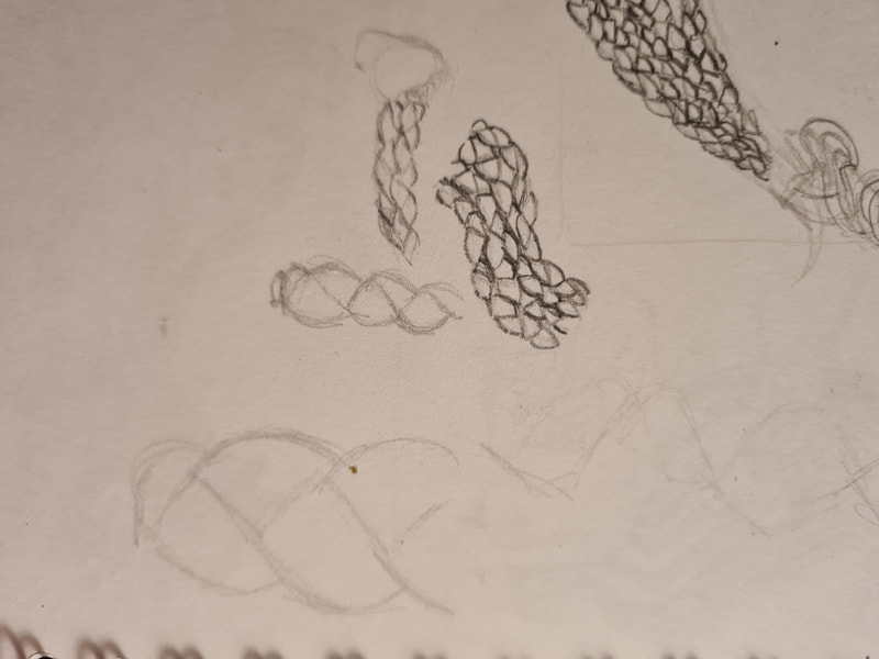
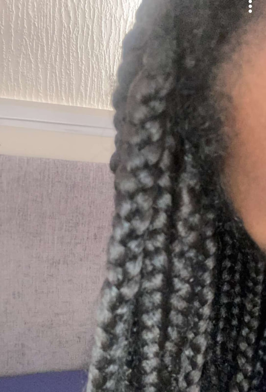
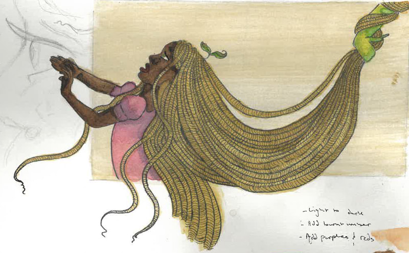
Rapunzel's most iconic feature is the amount of hair she has, its a weight not the just the length that's involved in her design. I originally wanted to depict her as having protective braids as her hair. However after looking into it I thought that either locks or twists made more sense as these hairstyles could be something Rapunzel's does while being locked in the tower. I referenced my friend Amandas hair in the first drafts and thesn how her hair lays when it is pulled in the composition I wanted.
Skintone
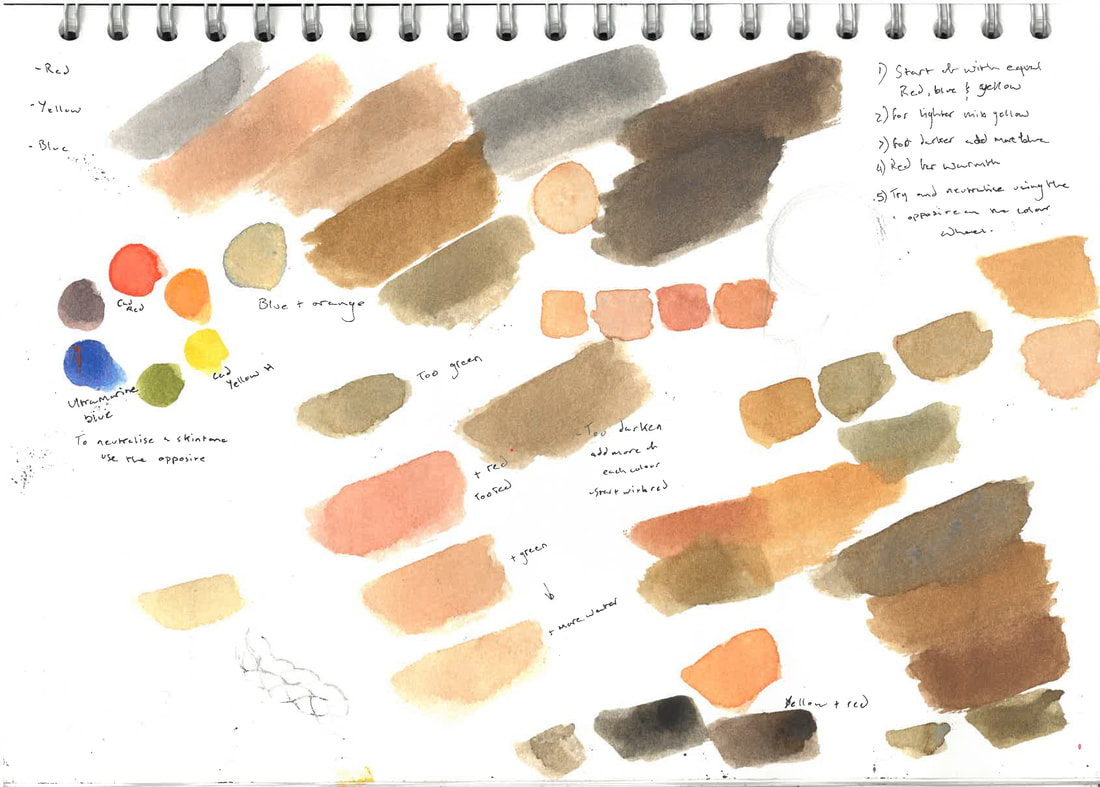
When painting a deeper skintone you have to keep in mind how to change the variations. I found that using the colour wheel aided me in knowing how to mix the primaries to get the tones I wanted.
|
|
|
|
I found these videos very helpful in trying to mix my own skintones, I learnt that having a colour wheel on hand is very useful. For a basis i mixed Red (cadmium), yellow (cadmium) and blue (Tramaline) together, this will give you a brown colour. It relies on what proportions of each colour you use. I learnt that if the colour is too blue then you need to add orange to neutralise it, or if it turns out too red then add green to neutralise it. Adding more blue will deepen the brown shade, yellow will make it lighter and red will make it warmer. For my new Rapunzel I wanted her to have a deeper warm undertone to contrast her golden hair.
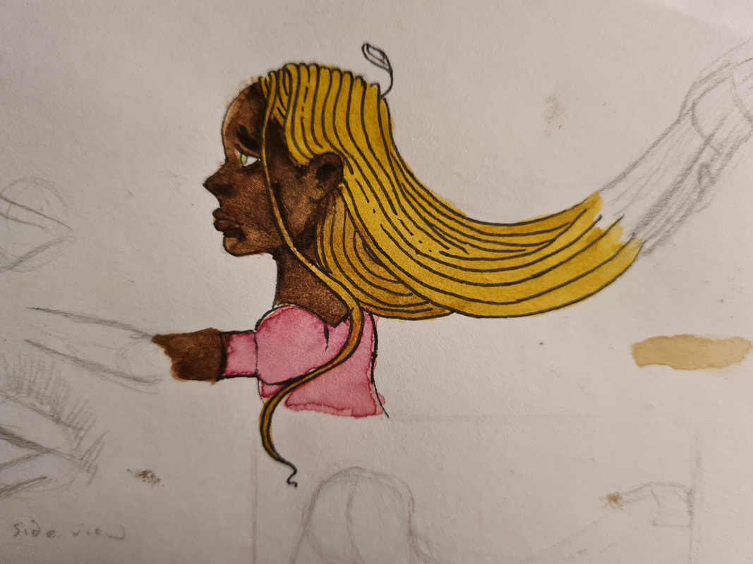
This was my first attempt at mixing her skin tone, while I liked the contrast I thought she looked too ashy for what I envisioned.
My second attempt ended up warmer and looked how I wanted it to, I love the contrast of deep skin and light hair.
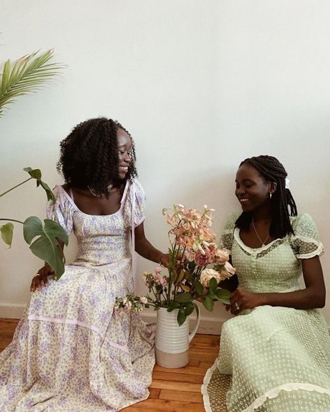
For Rapunzel's look I wanted her to have a younger, cuter look. Imagining her dress was something she herself made. I referenced a cottage core aesthetic look as it references nature, pre materialism and a simpler existence. In particular I love the puffy sleeves an flowy look of the dresses.
Thumbnail to Final
I'm very pleased with how Rapunzel's look has turned out, I'm very happy that I did give her this style overhaul. I feel her original look was very basic and too Disney like. I feel like this is better and hopefully if in production a child saw someone who looked like them. I also like her little leaf from her scalp, it was a little reference to the lettuce breed, Rapunzel.
The cover
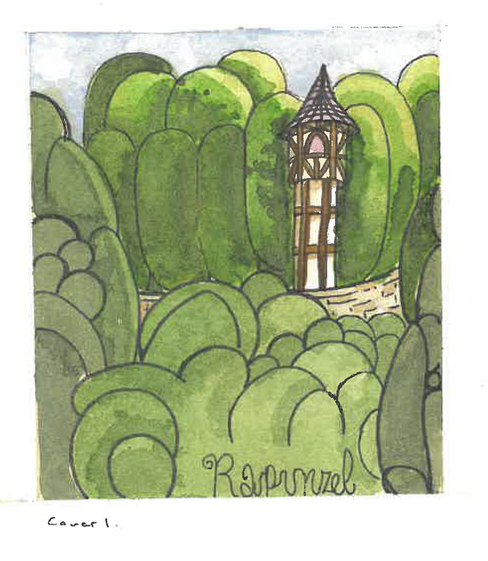
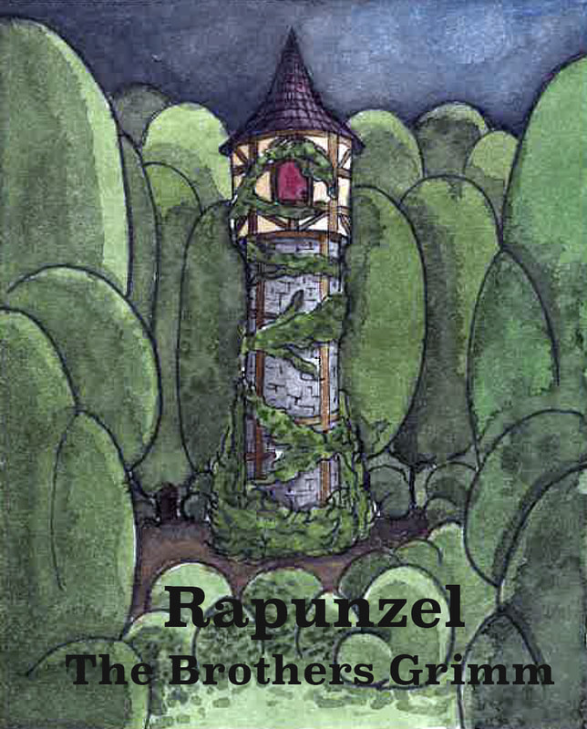
The cover was to be the stand alone tower Rapunzel was locked away in, I was very inspired by the idea of stone based tower with the top of it being a traditional tudor wood and stone design. My feedback was to play with mood lighting and the spikes at the bottom of the tower.
Thumbnail to Final
Its been very fun to illustrate a children's book cover, I wanted it to look magical and fairy-tale originally. While I think it still references that I think the added connotations of the darker parts of the story ground the cover. The towers purple roof is to reference Rapunzel's dress. I likes the symbolism of the tower (Rapunzel) being surrounded by the forest (the Sorceress).
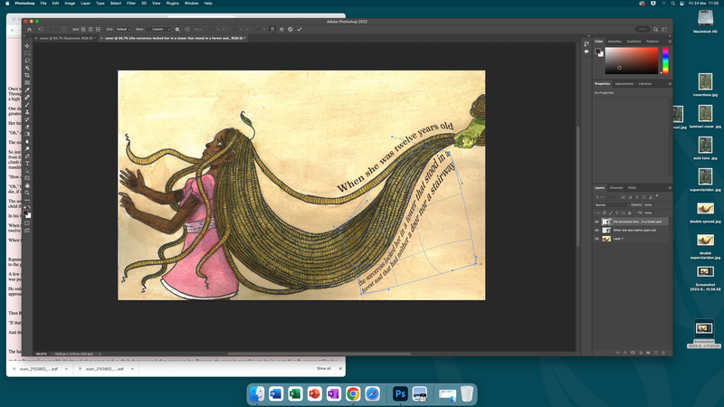
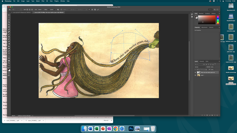
Adding text
Continued
I repainted my interpretation of the sorceress, I felt happy with my other submissions for this brief except for the single page spread. I'm much happier with this version. Instead of the Garcia inspired piece I focused on making her look as scary as possible.
Site powered by Weebly. Managed by 34SP.com

