"Don't think it, ink it." -Mark Victor Hansen
Weeks 1-4: Traditional
Week one: Black and White (part A)
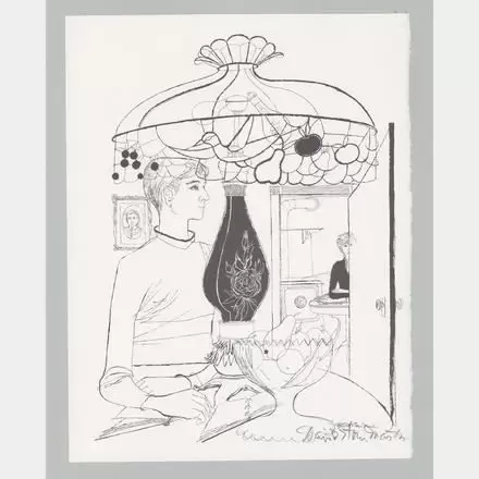
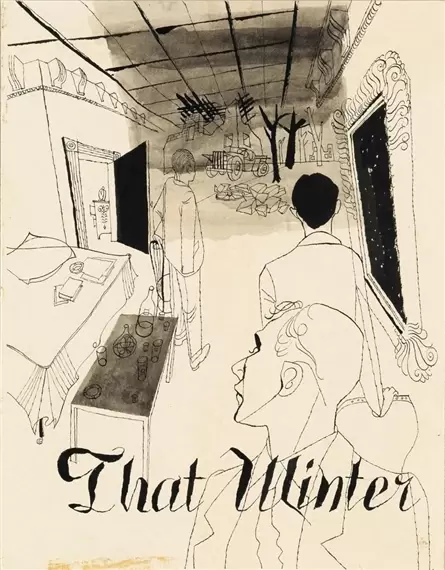
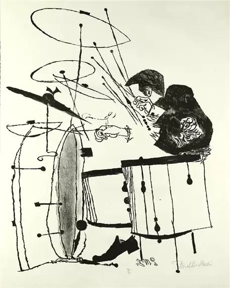
For the first week of this module the focus was on understanding the techniques to apply black ink to paper, learning that there are four main ways to do this. Such as a dip-pen, fine-liner, brush and an improvised brush. Also, to look into mark making techniques like cross-hatching or stippling. In this week I chose to focus mainly on using the dip-pen and ink as much as I could as its the medium, I have the least experience with. I'm happy I chose to do this as it's become a material I really like using. I started off by looking at mark making techniques using pen and ink and how these would vary to using them with pencils. Focusing on hatching, cross-hatching, contouring, weaving, stippling, scribbling. I then looked again at Charles Dana Gibson's "Gibson girls" for reference on how to create the self-portrait we were asked to create as part of this module. For drawing my still lifes I looked at David Stone Martins album covers.
Dip-pen and ink Portrait
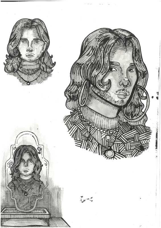
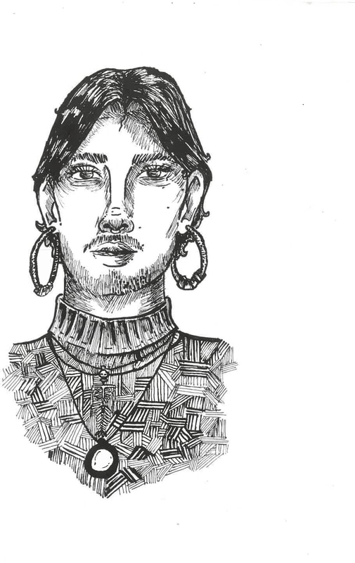
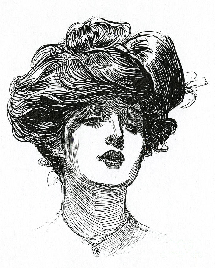
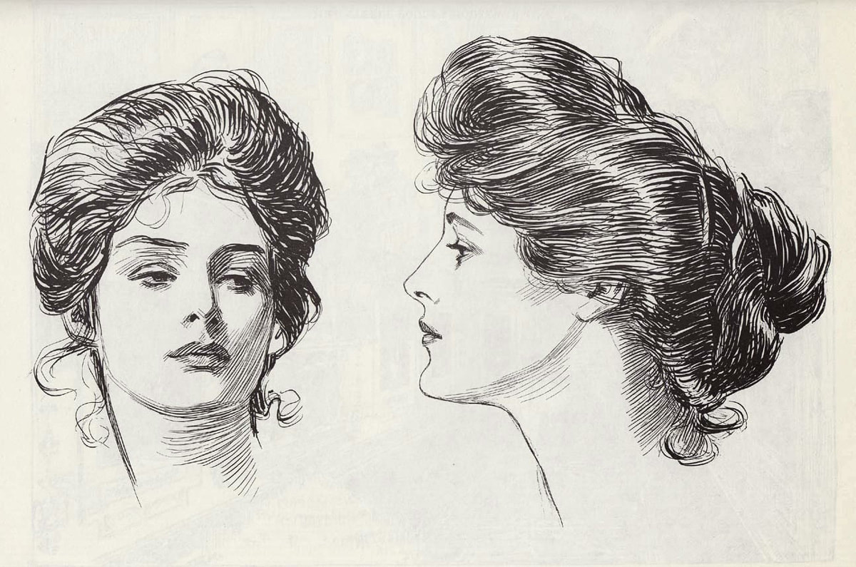
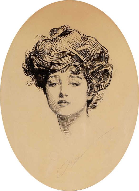
For my ink self-portraits I referenced Charles Dana Gibson's "Gibson girls" because of how simply he used mark making techniques to create the illusion of shadows and depth in his illustrations. In his work I noticed the use of contouring lines around the hairline, top of the neck and around the eyes and nose. Anywhere that shadows would fall naturally he used these lines, they also gave the illustrations more shape and structure in a believable way. I also noticed that he was very skilful in how he would've applied pressure to his pen and his lines can easily change widths, also using solid ink shapes in the darkest parts of the portrait's hair. When it came to drawing my own self-portraits, I find referencing his illustrations very useful because it is obvious which techniques he used, where he used them and how he did the. It came in good use when I was learning how to use dip pen and ink.
To make my self-portraits I started off by drawing an under-drawing in pencil. This was to get the shapes and proportions right. When I felt happy with this, I used an eraser and lightly erased the sketch and went over it in ink. I had to remind myself that Gibson didn't use a continuous outline, instead using the contour lines to create the natural shapes of the figures. Which I tried to replicate, where it felt appropriate. Other than contour lines I used a mark making technique called weaving, this where you draw 3-4 straight lines going in opposite directions, I found this useful to create the textures of my jumper I was wearing whilst illustrating these because it looks like fabric. I also used hatching and cross hatching to add shading to the background of the mirror portrait. I also discovered a cool ink and water technique from artist, Paul Heaston. Using a watercolour brush pen and water you can dilute ink to certain shades to add different grey shades to your illustrations. I tried this technique using different washes on the different parts of my portraits and found it a better success then leaving the highlighted areas as pure white like Gibson did.
To make my self-portraits I started off by drawing an under-drawing in pencil. This was to get the shapes and proportions right. When I felt happy with this, I used an eraser and lightly erased the sketch and went over it in ink. I had to remind myself that Gibson didn't use a continuous outline, instead using the contour lines to create the natural shapes of the figures. Which I tried to replicate, where it felt appropriate. Other than contour lines I used a mark making technique called weaving, this where you draw 3-4 straight lines going in opposite directions, I found this useful to create the textures of my jumper I was wearing whilst illustrating these because it looks like fabric. I also used hatching and cross hatching to add shading to the background of the mirror portrait. I also discovered a cool ink and water technique from artist, Paul Heaston. Using a watercolour brush pen and water you can dilute ink to certain shades to add different grey shades to your illustrations. I tried this technique using different washes on the different parts of my portraits and found it a better success then leaving the highlighted areas as pure white like Gibson did.
Charles Dana Gibson
Dip-pen and ink still life
Experiments
Final still life drawings
I chose to look at the artist David Stone Martin for reference for my still life images, I like the grungy look his illustrations give off. While they're still clean the use of brushes gives them an edge I really like. When I looked at his work, I noticed that he mixed clean ink lines with using ink brushes. It looks as though Martin used these brushes to bring attention to certain objects in what he was illustrating or to fill in dead space. His use of these ink brushes is something I took notice of in particular as it's something I haven't seen in art before. I found an easy to make a multi-purpose brush is to use a sponge. I found that depending on how you apply the ink it can give different marks. I you tap it quickly and lightly it gives off a stippling effect. I also noticed that if you drag the sponge, it makes a solid black shape.
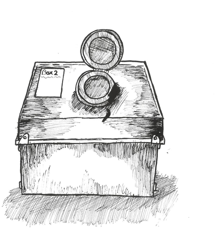
The still life images we had to draw had to include books, plates, cups or a bottle in any grouping you chose. I haven't done many still life drawings before, so I chose to group subjects of similar shapes together. I found that I had the most difficulty with drawing the circular plates and getting the books in the right angles. For my experiments I went straight in with the ink to see how different the final pieces would look compared to those I drew with an under drawing. I found using an under drawing the better approach personally however by going straight in with the dip pen and ink I found I was thinking more strategically and making less mistakes. For any future experiments I will probably use a vague under drawing again to gain accuracy and then go over it with ink later. I would probably then experiment with using only ink once I felt more confident with the medium.
The still life images we had to draw had to include books, plates, cups or a bottle in any grouping you chose. I haven't done many still life drawings before, so I chose to group subjects of similar shapes together. I found that I had the most difficulty with drawing the circular plates and getting the books in the right angles. For my experiments I went straight in with the ink to see how different the final pieces would look compared to those I drew with an under drawing. I found using an under drawing the better approach personally however by going straight in with the dip pen and ink I found I was thinking more strategically and making less mistakes. For any future experiments I will probably use a vague under drawing again to gain accuracy and then go over it with ink later. I would probably then experiment with using only ink once I felt more confident with the medium.
David Stone Martin
Week one: black and white (Part B)
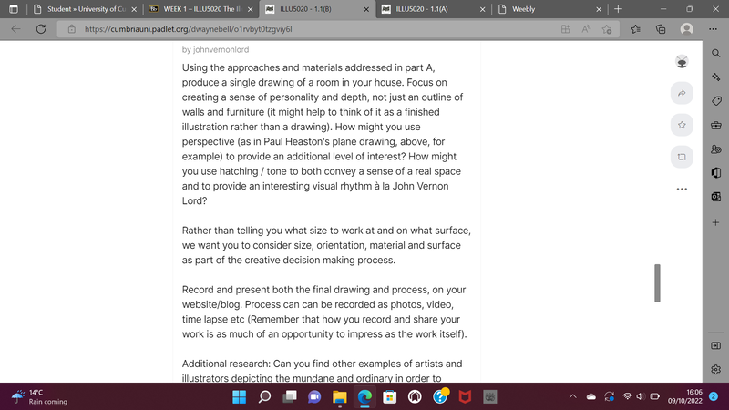
The second part to week one of "illustrators toolkit" we were given the brief of drawing a room of our house using skills and techniques learnt in part A. The idea was to think of this illustration as a whole or as done and not something in progress while doing it. whilst also giving the illustration a sense of personality and not an illustration of a bare room. As someone who keeps their room relatively clean this was an interesting task to do as I wanted to give my room personality while also making it interesting.
Drawing my bedroom
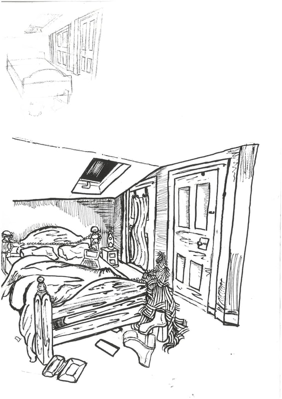
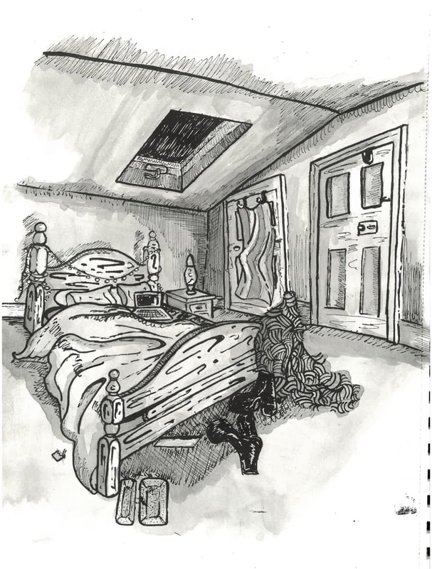
Before I started drawing out my room I was very stressed out, mainly because of the roofline above my bed the other reason was implementing enough "character" into my illustration to make it look like it was my room and not just an outline with some furniture in it. I found looking at artist, Paul Heaston quite useful because he has an expanse of illustrations of rooms, he's in, or ones he's stayed in. From looking at these images I learnt to think about the perspective of what I was looking at, to pay attention to textures and that using watered down ink was a good way to add depth to the illustration. I tried drawing out my bedroom from the view right as you go through the door, but it just didn't look right, it looked to clunky. So, I tried sitting on the opposite side of my bedroom and it worked out looking way better (image on the right). I think getting the angle of the bed right was the hardest part because it was the closest thing to me. Once I'd gotten that right the other parts started falling into place.
For the roofline I found that using the "Y" method very useful, to get the angles of where the roof meets the wall correct, I held my pencil up to the lines and tried to replicate the angle the best way I could. This was the easiest way I could figure out how to replicate my bedroom. I chose to draw my bedroom and specially my bed because it has the most sense of personality in it, I drew this at around 11am right after my friend had left and the room was slightly messy from the night before. Some of my favourite parts of this piece are the blanket over the pole of the bed, the pride flag and the frame of the bed itself. I really wanted to home in on the textures of my room, so it was a more believable recreation. To draw the furry blanket, I used contour lines flicking in alternative directions to replicate how fur fabric gets messed up, For the bedframe I drew in the outline of each part, focusing on the dark coloured streaks that are found in wood, angling my dip pen to create a 'swoosh' motion, I used a similar technique for drawing my duvet and pillows, just by using a rounded soft approach as harsh straight lines don't appear in these things. For my platform boots I chose to use the pen in a heavier way then used a white gel pen to replicate some of the highlights that occurred on the leather material. To get the tones in the illustration I used Heaston's technique of using a watercolour brush and dilute some ink in its barrel. Then going over it in several washes to darken certain areas appropriately.
For the roofline I found that using the "Y" method very useful, to get the angles of where the roof meets the wall correct, I held my pencil up to the lines and tried to replicate the angle the best way I could. This was the easiest way I could figure out how to replicate my bedroom. I chose to draw my bedroom and specially my bed because it has the most sense of personality in it, I drew this at around 11am right after my friend had left and the room was slightly messy from the night before. Some of my favourite parts of this piece are the blanket over the pole of the bed, the pride flag and the frame of the bed itself. I really wanted to home in on the textures of my room, so it was a more believable recreation. To draw the furry blanket, I used contour lines flicking in alternative directions to replicate how fur fabric gets messed up, For the bedframe I drew in the outline of each part, focusing on the dark coloured streaks that are found in wood, angling my dip pen to create a 'swoosh' motion, I used a similar technique for drawing my duvet and pillows, just by using a rounded soft approach as harsh straight lines don't appear in these things. For my platform boots I chose to use the pen in a heavier way then used a white gel pen to replicate some of the highlights that occurred on the leather material. To get the tones in the illustration I used Heaston's technique of using a watercolour brush and dilute some ink in its barrel. Then going over it in several washes to darken certain areas appropriately.
Week two: Experimental image making (part A)
Cat and Dog sculptures
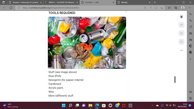
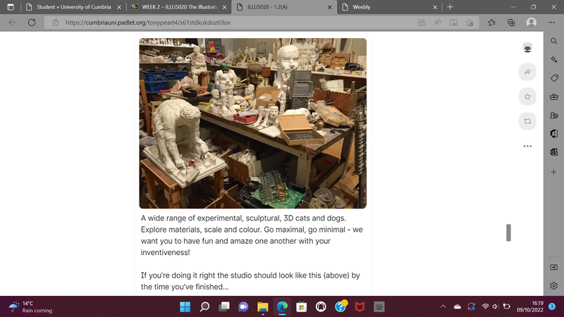
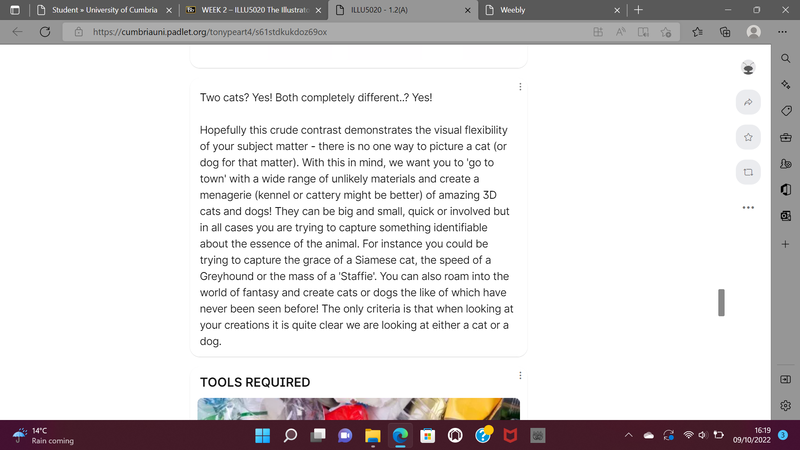
In week two, the focus moved to making 3D sculptures of both cats and dogs, this was a weird project to undertake as these sculptures weren't meant to look identical to cats or dogs. Rather have the essence of them. The tools we were supposed to use other than adhesives of our choices and paint were rubbish, cardboard, cans, bottles, tape, anything. Which came very usefully because our recycling hadn't been collected the week before, so we had access to more pieces. This project while difficult trying to make the different pieces stay together has actually been very interesting. Having to think in a way that means you could look at a cardboard cup and think "hmm that could be a dog's body" has been a very different thought process.
Alan Fletcher
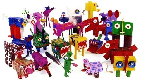
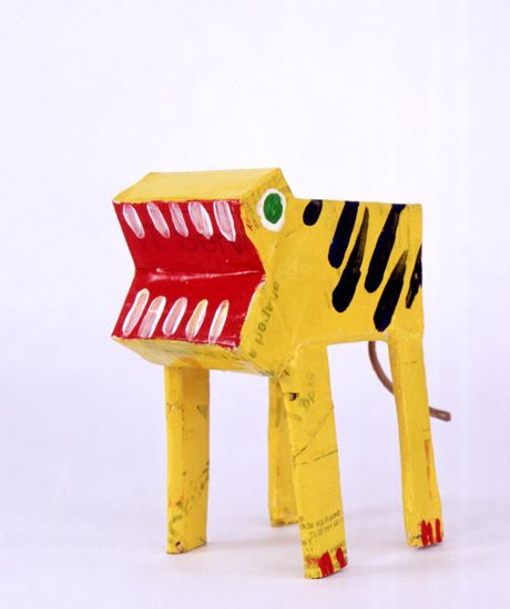
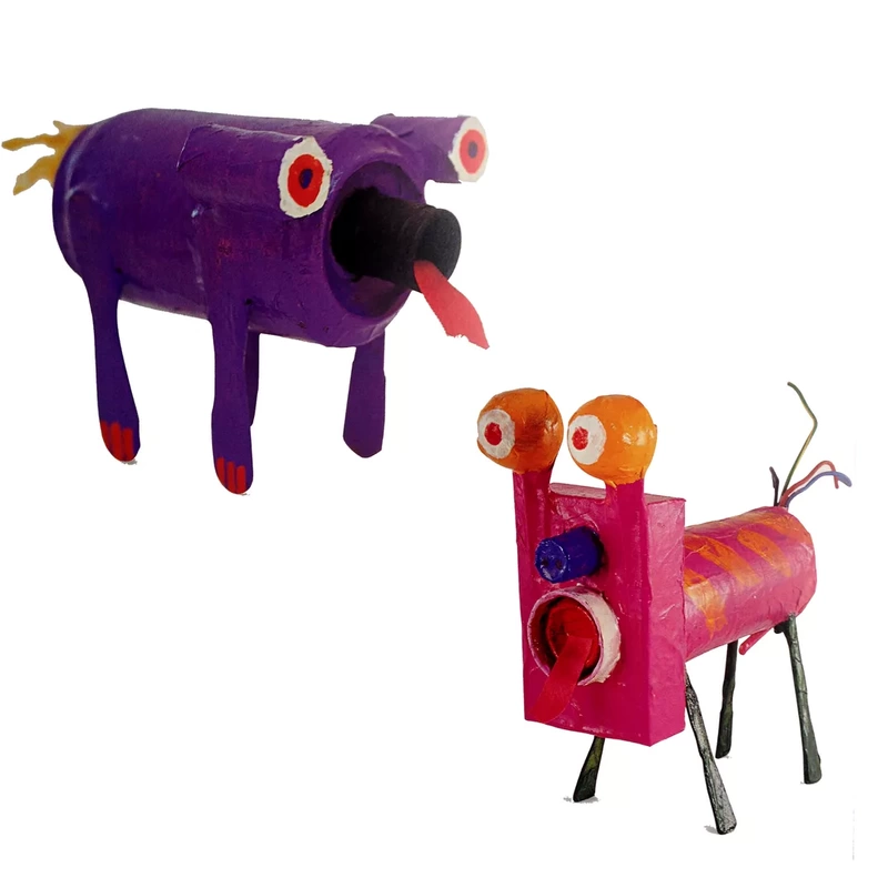
For this project I found it useful to look at the artist, Alan Fletchers animal sculptures. They're so simple and i imagine made of rubbish but they really do portray the essence of the animals Fletcher was referencing.
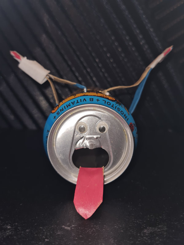
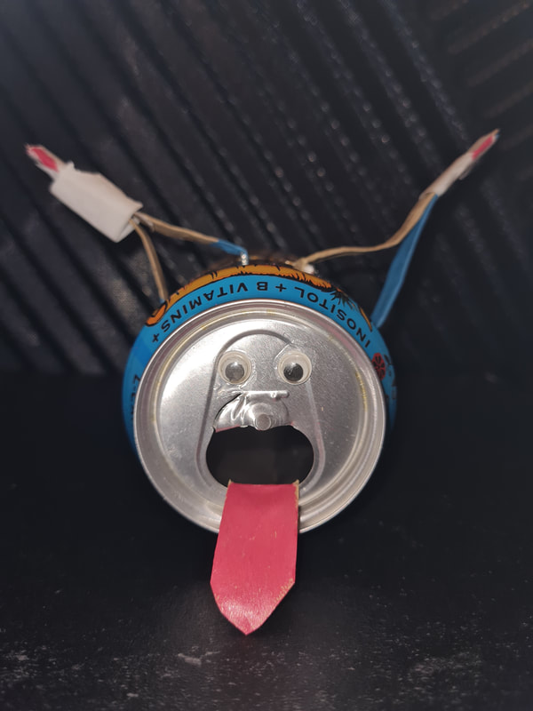
Sully Monster dog
Meet Sully the dog, whose body is made from a monster energy drink can, ears and tongue made from a Primark bag and who has googly eyes.
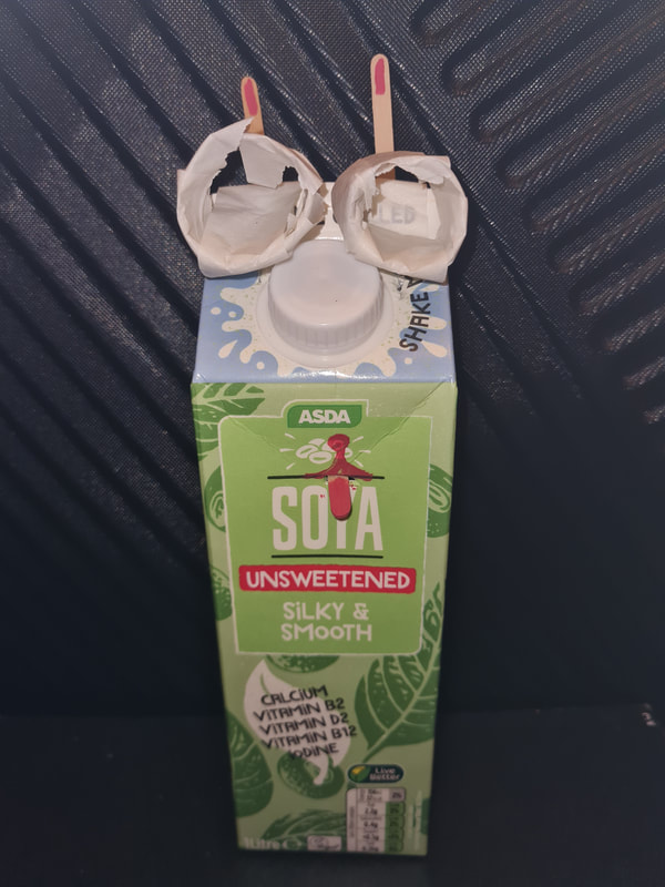
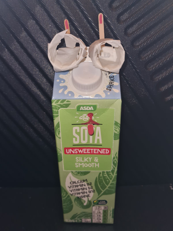
Silky the cat
This is Silky and smooth unsweetened soya milk the 1st, her body is made from a milk carton, I used wooden mixing sticks from Starbucks for her eyes and tongue and painted them, her eyes are made from the cardboard skeleton from kitchen roll.
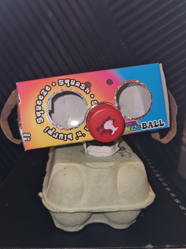
Sausage and Egg McMuffin the dog
Sausage and egg McMuffin is supposed to be a sausage dog, made from an egg carton, a toy box and the straps from a Primark bag.
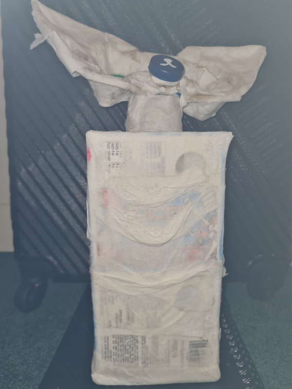
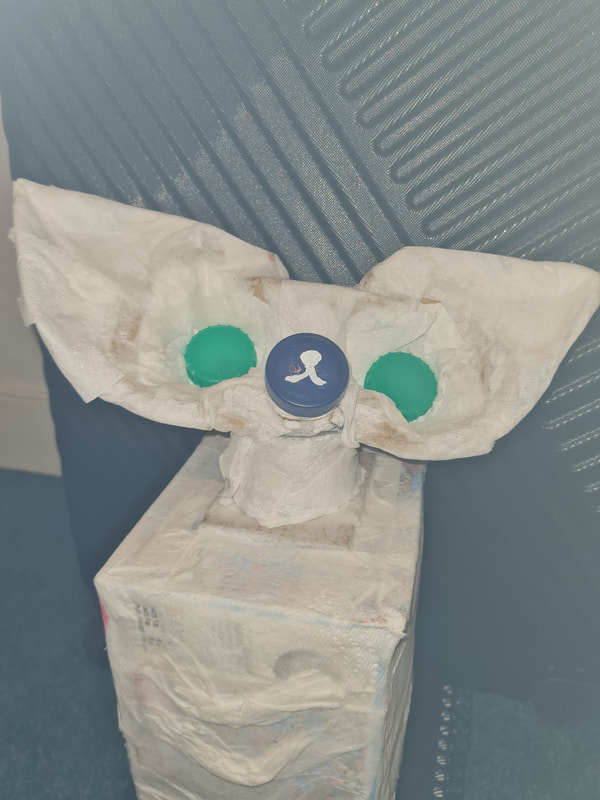
Boxy The Foxy cat
This is Boxy, I used two monster cardboard boxes tp make the body, a drinks tray for her head and two mini cereal boxes to make her ears. Also, two milk caps and an Oasis cap. I used tissue to add texture to the cat because I was referencing a Sphynx cat.
Week two: Experimental image making (part B)
Masks
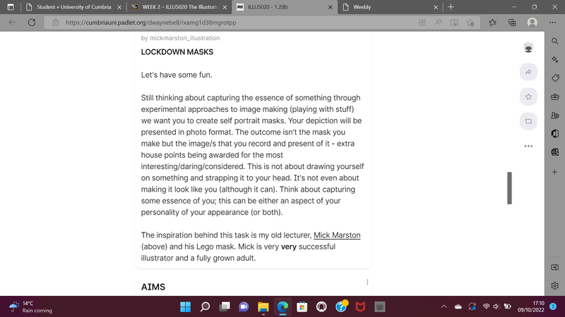
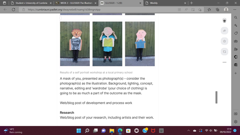
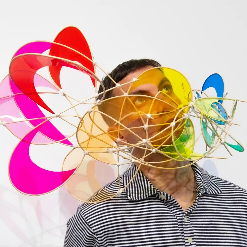
In part B, we were introduced to the mask making project. These masks are about capturing the essence of something in an experimental format, much like the cats and dogs. The outcome being how the final mask is recorded and presented. To capture some part of ourselves, whether that be our appearance or personality. The aim of this week being to recognise the importance of experimental image making and exploring different approaches.
Experimental masks
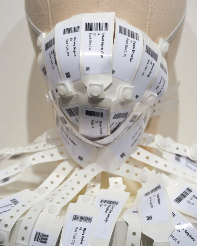
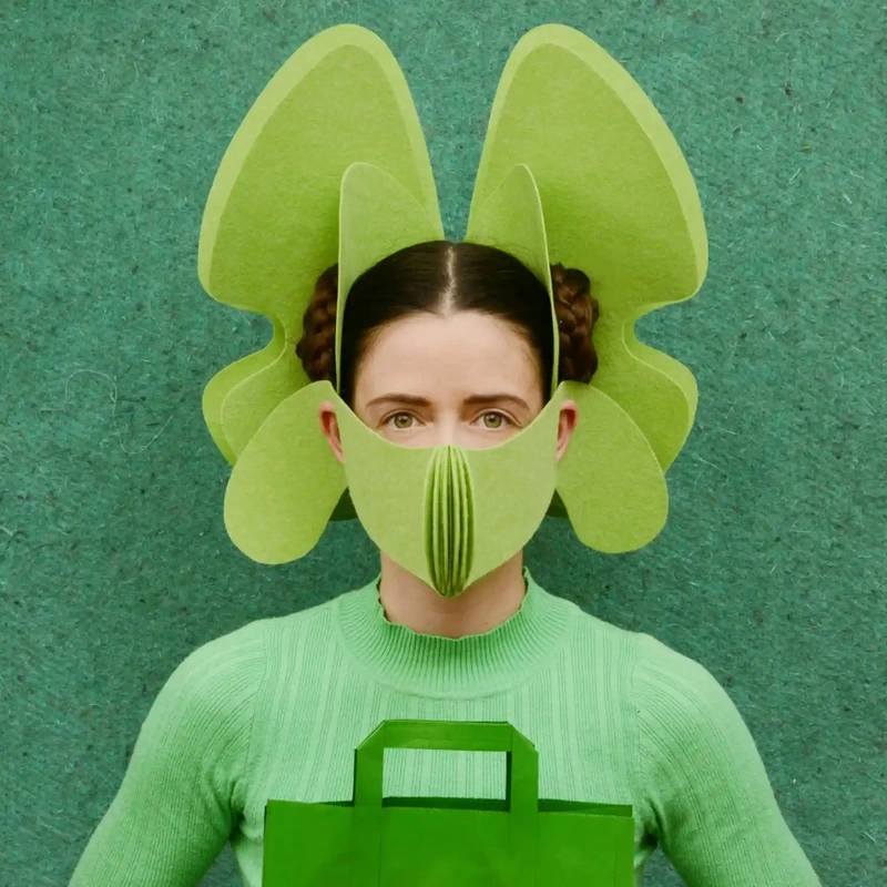
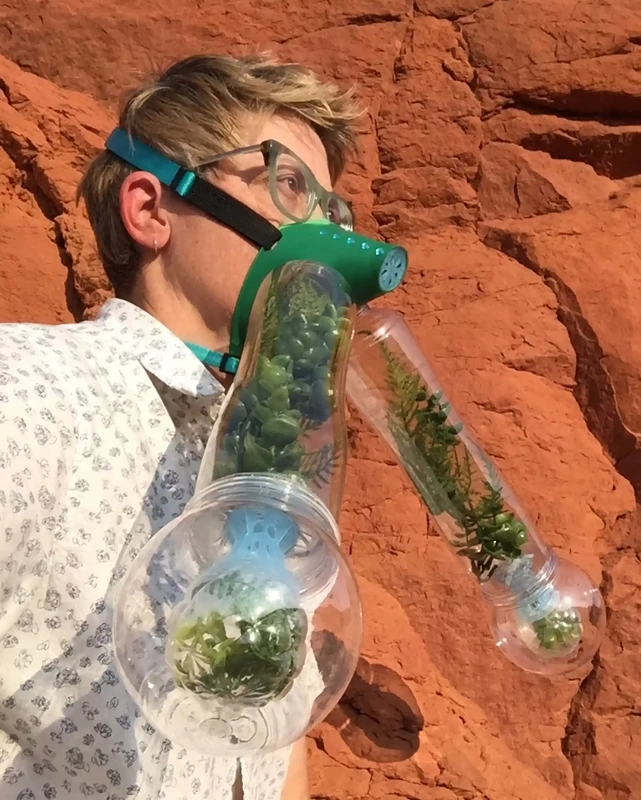
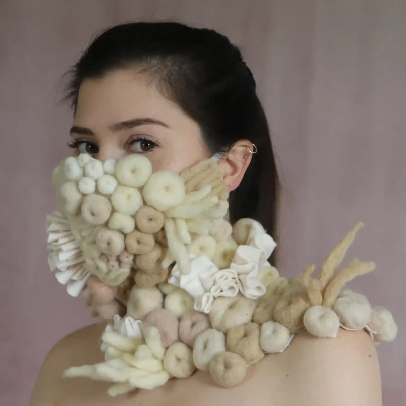
When I was first conceptualising my mask, I looked at these renditions for how I could photograph and present the finalised mask, noting how these artists have made theirs so eye catching and beautiful. Each has their own personality and sense of character. For example, "food" by Freyja Sewell and "our dying coral reefs" by Felicia Murray give off completely different essences. This comes from how they've been photographed. Sewell has chosen to make a monochrome colour palette of different shades of green. The mask, paper bag and sweatshirt all being green creates a uniformed look that is beautiful to look at. While the structure and form of the mask give editorial photography vibes. The opposites could be said for Murray's mask, with its soft neutral palette it is the opposite of Sewell's very bold structure. From these masks it's important to note that that what the model is wearing, setting, colour palette all play into making something appear more professionally presented then amateur.
My Mask
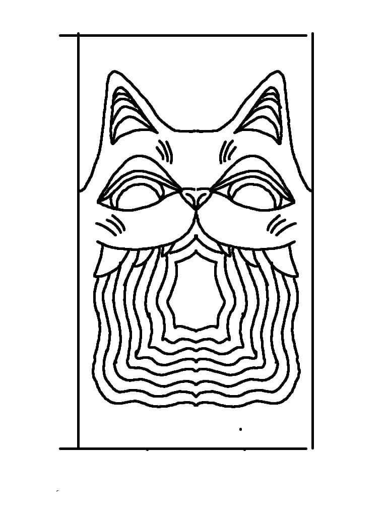
When we were first given the brief to make a mask made to replicate our personality, my mind was filled with many different concepts. I decided to sketch them out first. To see which one made the most sense with the materials I had available and also for the time we had to do it. I find these tasks based on us difficult because it's hard to condense your entire being into one art piece. However, I think i managed to pull on many different elements and make them work cohesively. I found this a very interesting piece to make as many of my ideas and thoughts changed from when I started to when I finished.
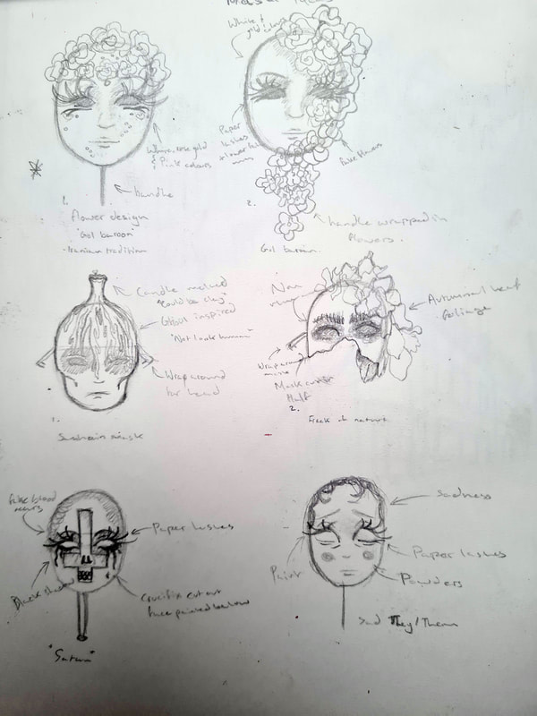
I initially had 3 main ideas that stuck out in my head, a Gol Baroon inspired mask, A Samhain inspired mask and a horror mask. I'm proudly mixed race, half Irish and half Persian so I really enjoyed conceptualising customs from each of these cultures.
Gol Baroon is a wedding celebration in Iran, it is when the bride and groom are surrounded by their guests and showered with flower petals or flowers at the end of the night. It's always been such a beautiful part of the ceremony, it's like showering the couple in love before they start their life together. It was something I really wanted to depict in my mask as my cultural identity is such a huge part of my personality.
Samhain is the Gaelic festival marking the end of harvesting season it marks the start of winter, bringing in the "darker-half" of the year, In Ireland it is called Samain or Samuin in Irish literature from the 9th century onward. It is part of four Gaelic calendar celebrations Samhain (1st of November), Imbolc (1st of February), Bealtaine (1st of May) and Lughnasa (1st of August). The celebration of Samhain is very similar to Los Dios de los Muertos, in the belief it is the time in which the doorway to the otherworld opens. Allowing the dead and the lost souls to once again walk on earth. Human sacrifices, offerings and Bon fires are alleged rituals of ancient Samhain. I wanted to reference this in a mask as masks were also something worn to trick evil spirits into believing you too weren't human.
My last idea for a horror mask was more related to my love of horror movies, sfx special effects and makeup, true crime documentaries and all things Gorey. Pulling on a more personal element rather than the cultural ones. However, I felt it was my weakest idea but also overly done.
Mask concepts
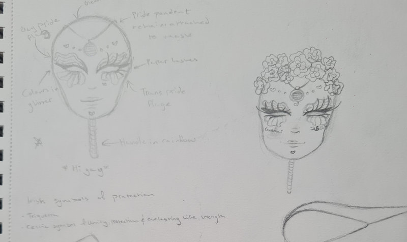
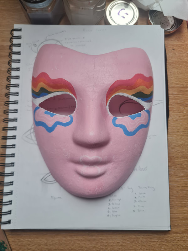
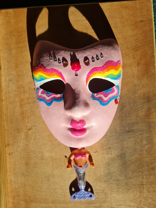
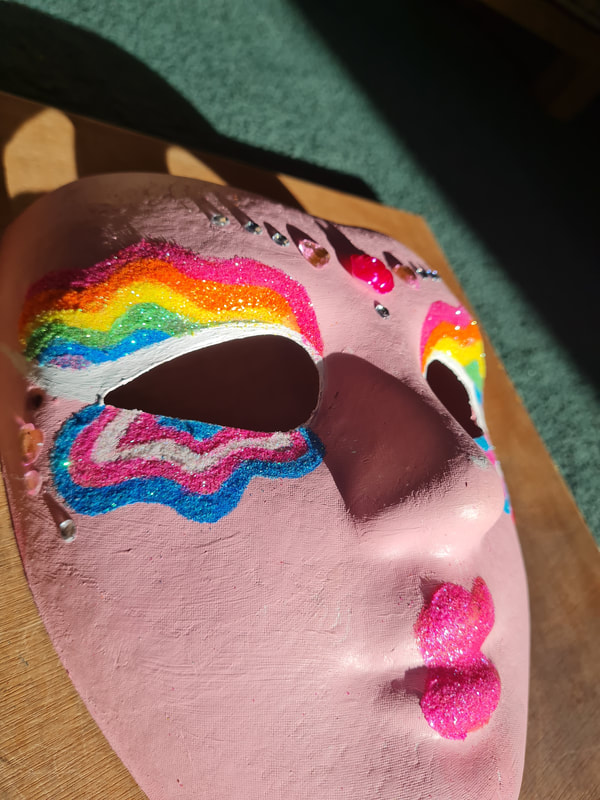
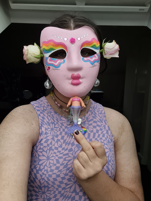
I decided that a good representation of me would be to reference both my Irish and Persian heritage while also referencing my queer culture as a gay and non-binary relating person. From my Persian culture and also my queer culture I wanted to reference the sparkly aspect, while from my Irish culture I wanted to reference how people are very proud of themselves. and to be themselves. From that I decided that using flowers attached to the mask could reference the Gol Baroon ceremony, around the eyes the Gay pride flag but also the Trans pride flag (non-binary is under the trans umbrella) could be done in glitter to replicate the make-up people wear to pride ceremonies. I had heart stickers and flower stickers and thought these could reference the beauty that Ireland and its people have, and its Love it shows to itself but also many around the world.
When I was drawing these, I thought of the letter I got from my Irish grandparents after I came out as gay and then later as non-binary. Full of support thankfully they wrote the Gaelic word for protection: "Caomhnu". I thought of how I didn't get that with my Iranian grandparents and gave it to myself and used the Farsi word for protection myself "حفاظت".
When I was drawing these, I thought of the letter I got from my Irish grandparents after I came out as gay and then later as non-binary. Full of support thankfully they wrote the Gaelic word for protection: "Caomhnu". I thought of how I didn't get that with my Iranian grandparents and gave it to myself and used the Farsi word for protection myself "حفاظت".
Final mask process
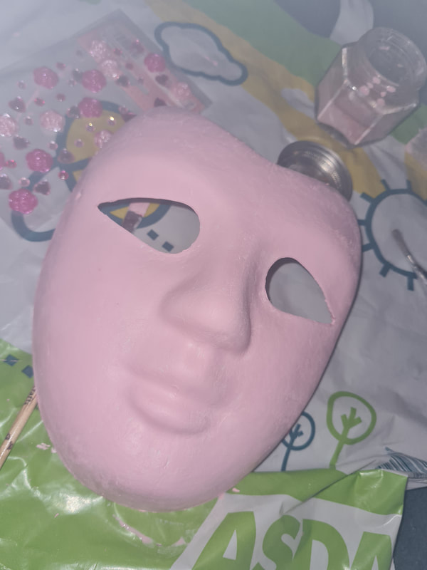
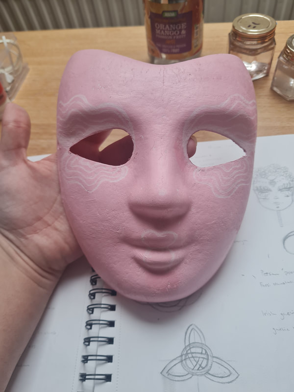
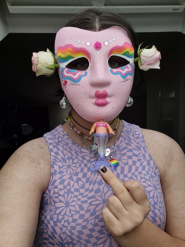
My process of making the mask was straightforward because of my planning earlier on in the project, I think the idea of making an amalgamation of my ideas came out. I started off my painting the mask a baby pink colour because it's my favourite colour, using a white pencil I sketched out the details for the mask. The next thing I did was paint a layer for each of the colours, after which I used a layer PVA glue. Both of these layers gave the mask a grip for the layer of glitter. doing it this way allowed the glitter to grip properly to the paper mask. I then attached the flower and gemstones using PVA glue. It gave off the right vibe that i wanted which was "Barbie having an aneurism in Claires".
Aneurism in Claires
Unintentionally flipping off the viewer woops
Week three: Paint
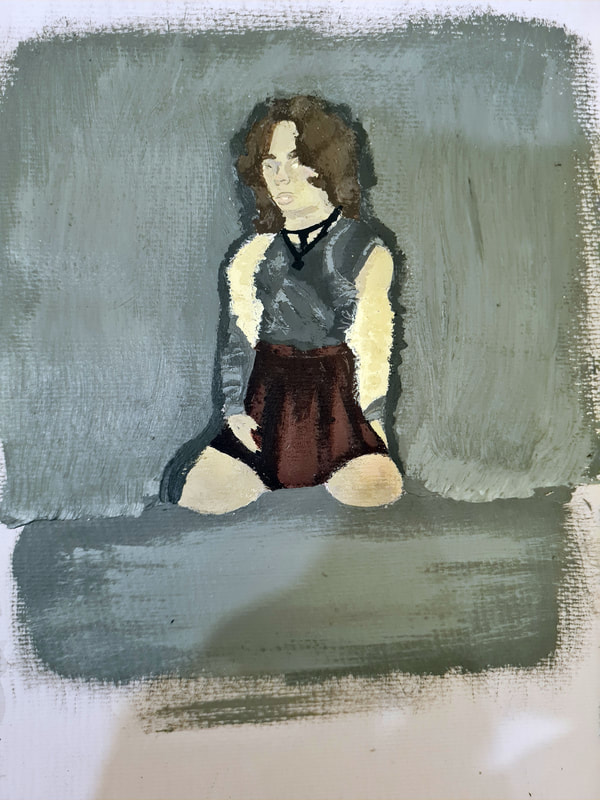
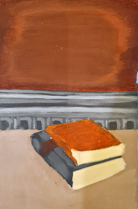
In week three we returned to the subjects of week one, small still lives and self-portraits, however the differences this time was the mediums we were expected to use. We were tasked to used acrylic paint and watercolour. By selecting four artists and relating them to either acrylic paint or watercolour the task was to look at how these mediums could be applied to different surfaces and what techniques we could identify and use in our own work.
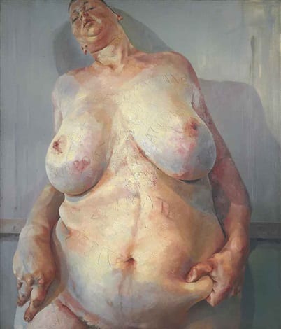
Jenny Saville
Jenny Saville is a British contemporary artist; in her artwork she specializes in using oil onto canvas, her subjects being fleshy, obese female figures. I noticed that in Saville's work she uses thick layers of paint on top of each other, this conveys a sense of weight and a heavy feeling because of doing this you can see the motion in which her brush of palette knife has applied the paint. For my painting I used Acrylic as opposed to oil paint because I didn't have access to oil paint at the time. I felt that these two mediums have the same application process. I noticed that Saville is very good at using blue and red hues to add life or even death to her paintings. This is something I tried to replicate as well as the extreme proportions Saville uses in her work.
Brad Holland
Brad Holland is an American self-taught artist; his work is known for its unconventional and often weird subjects but painted in such a beautiful dream like way. In his work Holland used acrylic paint the most, so it was an immediate choice to reference him as an artist for the project. One thing I attempted to replicate was Hollands approach to painting, He preached the "dry brush" technique. Which means he often painted onto a dark surface using layers upon layers would apply lighter colours on top to get a natural gradient. This was definitely weird as you have to leave each layer to dry fully before brushing on a new layer. To improve this piece, I want to go back and add lighter layers where appropriate.
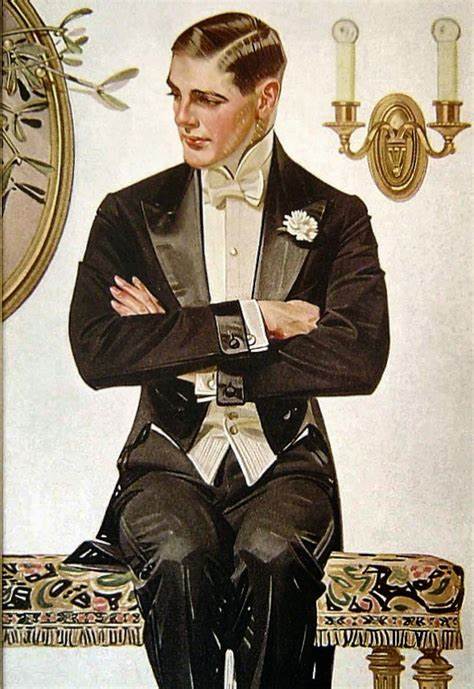
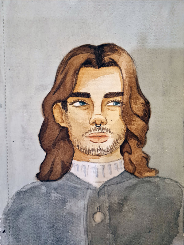
JC Leyendecker
JC Leyendecker was an American illustrator; his work is primarily known for its art nouveau style and intricate hair details. Leyendecker worked with oil on a variety of different surfaces, most notably onto cardboard. One thing I noticed about Leyendecker's work was how he illustrated hair. Instead of focusing on little details he would instead break down the hair into simpler shapes. Due to when he was working curly hair or hair with waves to it was popular and made quite the appearance in Leyendecker's work. I found this a really useful approach to drawing hair. Instead of working on little bits thinking of the finished piece allowed you to add details in ways you might have missed. I worked in layers of watercolour to replicate the way Leyendecker way able to get such believable shading and highlighting in his work. My only improvements would be to get more skin tone midpoints in. However, I really liked working this way and found the outcome very beautiful.
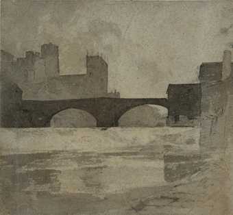
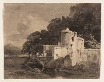
John sell Cotman
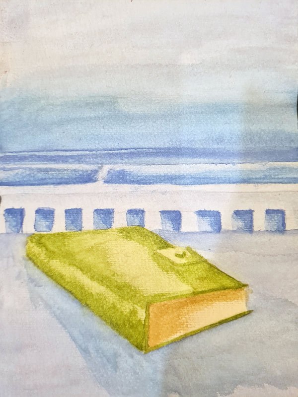
John Sell Cotman was an English watercolour painter, his technique at the time to painting his many landscapes was to use watercolour washes. This process involves painting many layers or "washes" to your painting to deepen the colours in certain areas of your piece. I think this was most successful in the leather book I painted, because of its texture it picked up many different shades naturally, so it was very easy to try and replicate in the painting.
Weeks 5-8: Digital
Week 1-2: Photoshop
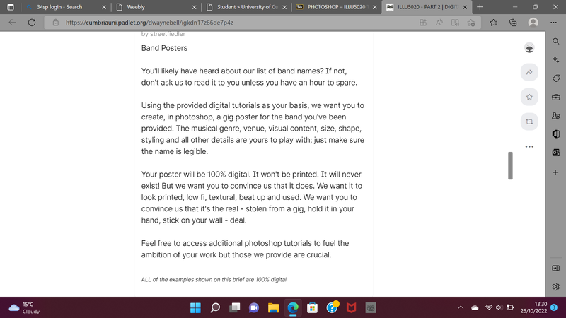
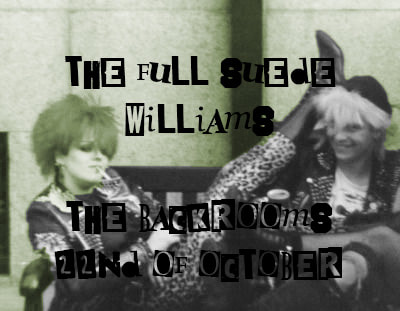
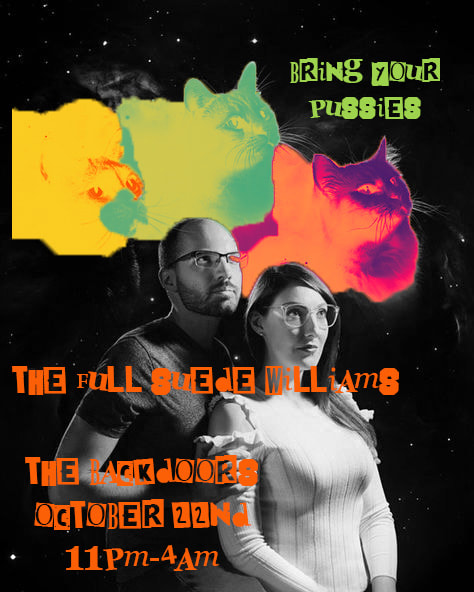
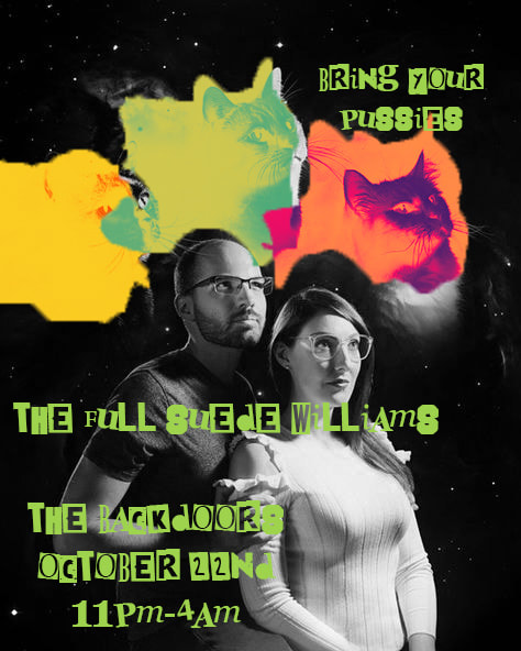
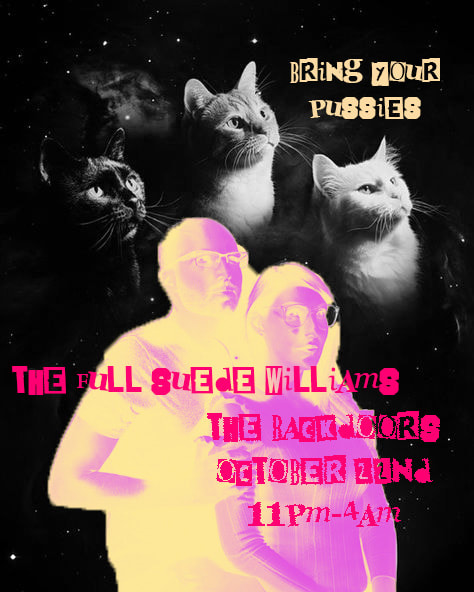
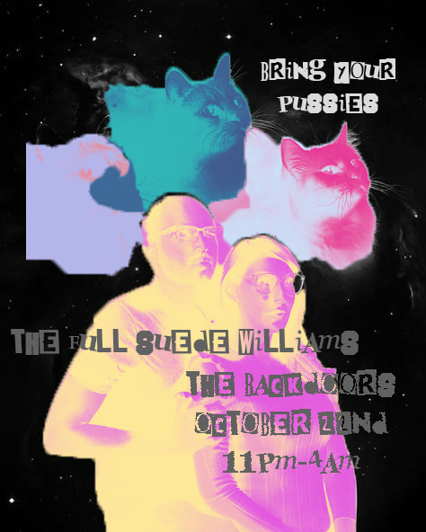
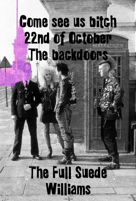
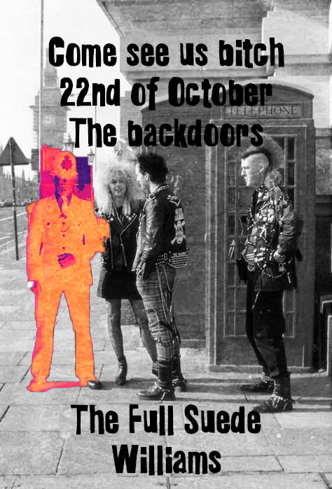
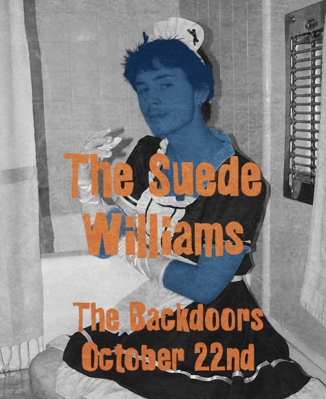
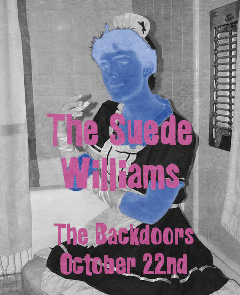
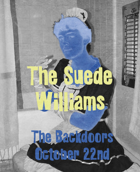
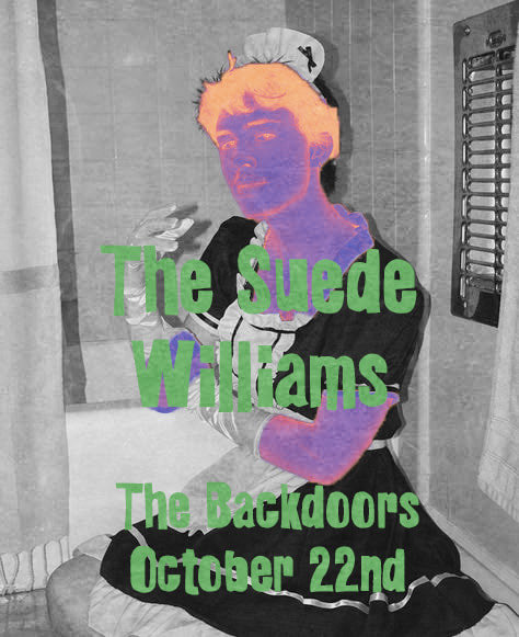
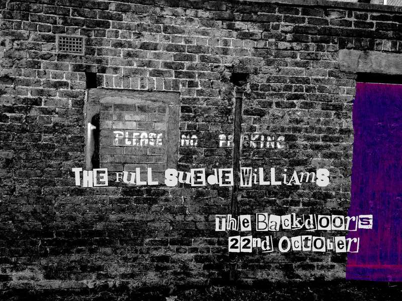
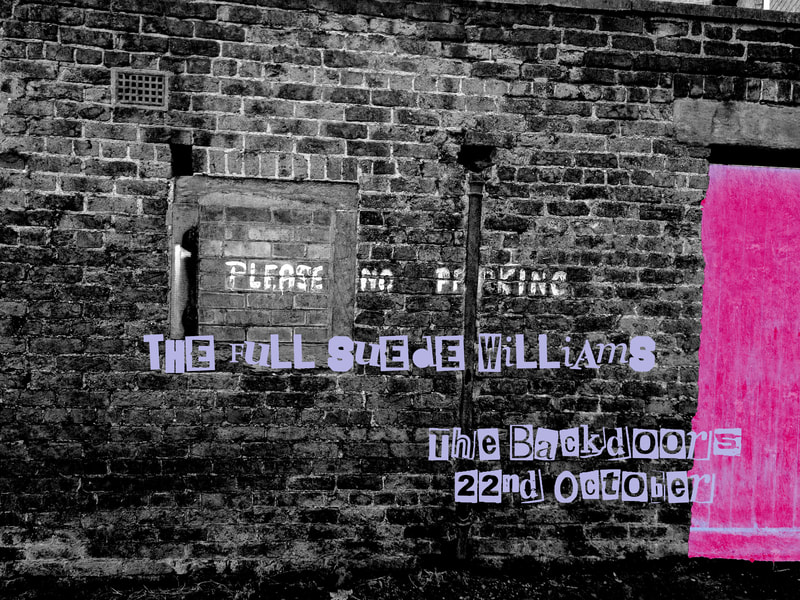
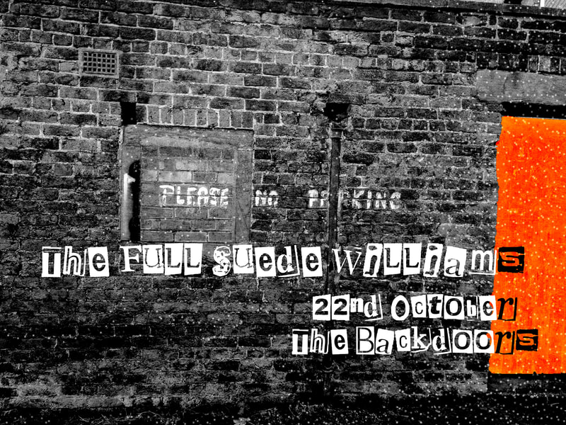
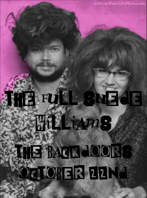
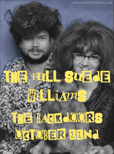
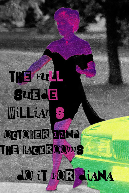
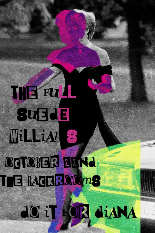
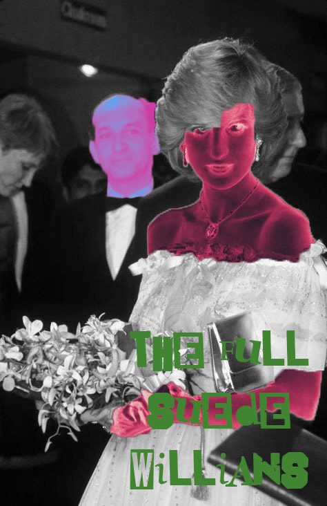
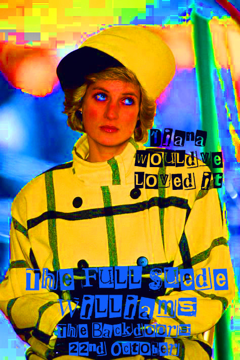
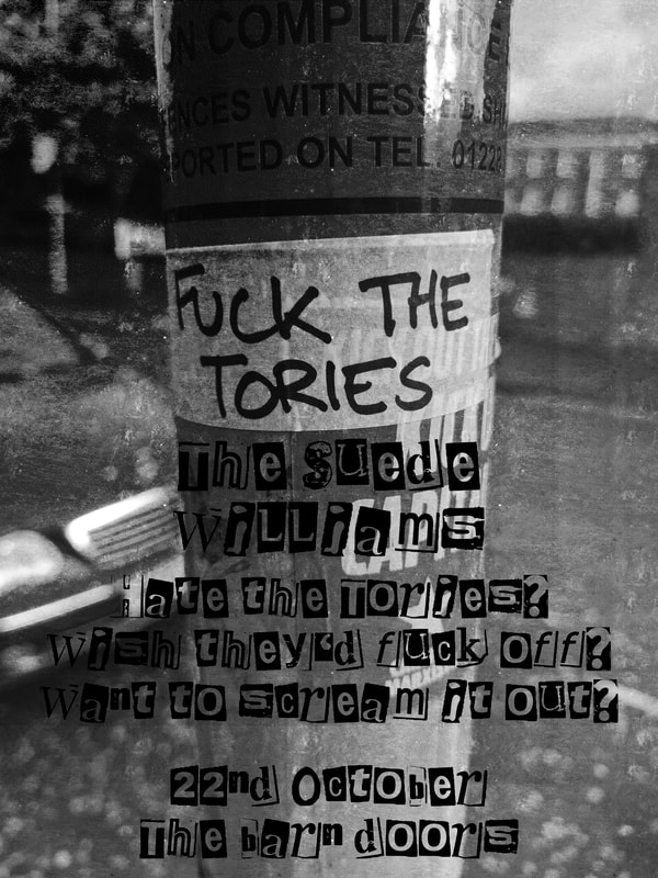
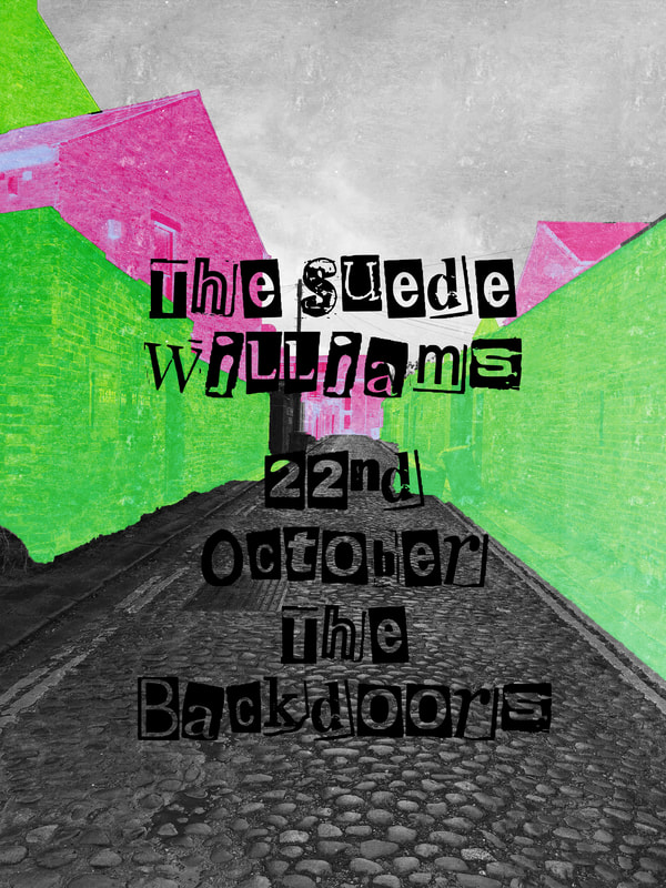
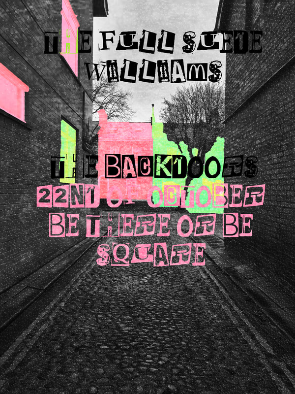
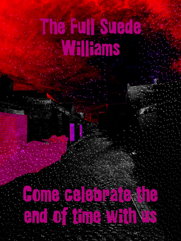
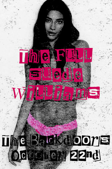
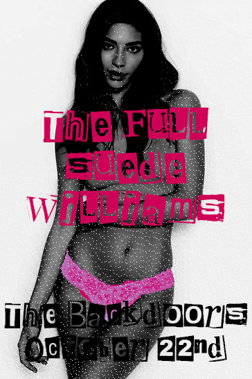
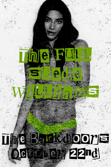
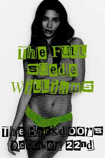
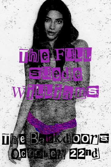
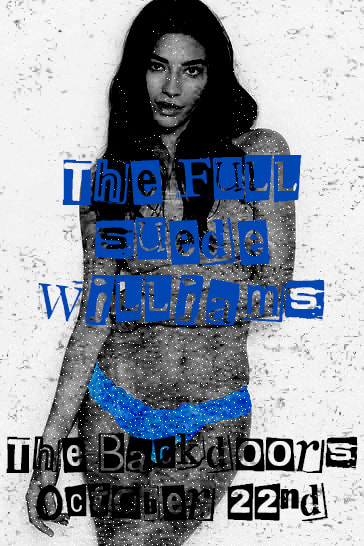
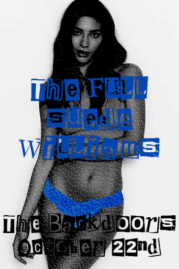
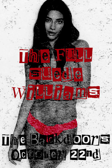
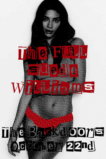
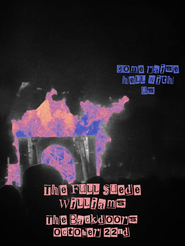
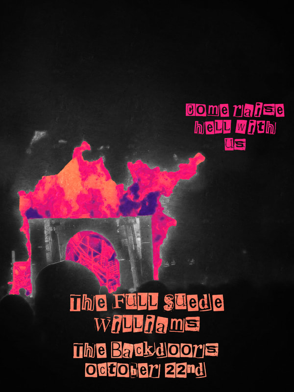
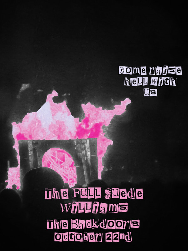
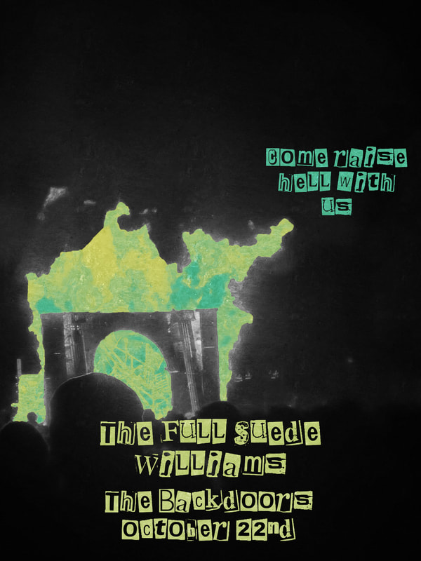
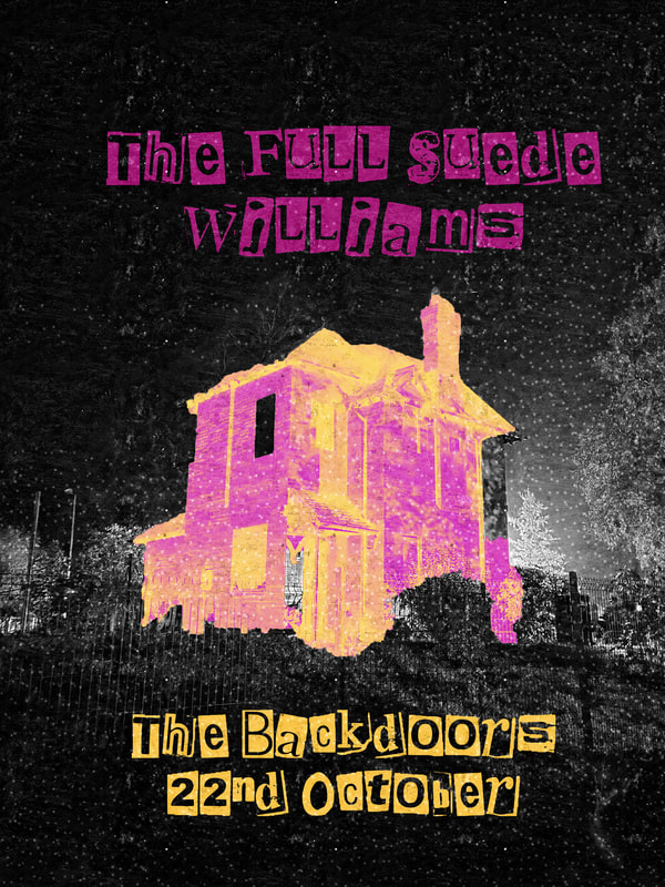
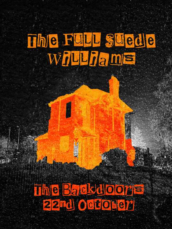
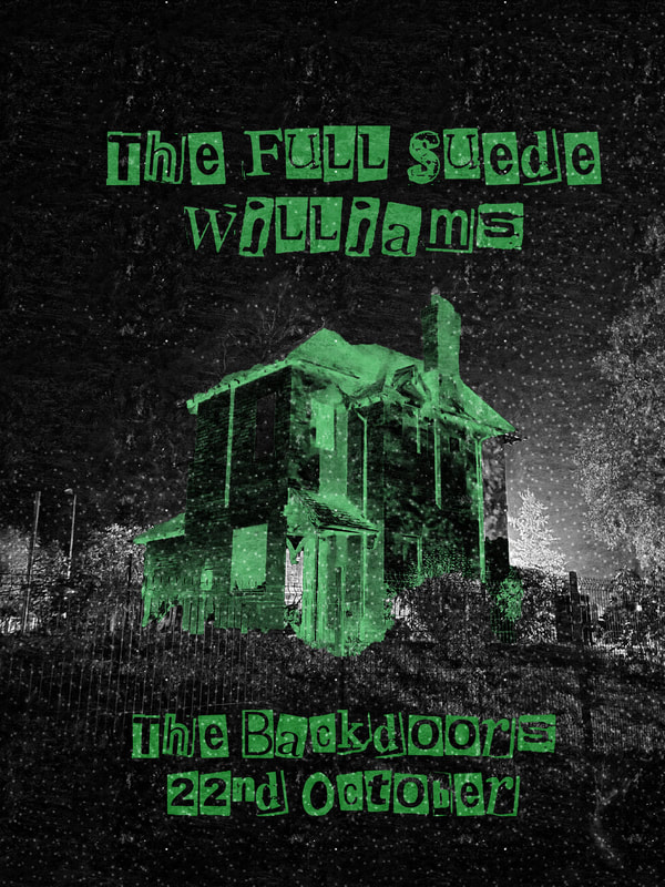
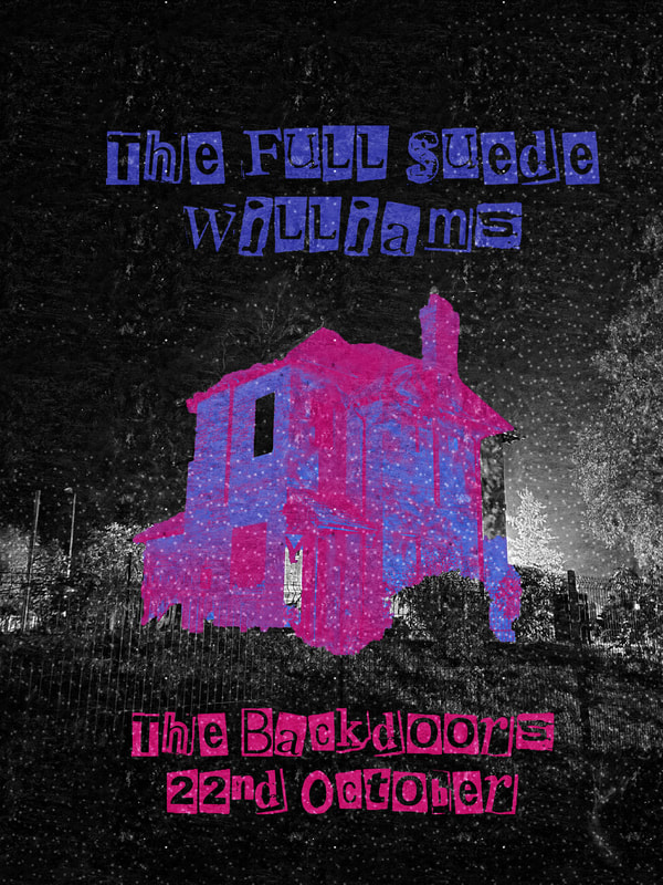
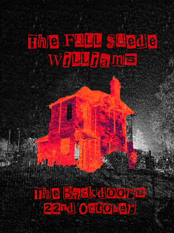
In this two-week block of the digital project, we were asked to use photoshop to create band posters for a band given to us by the name generator. We were asked to present at the end of this project a completely digital poster that looked ike it could be a real thing. The genre, venue, size, shape and style were own choice.
The Suede Williams
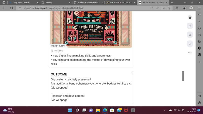
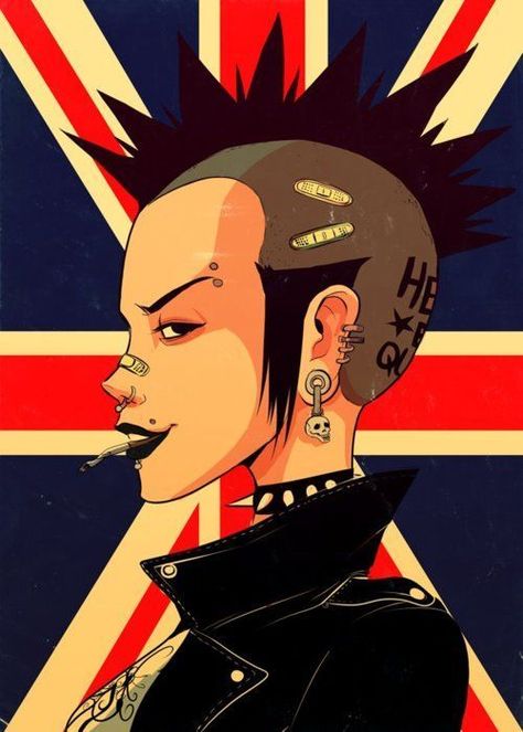
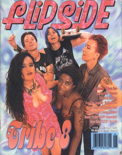
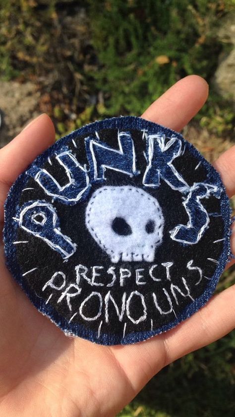
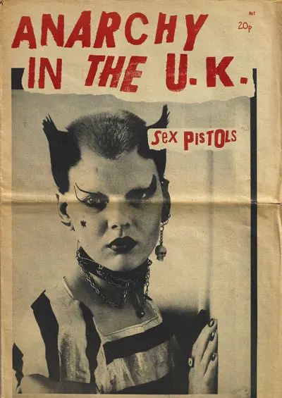
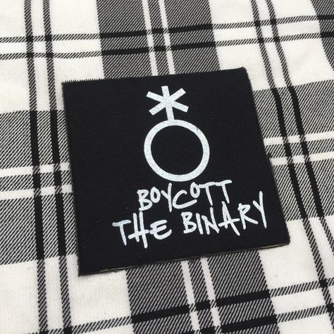
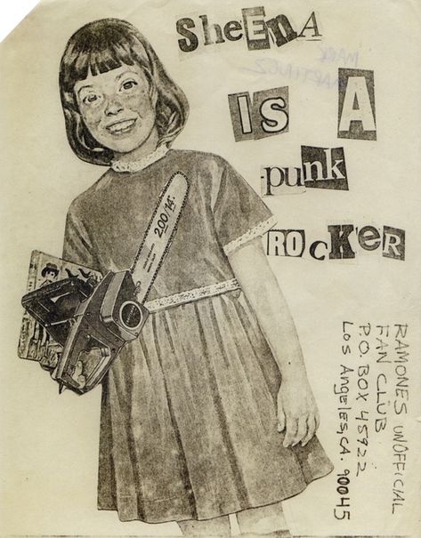
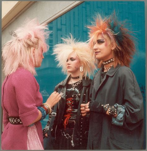
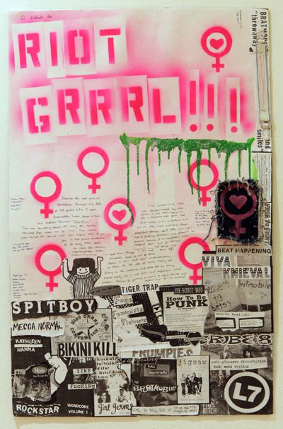
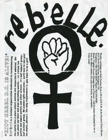
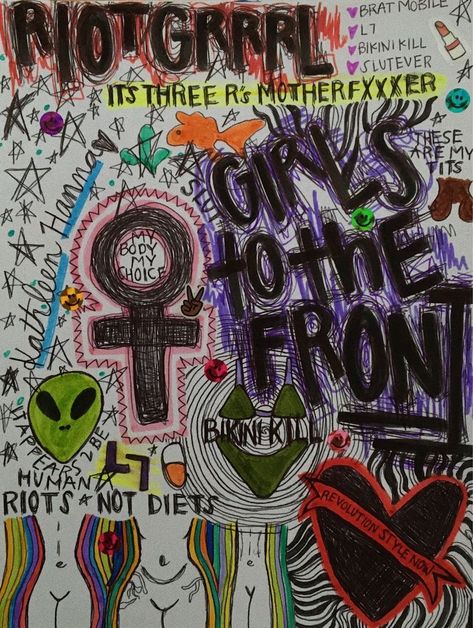
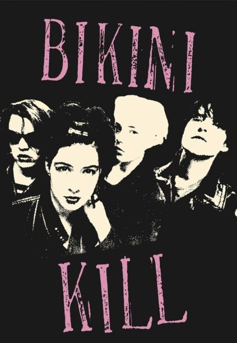
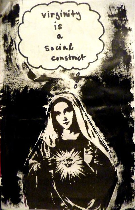
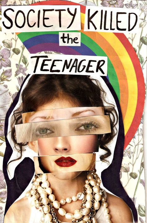
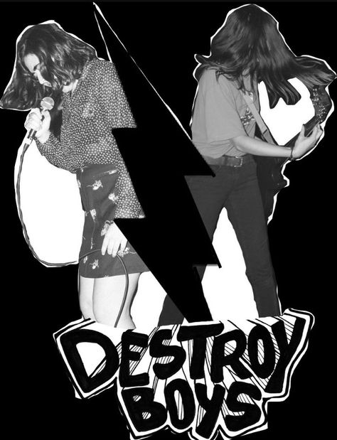
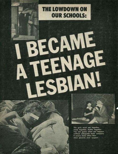
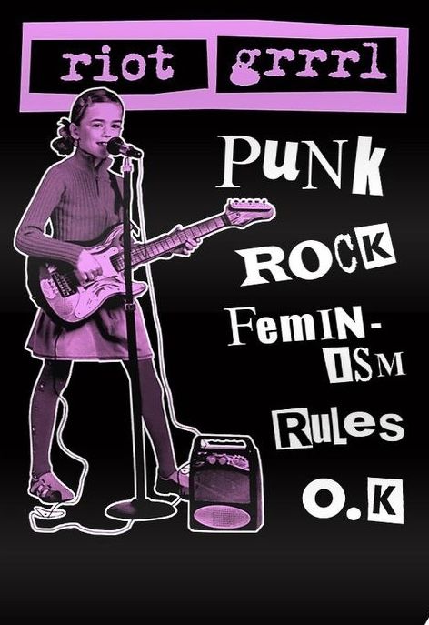
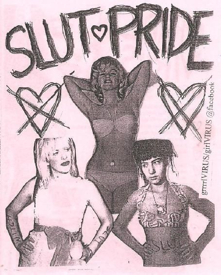
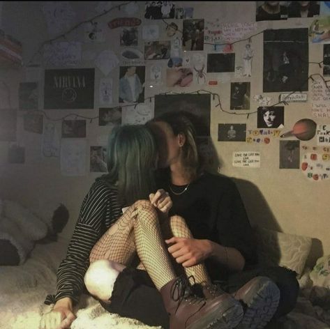
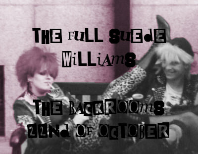
The band name I was given was "The Suede Williams", I immediately thought of some of the bands I listen to and the genres they come from. For example, AJR, The Wombats, The Menstrual Cramps, Dog Park Dissidents, The Muslims, Le Tigre, Pansy Division, Bikini Kill and Dream nails. These bands all come from Indie + Indie subcultures, Punk, Rock or Queercore. There was something in the name "The Suede Williams" that made me think they could be a band from one of these genres. I also got the idea of a dad rock band, a band formed by a group of dads all called William. From this I started looking at these bands' album covers, performance flyers, official merchandise and so on to get an idea of the aesthetic I should reference.
Inspiration images
Initial ideas
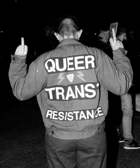
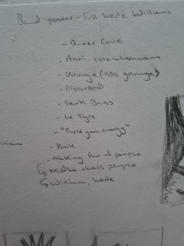
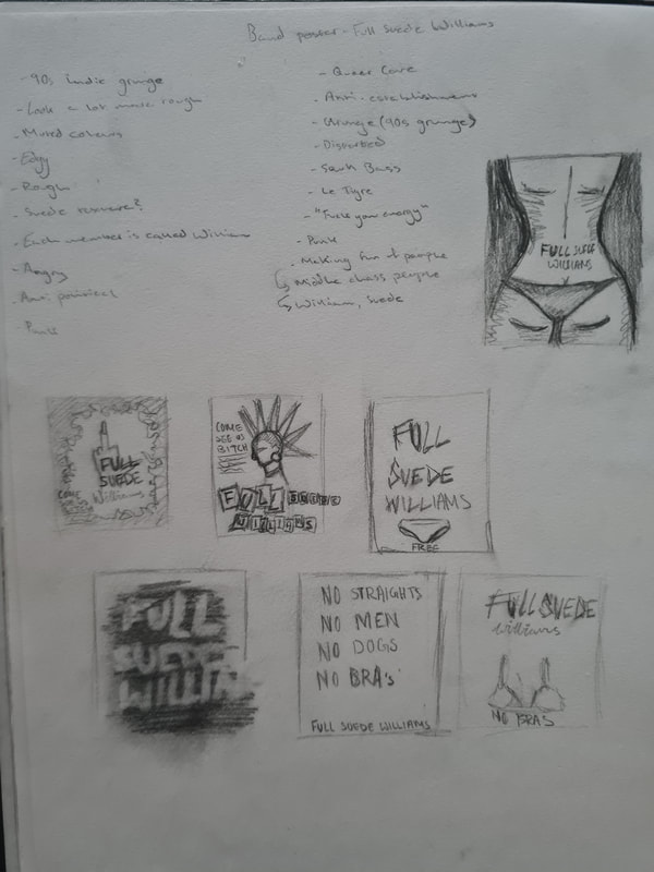
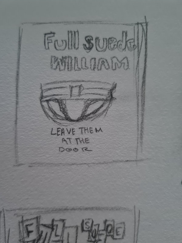
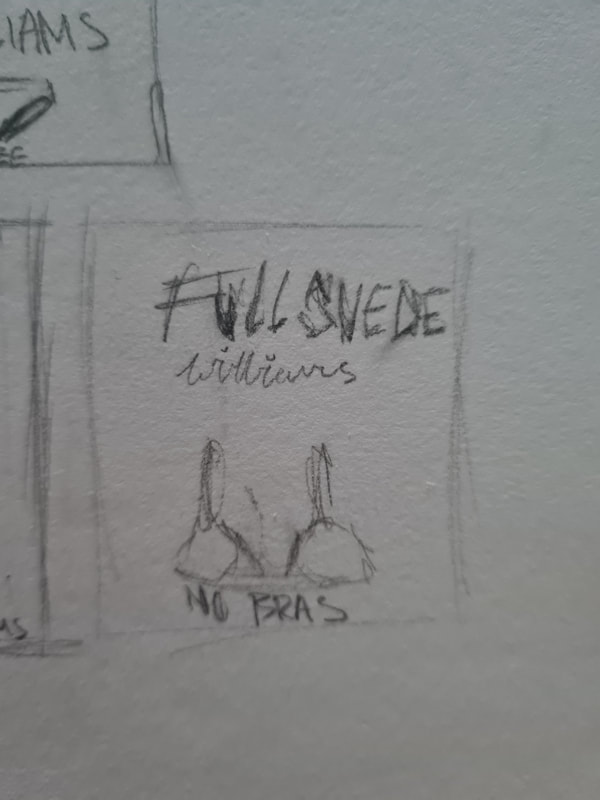
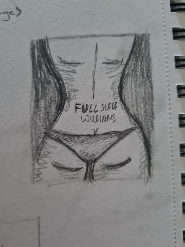
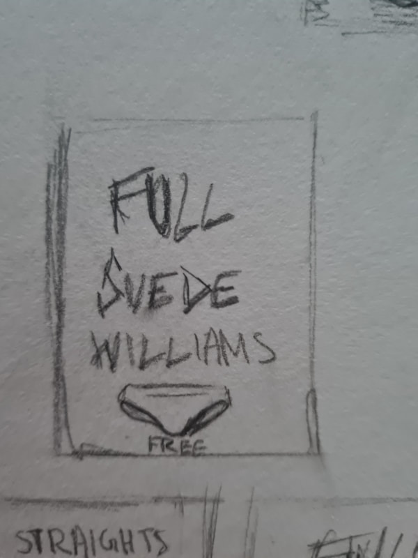
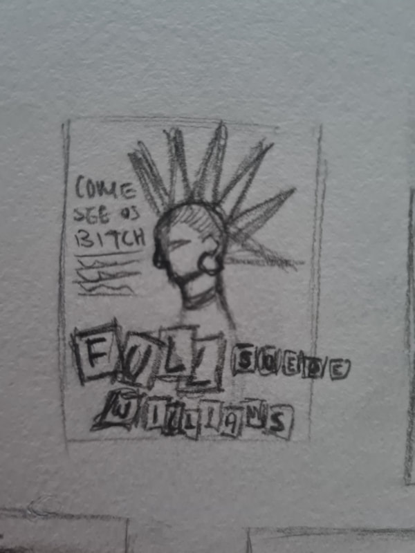
This was an idea generation plan I had, I thought about the name "The Suede Williams" and wrote down the words that initially came to my head. Most of the words that came to my head revolved around punks or queer punks and the ideologies, thoughts and attitude that comes with being a punk. Being a punk is about being an individual and rebelling against the conformist society in which we find ourselves, in essence doing what you want and not giving a f*ck what anyone thinks. I immediately thought that The Suede Williams could be queer punk band, referencing bands like The Menstrual Cramps and The Muslims I thought that this band would be anti-establishment, anti-capitalism and having an anti-hetero-normative vibe to their songs, performance and aesthetic.
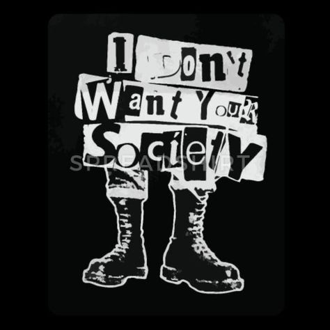
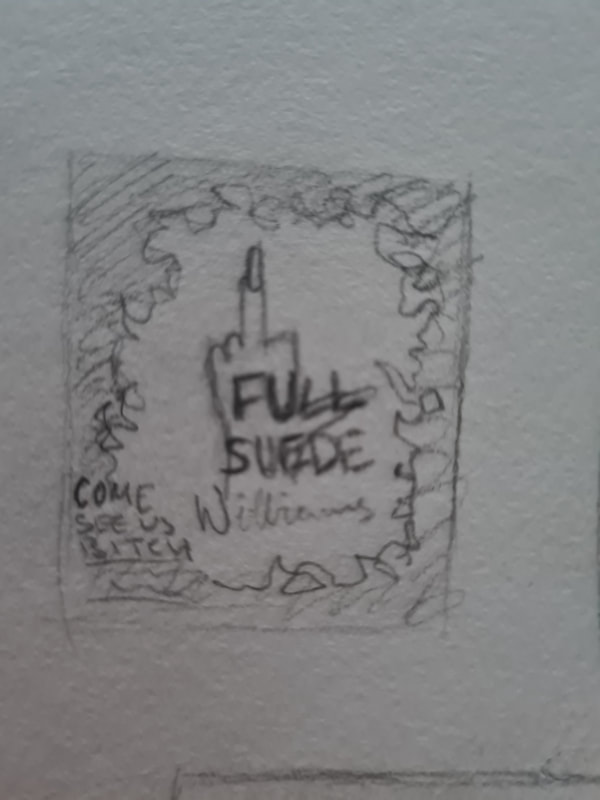
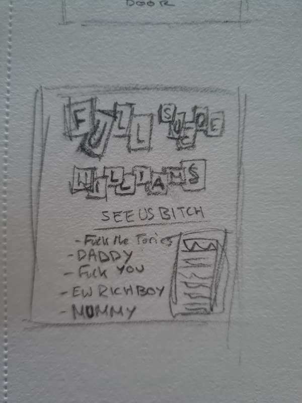
My first ideas revolved mainly around the themes of shock value, political response and a raw, unbothered approach to the societal values or beliefs. I want this poster to be eye catching, so using contrasting and bright colours, bold shapes and fonts was really important to me. I chose to also reference a lot of British punk because of how rough its aesthetic is. You'll see people wearing chunky boots, spikes, leather jackets, wearing their hair in mohawks or liberty spikes and doing what they want. Looking at posters I noticed a lot of them had a typeface that looked like newspaper lettering cut outs.
Sex sells
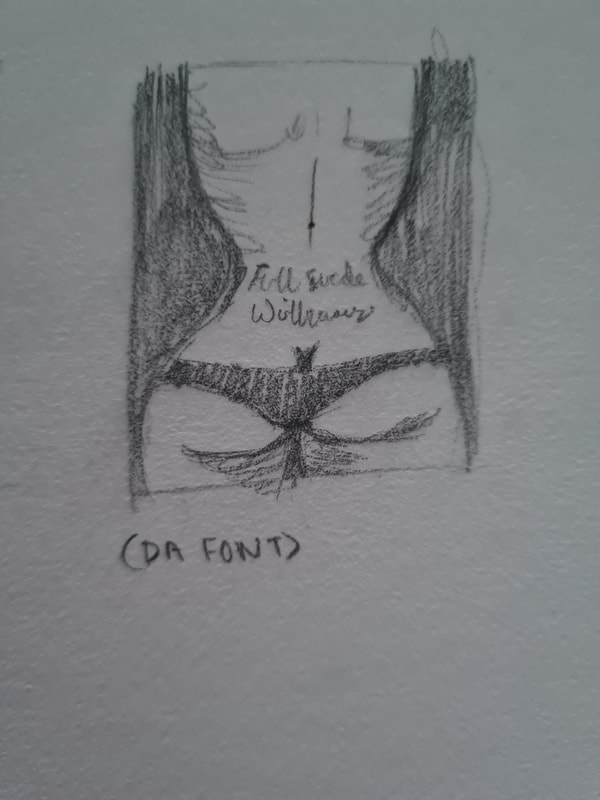
Using sex as a shock factor theme is common in punk genres, the ideology is very sexually free. In queer punk scenes talking openly about sex and the experiences around it and "sex symbols" is quite a common theme in songs, album covers and aesthetics. I think that using the images of bras or jockstraps or even the nude elusion is an individual choice. It can be done in an uplifting manner and break stigma around sex and sexual pleasure, which is very punk.
Using negative space
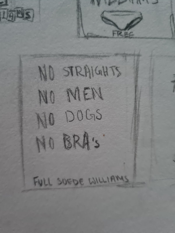
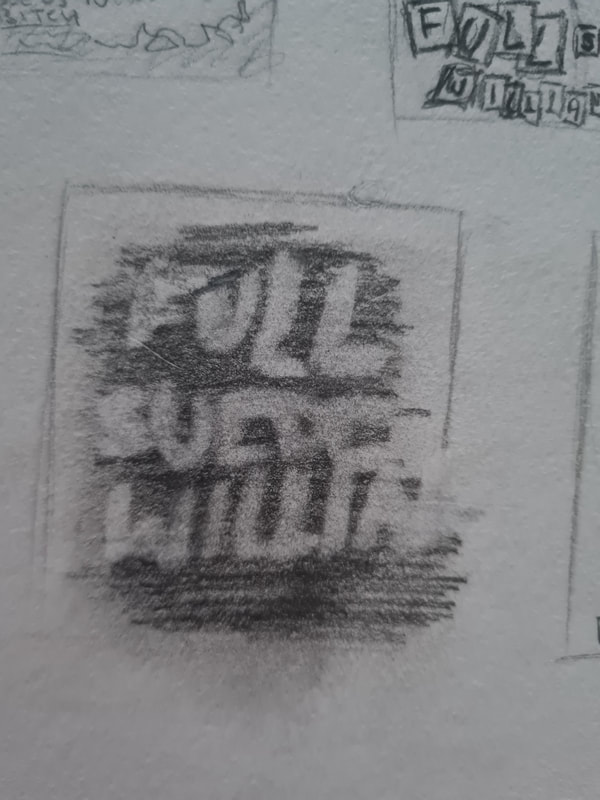
I thought that using simple negative space could be cool idea, utilising the strong contrast between using black and white, which could reference the blunt and raw attitude that is associated with Punk. For the idea in the middle, I referenced the "No blacks, no dogs, no Irish" signs that adorned many British pubs after the second world war. Meaning to Demonise Black and Irish people I thought it'd reference queer punks' attitude to hetero-normative and cis-normative societal attitudes.
Punk Shock factor
From looking at Queer punk and queer art I noticed a lot of artists using shock values to make their pieces more eye-catching to the wider audience. Use of power symbols and words, bright colours, rough and harsh lines and a look of being grungy is a common thing in this art form.
Typeface choices
Friends
Cats
London Punks
Maid boy
Please No Parking
Sloths
Diana, Princess of Wales
Alleyways
Sex Sells
Fire
The House
Week 2-4 Illustrator
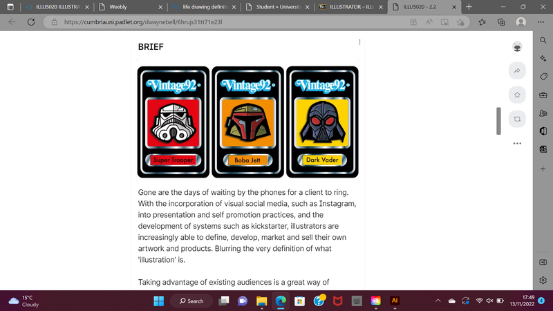
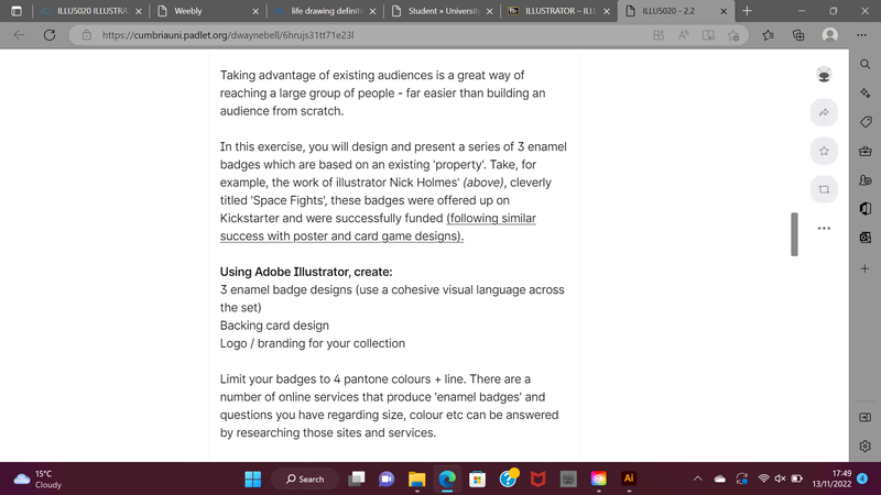
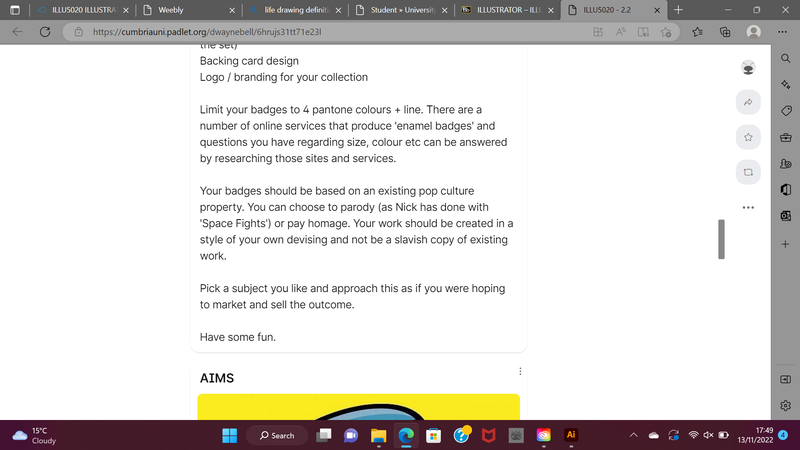
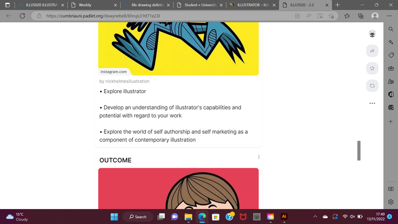
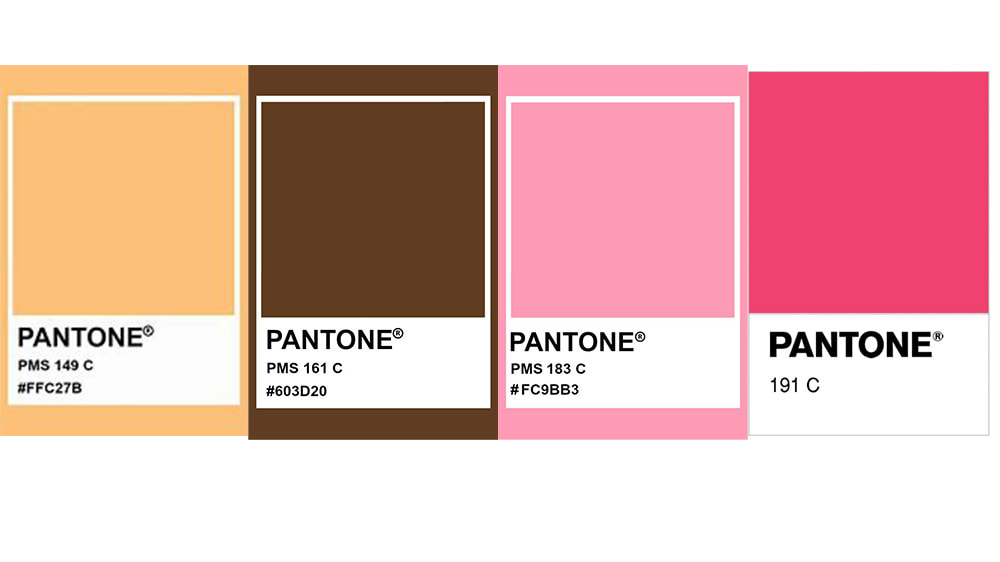
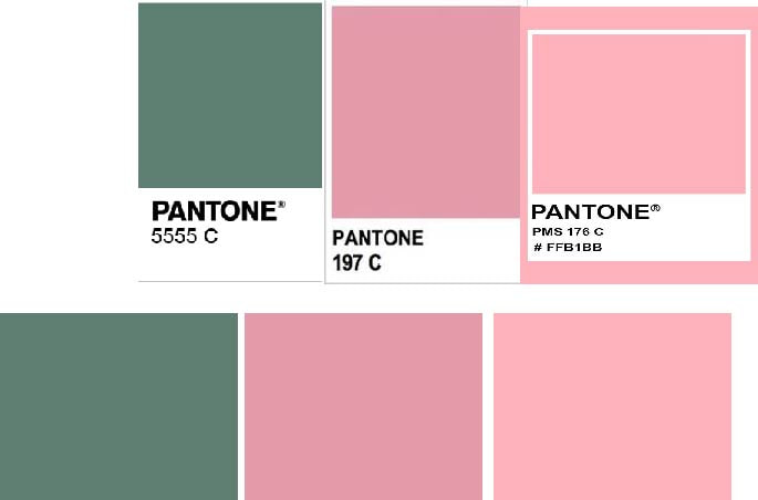
For the second part of the digital module, we had to use the adobe product, Illustrator. The task is to produce 3 enamel pins, back cards and a logo using Illustrator. This project was to aid us in understanding this software properly. We were asked to take an already existing property and make them a separate entity. The only limitations we had was to use 4 pantone colours and the black outlines.
Before I did any I got onto illustrator and just had a play around with some of the tools, short cuts and some of the hidden tricks I didnt know about. I havent used Illustrator since college so it was a slower process for me at first.
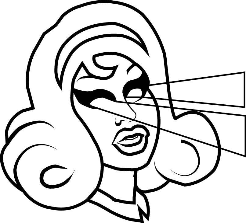
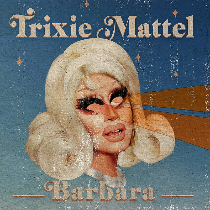
When I saw, we were only allowed to use four pantone colours I immediately thought of cartoons from the 1960. Like Scooby Doo, the Flintstones and Bamse. These cartoons would usually have black outlines with simple and limited colour palettes. One tool I thought to use was the pen tool and the curvature tool. I decided to draw drag queen Trixie Mattel. I then had the idea to make my pins about drag queens while using stereotypically "girly" colour palettes. I pretty quickly decided against that as a lot of drag queens already do this in their own work. I thought that maybe I could bring two opposites together. Y2k, girlypop, pink and bimbo with something seen as traditional. Now with no thought of Nick Holmes "space fights", I had my idea...
STAR WARS BUT SLAY
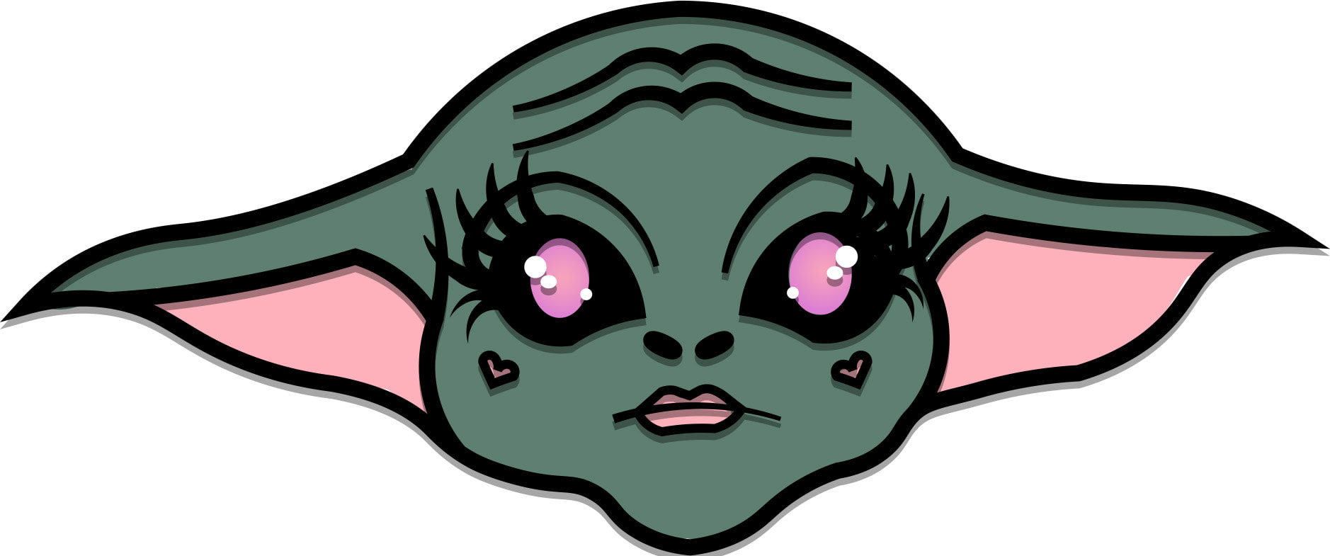
And just like that the idea for the biggest intergalactic slay was born, my idea was to take a product I have no interest in whatsoever and make the pins, logo and backing card something that'd catch my eye. I found this the best was to do this project because all the other products i thought to do were already this girly, bimbo, slay style.
|
|
|
|
I found these videos useful when I was trying to learn illustrator, it was useful to learn what each tool illustrator offers does and some of the hidden tips you can pick up.
Making a logo
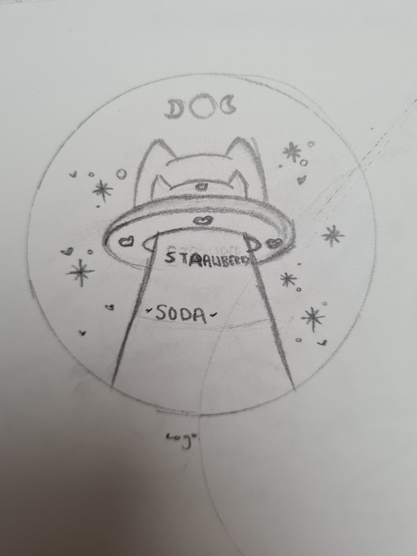
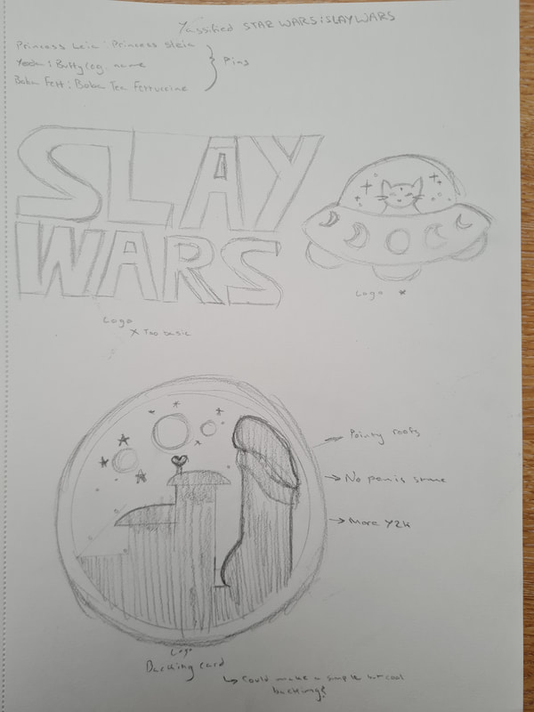
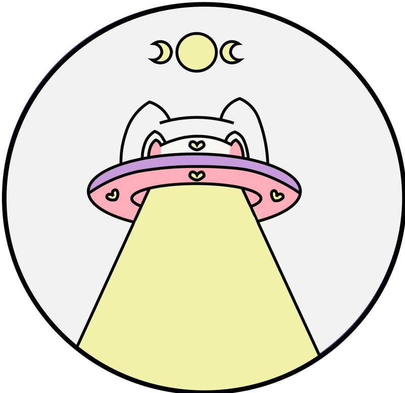
I started off by making some quick sketches for my logo ideas, some were based on Star Wars, and some were based off of space in general. I decided to use the cat spaceship design as it went more with the kitsch, 90s/ 2000s colourful look I wanted. At first I made it look like this, however I felt the colours looked more like a badge itself.
THE LOGO
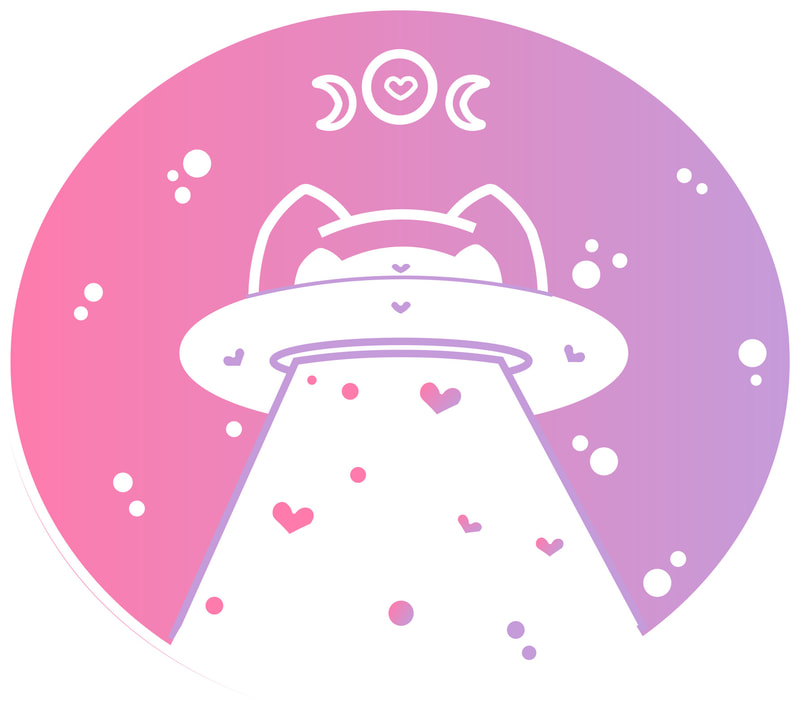
I decided to reverse my design completely, instead of the blacklines around the colour I made used the ellipse tool to make a background. I then applied the gradient tool to the ellipse and used a pink and purple mix. The outlines I made them white to contrast the colourful background, I used the pen and curvature tools to add coloured lined in the main hub of the spacecraft to give it more structure and readable as opposed to it looking like a blob. The last thing I did was add little ellipses, looking like stars and hearts using the pen and curvature tools. I'm actually very happy with how this looks, when I was designing the logo, I wanted something that could've been placed on the backing card with the pins while not fighting for attention.
Pins designs
The next thing I did was create my pins, using the tutorial linked above I got reference images and used them as templates. On a layer above this i was able to use the pen and curvature tools to create my pins.
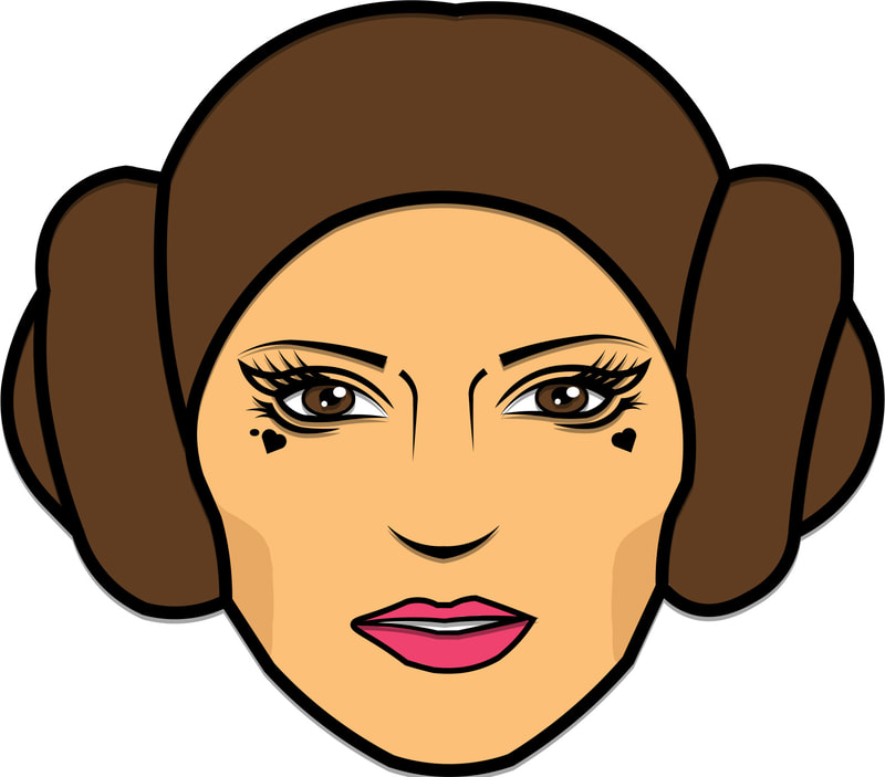
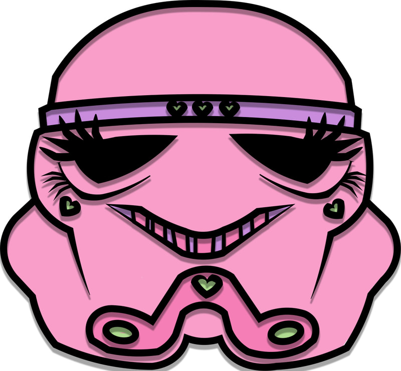
I present Princess Sleia, Sashay Trooper and baby Sloda. I chose these characters mainly because I thought it'd be really cool to see these characters in more of a girly targeted style, colour palettes and look. I used the pen and curvature tool to create the outlines of the basic shapes I saw. I would've used the shapes tool however I couldn't get it to work properly for some reason and I wanted to finish these designs as quickly as I could. To add in the colours I used the same tools but made each part a shape, for example Princess Sleias skin is its own shape. This seemed to be the best way for me to work efficiently.
|
|
|
|
ADDING CUSTOM COLOUR PALETTES
To add custom colours palettes to illustrator was an issue for me, its finicky process however I was able to simplify it with the tutorials above. In order to do this, you must create a series of shapes which are coloured using your own colours. In the "swatches" window you'll find the "add new colour group". With your custom colours selected press this button and select the "selected artwork" option. After this use the "swatch libraries menu" button. From this you will want to use the "save swatches" option to save these swatches to your device. Under "user defined" you will find all your own palettes.
BACKING CARD
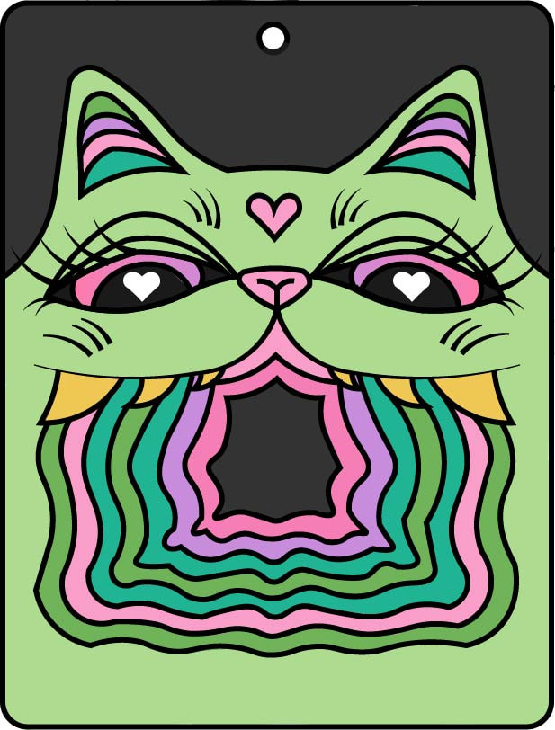
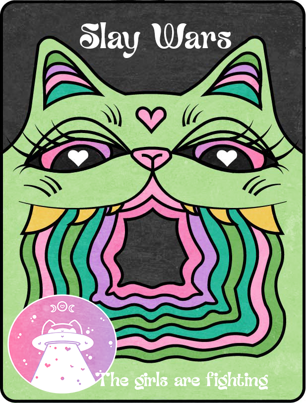
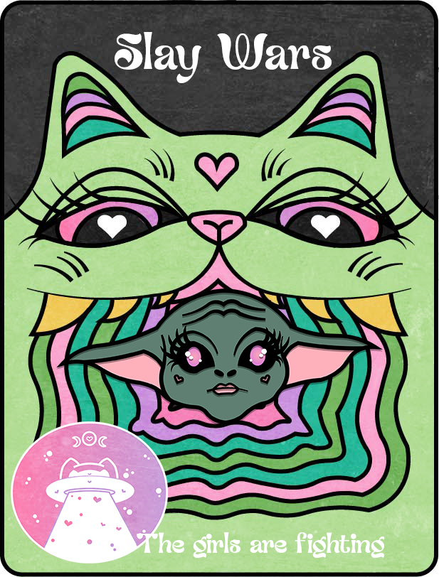
For my backing card I wanted to reference a more retro colour palette, style and image that also contrasted the logo. I wanted a retro design to compliment the modern logo to show that Slay wars is something that'd be around for as long as Star Wars has been.
I made this very similarly to how I had the pins, using a line art template and then making a line art layer on illustrator. The colours reference each pin as well to compliment them all.
Imagine if it was real
I have never wanted something more than a green space cat, oh she's called Bimbo
With the pins
Seeing it all done and put together I'm very happy I decided to go the route I chose, I'm also very happy That I didn't give up on Illustrator. Even though I do think it's the spawn of Satan sometimes.
Weeks 9-12 concepts
In person experiment
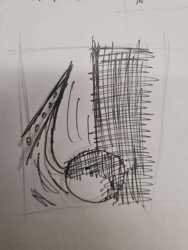
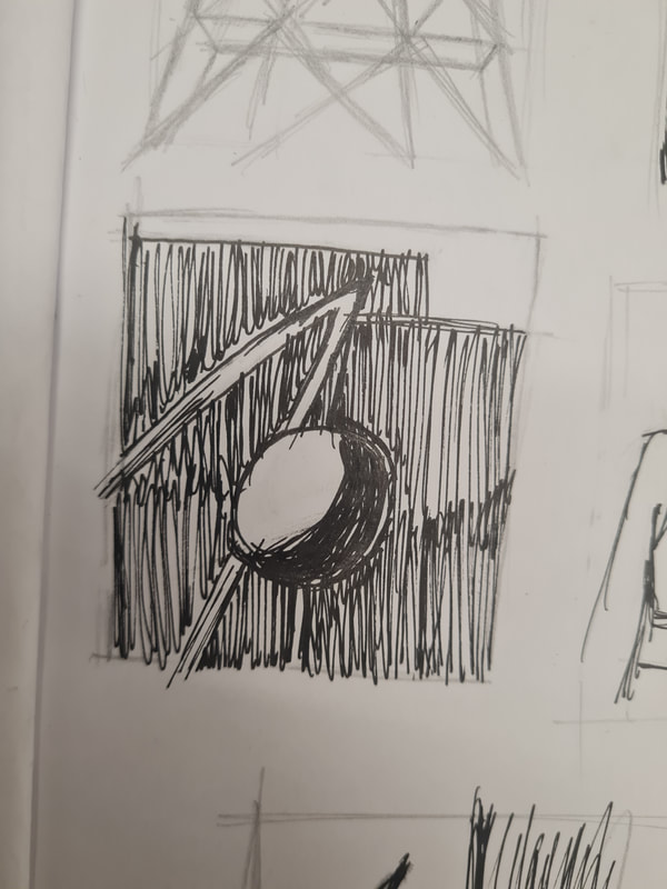
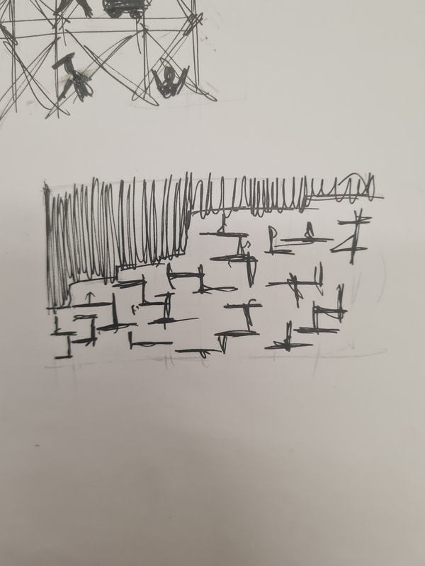
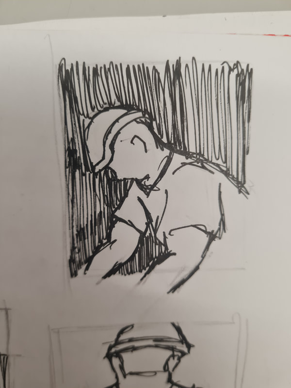
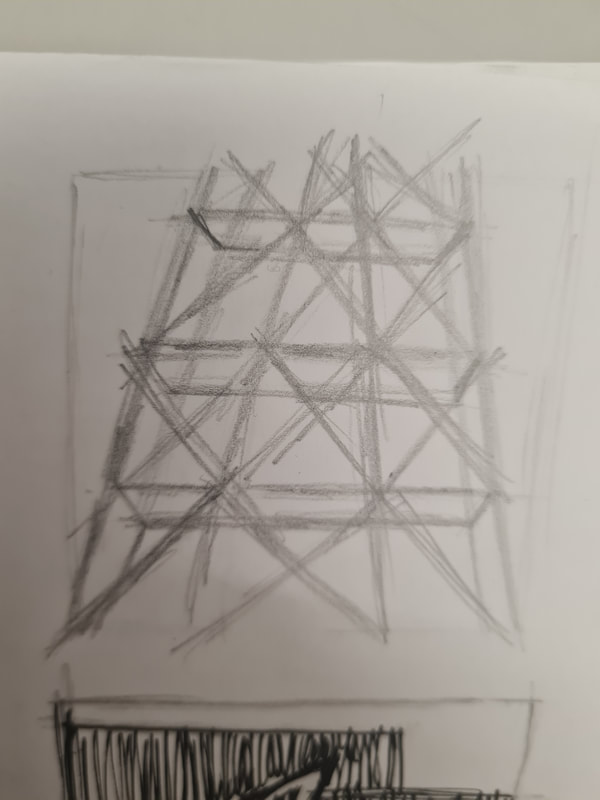
To get used to using thumbnailing we were given a task on the first day of this project, we were each given a word and had to make thumbnails out of this word. Mine was construction, so focused on the rough and raw shapes and attitudes found on a construction site.
Week 9: Action
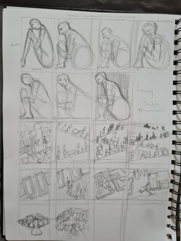
For this project we were tasked with making thumbnails on different themes and titles, mainly focusing on how we could use abstract shapes to create appealing thumbnails and final illustrations.
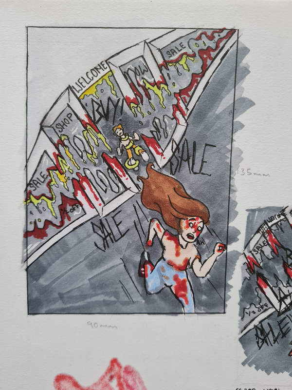
January Sales
For the January sales thumbnails I wanted to focus on the idea of claustrophobia, the extent of waiting in lines and the push supermarkets put on you to buy more. I decided to go with the idea that the store had become a sentient being and had become a monster. In the illustration you see someone running out of the store as fast as they can, in the background you see someone being pulled backwards though the stores doors "teeth". To make it more grimy and gross you see the woman covered in blood and the doors drenched in blood. I thought that maybe inside the store a fight emerged over the for sale items, thus awakening the demonic store. To add to the action and emphasis on the woman running fast i added directional lines trailing behind her, with her hair flowing far behind her.
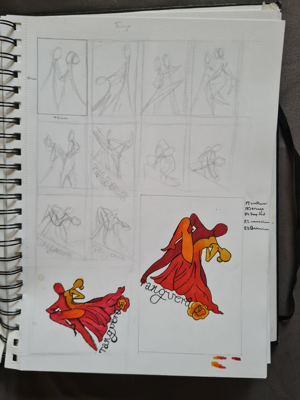
Tango
for the Tango theme I wanted to focus on the sexiness, intimacy and closeness that the tango requires of its dancers. I chose to use this as impact for colour palette, composition and type. Speaking of I used the word "Tanguera" because its another Spanish word for the Tango. I also thought it sounded sexier which is what i wanted to portray for this theme. I used a Dutch tilt to help emphasise the action of dipping your tango partner. I used a lot of colours that relate to heat and passion for this theme, reds, oranges and yellow. I thought it also gave into the idea of how passionate the tango is.
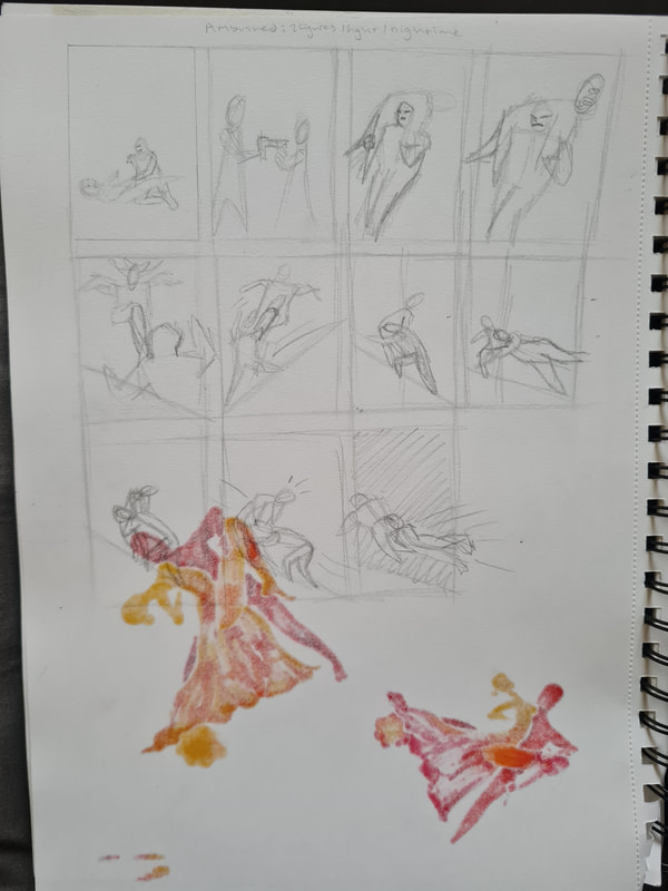
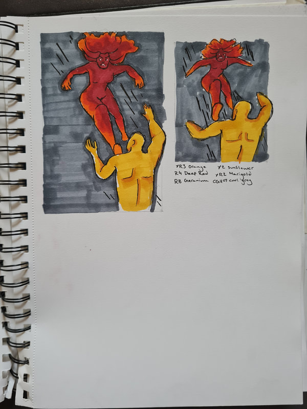
Ambushed
For the theme of Ambushed I referenced a lot of fight scenes from movies, thought that having a figure kicking another out of frame could be a good idea and allowed me to push the use of action and movement. I used a darker colour in the background to emphasise the shape of the two characters. I used action lines around the woman to show how hard she's flying through the air and the amount of force she's using. For the characters I used a red to orange colour palette for the woman to reference the fiery anger. For the man I used yellow to reference weakness and cowardess.
System failure
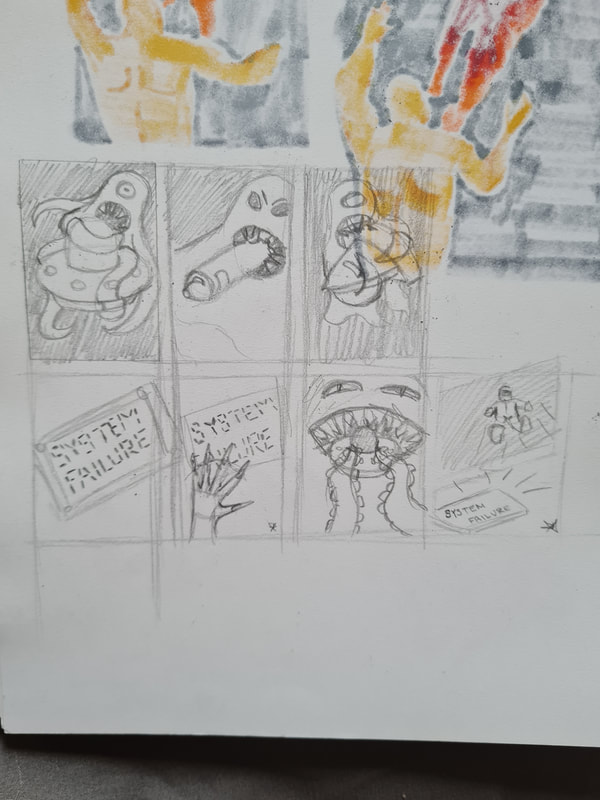
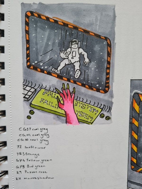
For System failure I wanted trial the idea of a spaceship being eaten by a larger space creature, someone hitting the failure button or the idea of an astronauts connector breaking and being pulled into space while you see someone reaching out for them. I think here I managed to get the action of someone being pulled backwards well. Again I used lines around the astronaut to reference how quickly they're being pulled backwards. By using the out of frame pink aliens arm in shot and the astronauts arm reaching towards the ship I think it gives of the motion of urgency and panic that you'd feel in that moment. I also enjoy the contrast of the the pinks, oranges and greens with the dark steel grey of the metal.
Vertigo
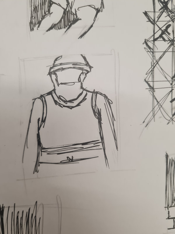
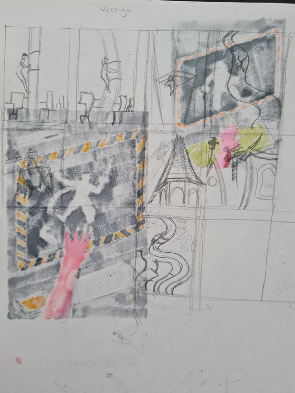
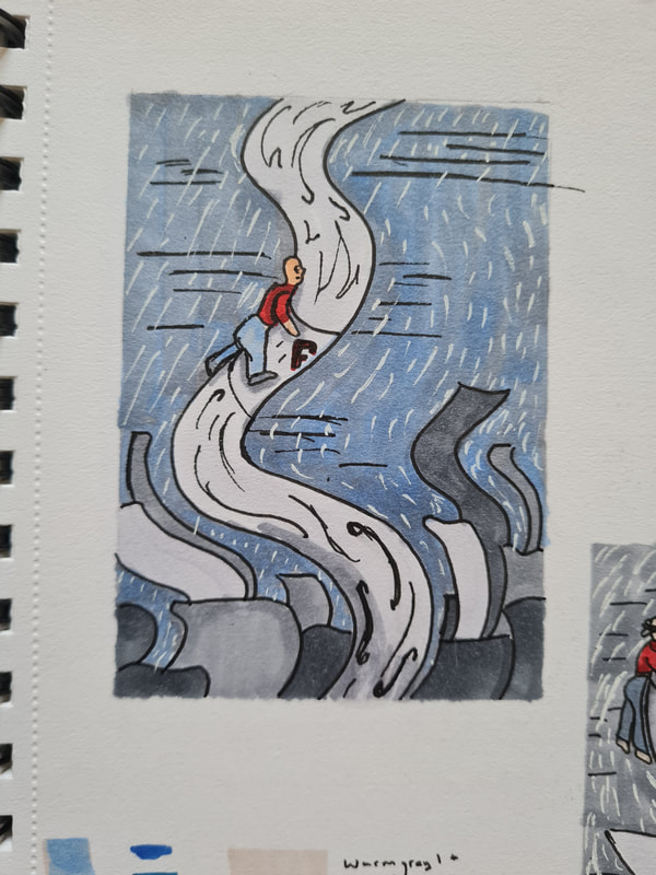
For Vertigo I wanted to really pull on the idea of being dizzy and feeling like the world is swirling around you. For this the brief wanted the thumbnail ton include a steeplejack. For this theme I also wanted to show off how high up the steeplejack was, which is why in the background I included shorter buildings while the steeplejack is way up above him. For this I also chose to use a limited colour palette of mainly greys and the only colour being the red shirt and toolbox. In this I also used a white gel pen to add a gloomy vibe but also give the buildings directional curves and pulls.
A giant leap
For giant leap I used three characters running atop a rooftop, in this I used a Dutch tilt to give the characters a direction in which they're running. To give this theme action I chose to have the woman and childs hair flowing behind them as the run as well as the action lines behind them.
Week 10: Body language
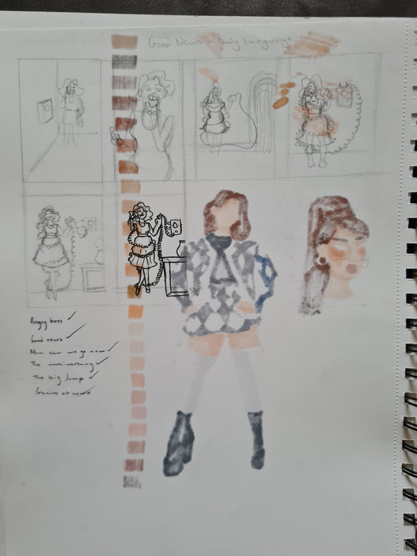
For week two of concepts, the work was very similar however the focus was on body language and how this can be used to portray certain emotion or situations.
Good news
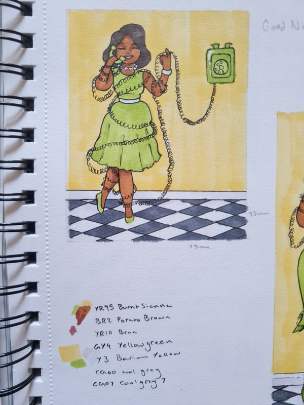
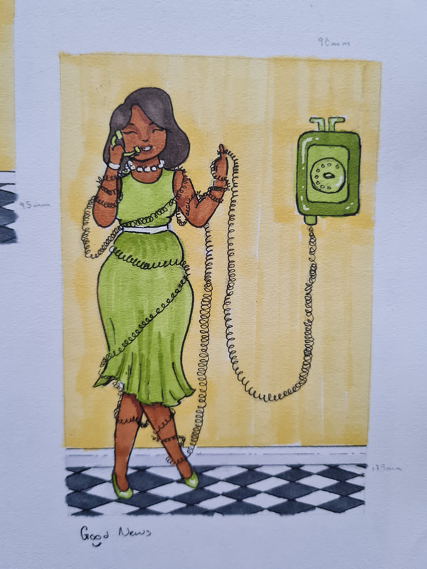
For the theme of "good news" we were told it had to include a 50s housewife, in a phone call and a happy vibe. In mine I chose to illustrate the housewife as being so invested in her conversation the phone cord had wrapped around her multiple times. The idea being she would've walked around her entire house getting the chord tangled in her dress and around her arms and legs. I used happy colours of yellow and green to compliment her warm brown skin, I thought that her legs being crossed to reference her being slightly giddy at the news she's hearing on her call. Whilst twisting the chord to indicate this is a rather long call.
Happy Anniversary
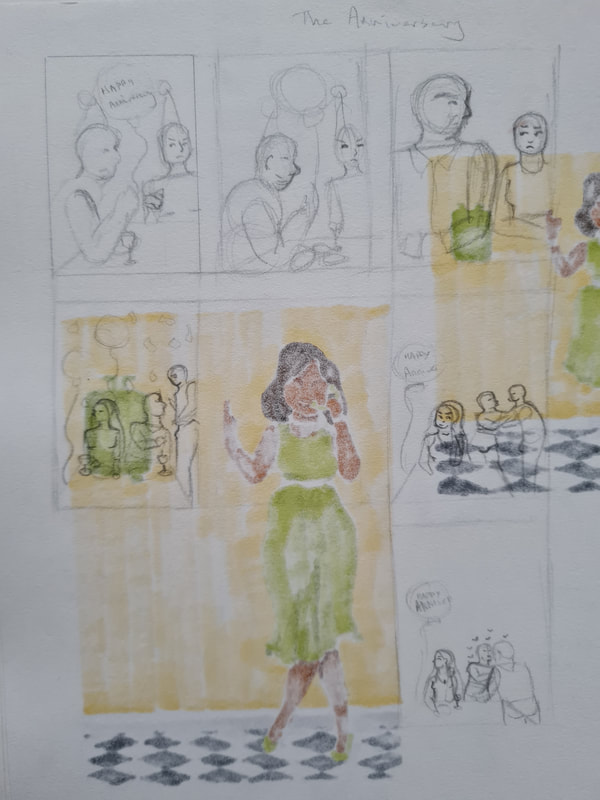
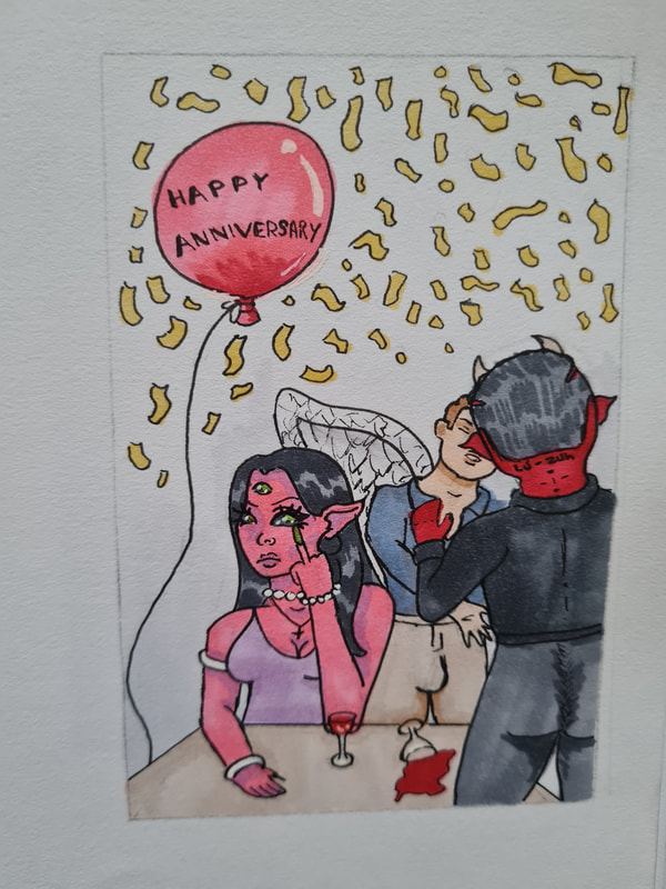
For the theme of "happy anniversary" we had to portray a couple celebrating an anniversary whilst ironically being unhappy. In mine I chose to portray the wife being so uninterested in her husband she's turned away from him, not even caring he's about to kiss the waiter. The husband is supposed to look as though he's stood up with such speed and meaning he's nocked over the wine glass. I thought because the waiters back was to the viewer and the husbands eyes were closed that giving the wife's face a lot of emotion was a good ide. Trying to make her look bored and pissed off. I had a lot of fun with this one, including her bored face as she flips off the audience while her husband and the waiter are going at each other. I had an idea of this looking as though someone was about to take a photo of the couple hence the balloon and confetti. I also included a Sumerian tattoo on the waiters neck, translating to "seed thief". Ill let you deduce what that means.
Angry boss
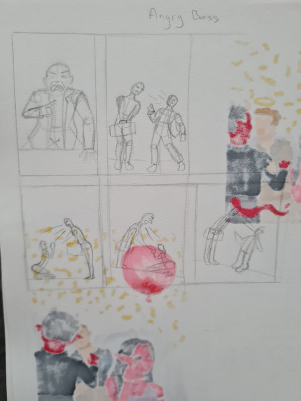
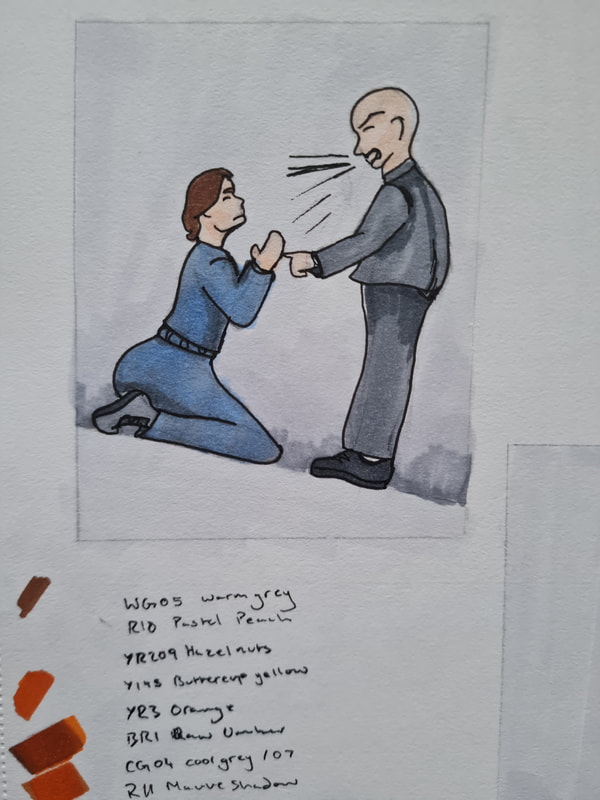
For "angry boss" we had to show an angry boss and an employee, in mine I showed the boss being a towering bent over older character yelling at his younger employee. I showed the employee on their knees to emphasise the power dynamic between the two. Imagining that the employee has been fired or about to be so is begging for their job.
Mum can we go
For the theme of "mum can we go now" we had to show three characters a mother, a child and a friend of the mothers. I had the idea for mine to depict the daughter as being a zombie implying that the mum has been talking to her friend for so long she's died and become a zombie. I tried to show the mum and friend as laughing while the daughter has a tired limping stance.
The big jump
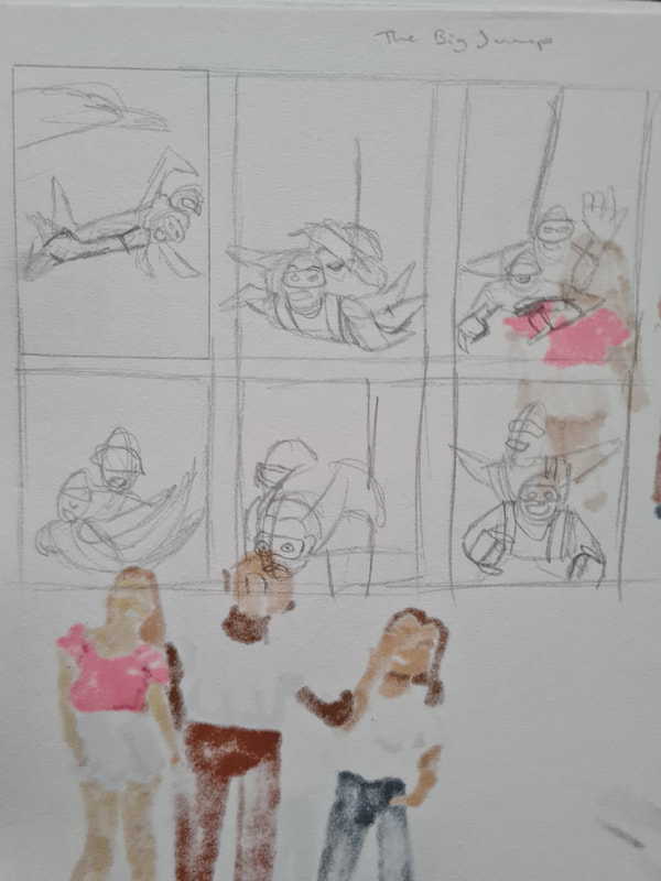
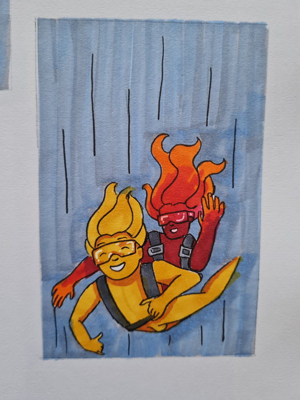
For the "big jump" we were asked to show two characters preparing or having jumped out of a plane. I chose to think of this as those couples who skydive for their honeymoons. hence the very chilled poses and faces of the two. I tried to show them as being attached by a harness, while their legs bend upwards through the air, shown by the directional lines and their hair.
Genius at work
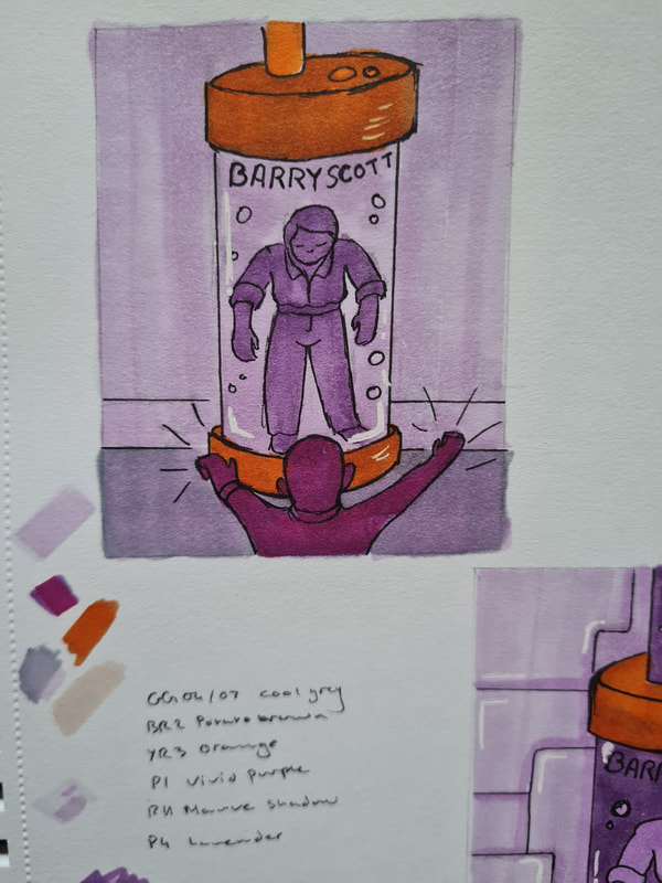
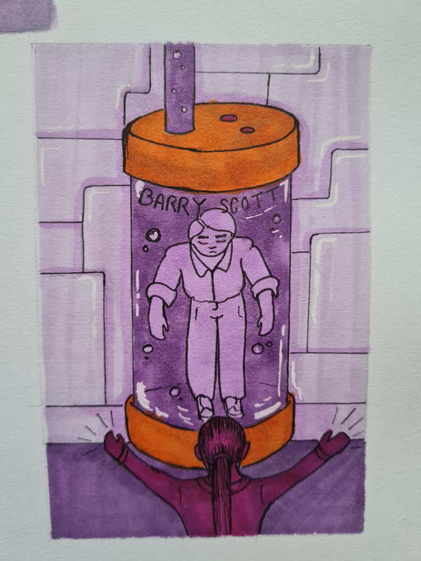
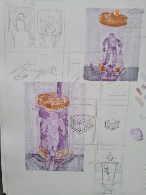
For the "genius at work" theme we were asked to portray a genius scientist at work whilst being focused. Around this time I discovered Barry "bang and the dirt is gone" Scott isn't a real person, but a company mascot. Shocking I know. For this theme I decided to portray the Cillit Bang headquarters laboratory. The scientist in question has just finished making Barry Scott, shown in a testing tube covered in purple liquid. The scientists arms are pumped in the air showing glee at the creation.
Week 11/12: Communicative Colour
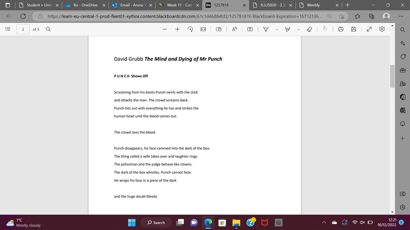
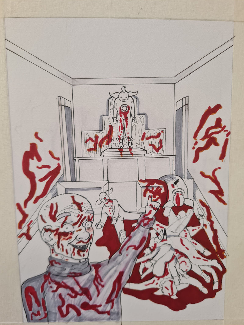
For the last project of Illustrators Toolkit, I was given the text of Mr Punch by David Grubb, in this specific project we were asked to use thumbnailing to create an illustration based on our individual texts. relating these styles to the Folio society style of illustration. Also being asked to look at how we can use colours to portray certain emotions.
Research
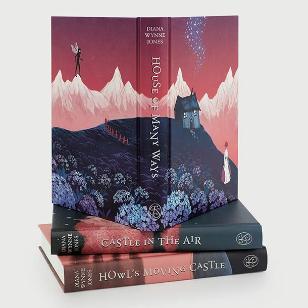
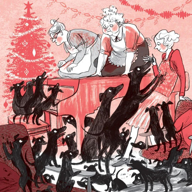
I mainly looked at these illustrations from the Folio society's website, for reference on how their books are illustrated and how they look in a finished book. In looking at these it appears that they primarily use one colour or a monochromatic palette of that colours shades contrasting with a lot of black and darker colours. It appears they could be done with pen and ink by hand. I noticed they also use a heavy amount of line art and shading as opposed to fully coloured illustrations.
Thumbnails
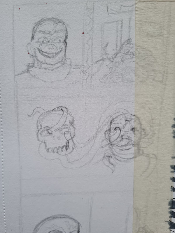
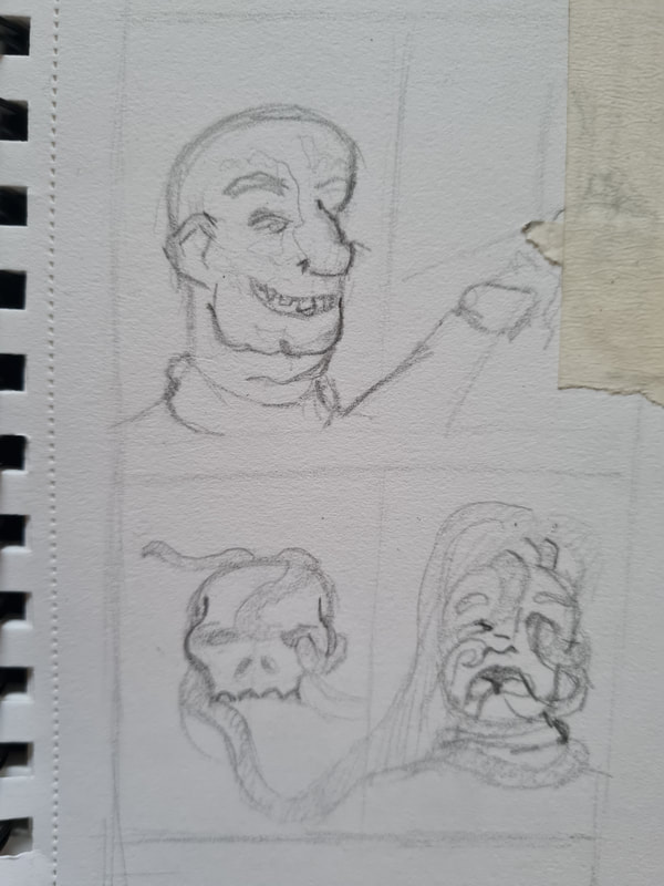
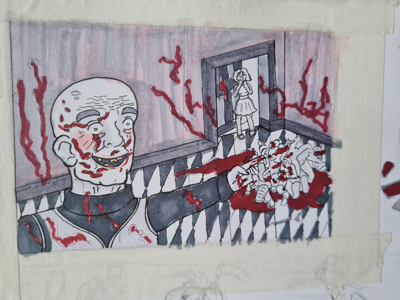
I mostly felt inspired by three lines in particular and got some ideas immediately from them. "The policeman and the judge behave like clowns. The dark of the box whistles. Punch cannot hear. He wraps his face in a piece of the dark". I found the idea of Mr punch in a courtroom surrounded by clowns that used to be the judge and policemen could be a cool illustration and something that could portray the emotions and feelings of Punch to the world he's in. Another idea I had was of Punch being surrounded and corrupted by the darkness. The darkness having consumed another and heading to consume Punch. I thought these could be translated to either double spread or single page illustrations. I really tried to play off the use of dark monochromatic colours next to a singular colour. I chose red and a light pink.
Final illustration
"The policeman and the judge behave like clowns". This line ended up being the line that inspired me the most, Punch being surrounded by dead clowns or police officers, the judge and other courtroom people. I got a vibe that Mr Punch might not be mentally aware so I thought giving him a proud, creepy smile and pose could work. As if he's been found in the room by someone and he's showing off what he's done. I like the way the bodies are slumped over each other and the clown that's pinned to a wall, I got that visual from an 80s horror movie in which a victim is hung up to a wall with a deer's antlers piercing through his chest.
Site powered by Weebly. Managed by 34SP.com
