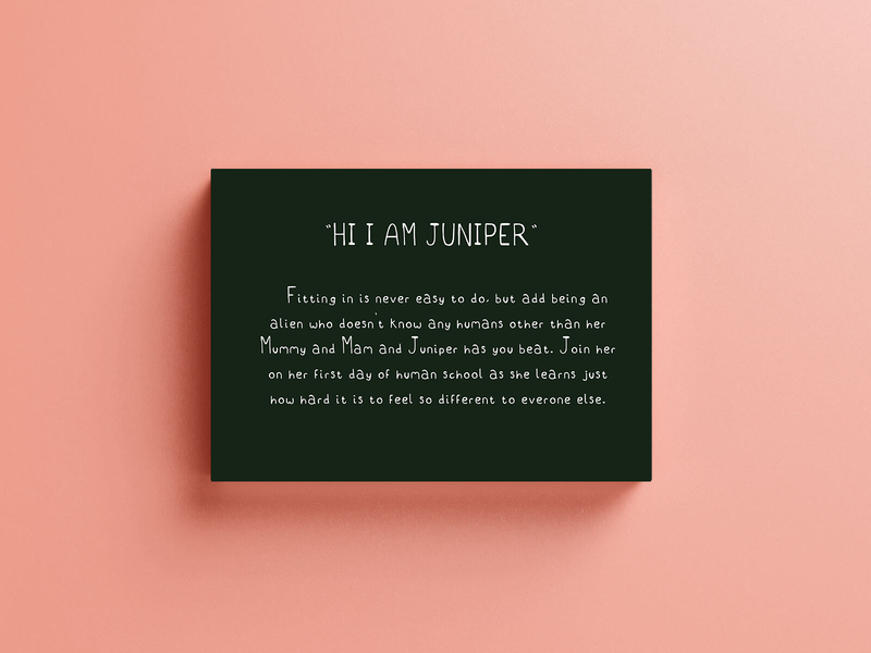
Project theme generation
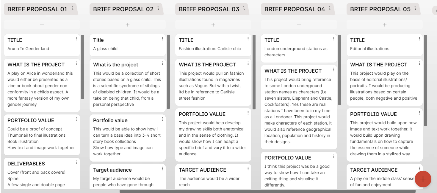
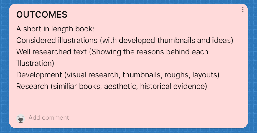
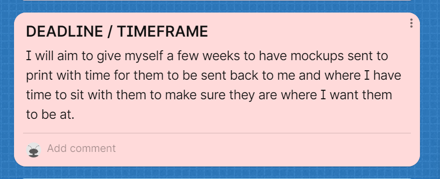
My initial idea generation was varied in briefs, some would lead me to making a book which was original idea, some would be more fashion illustration and others were more editorial inspired. I had to really consider what ideas I could develop and keep fun for myself, but that also kept the time-frame in mind.
My choice
I decided to merge a few of my ideas into one, after feedback I realised certain ideas could be taken the wrong way.
My new idea would focus on the idea of not fitting into the wider community around you, something I have felt all my life. It would be a childrens picture book, following the main character who tries to copy other characters (style, speech, aesthetic) to fit in.
I thought this would be a fun way to end university, while reflecting on my own life as well as be a slight anecdote to other people.
I thought this would be a fun way to end university, while reflecting on my own life as well as be a slight anecdote to other people.
In person research 20.01.24
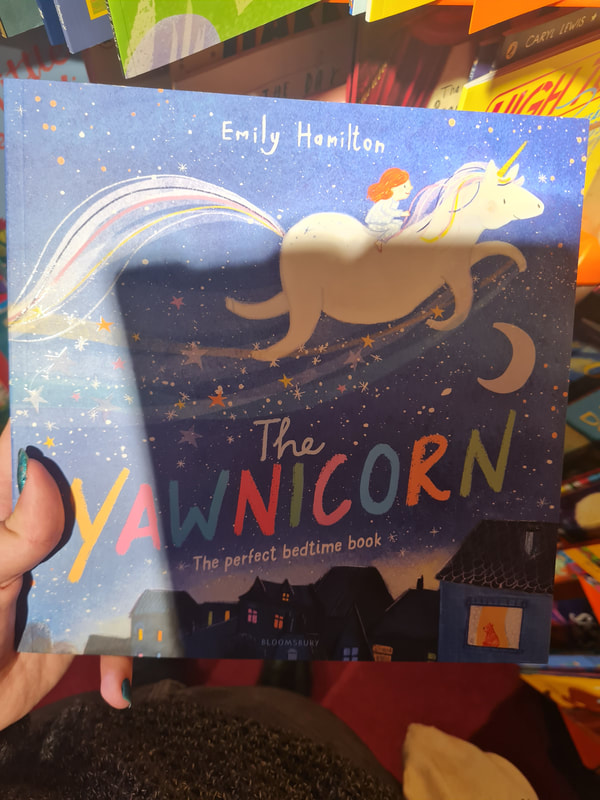
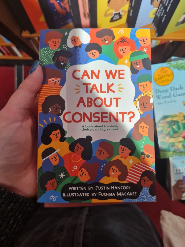
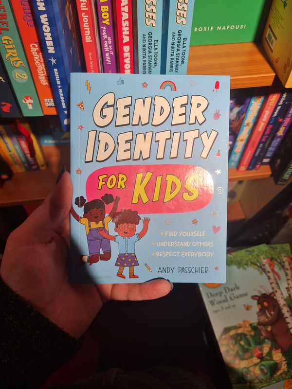
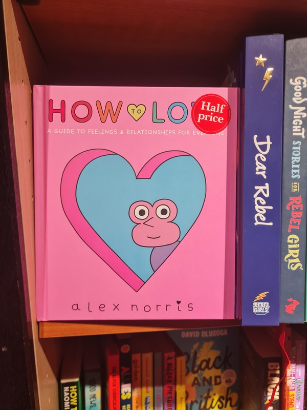
Where does one find a plethora of books for reference in terms of length, style, colours and to find new illustration inspiration? Waterstones of course.
I looked in their Inclusive Children's Books section to find reference for already existing books that had a similar theme to what I wanted for my book.
I looked in their Inclusive Children's Books section to find reference for already existing books that had a similar theme to what I wanted for my book.
Not my amazing photography
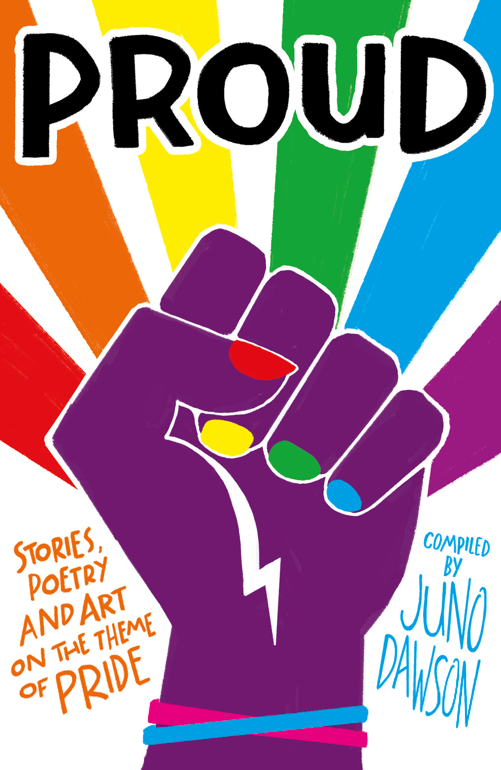
Now I'm no Diane Arbus with a camera and I felt awkward photographing the books. So some are visually disturbed. So here are some better online images.
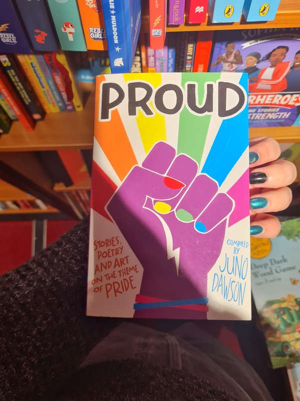
PROUD- Juno DawsonI saw this book next for similar reasons, its bright and colourful cover stood out on the bookshelf. The fist raised in black solidarity was also a good touch for racial inclusivity which is often ignored in LGBT representation. This book was helpful because it is a collection of short stories and poetry, I was able to find a good range of queer and minority illustrators from it which is something I have been wanting to improve on.
|
Gender Identity- Andy PasschierI thought this book was a good reference of how to make an "adult" theme adaptable for children. The brighter, child like illustration are visual languages for children's books. However it was written with scientific accuracy but in a less formal tone. It was a good find and is helping me think about the tone of the text for my book.
|
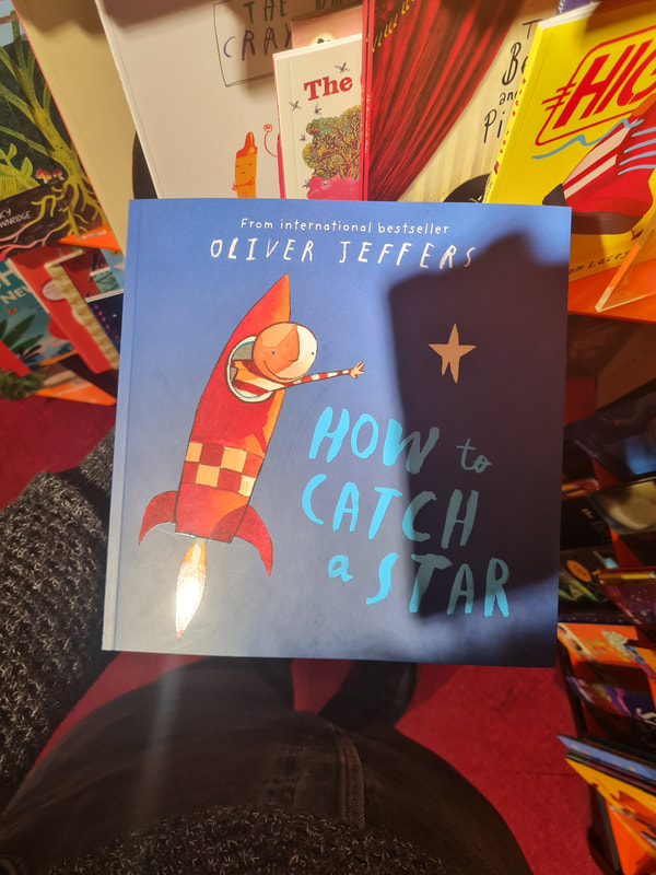
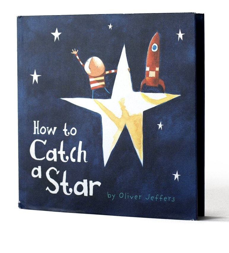
How to Catch a Star- Oliver JeffersThis book caught my eye for the illustrations simplified style. It makes sense for younger audiences to have characters be made into more digestible shapes than anatomically correct figures. I also liked the texture from the illustrations, they felt dreamlike. Whether they were created using a digital medium or more traditional mediums is something I want to find out because it definitely looks interesting to me.
|
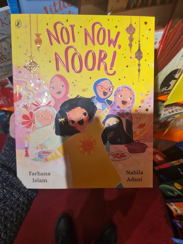
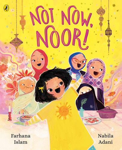
Not Now Noor!- Farhana IslamI found this book in the general picture book area of the bookstore. I loved the inclusivity of a Muslim family and story-line. The simple stylisation I thought helped get an idea of each characters personality from the cover. That Noor who is center comes from a big family and is a prankster, the character with red glasses winking implied that maybe she is as well. I loved the muted colours as well, they all worked together I thought and weren't too overly stimulating.
|
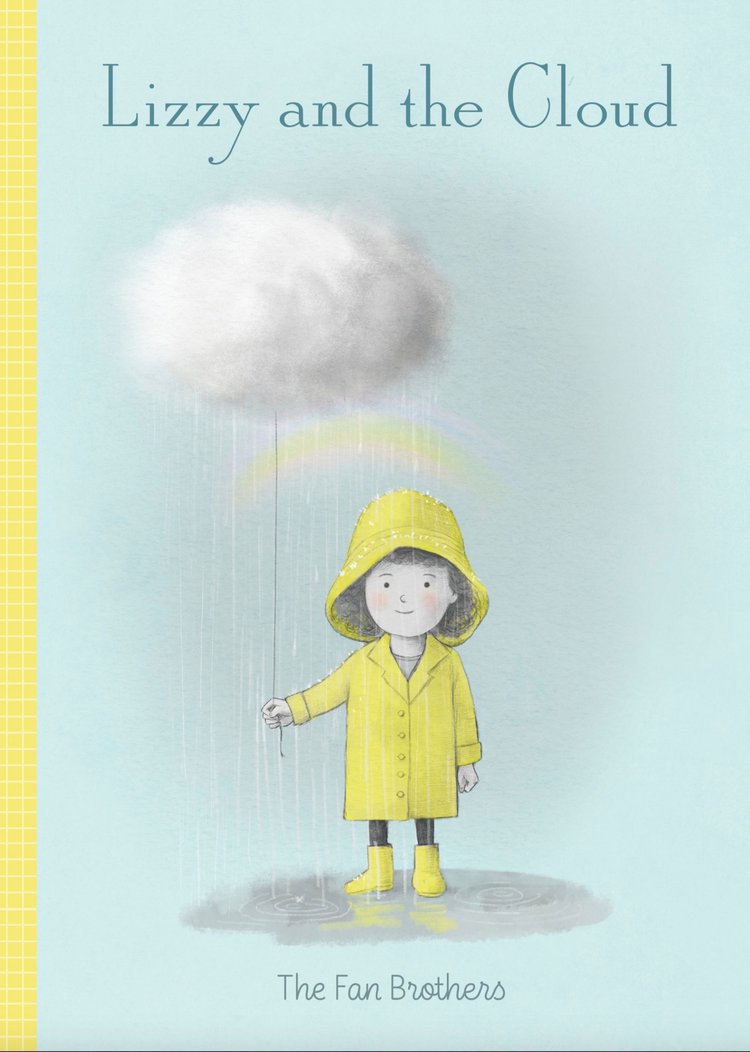
Lizzy and the Cloud- Fan BrothersThis book I liked the colour palette, the muted and faded colours are well done. Highlighting the cloud as being important. I again liked the simple style of illustration from Lizzy, which reminded me of Quentin Blake's illustrations. The colours looked faded, and made the yellow look brighter by comparison. Without it being a neon colour.
|
Artist research: Anoosha Syed
An artist I have been following for a few months is Anoosha Syed, she works as both an author and illustrator so I have found it helpful to get the background process from start to finish. Shes also a modern illustrator who pushes for diversity and inclusive illustration, so I find myself being influenced by her quite a lot.
Im very inspired by Quentin Blakes illustrations, having seen them since my childhood. I love the colourful, expressive, freedom that they invoke. He makes it feel comforting and something you want to look at.
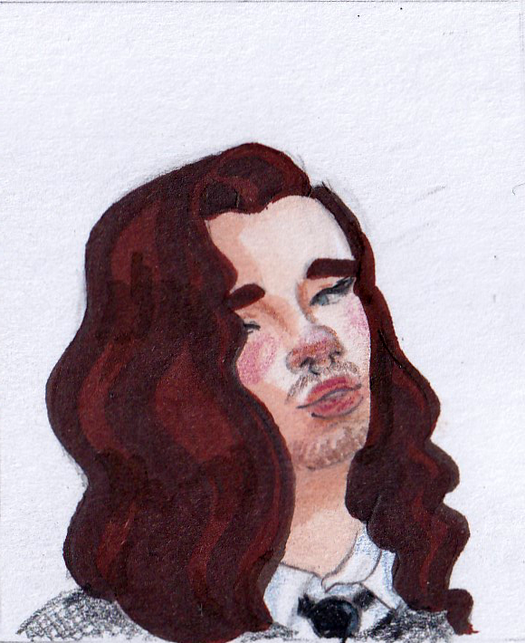
Style practice- Anoosha Syed
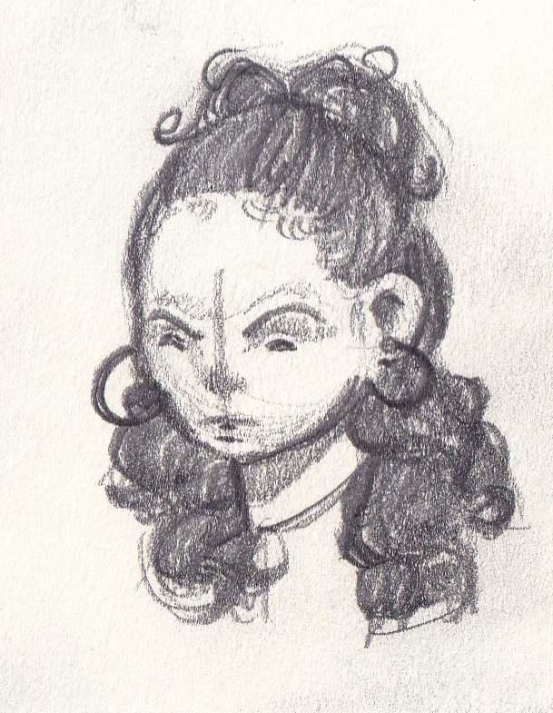
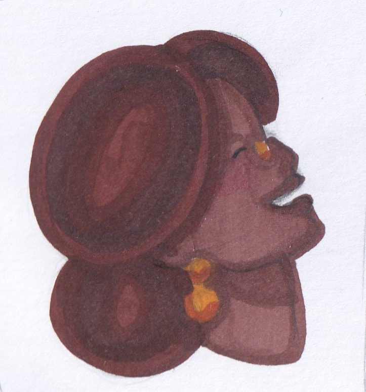
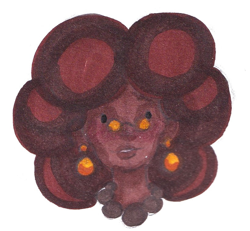
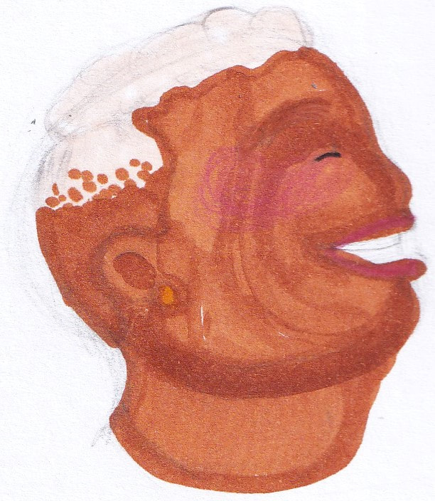
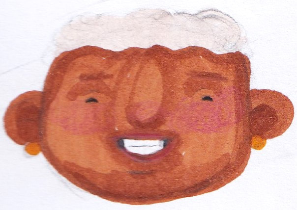
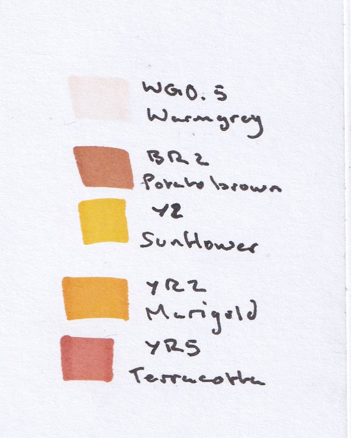
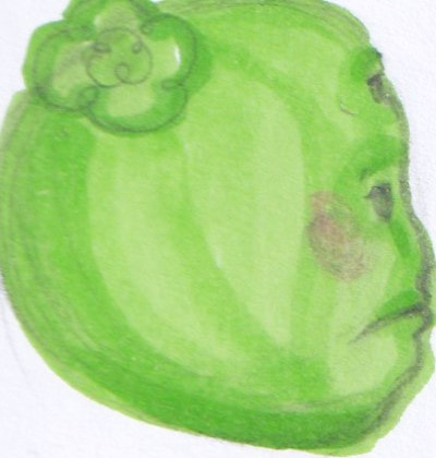
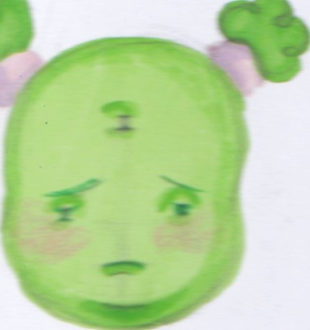
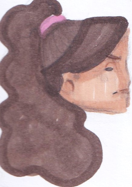
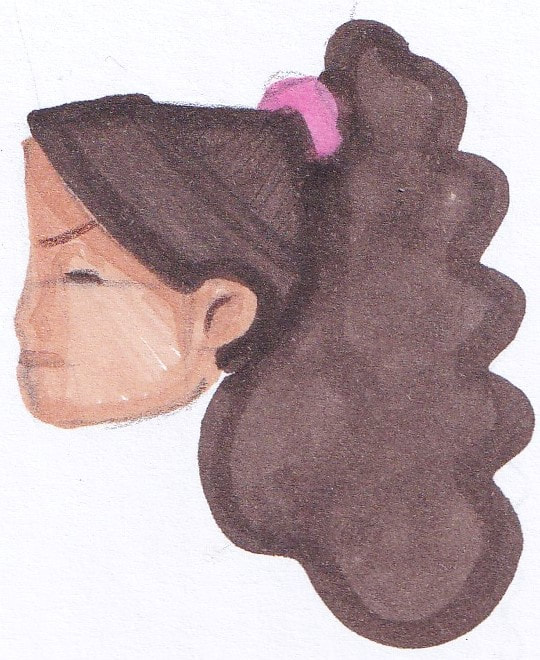
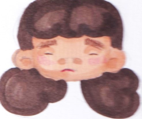
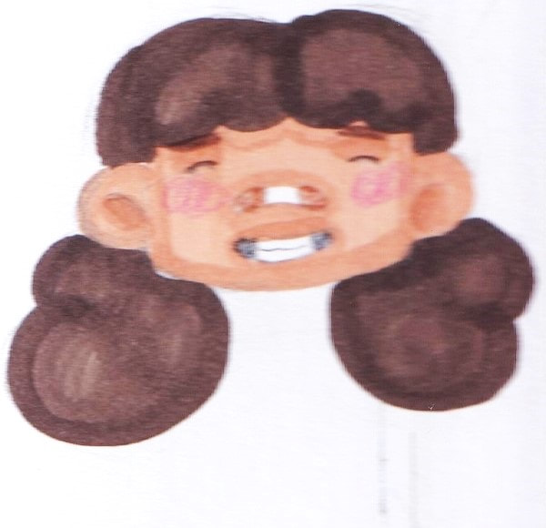
I illustrated two portraits in Anoosha's style. However she used procreate and I don't have access to that so I used alcohol markers and tried to get it as close as I could. I didn't personally enjoy this approach as it felt like a step back in technique to what i have been used to. What I did like however was her use of shape theory in her illustrations. The rounder characters feel friendly and warm.
Style practice- Quentin Blake
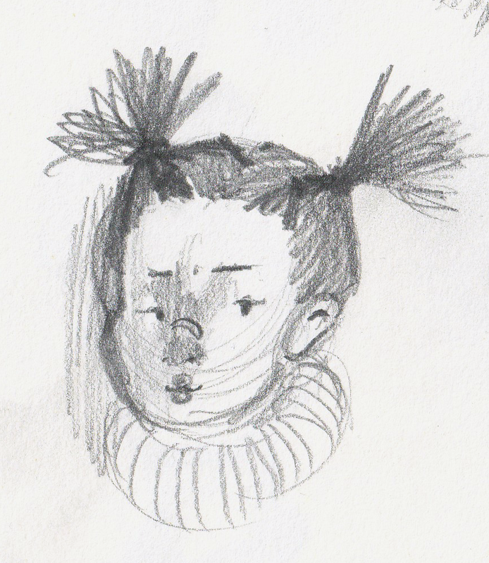
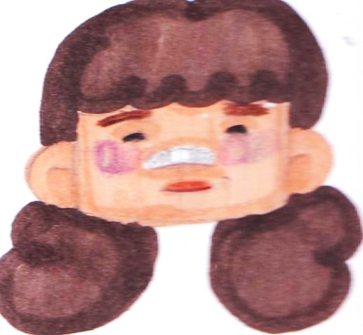
I then illustrated two portraits in Quentin's style, it was a really fun exercise as his illustrations aren't conventional. The colours overlap on some shapes and don't conform to the line art. One thing i liked however was how fun they were to make, they definitely give off the children's book style I want. I think with some minor adjustments to develop it into my own its something id feel more comfortable in.
Observational drawing
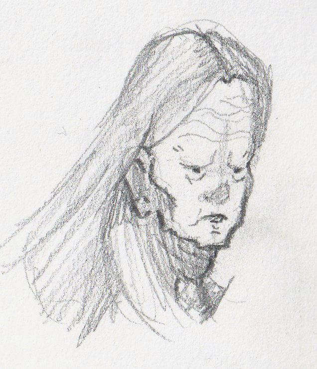
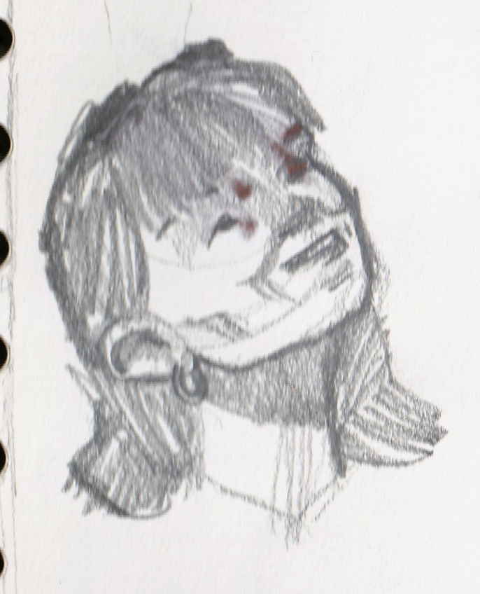
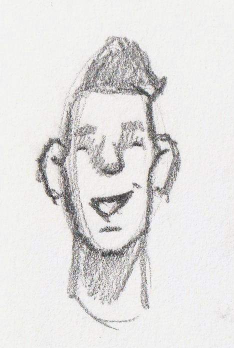
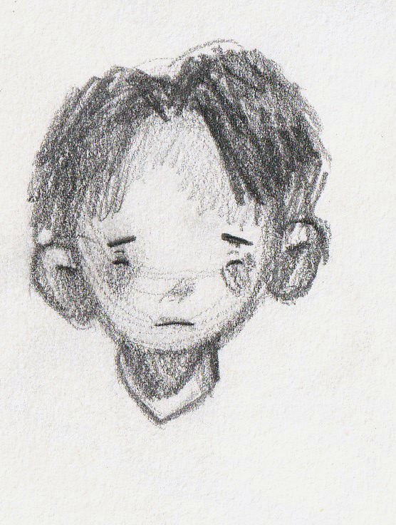
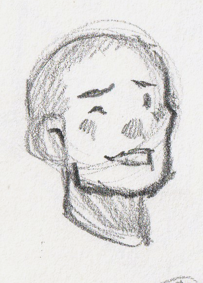
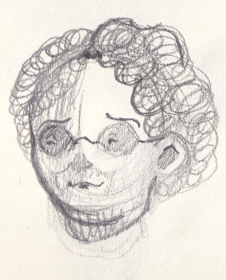
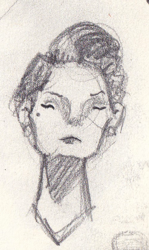
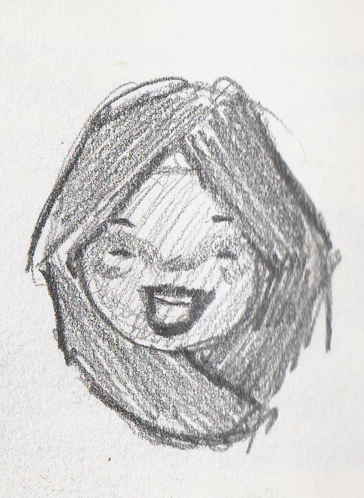
I really enjoyed illustrating in the more free form style, inspired by Blake. So the next day I went into the town centre and drew some of the people about. Thankfully it wasn't raining. Using skills from the observational drawing module in year 2 I was able to get key features of each person, I think the more simplified style meant i could capture emotions, essence and vibe quickly.
Artist research- Jess Rose
I came across artist, Jess Rose via Instagram a few months ago. She illustrates in a really childlike, friendly way. I liked the link between hers and Blake's art styles.
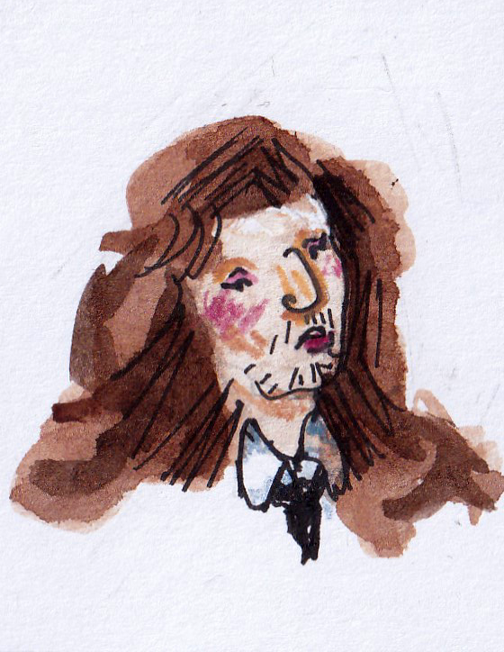
Style practice- Jess Rose
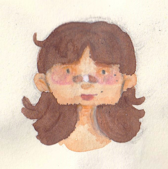
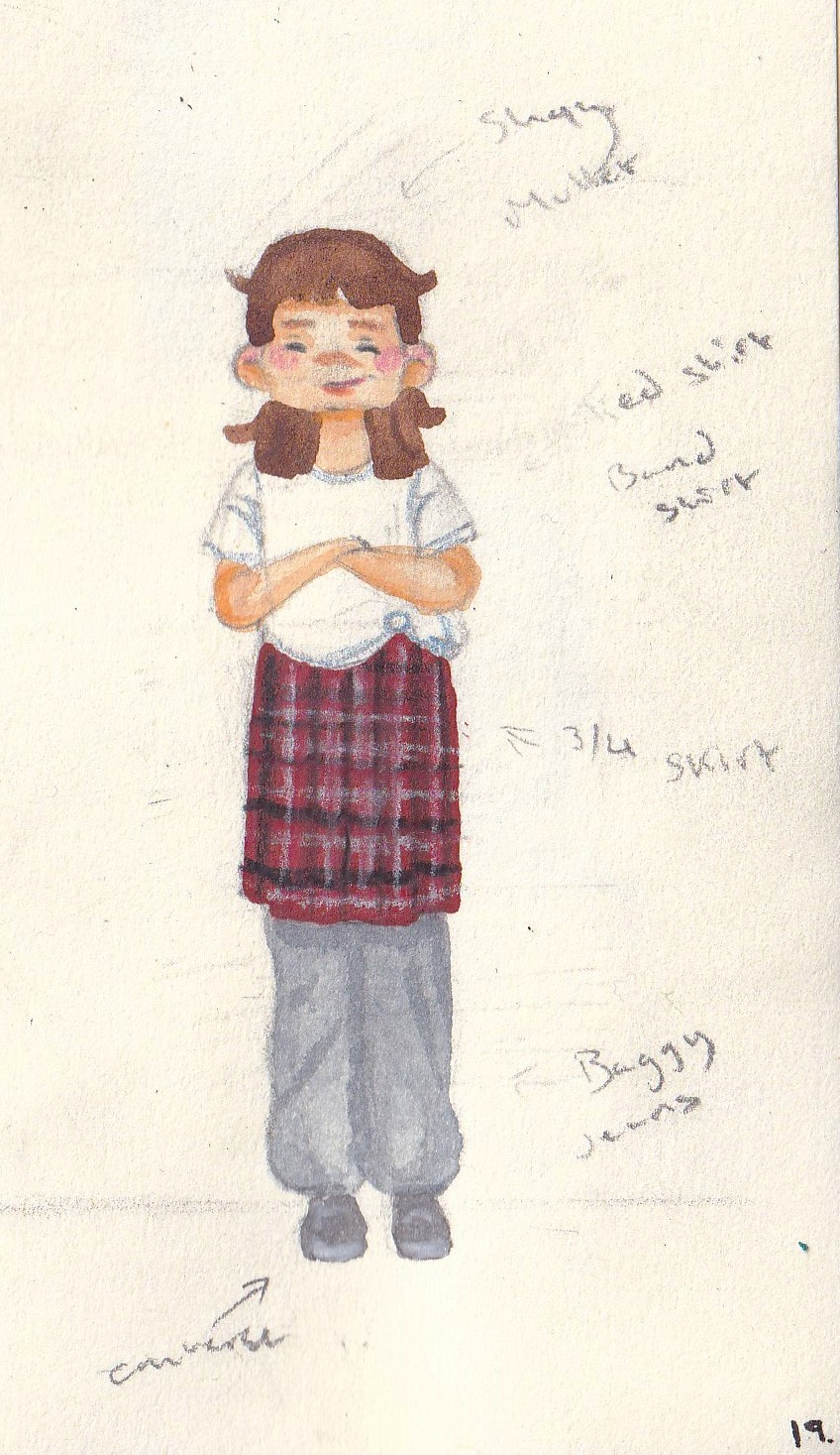
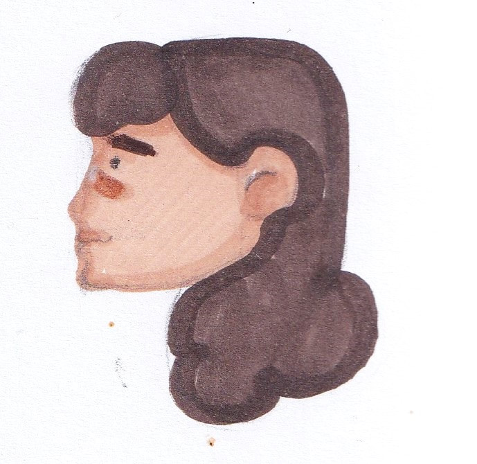
Using Watercolour paint and a fineliners like Rose i illustrated some quick fashion illustrations based on some outfits i wore on a trip to Saint-Malo at the end of summer. I liked the simple outcomes, they felt very child accessible
Materials list
- Ohuhu alcohol markers
- Copic Ciao markers
- Derwent watercolour pencils
- Coloured pencils
Characters
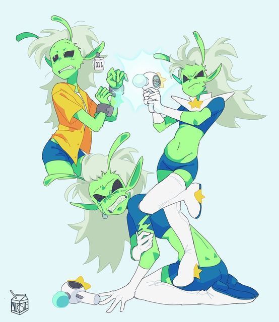
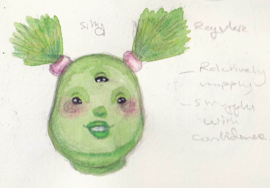
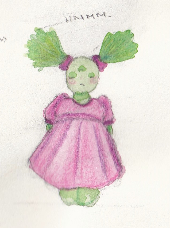
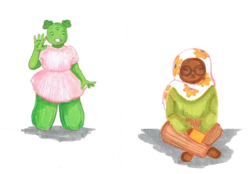
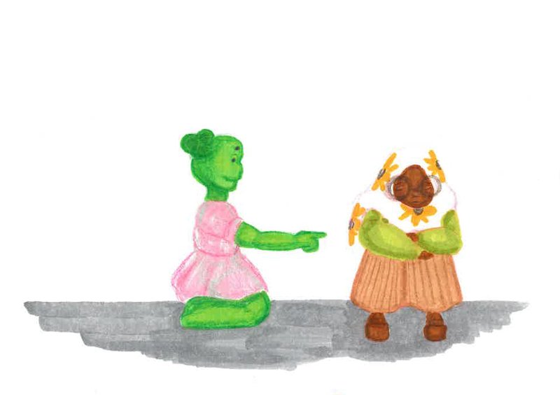
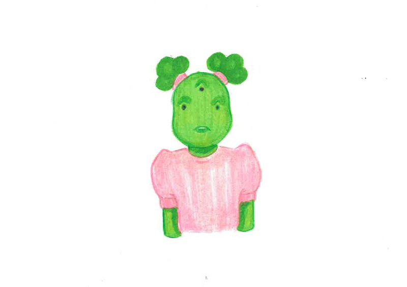
From the beginning of the project I knew I wanted the main character to be an alien, this is because the main concept of the story is how she doesn't fit in with the other characters. Having her be a non human character helps make her feel more representative to a wider audience because she doesn't visually represent a singular group.
For my secondary and background characters I will be referencing stereotypical school groups:
For my secondary and background characters I will be referencing stereotypical school groups:
- The Popular students
- The creatives (artists/music kids)
- The smart kids
- The "weird kids"
- The characters parents (family members)
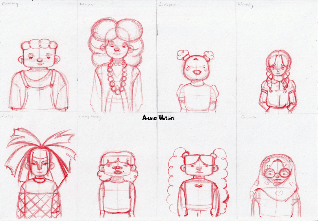
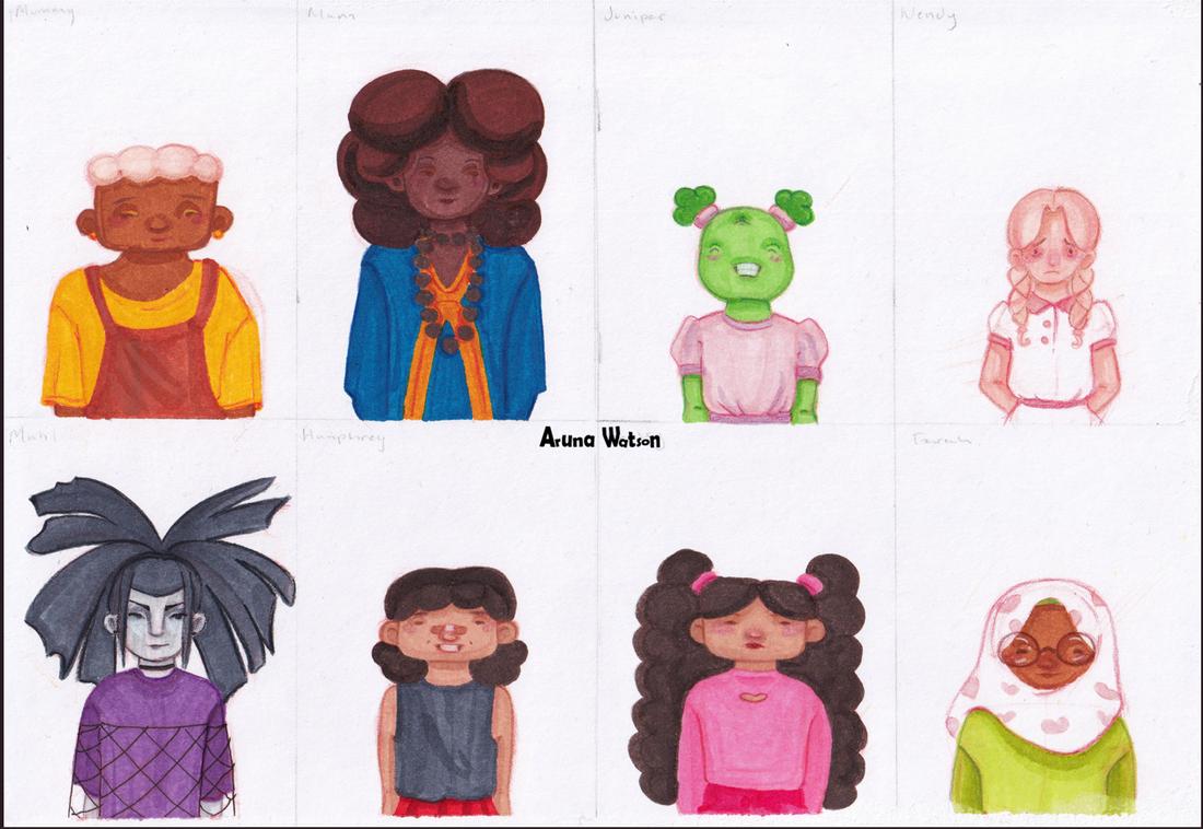
Mummy and Mam
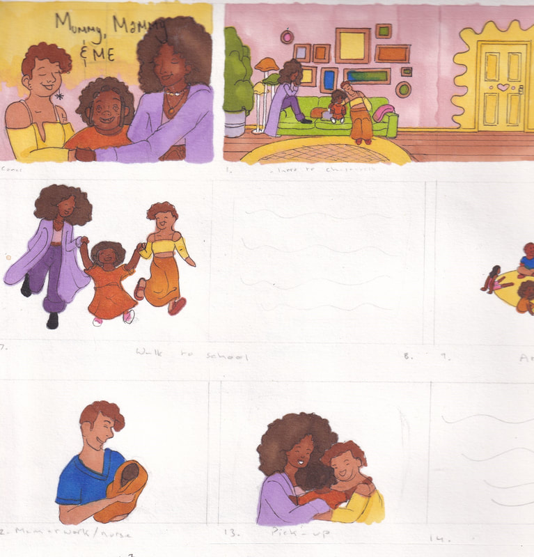
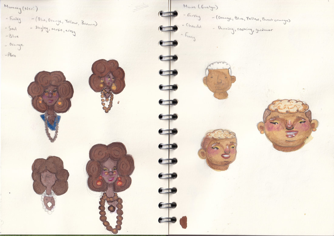
For the main characters parents I reused some characters I had developed as part of my dissertation module (based on same sex representation in children's literature). I ended up scraping this story because it didn't fit with the end essay. However I really liked the Mummy and Mam characters I created.
These are some scans from that project but I felt their personalities matched with this new story I had. For me I also liked the idea of having a diverse character cast as this has really informed my illustration path so far on the course. Having a black and lesbian couple in a children's book that isn't solely about them helps normalize those relationships for the child reader.
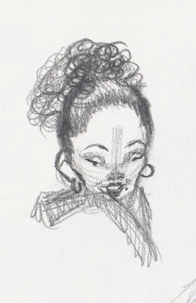
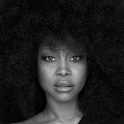
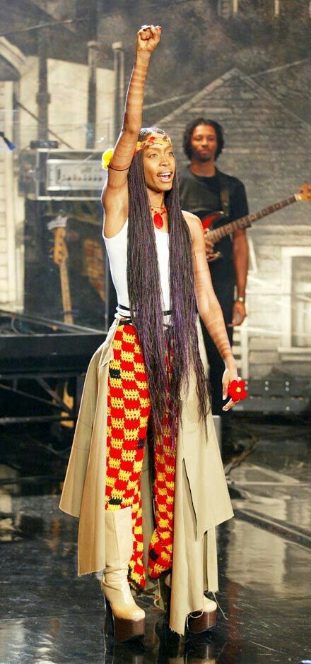
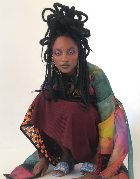
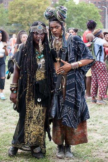
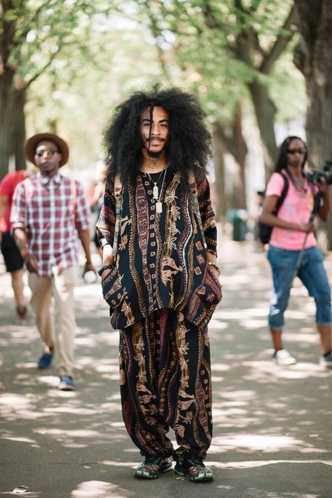
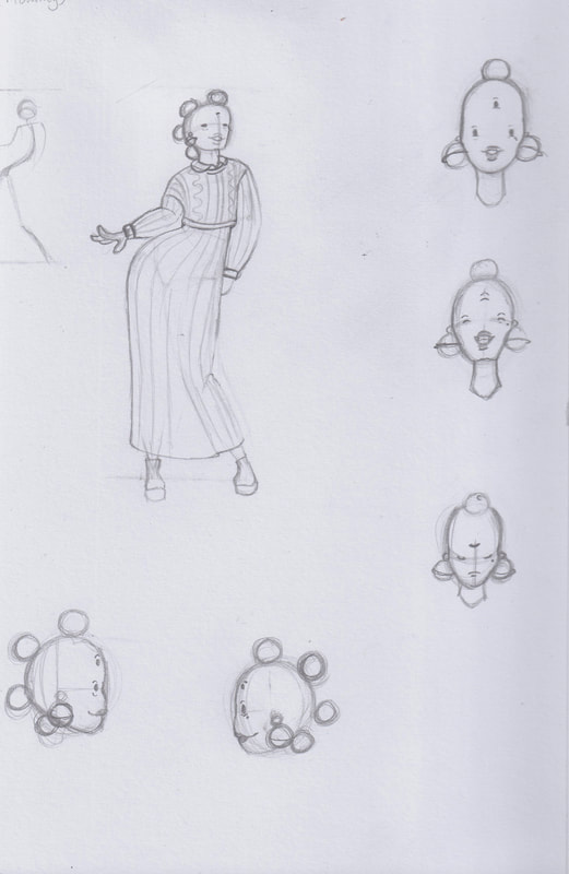
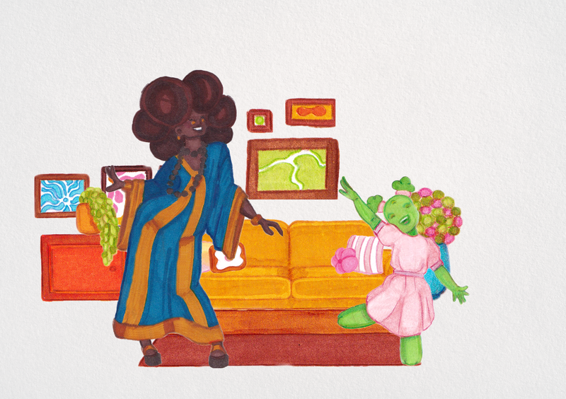
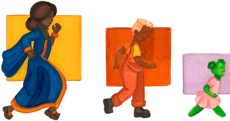
I wanted Mummy to feel like a free spirit, I had this idea that in the story she would be dancing with my main character. I took inspiration from a fashion subculture called Afro-Punk, this is similar to bohemian style but is more common in the black community. A celebrity who embodies this look is Erykah Badu, her eccentric look makes her stand out to me. I also made Mummy's skin tone darker and with a cooler undertone. It was important for me that each character looked unique, and well representative of the communities I references.
Mam's re-design
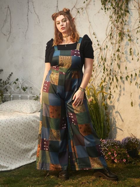
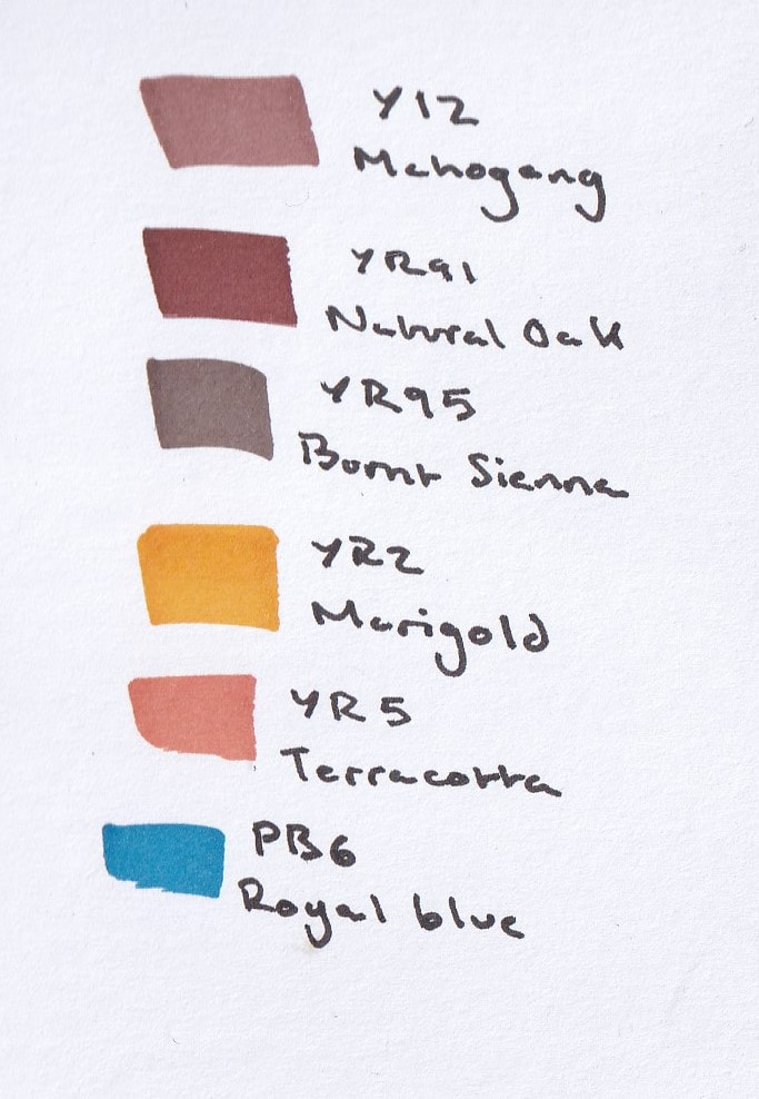
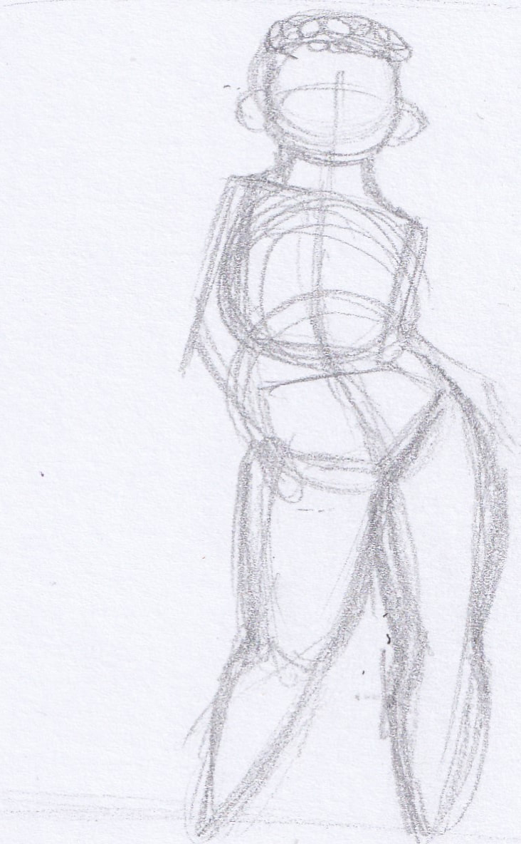
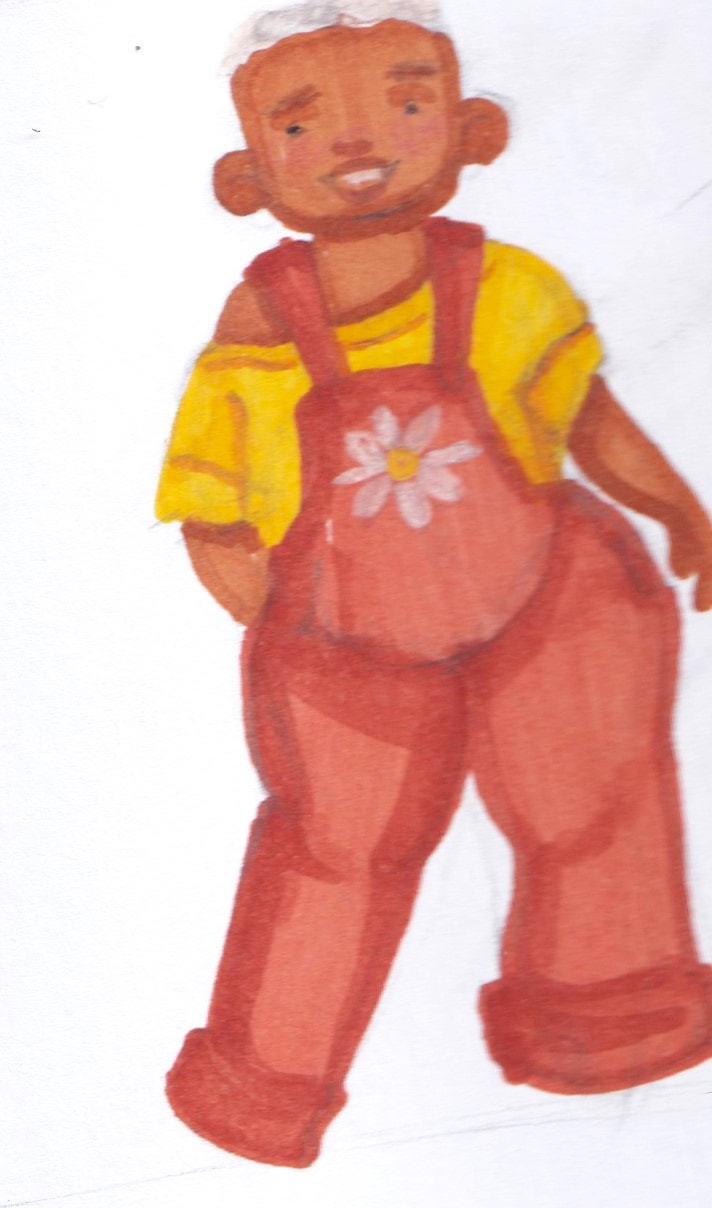
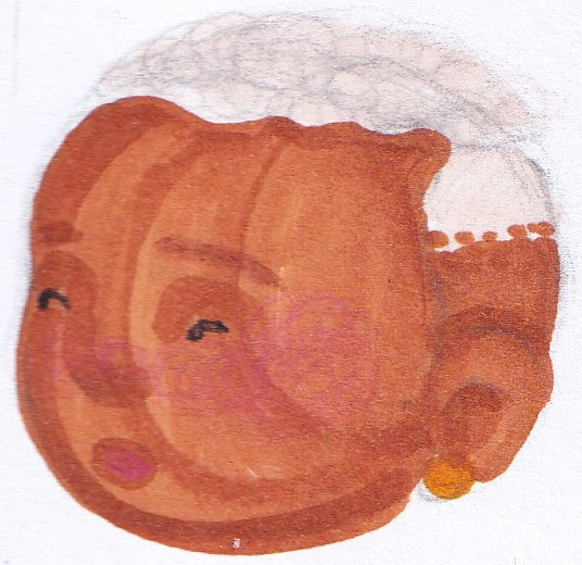
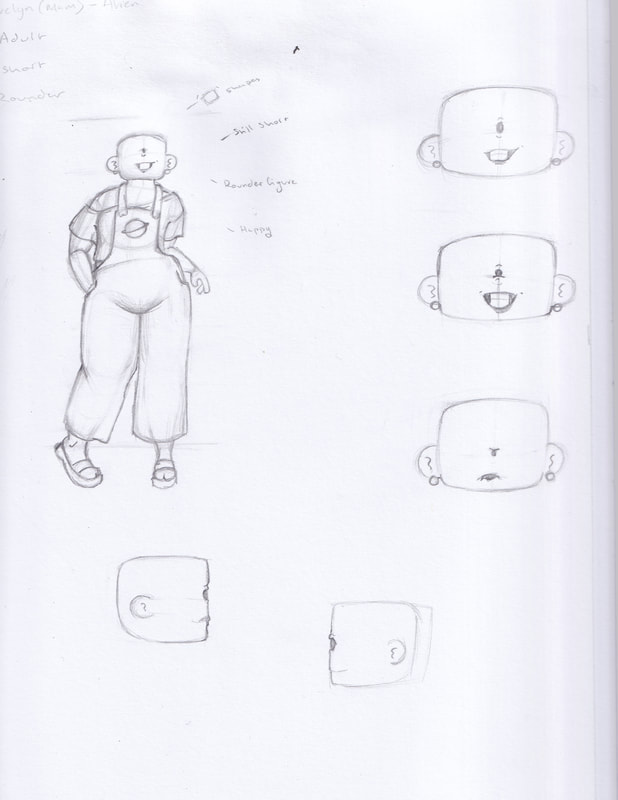
I mostly like Mams original design, I felt the colours all worked together well creating a sunset palette almost. It also contrasted Mummy's well so they wouldn't blend together when they were illustrated together. I kept her fuller figure, her short hair, shorter figure, and her lighter skin tone. I replaced her cropped shirt and skirt for a dungaree set. This felt more accurate for what you would see in a children's picture book.
|
|
|
|
|
|
Whilst redesigning Mummy and Mam I watched and researched a lot about the representation of Black people in media. I learnt about Colourism: which is the discrimination of a person based on their skin tone. It is a prejudice that places darker skin lower than lighter skin.
Given my own mixed race identity I knew it was important to represent the different racial groups positively. While in the story it doesn't impact the story line portraying minorities positively is important to me. |
I went back in using shape theory to better adapt them for the story, I learnt that shorter or rounder characters are perceived as kind or cute. Slimmer sharper characters can be either villainous or stern. The difference being if the shapes are rounded off or not. (an example being Mario verse Waluigi. Mario being rounder and softer means hes seen as more friendly, Waluigi is taller and has sharper feature so is seen as less appealing to the audience).
|
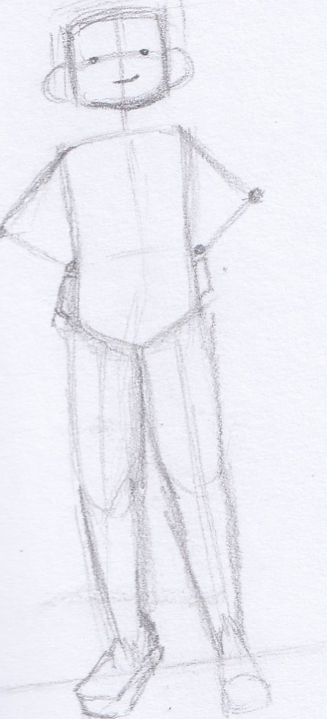
I wanted Mummy and Mam to have opposite appearances, Mummy being the taller of the two I used more thin in width shapes for her design. Using this technique meant she feels a lot taller and motherly compared to the younger characters. For Mam, I used more short in height but wide shapes to contrast Mummy. Her body shape is curvy so using rounded and soft lines complimented this more. I also realised they resemble the number 10 which I like. This technique is used by Anoosha Syed to create a difference in her characters appearances.
Main character- Juniper
|
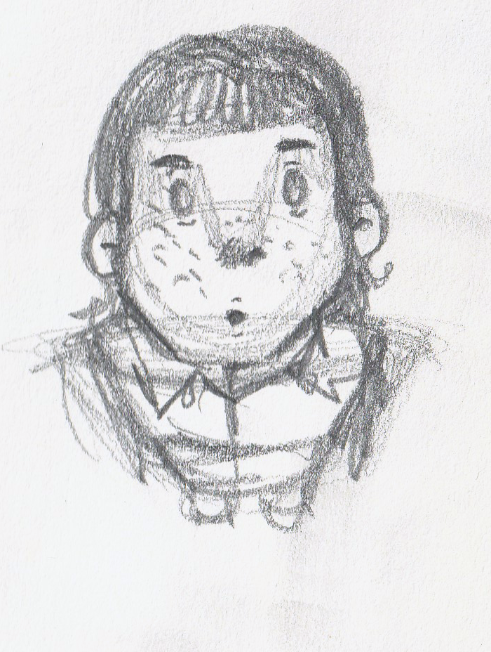
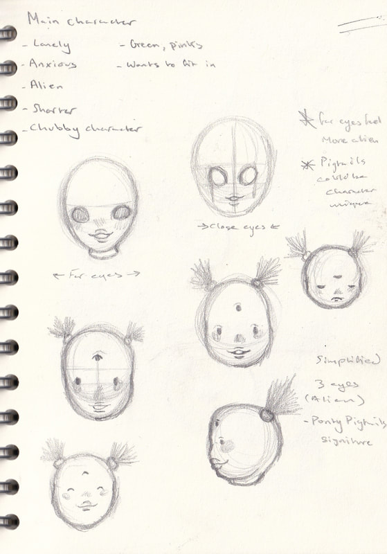
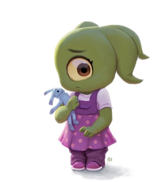
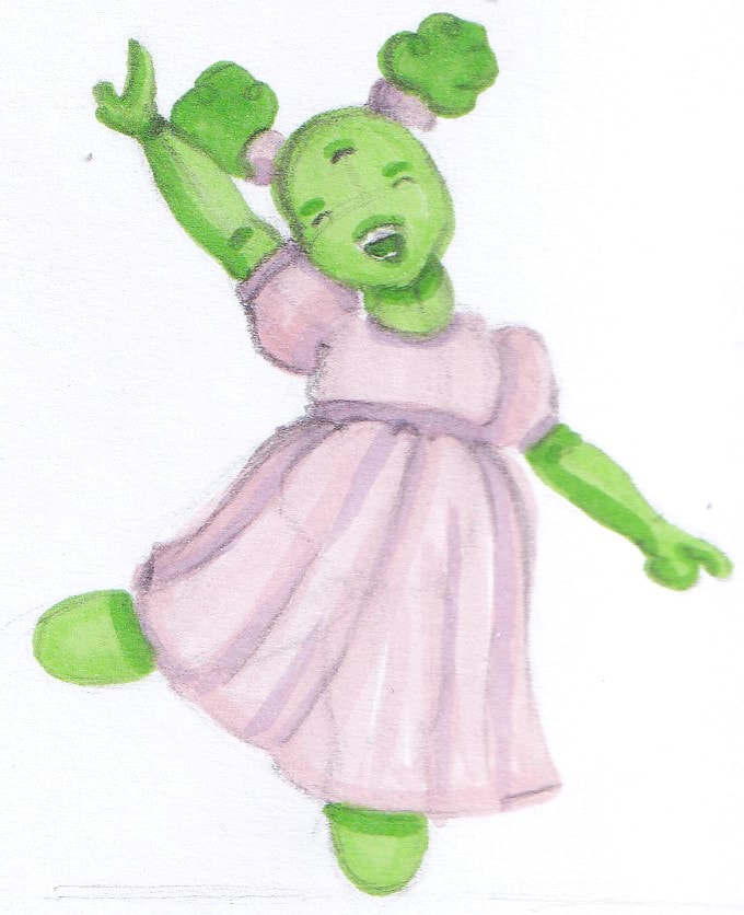
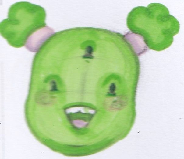
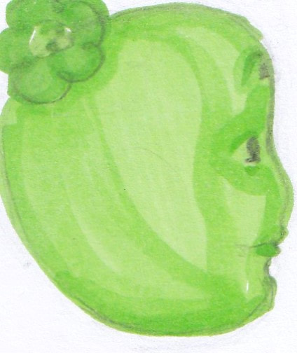
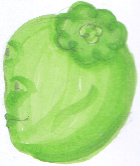
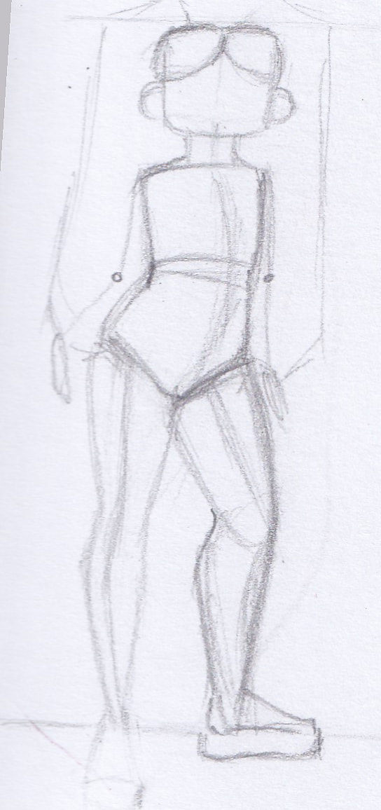
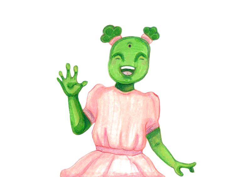
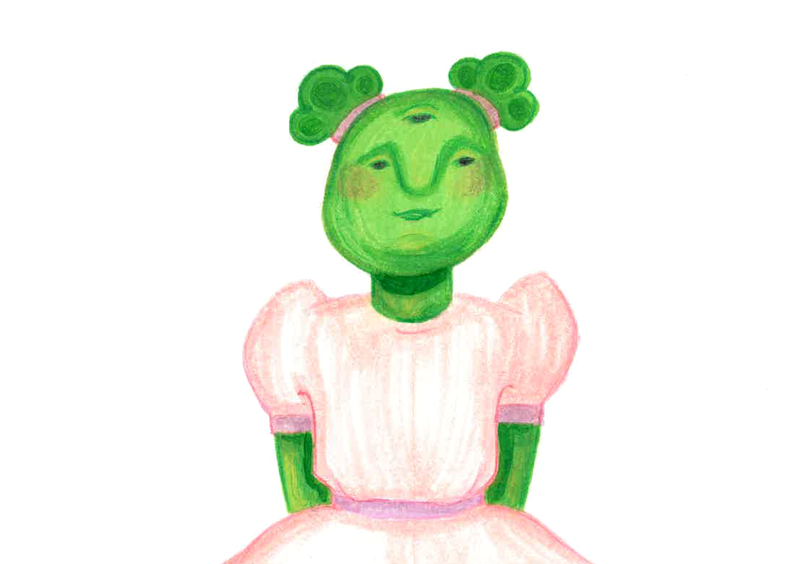
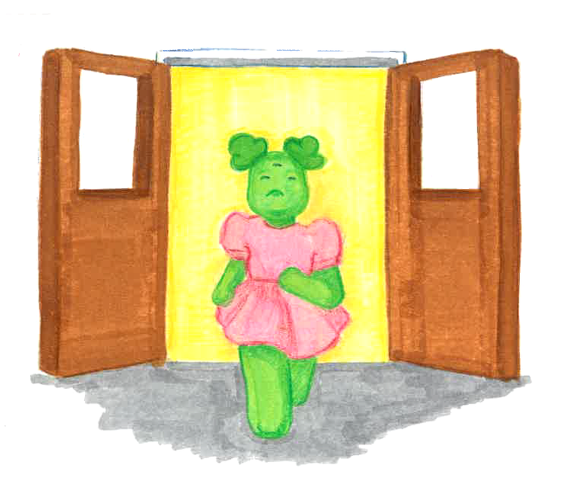
Using this technique for an alien was interesting, I wanted Juniper to use the stereotypical "little green alien" visual language. I wanted her to look like a young child (around 6-8), so a tip i picked up last year was children's faces tend to fit into a square. Meaning their heads are bigger compared to their faces as they haven't developed yet.
|
Matilda 'the goth'
|
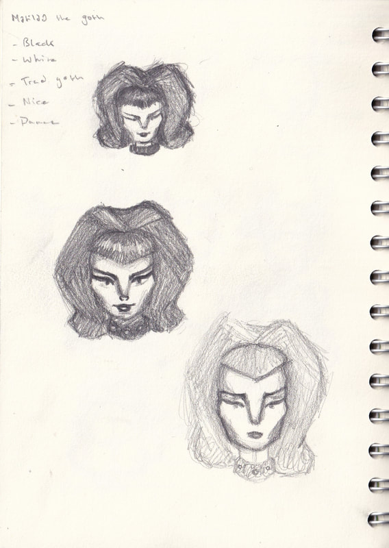
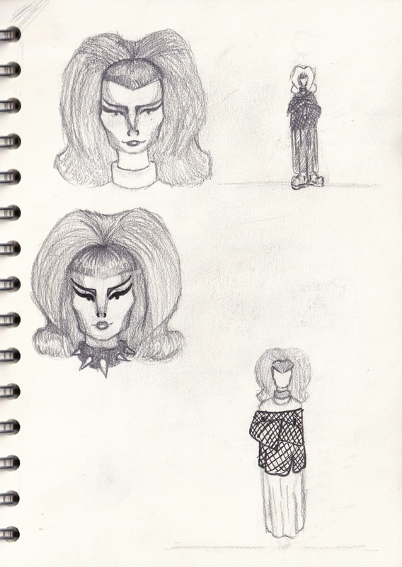
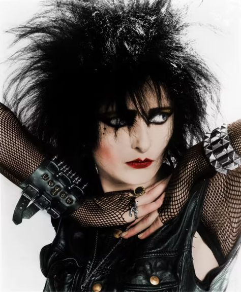
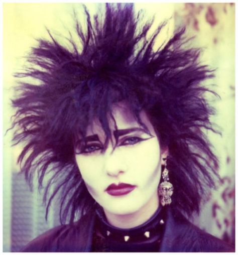
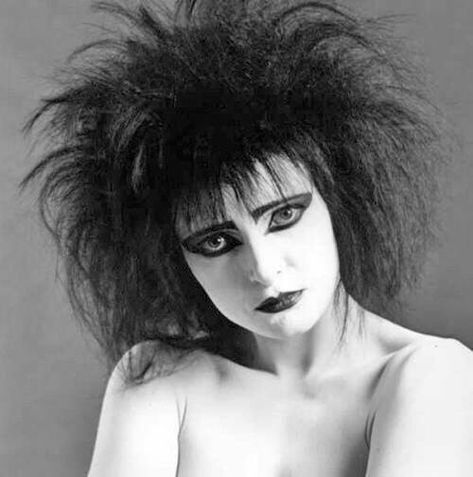
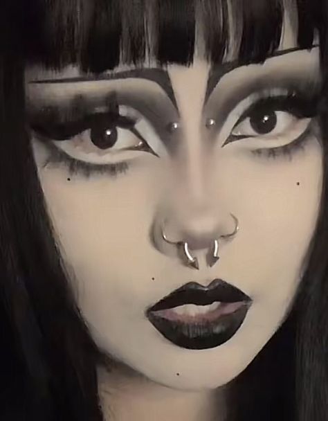
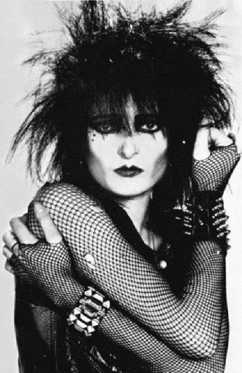
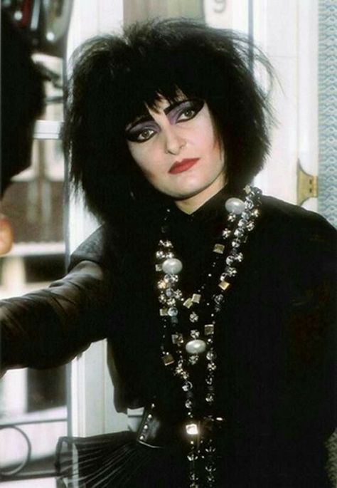
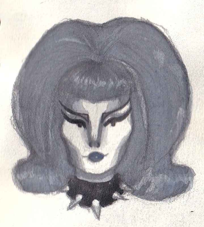
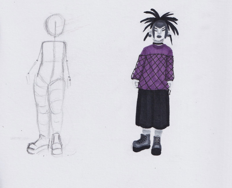
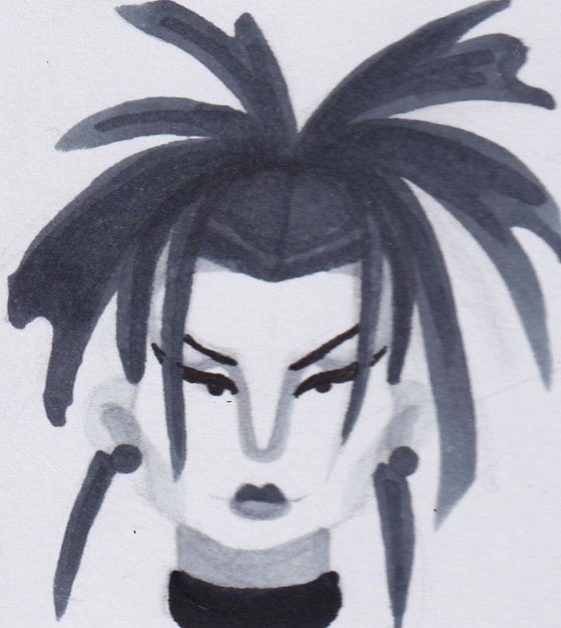
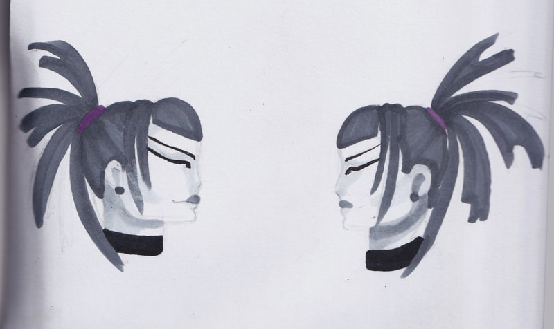
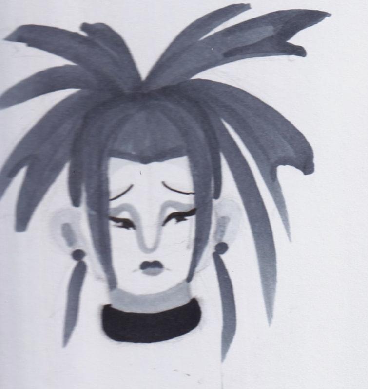
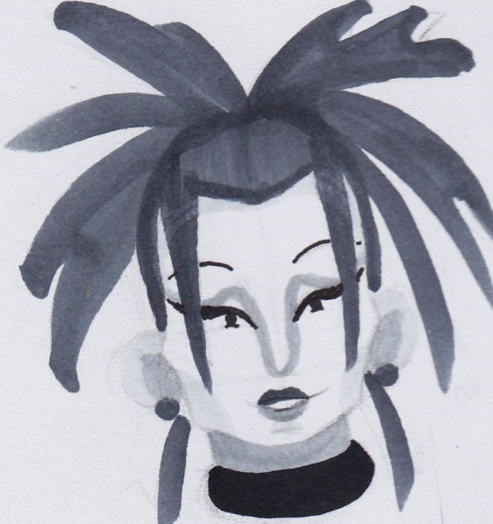
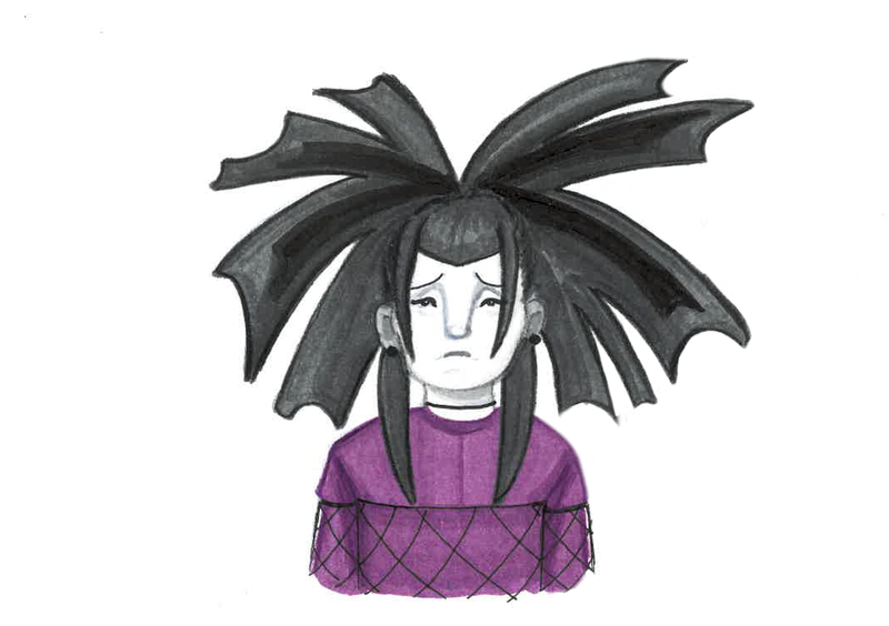
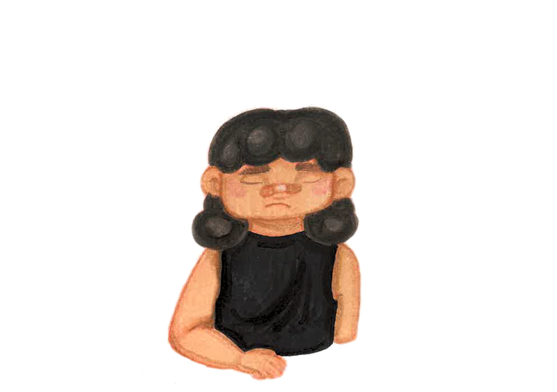
For Matilda 'the goths' appearance I referenced classical goth makeup. High contrast, sharper lines, high and big backcombed hair.
I wanted to make Matilda a nice character, Goths are seen as "scary". However they're the nicest people you'd meet. I want her to look like she's in black and white compared to the other more colourful characters. I took a lot of inspiration from Siouxsie and the banshees. |
|
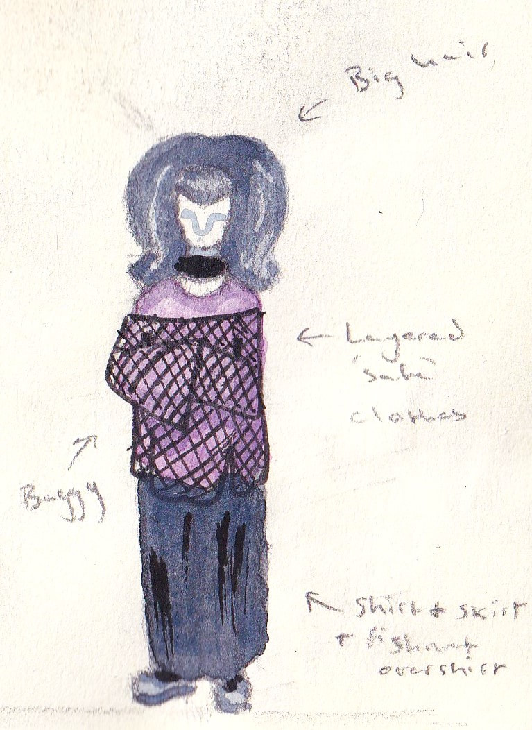
For Matilda's final look, I wanted to reference the trad goth aesthetic. I want her to look like a friendly goth character, who is relatively quiet but accepts Juniper for her weirdness. Solidarity in weirdness. I imagine Matilda is actually kind of short, but her hair and boots give her added height.
|
Becky- The popular
|
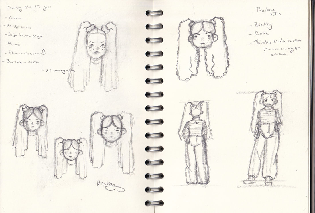
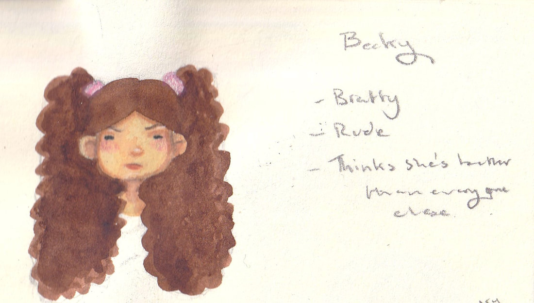
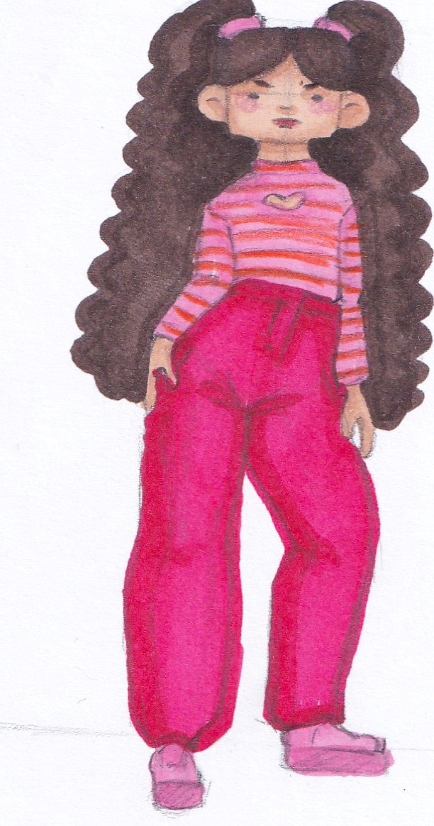
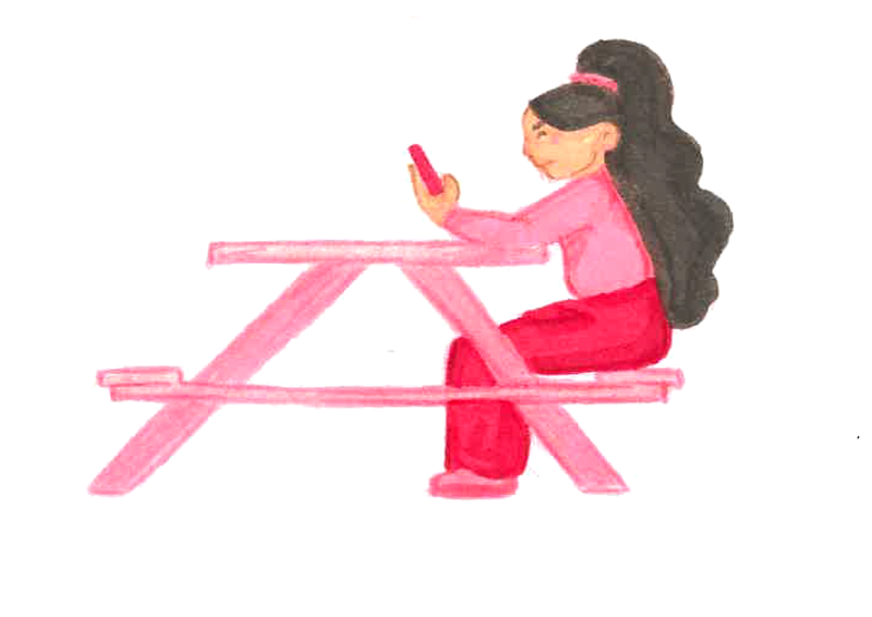
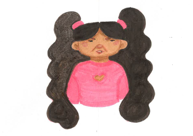
For Becky's final design I wanted to use a lot of pink. Pulling on the idea of the bratty and spoilt girl. I thought her and Juniper having similiar colour palettes could be an interesting reason why Becky rejects Juniper.
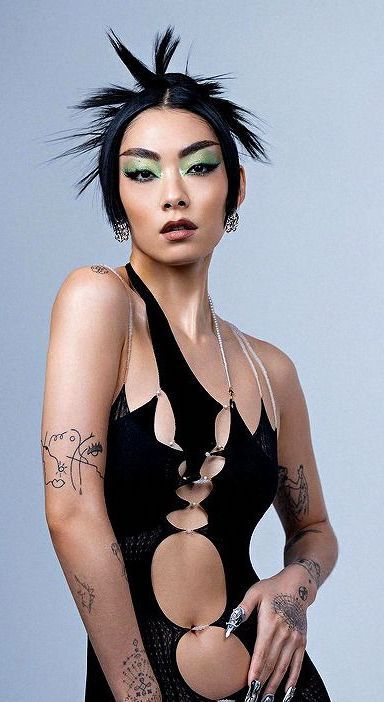
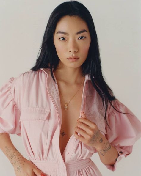
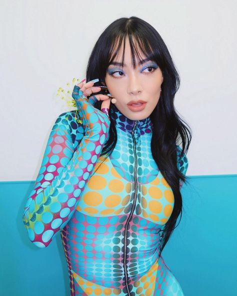
I referenced Japanese-British singer Rina Sawayama. I wanted the characters to be diverse and thought having an east asian representation was important. I also used square character design for her. To show her younger age which contrasts her fiercer attitude. |
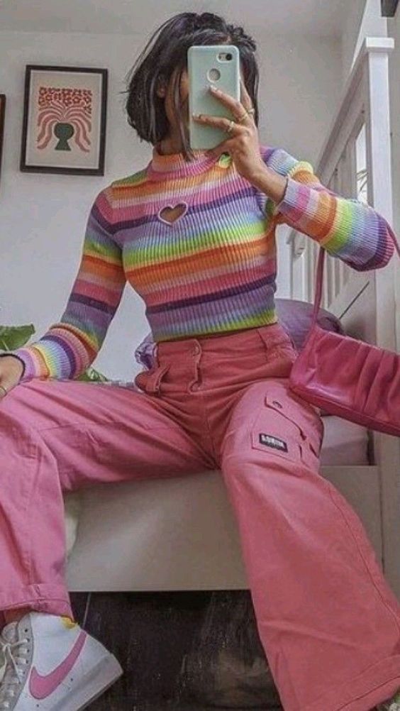
I wanted her to look annoyed in all her illustrations, like she cant stand having to give people her attention. I took inspiration from street wear as well as barbie-core because I thought these styles helped portray her bratty, popular, rich character well. Being popular with younger kids. I wanted her to be just taller than Juniper to add to her superiority in their relation ship.
Farah- The nerd
Humphrey- Artsy
|
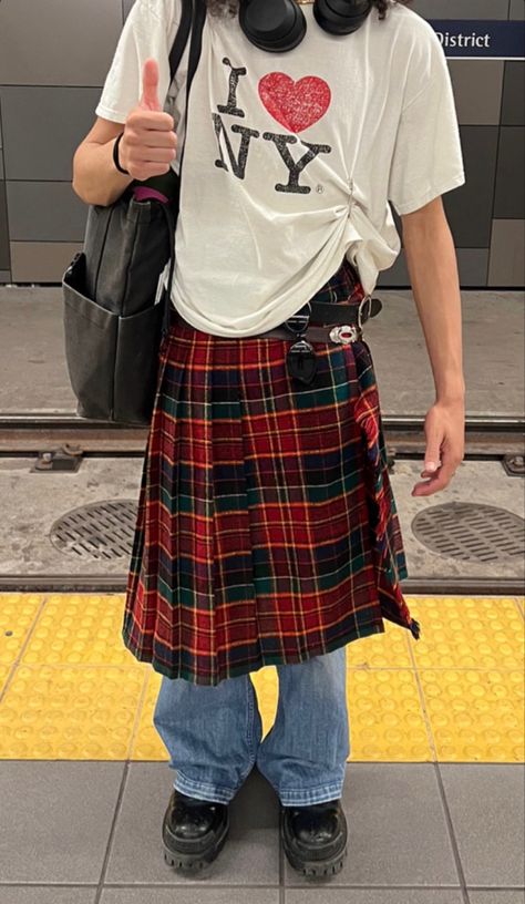
For Humphreys character design I used a lot of square shapes. This helped separate them from the more feminine characters. I envisioned Humphrey as being non-binary. This is an interesting concept for a child character as there is debates on if its something children know. However I really liked that Humphrey represents the fluidity of expression for more artsy people in their design.
|
|
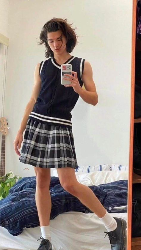
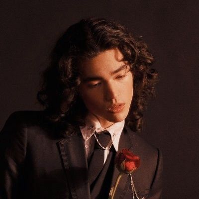
With Humphreys, design I wanted to reference androgynous fashion. I envioned Humphrey identifying as Non-Binary and using they/them pronouns. As a masc presenting character I imagined he'd be a little taller than some of the other characters. I referenced Conan gray, an Asian-American singer. He experiments with androgyny and I thought this inclusion would be cool for potential gender questioning kids to see.
|
Wendy- the weirdo
Character Design Sheets
It was suggested to me to create character design sheets for each character. To show them at different angles and emotions to help develop them as characters.
Mummy and Mam
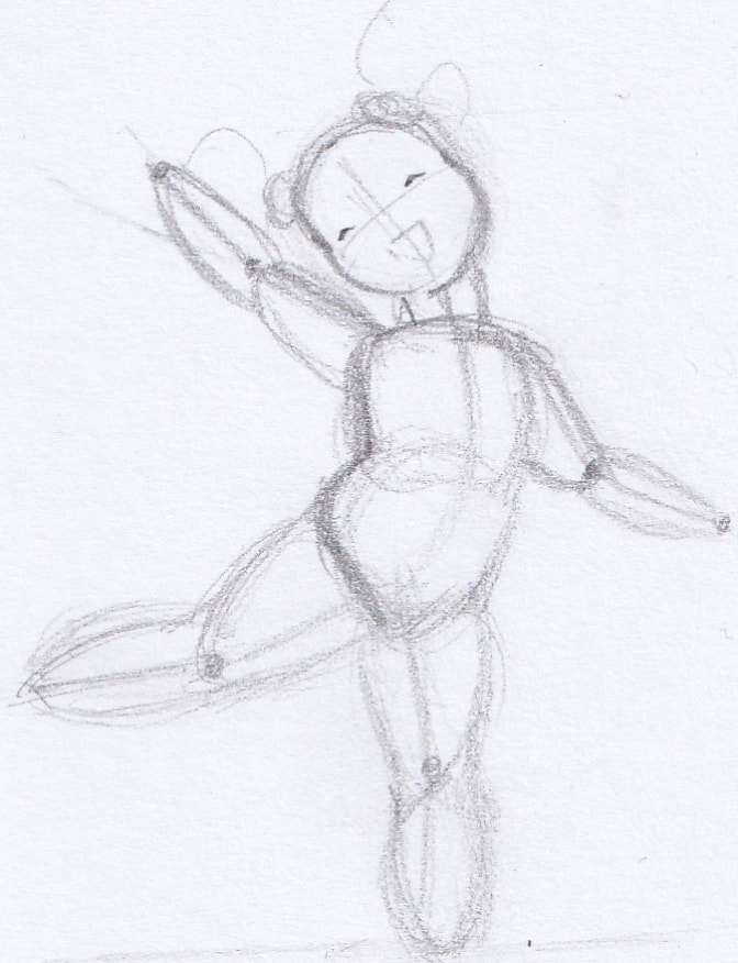
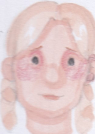
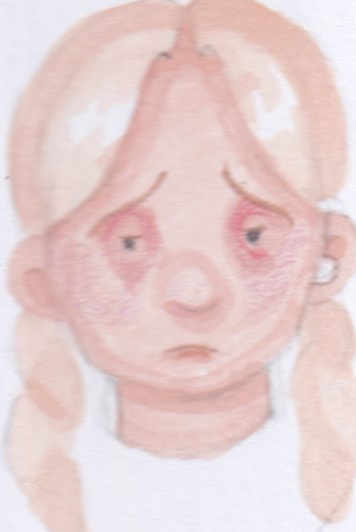
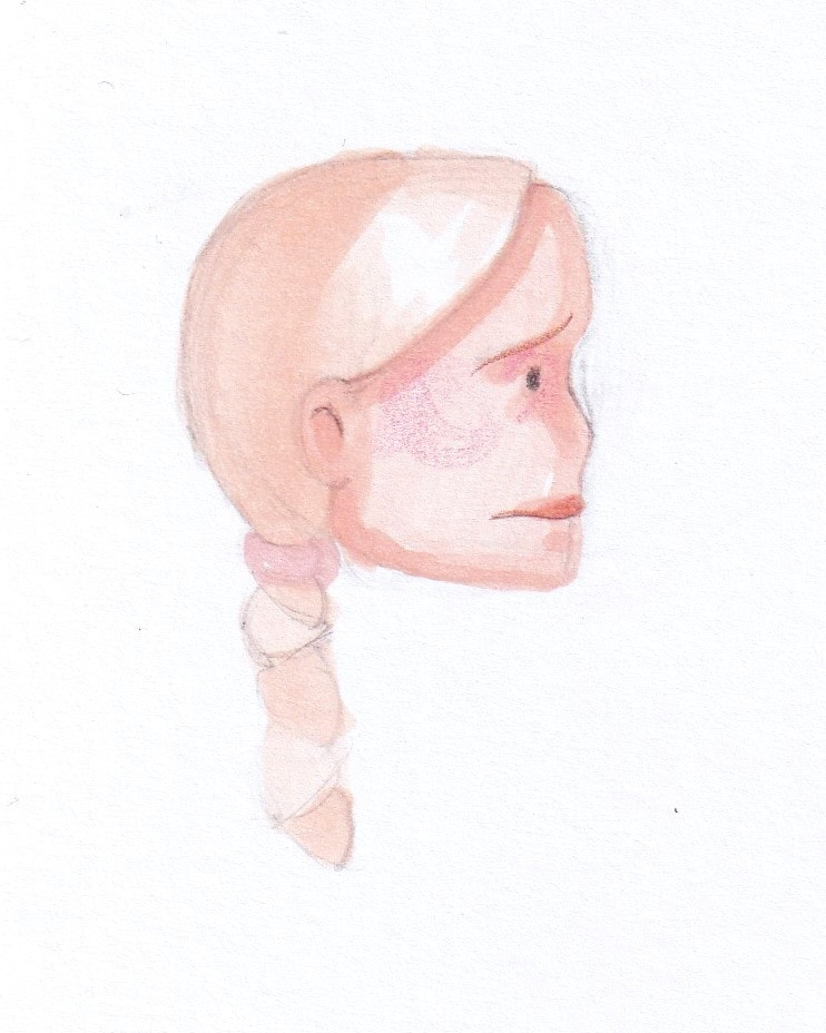
I decided to show some more personality for the characters, I imagined that Mummy is quite a free soul person that she is very in tune with emotions. She isn't going to be in the story too much so I illustrated her looking sad and happy, her side profiles (looking up and down) and her full face at different angles. This really helped get an idea for how her character will appear in the final book.
For Mam she is also a free spirit however I imagined her to be a little more serious in the parents relationship. Again I illustrated both sad and happy emotions and her from a few different angles. This exercise was helpful for me to picture some illustrations that depict both Mummy and Mam. For example how they'll look when comforting Juniper, which I imagined them being illustrated sitting in bed with Juniper.
For Mam she is also a free spirit however I imagined her to be a little more serious in the parents relationship. Again I illustrated both sad and happy emotions and her from a few different angles. This exercise was helpful for me to picture some illustrations that depict both Mummy and Mam. For example how they'll look when comforting Juniper, which I imagined them being illustrated sitting in bed with Juniper.
Juniper + Alien parents
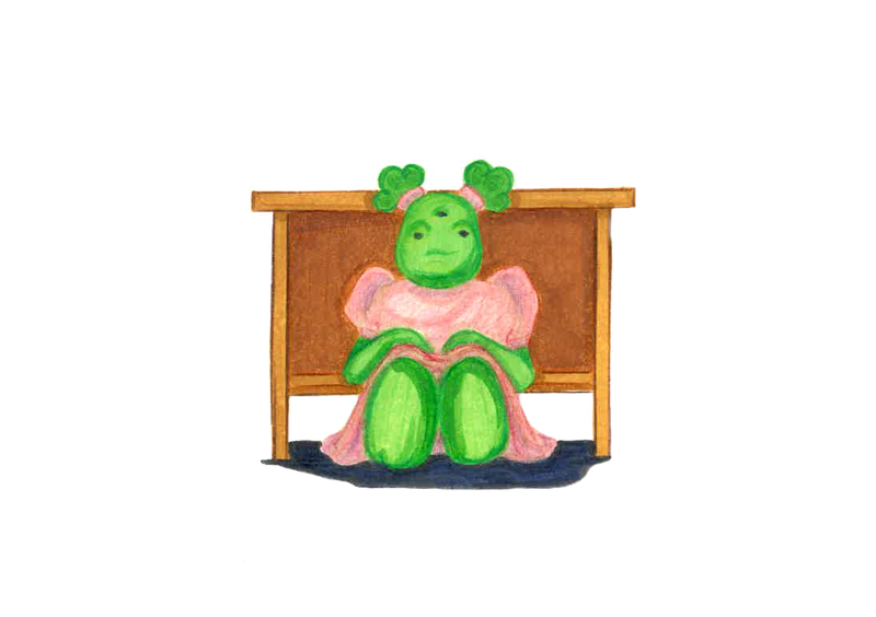
For Juniper I started to form the idea that she was excited to meet more humans, as the only alien I imagined that her parents hadn't introduced her to many. I tried to show her to be very expressive in her emotions. That when shes rejected you really see how she doesn't understand why. I thought her short and round character design really helped with gaining sympathy for her as a character because even I started to feel bad for her.
It was suggested to me to experiment with Mummy and Mam being aliens as well, to make Juniper a family more close to her. However when completing this idea it took away from the story I had. I imagined that the human Mummy and Mam found a baby Juniper and adopted her. Not really knowing how to look after an alien properly so shes a little confused on her identity which is why she tries so hard to be like the human children she meets. While the alien parents were a cool concept it didn't feel right to the original idea to change the characters that much.
It was suggested to me to experiment with Mummy and Mam being aliens as well, to make Juniper a family more close to her. However when completing this idea it took away from the story I had. I imagined that the human Mummy and Mam found a baby Juniper and adopted her. Not really knowing how to look after an alien properly so shes a little confused on her identity which is why she tries so hard to be like the human children she meets. While the alien parents were a cool concept it didn't feel right to the original idea to change the characters that much.
Becky and Humphrey
I decided pretty quickly that Becky and Humphrey are twins, they are very opposite in personalities and I liked how different stylistic choices can impact similar looking characters.
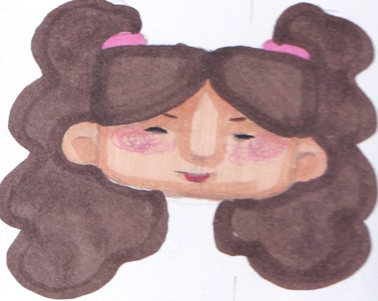
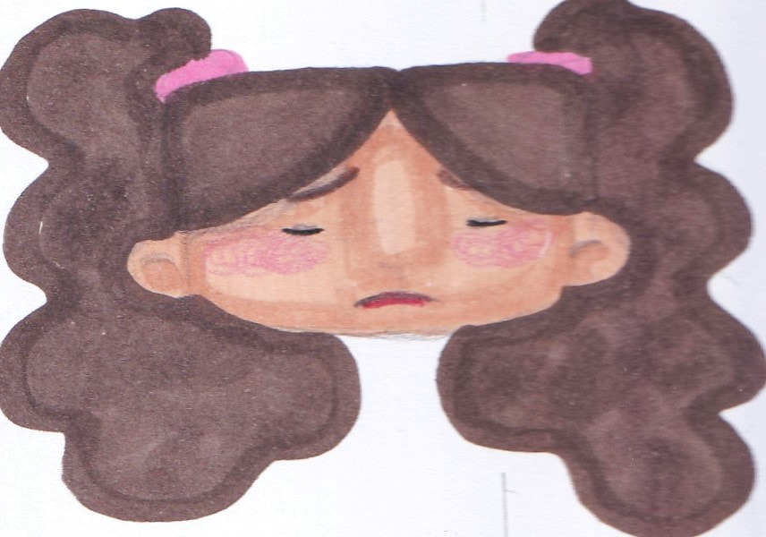
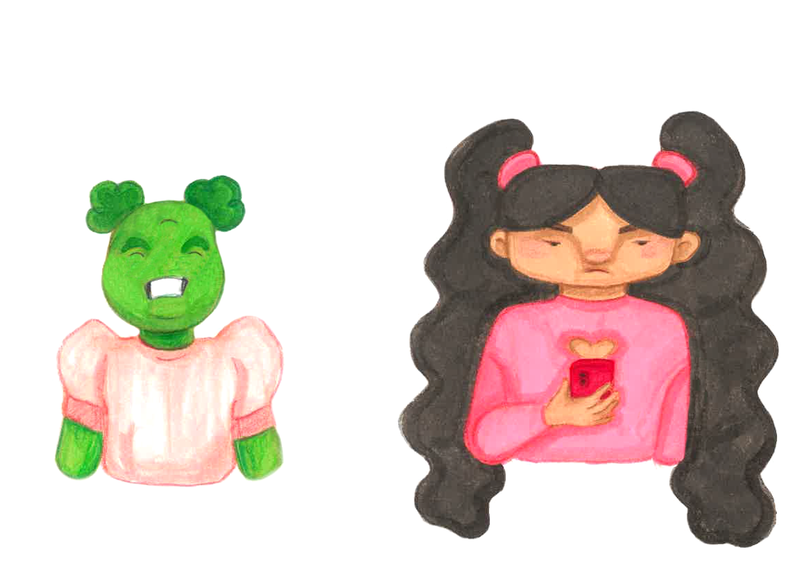
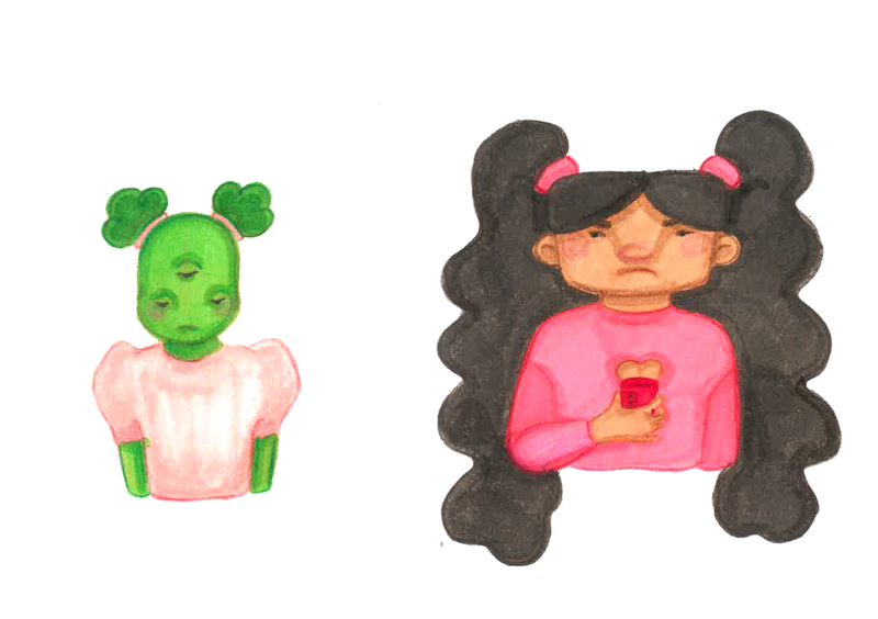
For Becky, I liked the idea of her looking constantly angry, like she doesn't want people to talk to her unless she speaks to them first. I got the idea that she wouldn't even care that Juniper is an alien and would be more annoyed that her and Juniper are both wearing pink. I pictured her being one of those kids who is always on her phone so maybe doesn't even notice Juniper.
With Humphrey, I imagined them to actually really like Juniper and is one of the only characters to accept her quirkiness. I could imagine what makes them angry with Juniper is her eating his art supplies. Which then makes him ask for her to leave, which is upsetting for Juniper as she thought she'd finally made a friend.
Farah and Matilda
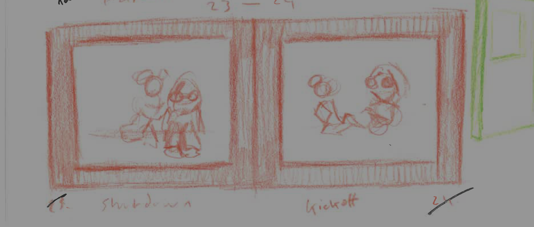
For Farah's character sheet I wanted to convey her as being a shy person someone who can be in a small conversation but is easily talked over or ignored. I imagined she prefers quiet time alone and Juniper being so loud and excitable would be over stimulating for her. I wanted to represent an autistic character and her personality felt right. I thought she'd feel a 'shutdown' from her talk with Juniper. This would be explained to her and stands as why she feels rejected by Farah.
With Matilda's design sheet I wanted to show her as being emotive, it was interesting to do because of her makeup. I started to imagine that Matilda is accepting but sensitive, potentially being made fun of by Becky for her Gothic appearance. It made me think that Matilda rejects Juniper for trying to dress goth without listening to or appreciating the subculture. Juniper not fully understanding why Matilda feels hurt.
With Matilda's design sheet I wanted to show her as being emotive, it was interesting to do because of her makeup. I started to imagine that Matilda is accepting but sensitive, potentially being made fun of by Becky for her Gothic appearance. It made me think that Matilda rejects Juniper for trying to dress goth without listening to or appreciating the subculture. Juniper not fully understanding why Matilda feels hurt.
Wendy and Wendy
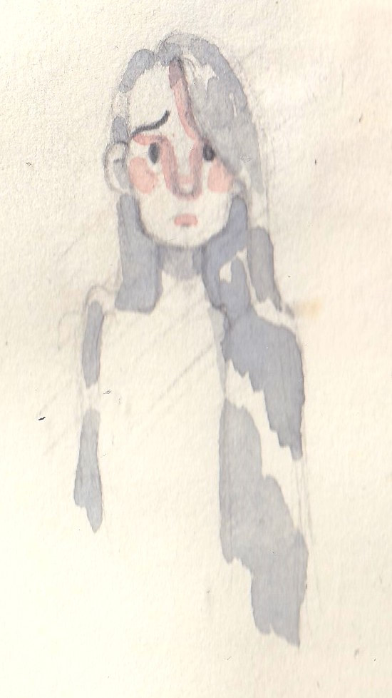
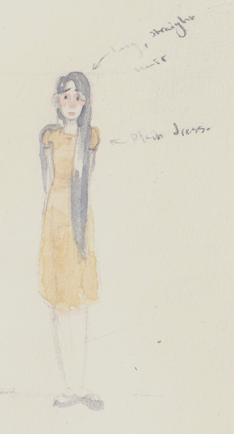
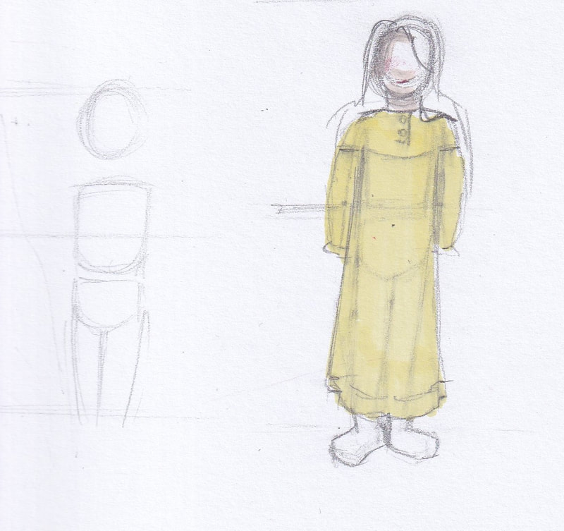
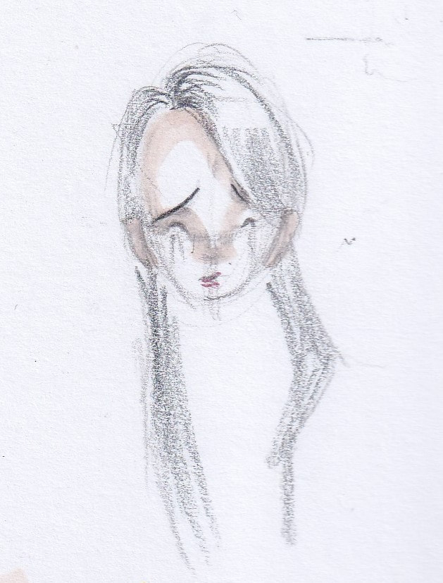
Wendy 's character design sheet developed the most out of all the characters, she was inspired by a character I had in college. Originally she felt too old compared to the other child characters, with her grey hair and gaunt appearance. I revisited her design again with a more youthful look. Inspired by older fashion. I kind of liked the idea of Juniper running into Wendy on accident and finding her quite scary. Subsequently running away from her. Which saddens Wendy who like Juniper struggles to make friends so is upset that another person is scared by her. I also designed her to be deaf, to be more inclusive. With a hearing aid in her right ear.
Character research
For some of my characters who represent underrepresented social groups, like Farah being Autistic and a Muslim character. Or Humphrey being East Asian as well as gender non-conforming, it was important for me to research these groups so I could properly represent how they act through the characters. So I did some research to help develop their personalities.
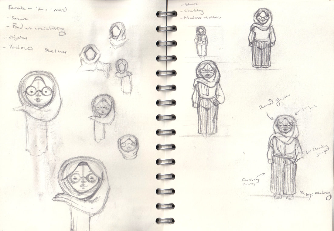
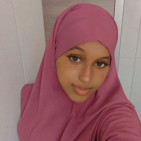
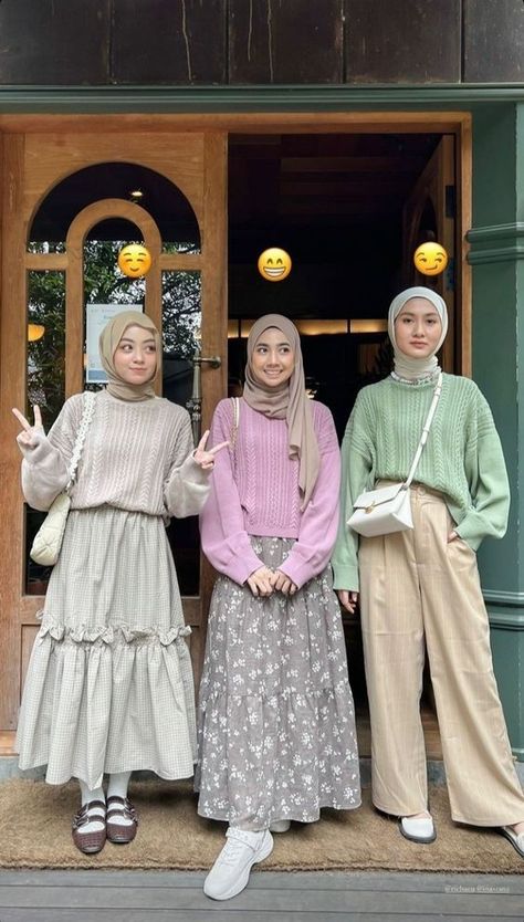
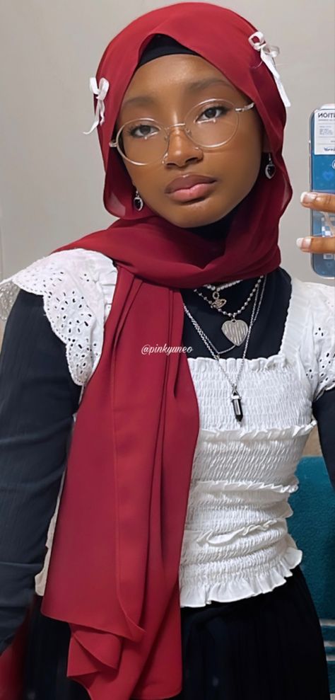
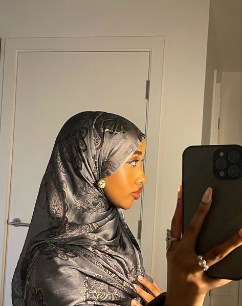
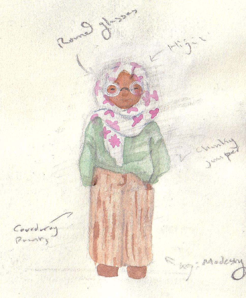
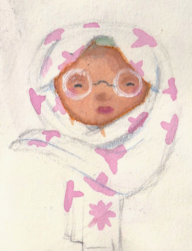
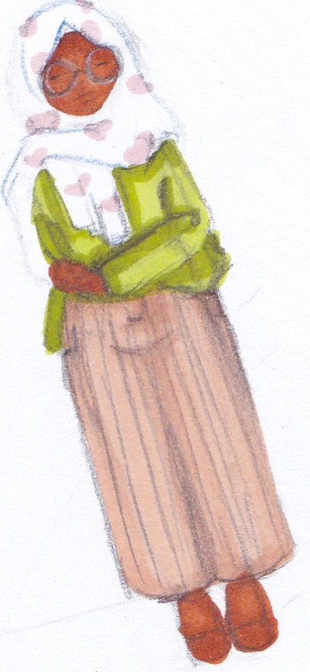
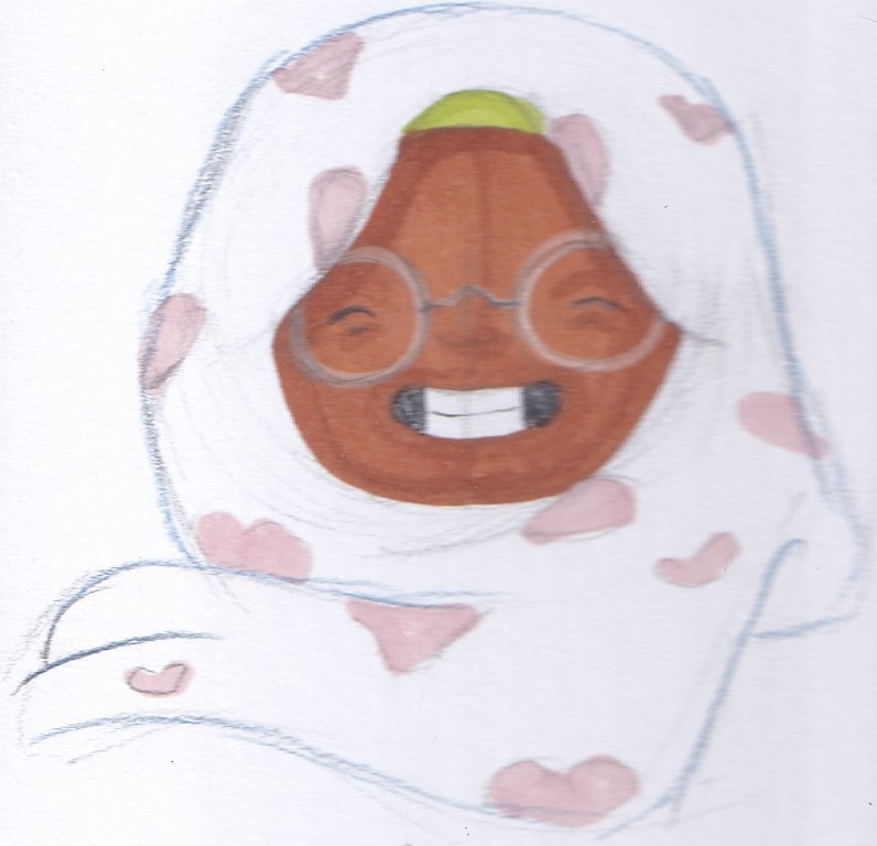
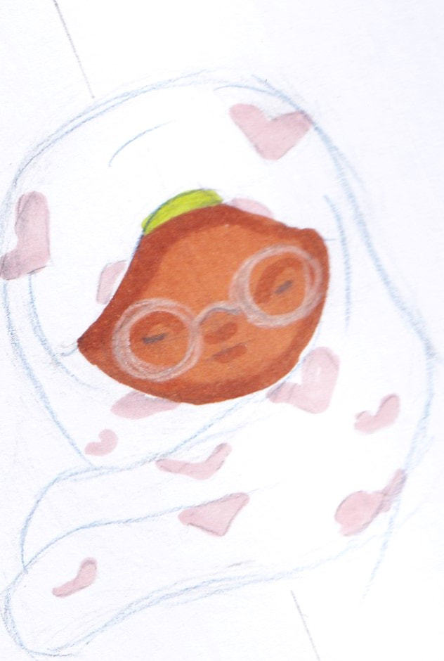
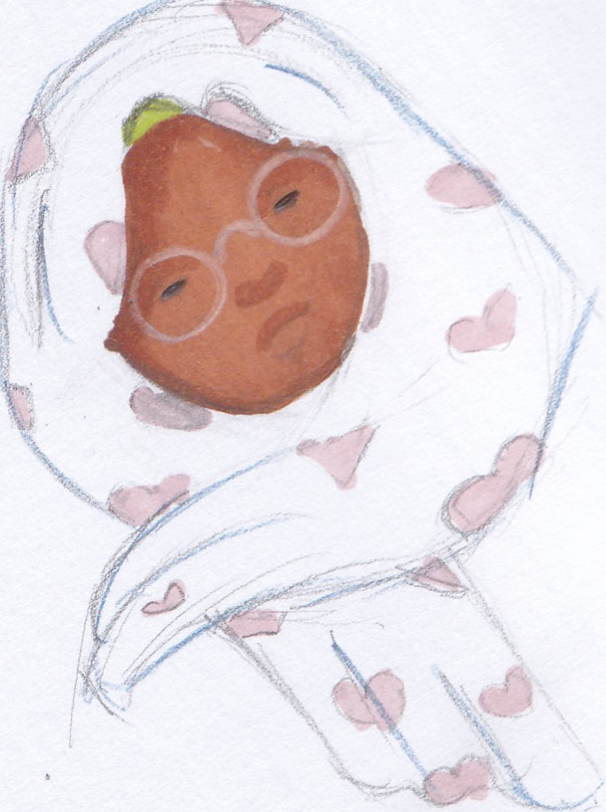
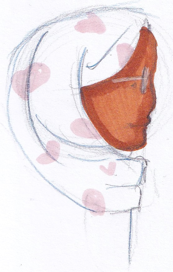
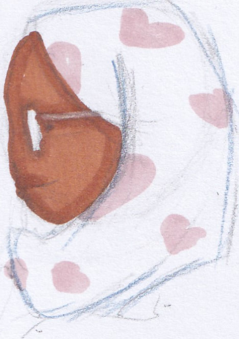
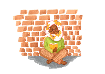
FarahFarah is a complex character. She represents an autistic character, she spends a lot of time alone and it generally quite quiet. She also wears hijab and dresses modestly. For someone who was brought up in a mixed Catholic/Muslim house I still needed to research modest clothing. As well as how to best illustrate a hijab wearing character.
|
|
|
|
|
|
|
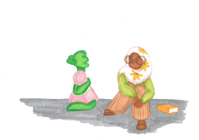
I found it helpful to look at both written and video documents for information. The concept for her character related most to Autism, I would define her as being Sensory Sensitive (overstimulated by sensory input). For her interactions with Juniper I think it would be best to show that Juniper is quite overstimulating to Farah (due to her own excitement). This loud, energetic and very colourful alien puts Farah into a shutdown (The bodies inability to function when overwhelmed). I think showing Juniper learning and understanding this and then apologizing would be helpful to educate anyone else who is confused on autism.
|
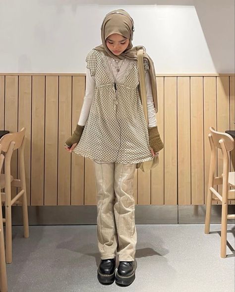
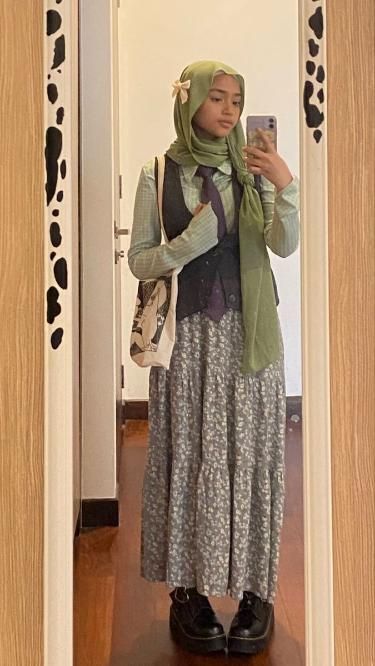
For her modest dress sense, I found a few helpful videos on modern modesty. This takes influence from western trends so muslim women and girls can also join in on them. For her young age I also know the rules are slightly more relaxed and tend to be taught when the child gets older. This information really helped with the reasoning behind her design. I learnt from my research that most modest muslims tend to dress in darker or neutral colours. (this is different from person to person). The reason for this is to draw less attention to themselves. This helped me reason why shes in more neutral older clothes. It links to the religious views she represents. While her heart scarf ages her down a little more and shows her younger age.
|
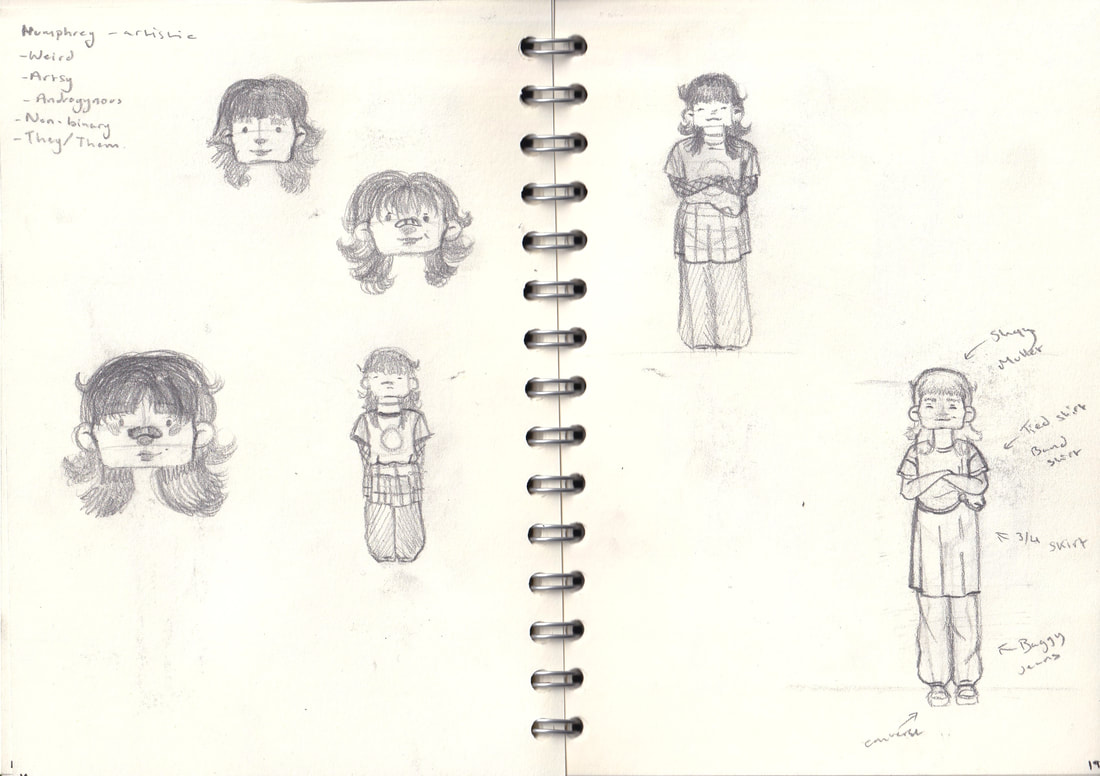
HumphreyHumphrey is also an interesting character. I chose to illustrate them as being from Eastern Asia. Whilst also presenting in mixed gender clothing. (wearing a skirt over jeans). I had to do some research to help develop his character and why they appear this way.
For a child audience to comprehend I'd say Humphrey is more Androgynous. Mixing both masculine and feminine characteristics. I don't want Juniper to offend his style so it isn't something that will be discussed in the book. (its too heavy to do in one page). However this information helps to explain my design choice. As well as represent an East Asian in a cool way as someone who isn't East Asian themselves. |
|
|
|
|
|
|
Identifying as non binary is difficult to explain to many people, because it goes against the western idea of gender. It is an absence of one or feeling in the middle of man and woman. Its difficult to represent because each non binary person will experience or define it differently. For Humphrey with research I believe they could use both They/Them and He/Him pronouns, for children's understanding I would probably use either. I think Humphrey relates to feeling in the middle or male and female which is why they wear a skirt with a traditionally masculine outfit. It was also helpful to learn that many Asian cultures (pre-colonialism) actually identified the presence of a third or other gender identity. It was an interesting link to Humphreys East Asian influence. It was also important to me to have a POC as a non binary character because there is a misunderstanding that it is a western only identity (it isn't).
|
For the research into East Asian culture I would say that Humphrey and twin, Becky are Japanese. This influence their colour palettes because I wanted to represent darker Asian skin tones as well as curlier hair. Both of which are viewed as being bad qualities in the culture sadly.
|
Matilda
|
|
|
|
|
In some aspects Matilda isn't as complex of a character compared to the others, she is a goth and I took inspiration from trad goth fashion for her design. I expanded my research to explain how she becomes upset with Juniper. My idea is that Matilda is a baby bat (a person who listens to goth music, dresses in goth attire but hasn't found their definite goth form yet). I think that in their interaction Matilda talks about her appearance as a goth to Juniper, describing that she feels happy in her goth community than she did when conforming with non goths (which is most goth peoples experience). I thought that maybe Juniper misunderstands this and copies Matilda's look (without listening to the music, which is an integral part of the community). This saddens Matilda who feels like Juniper is mocking her, so she asks Juniper to leave.
Book format- research
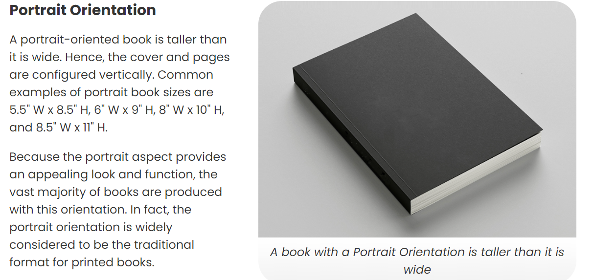
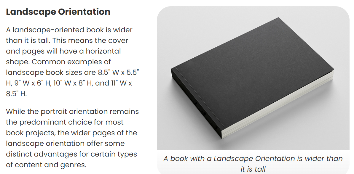
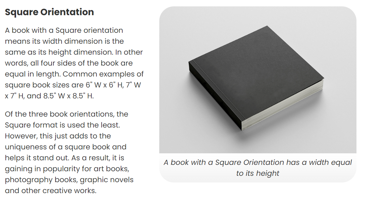
I did some research into book dimensions and what suited my book the most. The three main book sizes I found were Portrait, Landscape and Square.
|
Square books are used the least out of all the formats. There for they stand out the most, because of how unique they are. Their unconventional form is the balance of portrait and landscape. They lend themselves to mostly image based pages. Like photography books or graphic novels.
|
Landscape book formats are used for picture based books. These books are arranged horizontally. The larger page space allows for a more immersive reader experience. This is beneficial for story telling. The sentences can be structure longer.
|
Portrait books are the traditional format for printing books. These books are arranged Vertically. They are common for narrative books and the sentence structures tend to be shorter to fit the page.
|
I think I will go for a landscape format, they are more immersive and a common format for the children's book scene. I also think this will help when it comes to arranging the text and images on each page? spread. Im also thinking A4 would work as its not too small but also not massive so it would be easy to hold.
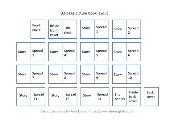
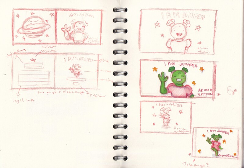
Using the above template I planned out the way the finished book would be ordered from cover to cover. I planned about 28-32 interior pages (adjusting for how i could arrange each page). But kept it in mind when printing the cover added about +4 pages (cover +interior). Something did here was sketch in a landscape format so I could get an idea for the final version.
Cover design generation 1
I wanted to play off of Juniper being an alien as well as a child, I think most of the time children seem to look up. To us as adults but also at the world. I thought this idea was very playful.
I developed that idea to using a fisheye perspective, I thought it was a fun playful idea, however it didn't look good as a landscape thumbnail.
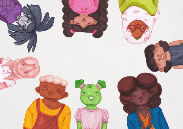
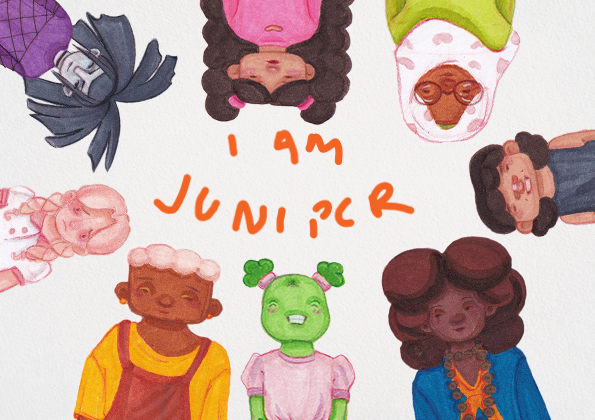
I liked this idea of the entire character cast, it felt welcoming to have them all there sort of like they are welcoming the viewer.
This idea was to have the characters holding up books, with each side of the covers having letters to show the book title.
I went back to the fish-eye idea, but this time having all the characters in it. It reminded me of the bugs bunny outro on looney tunes.
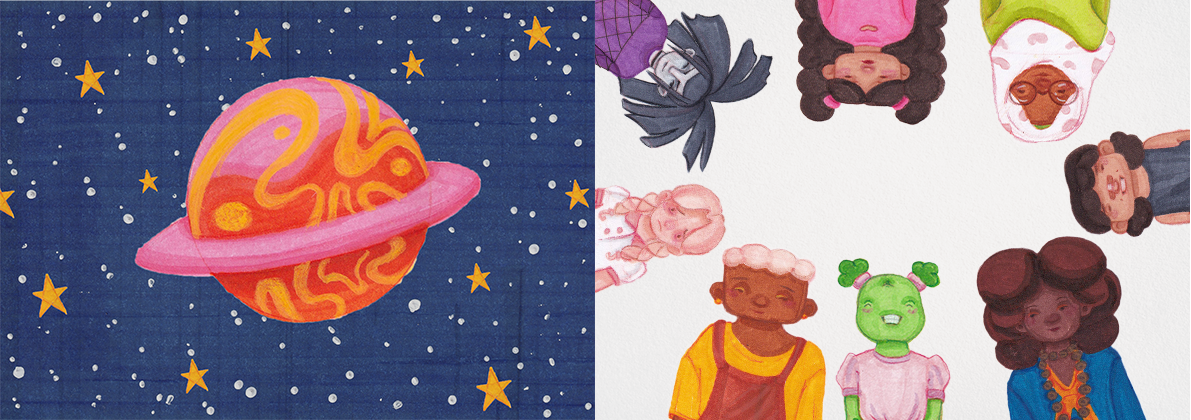
This idea was a lot more conceptual, having Juniper in the stars. This could work as a dust jacket perhaps.
Cover development
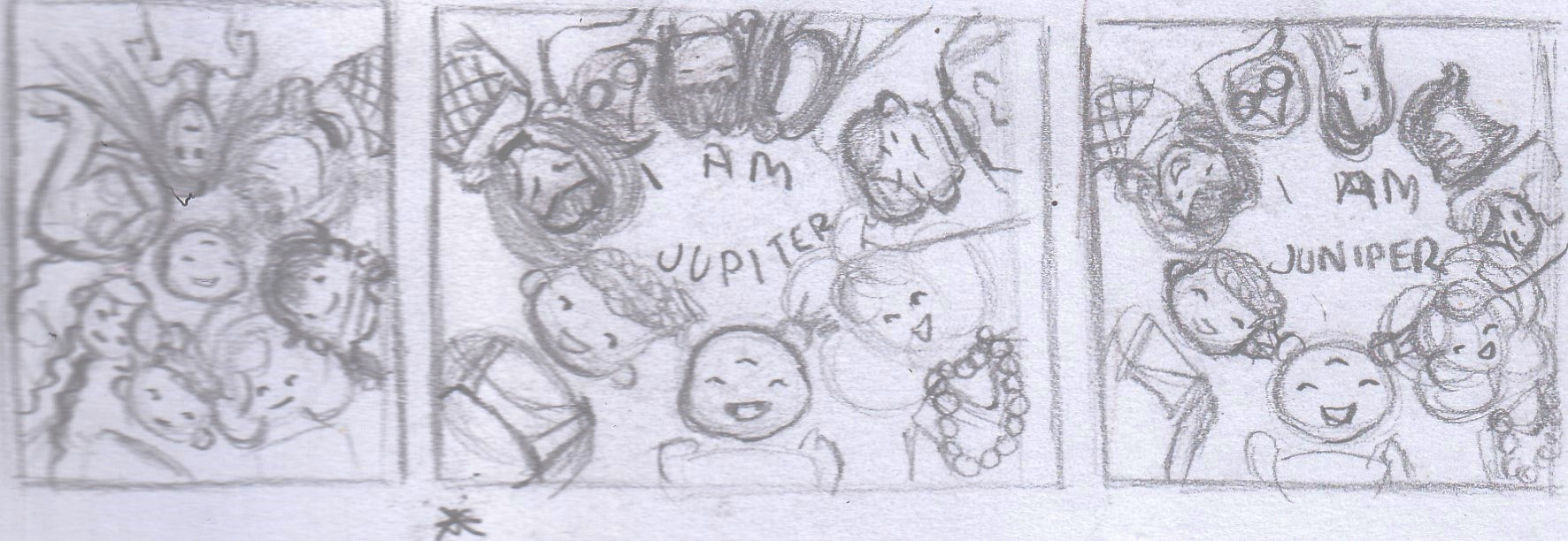
When I presented this generation of thumbnail, the group idea seemed the most popular. It felt chaotic but fun to see them all there.
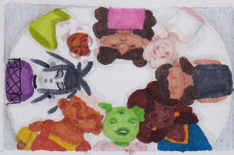
I went back in to redraw the characters to a higher quality, having been asked to add some outlines to make them less blurry when scanned.
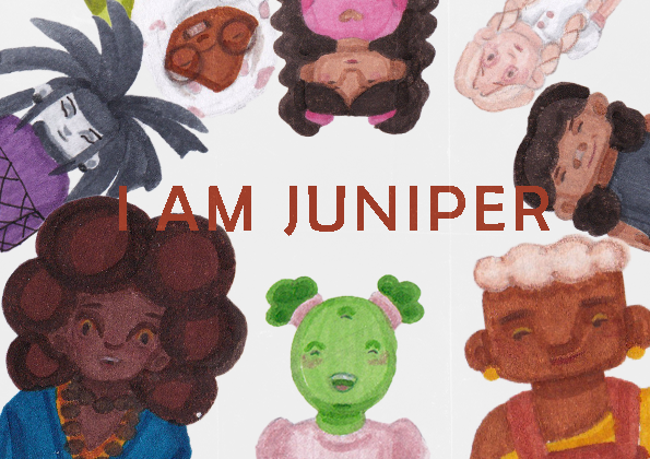
This would be similiar to the final concept, the text would lay in the middle displaying the book title, with my name being across the bottom. This mockup is A5, but the final book would be A4.
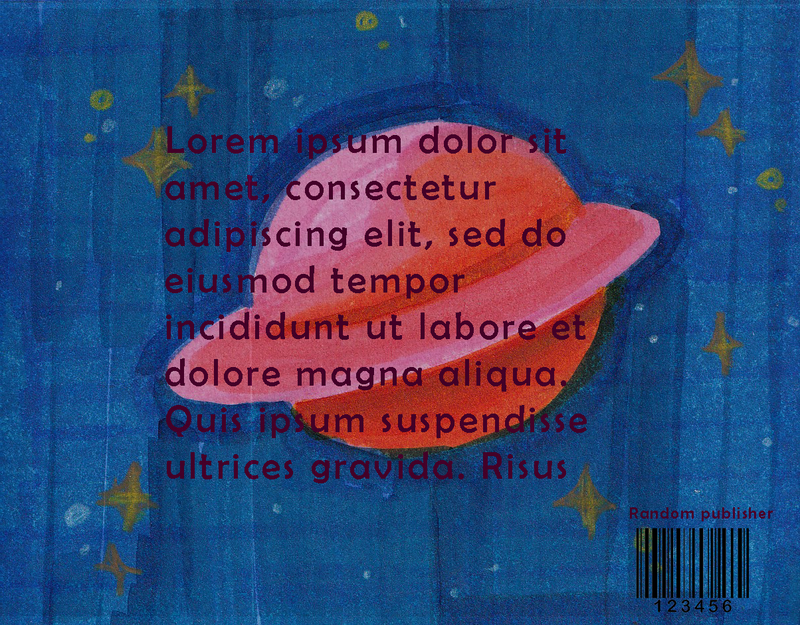
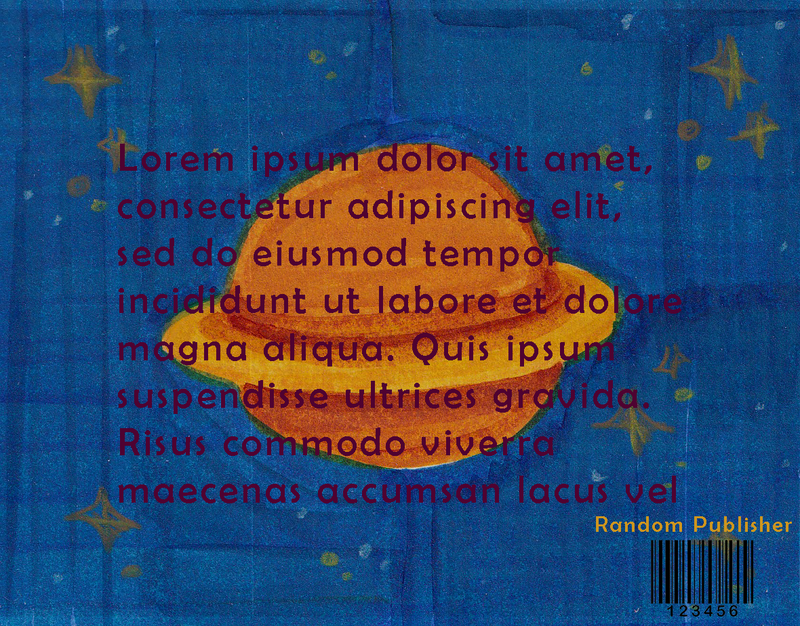
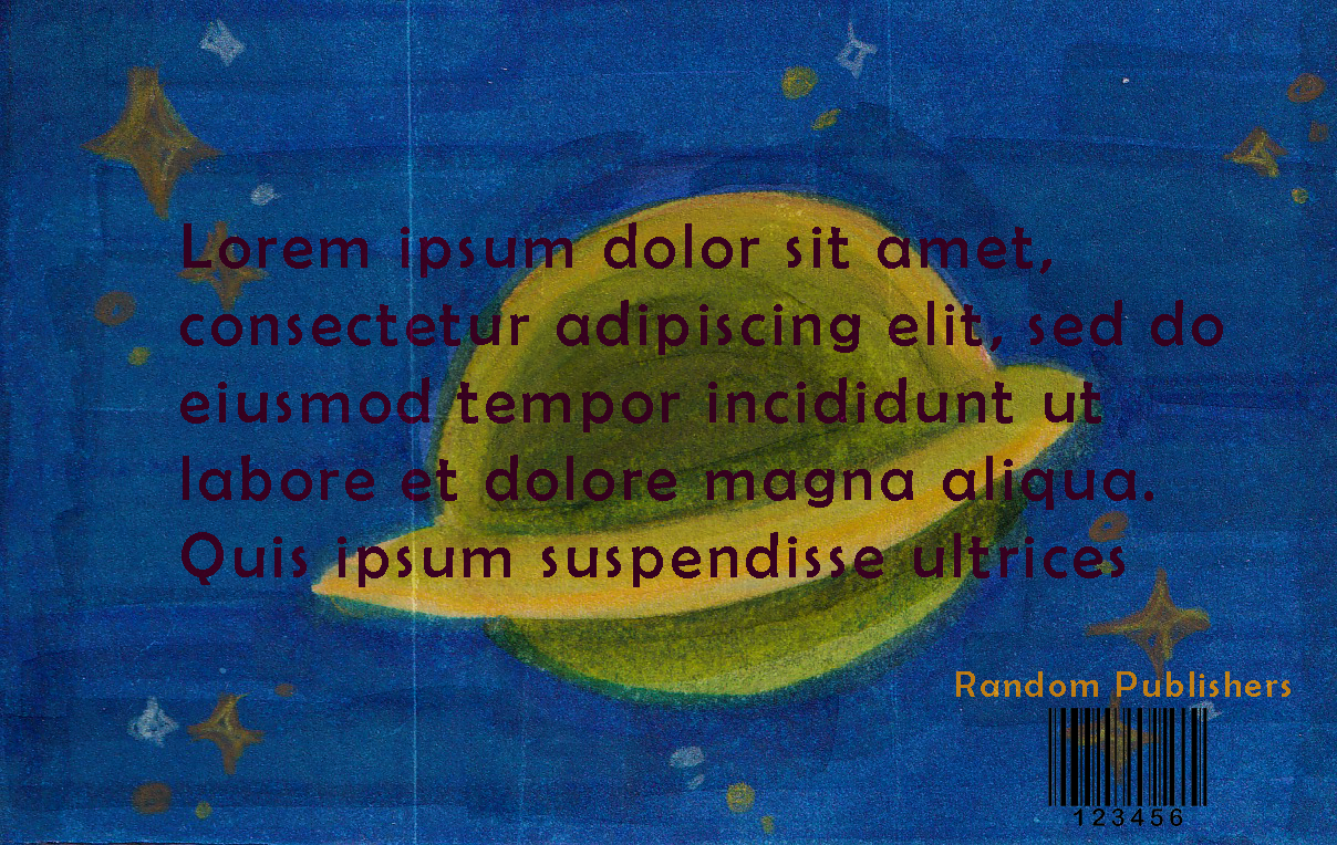
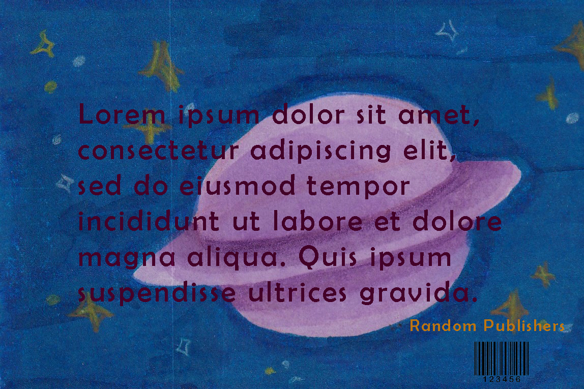
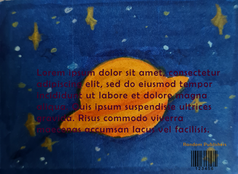
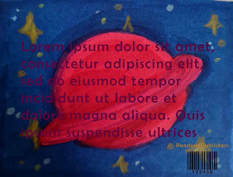
This would be the proposed cover spread. The back cover being the planet that Juniper is from.
I thought having a darker back cover would be a cool wrap around design, the idea being the blurb would cover the planet. However when presented i was told it would be too overly visually stimulating.
Idea generating
|
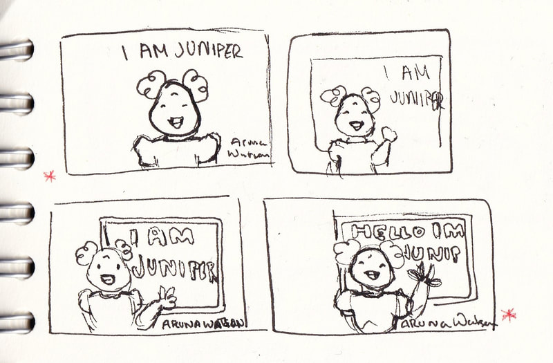
I did have an idea for a cover like this, relating more to a scene from the story where Juniper introduces herself to the class. I thought this concept would be a fun compositional because I could work up a chalk typeface and add the text over the boar to make it look like it was written on the board.
|
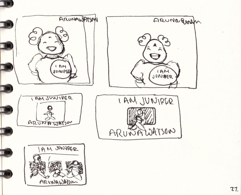
I went back and redrew some ideas, these pulled from the story more. However they didnt seem as well received as the group idea did.
Final cover idea
I was feeling a little lost with the cover, I liked each idea separately but they didn't feel right as the final cover.
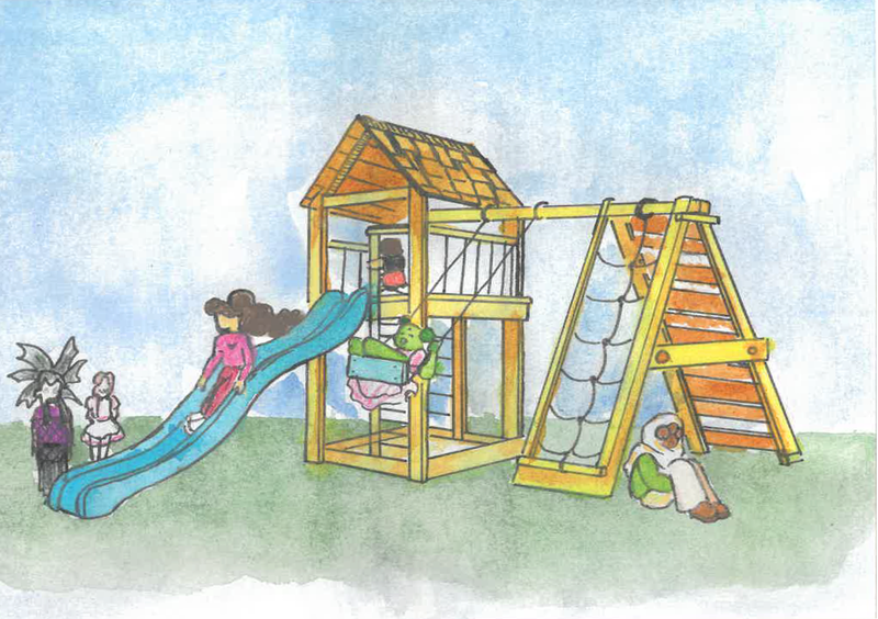
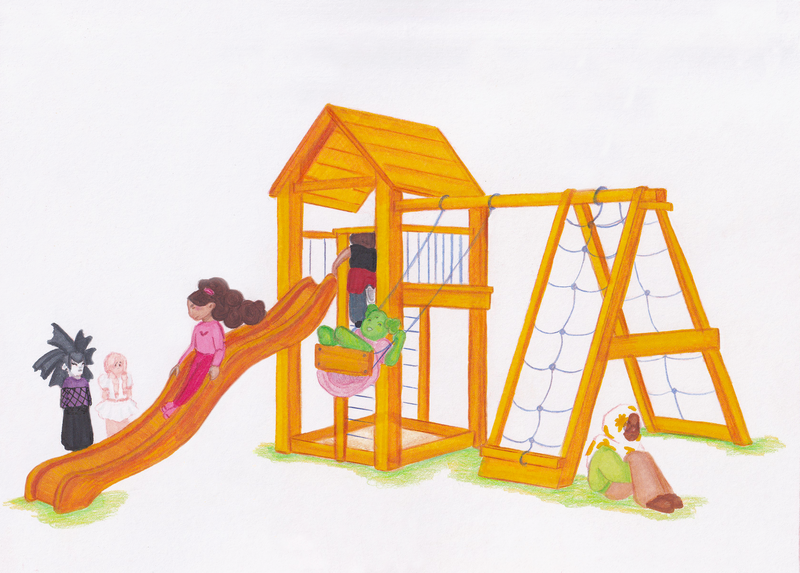
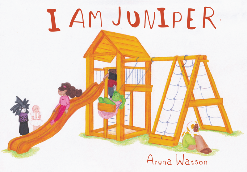
During a feedback session it was suggested i bring back the concept of having all the characters on the cover. To make it feel more chaotic and playful, like the story. I ended up going for the idea of a two-point perspective jungle gym. Using this idea meant I could also use up more of the landscape books space. Also I tried tp show the relationships between the characters. Becky glaring at Matilda and Wendy, Juniper baring a wide grin and Farah sat alone to calm down, Humphrey is placed at the top of the ladder as though they're going to slide down after Becky.
Page thumbnails
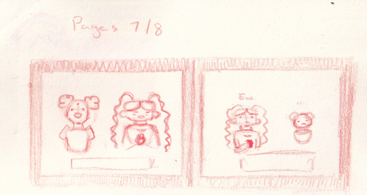
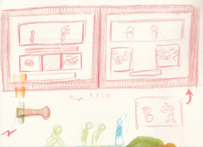
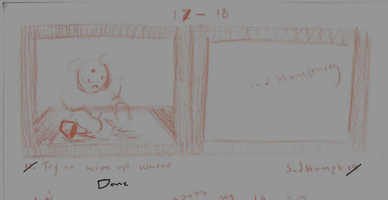
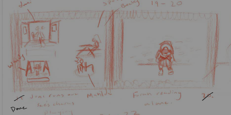
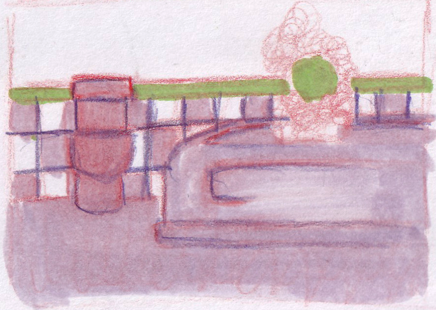
Part of the process of this book making journey has been thumbnailing in pencil the layout the spread I've been working on before hand. This allowed me to create loose ideas for how each page would look. I tried to keep in mind the space needed for the text as well. This then enabled me to find the illustrations I needed references for and subsequently the ones I spent my time on.
Illustrating the spreads
As stated earlier to illustrate the book I made the illustrations using analogue materials (alcoholic marker, watercolour pencils, coloured pencils). This is because they are materials I confident in, and have developed my use of in the course. Admittedly it took me a while to start this process however it allowed me to really know my characters.
Process
|
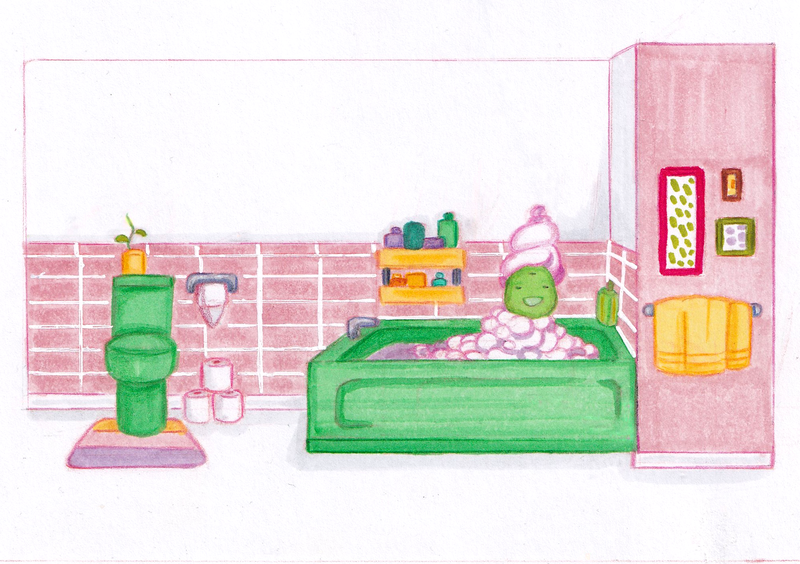
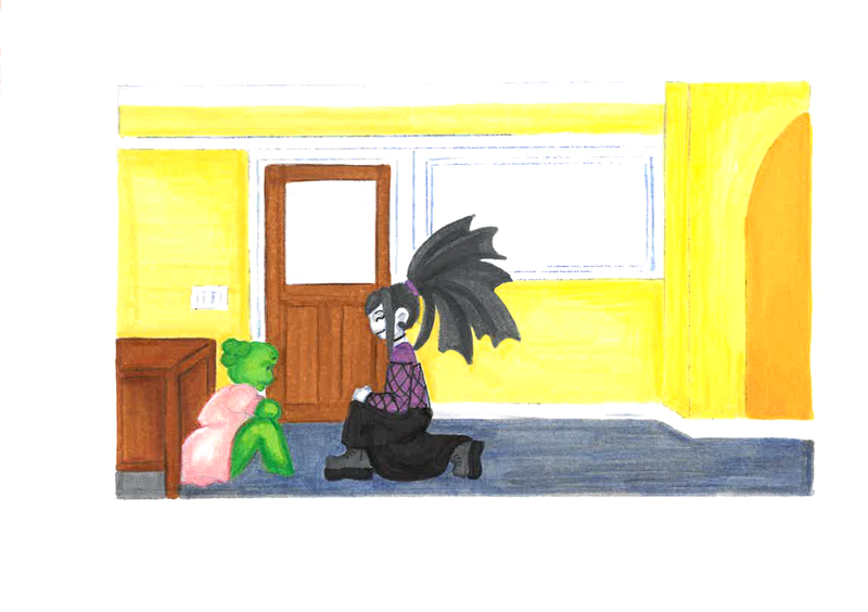
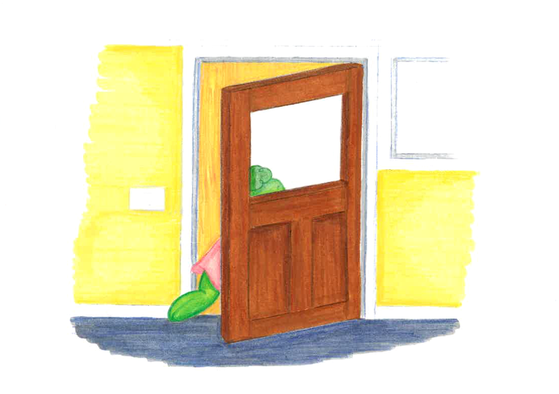
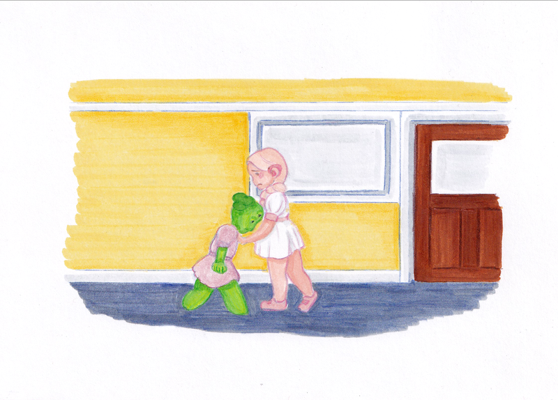
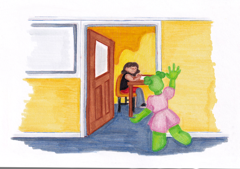
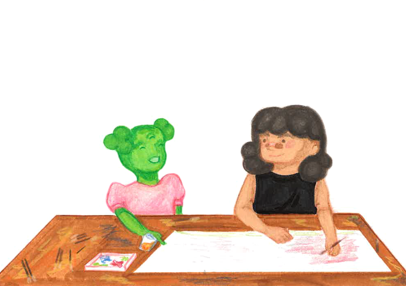
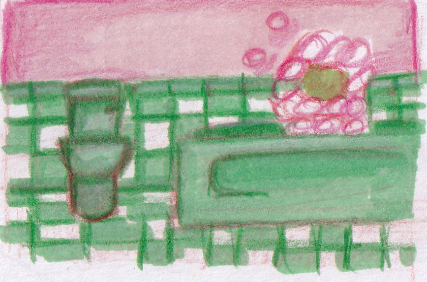
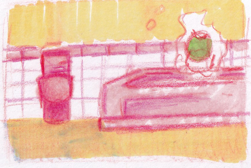
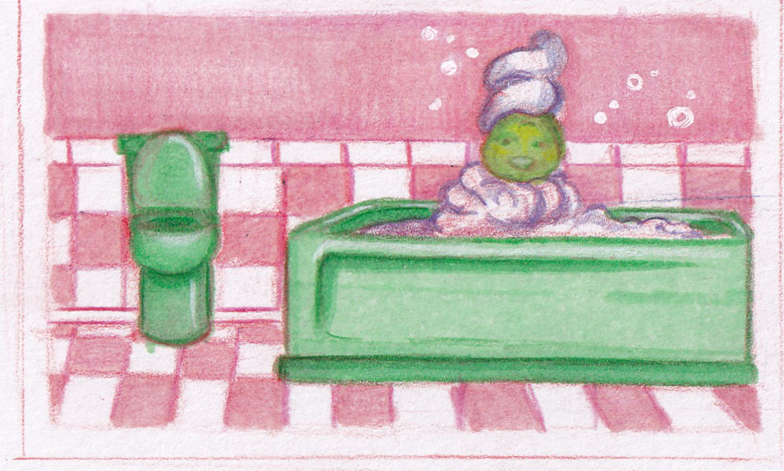
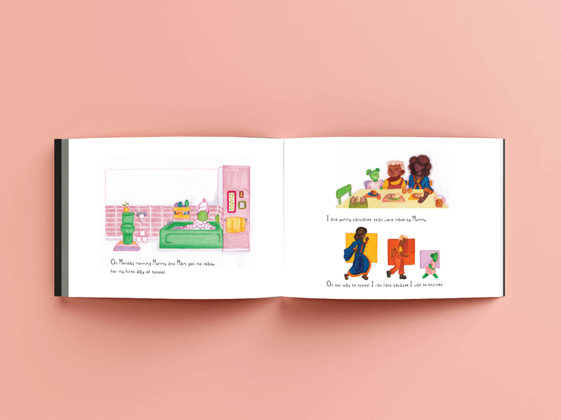
This is the final for that example, its the bathroom scene. IN cartoons the scenes are usually colourful and patterned. Unlike the real life counterparts. I tried to make the scenes fun and childlike, pulling from a design trend called Danish Pastel. For other scenes I pulled from the palettes of what characters were in it.
|
Above shows the process I followed for illustrating the spreads for the book, it appears pretty early in the story but made me really enjoy the project. I started with my rough thumbnail in pencil, then moved onto colour palettes in marker (once I nailed the composition). I tried to make a few versions. I wanted the palette to be pastel and visually simple to look at. I then made the final
|
I watched similar videos to base the scene illustrations off of, I really like how bright they have ended up, it feels like something a child would want which is what I was going for.
|
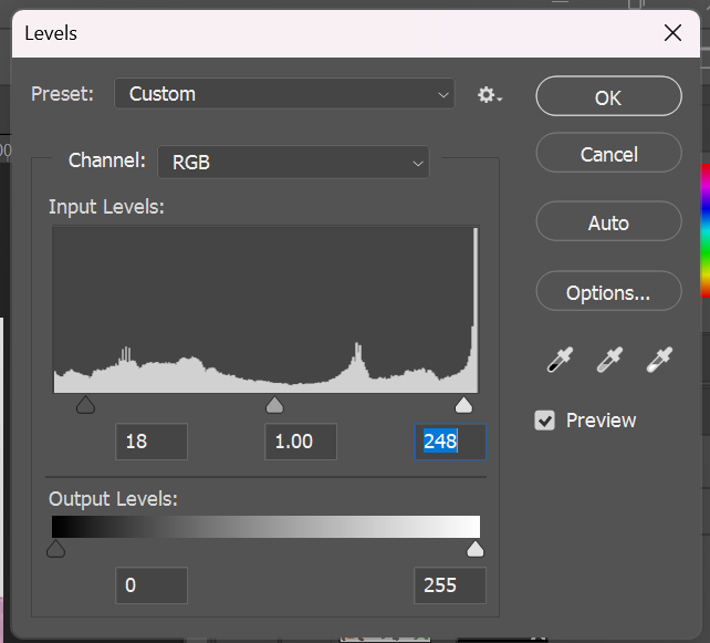
Once I had my illustrations done I followed the process from artist Sabina Fenn. This process helped because I wasn't sure on how to digitally clean up analogue illustrations.
|
|
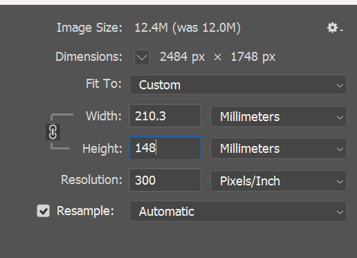
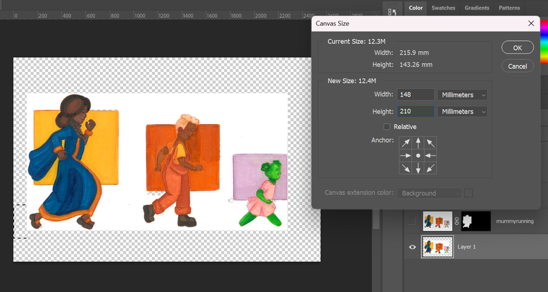
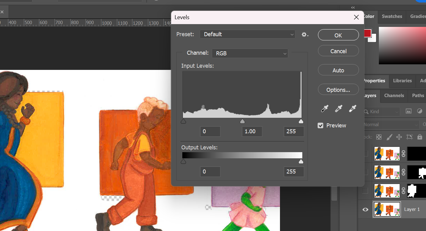
Some screenshots I took to show my own interpretation of the process
Typeface
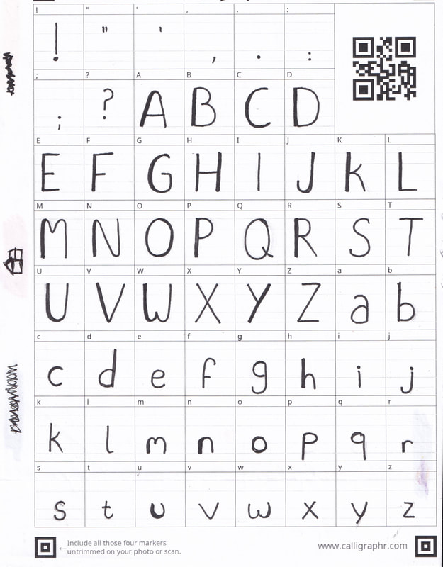
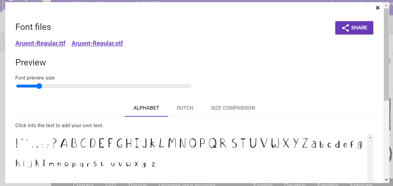
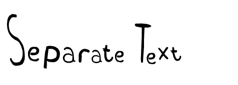
I wanted to create my own typeface for this project, partly because I enjoyed a previous project where we made them and partly because I couldn't find a typeface I liked that was already created.
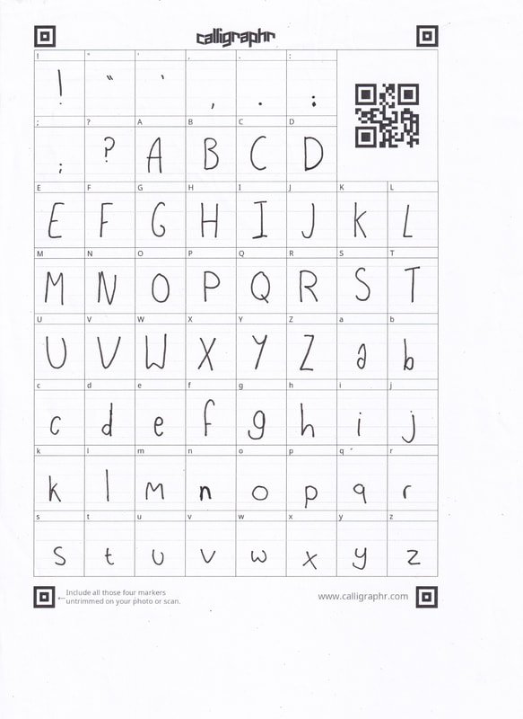
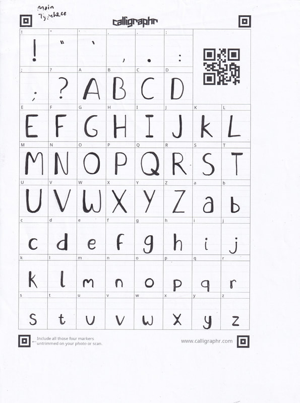
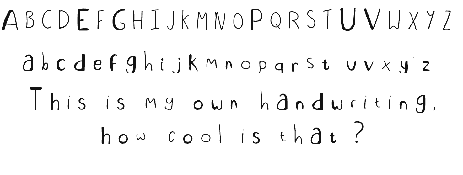
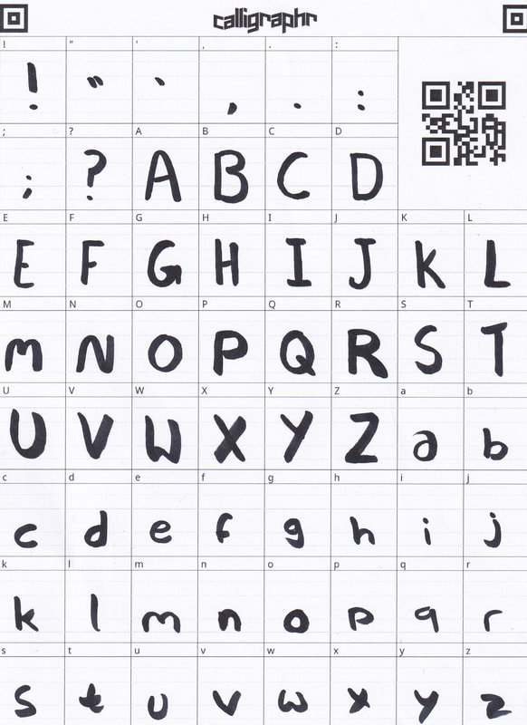
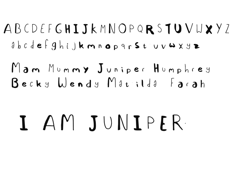
I used Caligraphrs template to create the letters and additional symbols. I created a few initially. To play around with line weight and materials. These initial typefaces were made with a 0.8 fine liner. I ended up really liking the look of the thicker weight, it kind of reminded me of the soft shapes I used for my characters.
I went on and developed my favourite look with a thicker material, a black marker.
To create the type face you go through a process, this is the process I undertook.
- Print out the template from Caligraphr
- Choose material to create typeface
- Write out each character
- Scan in sheet
- Upload template to Caligraphr
- Build font
- Name typeface
- Download the type face
Final typeface
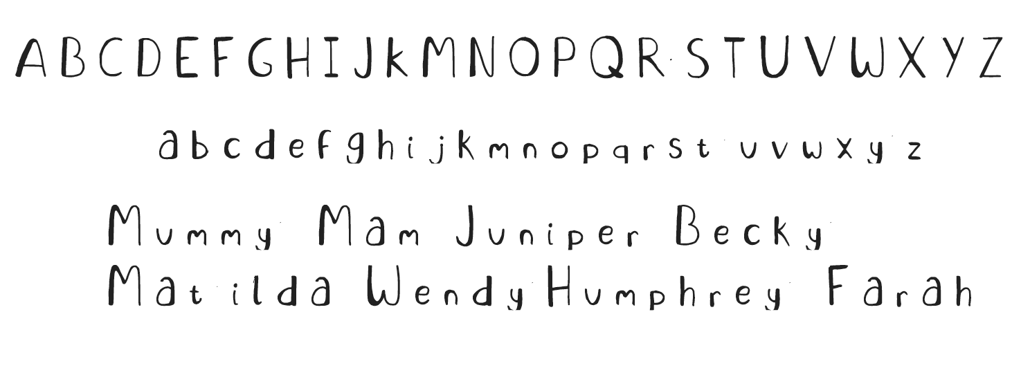
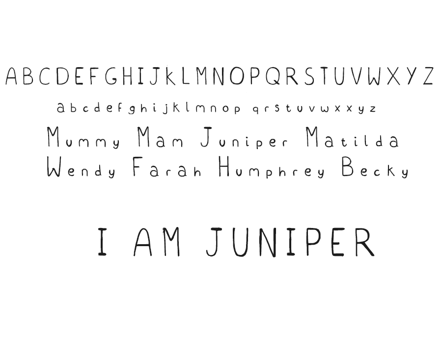
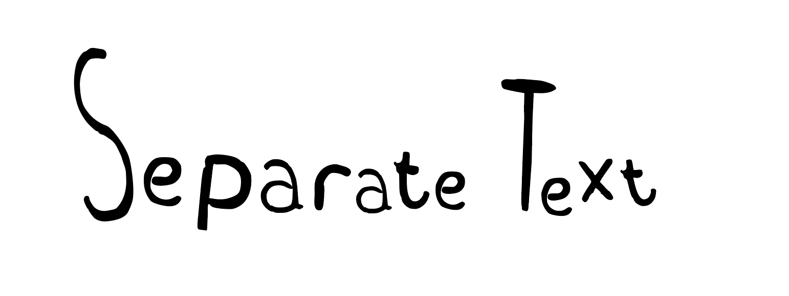
I went back in again to make the final type, this time using a thinner brushed marker. Using the guidelines on the template I tried to make sure each letter came out equally. My goal was for the type face was for it to look like a person did it, its readable but its not robotic.
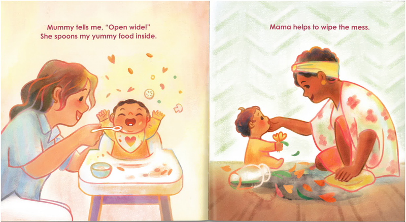
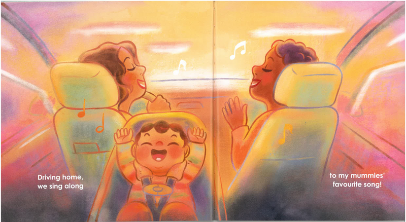
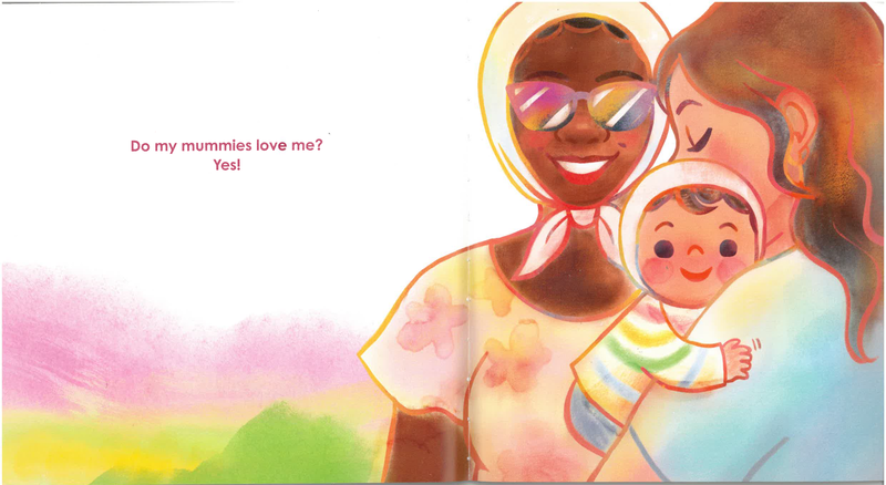
When it came to the typeface I looked at already existing book, this is My Moms Love Me a book i looked at as part of my dissertation. Something i really liked about this example is how easy it is to read. The use of non black text stands out to me, it feels like a lot of thought went into making the book accessible. The thicker type also means it is easier to read from further away.
Making the final product
After taking a small break from the project due to burnout I came back to make the layouts for the pages so I could have the book made. Im glad I did it this way it ended up meaning I was more fresh with the process.
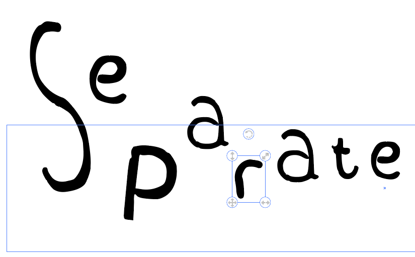
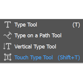
For my process I used the touch type tool on Adobe Illustrator, this allowed me to play around with each letter as an individual asset.
Final Mock-ups
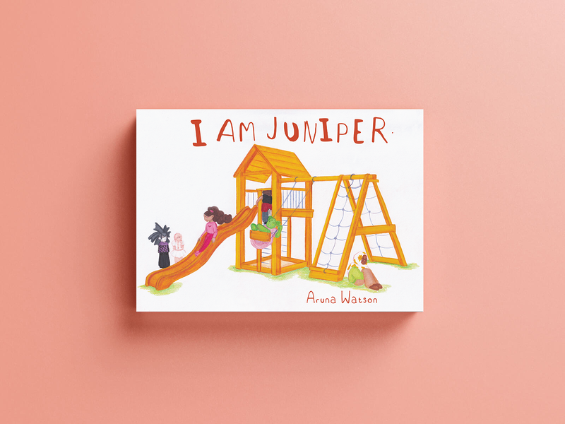
Before I sent off my book to print, I mocked it up using free templates of Landscape books. This really helped me visualize how the final product might look.
Learnt outcomes
- Approach projects with a childlike sense of enjoyment
- Importance of time managing and keeping to planned dates
- Giving yourself breaks and time off to come back to projects with refreshed eyes
- How fun it is to develop characters and a story
- Book anatomy
- Book printing- cost, schedule and importance of measurements
- Software- Confidence in Photoshop skills, In Design and Illustrator
As stressful as this project has been and how many times I doubted if I could finish it Im really happy with what I have been able to submit. I have crossed off a bucket list want I have had since childhood, and that was to have a book written and made by me.
Site powered by Weebly. Managed by 34SP.com
