Advanced Illustration project one: History
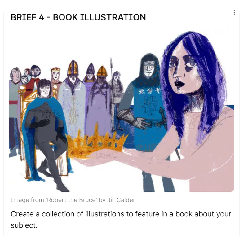
For this first project back we were given the history project, a project you guessed it based on a historical moment. For this project I selected 18th century Molly houses, for my final outcome i chose to create a book because i thought that Molly houses would make an interesting book theme.
Initial research
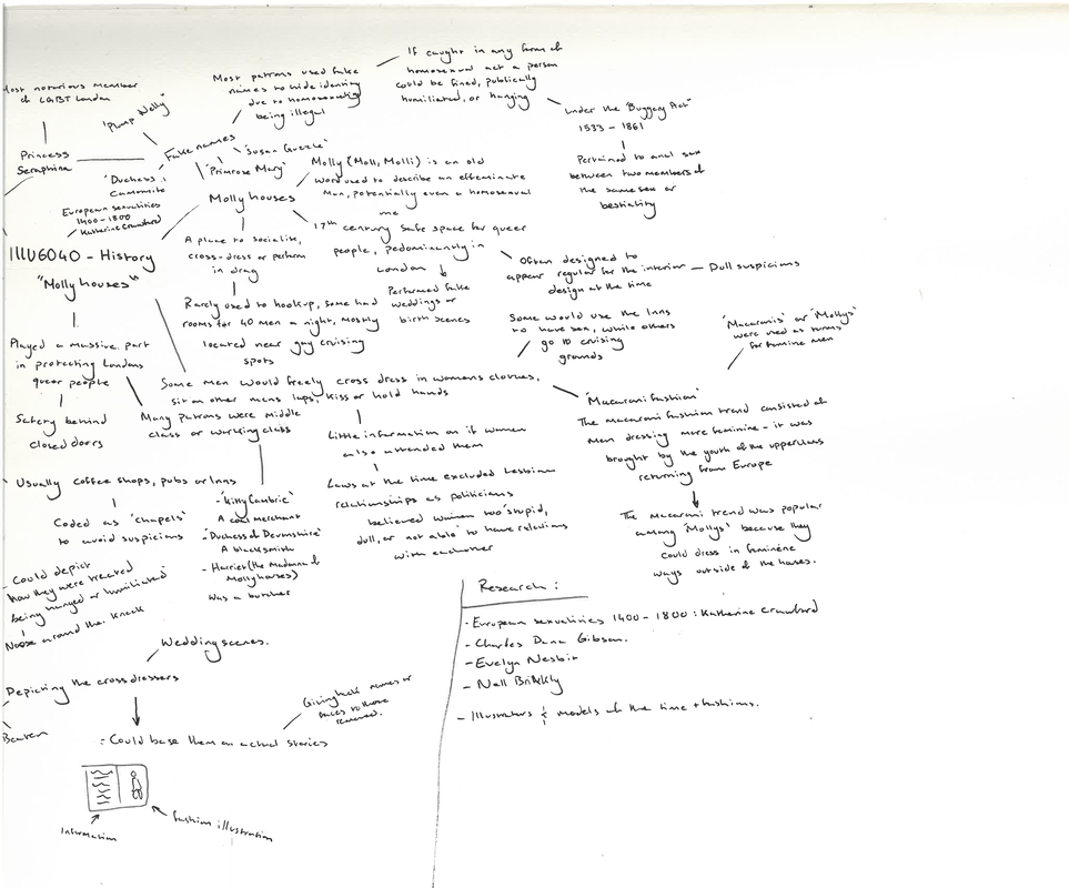
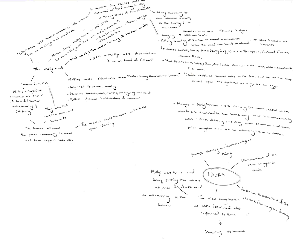
I began my research with mind mapping some information about molly houses because its a topic I'm not too familiar with. I found this helpful because I could add to it the flow of what information was going on in my brain onto paper. I also referred back to this a lot initially. I found breaking down the subject into smaller stems helpful to get my brain working, from 18th century fashion, to LGBT+ life at the time, to what molly houses actually were and finally any illustrators I could think that might link to the style I had forming in my brain.
|
|
|
|
|
These videos in addition to news articles and historic documents on the Mollys helped form some of my initial research and initial ideas.
Here I mind mapped again with more refined knowledge, I knew at this stage I was wanting to pull on Molly society and Molly fashion because it was at the time so important for Londons queer community to identify each other. From reading the information available on what these men went through if they were found I wanted to be as respectful as I could be, to give these men their names back their stories to be told.
Reason
Both a mixture of homophobia within historians and an attempt to erase queer history within government meant that finding out what Molly houses were and who the Mollys were was difficult. Many sources deem the houses as nothing more than brothels or for criminals. Further in depth research lead me to realise that the houses were often disguised as pubs, Inns, cafes or other social venues. They sometimes had a private room for the mollys to hookup however many didnt and instead focused on the social aspect. I wanted to illustrate the many stories and events that happened in these houses. It was important for me to do this so their pain and suffering doesnt go unknown to the modern gay person.
Visual research
|
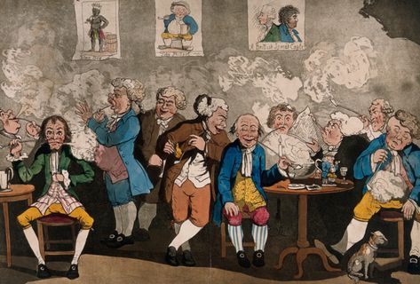
I found in my research that many of the men who would patronize Molly houses were working class or lower middle class men. The upper class queer man had access to anonymity if they wanted to act on their queer instincts by taking lower class lovers, traveling abroad or by frequenting their own Molly houses. It should be noted that some of these men mixed in social class. If warranted would leave the Molly house and go to what is known as a cruising spot.
|
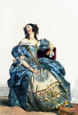
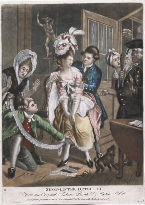
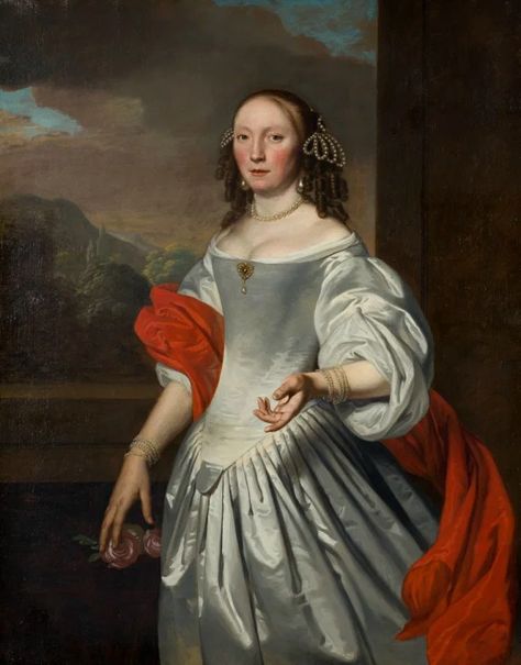
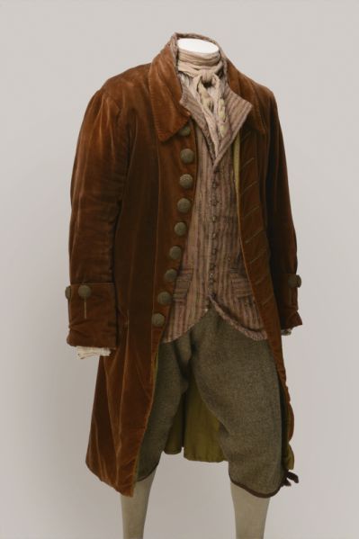
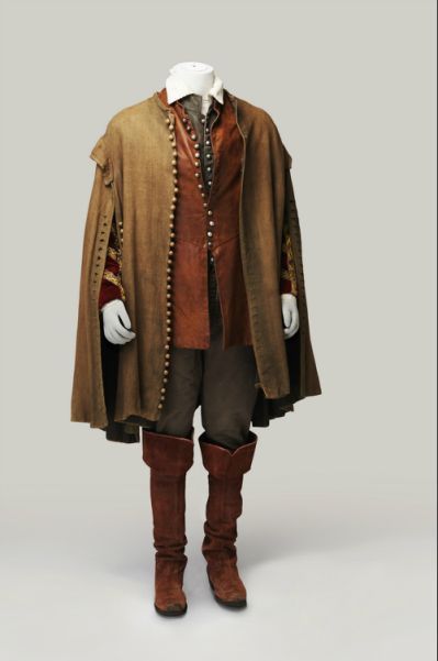
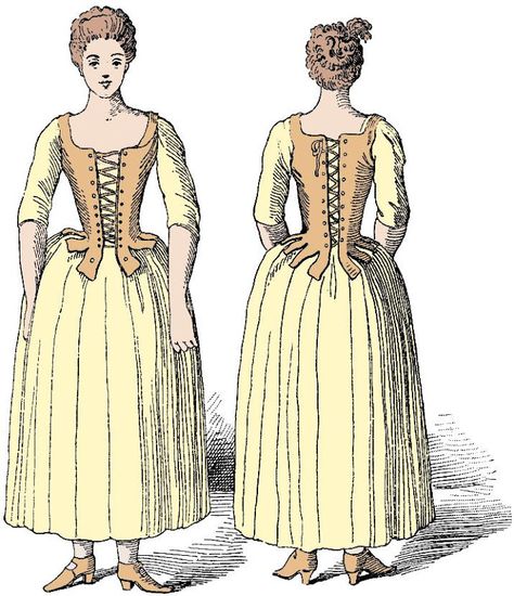
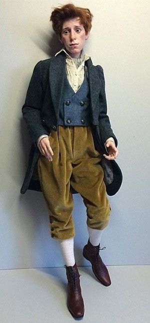
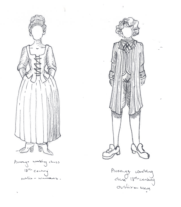
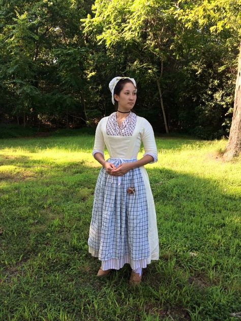
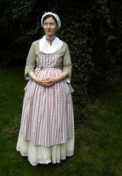
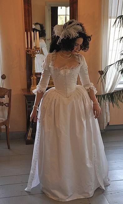
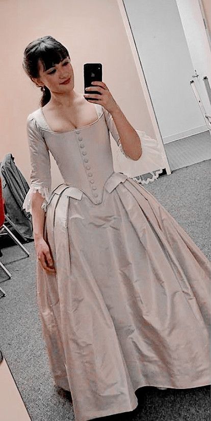
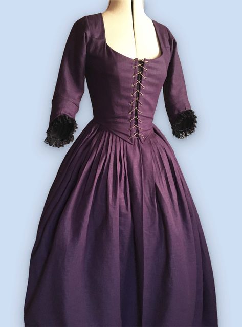
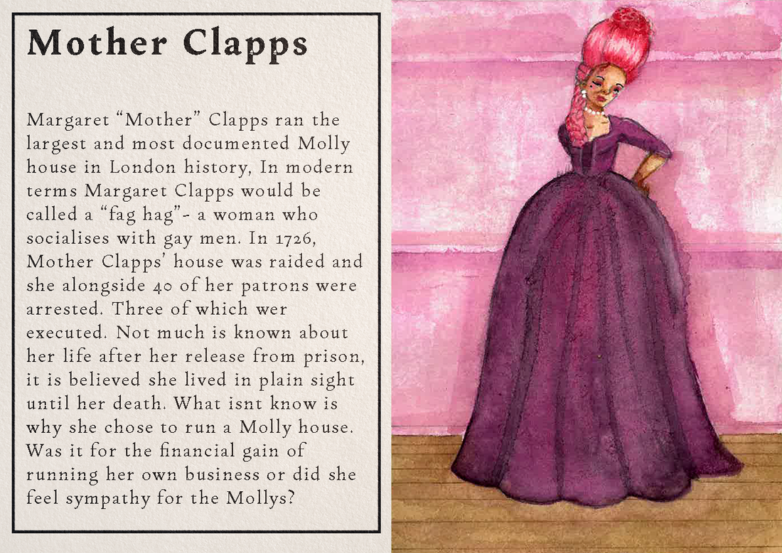
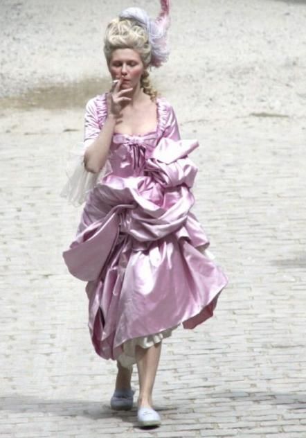
The owners of Molly houses often were Middle or upper class people (by today's definitions) they were able to run functioning businesses and pay off their charges if caught. One of the most influential Molly house owner and owner of the largest Molly house is Margaret Clapps, who was arrested for her "crime" in 1726. I did some research into what men and women wore at the time, it was difficult to find references for working class people because often they weren't seen in paintings, or their clothes well preserved.
Experiments
Artist research: Charles Dana Gibson
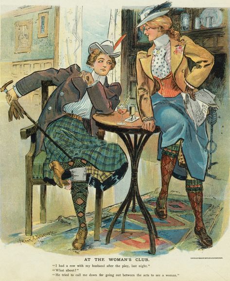
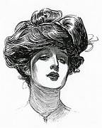
My initial idea for a style was reference Charles Dana Gibson with his Gibson Girls, they're an iconic piece of art history for the turn of century. While Gibson was illustrating nearly a century after Molly Houses were a functioning thing The style during his lifetime was still similar to what it would've been during the Molly house era. At this point I was thinking of using pen and ink as well as diluted ink to imitate a Gibson Girl.
Artist research: Tri Le
I got suggested Tri Le on instagram from researching pen and ink illustrators, I liked the way he used the lines to play into the shapes and curvatures of the human face. The way he experiments with lines to create a sense of shadow and highlight. I thought this would be an interesting way to use a Gibson style in a modern version.
Experiment with style
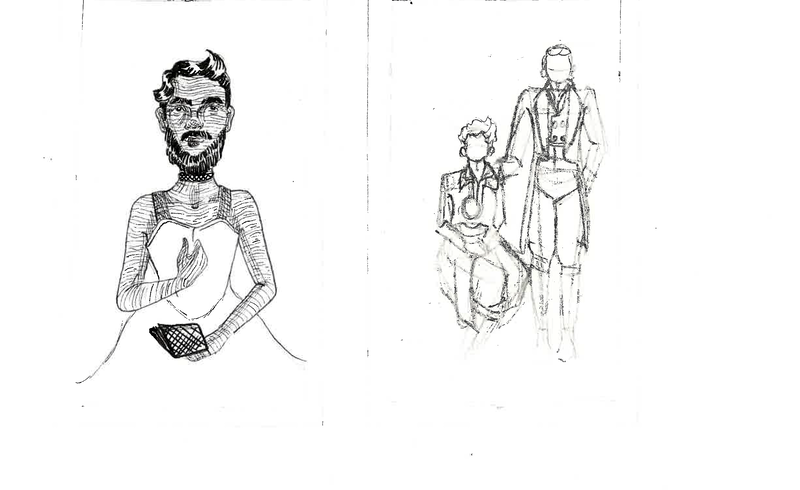
At the first formative feedback I presented these few thumbnails, I initially really struggled with this project. I didn't really have the same grip i had with other projects. Afterward it was suggested that I instead keep my idea of illustrating the molly's but think from the cover and onward. The concept being the perceptions on what Molly houses where on the outside vs. what they were on the inside.
Inside and outside
It was around this point that working with the concept of inside verses outside of Molly houses was suggested to me. The idea being the outside perspective of Molly houses being the cover and then the internal pages being illustrations of the people or what went down.
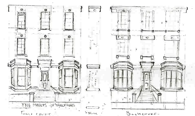
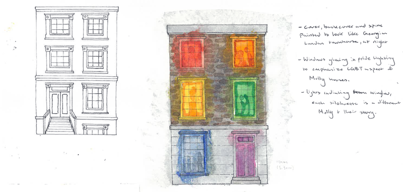
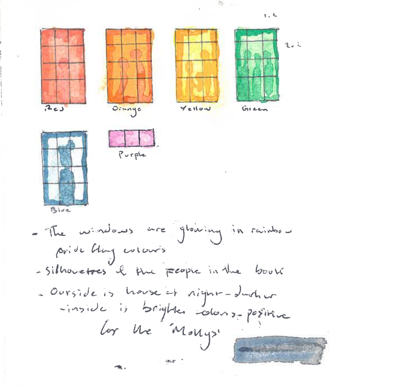
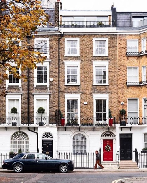
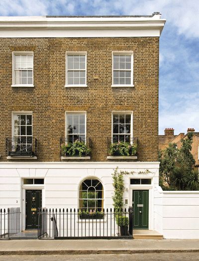
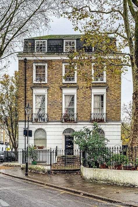
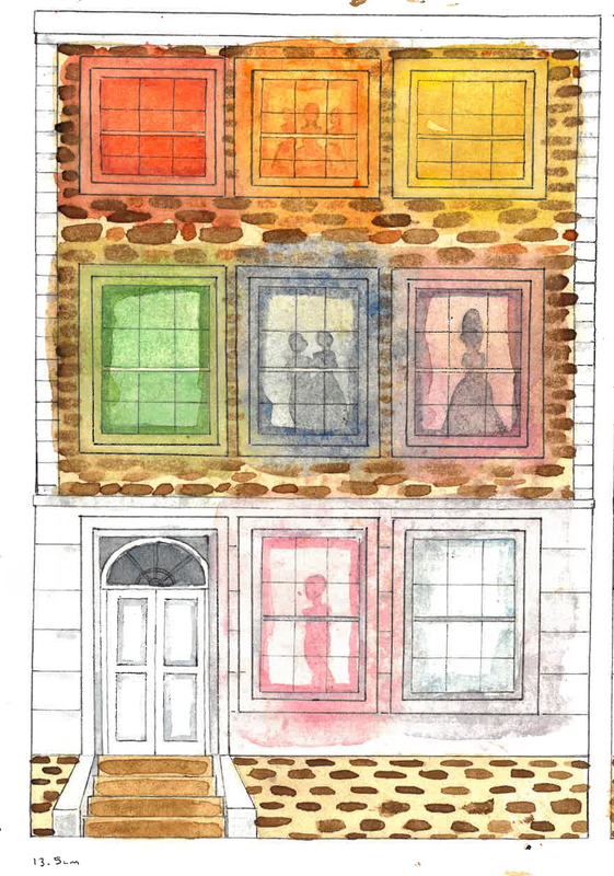
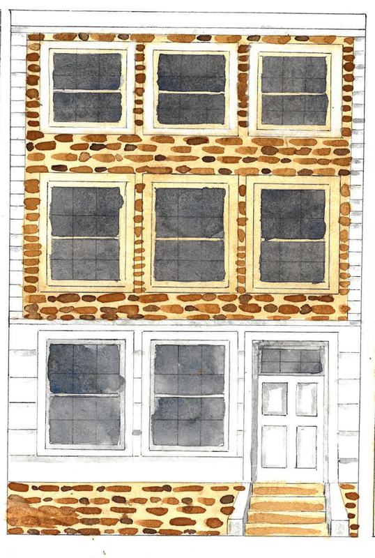
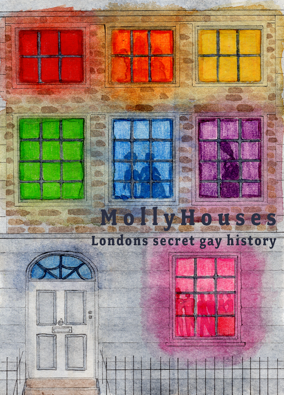
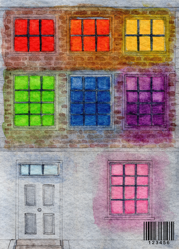
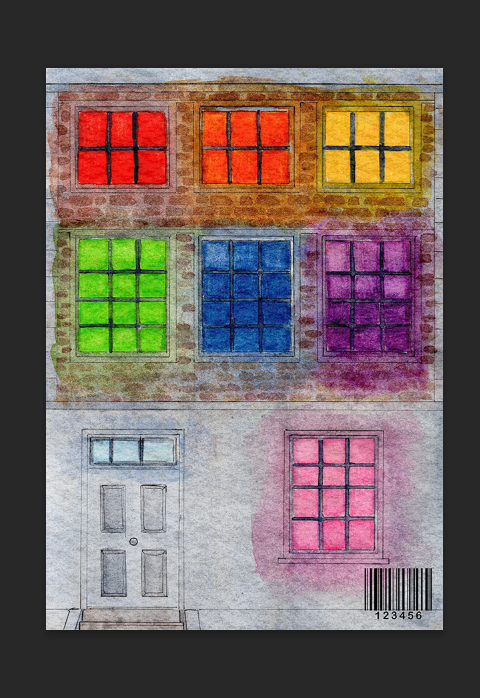
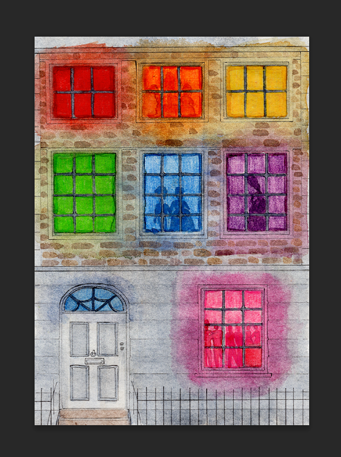
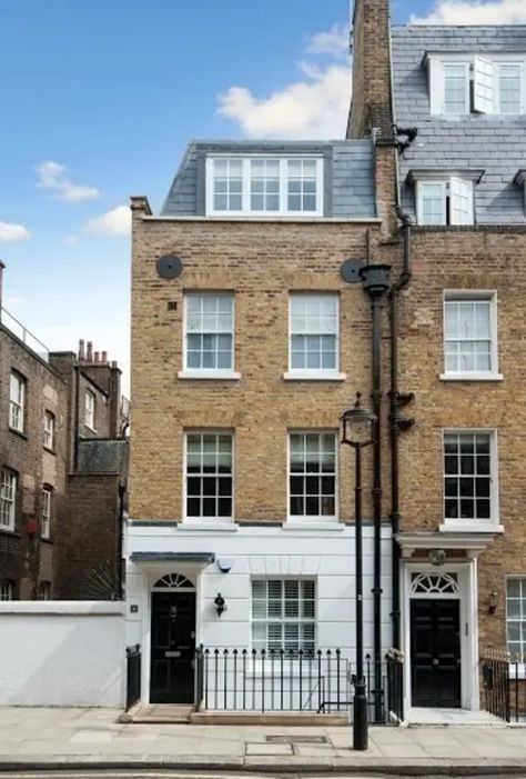
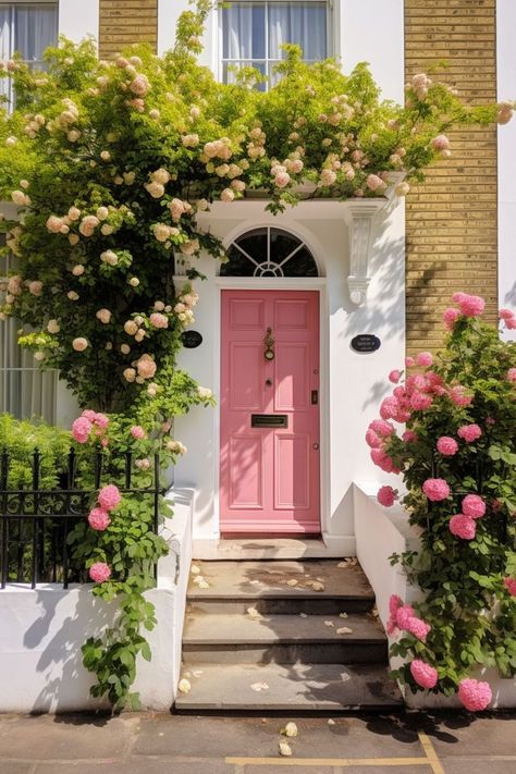
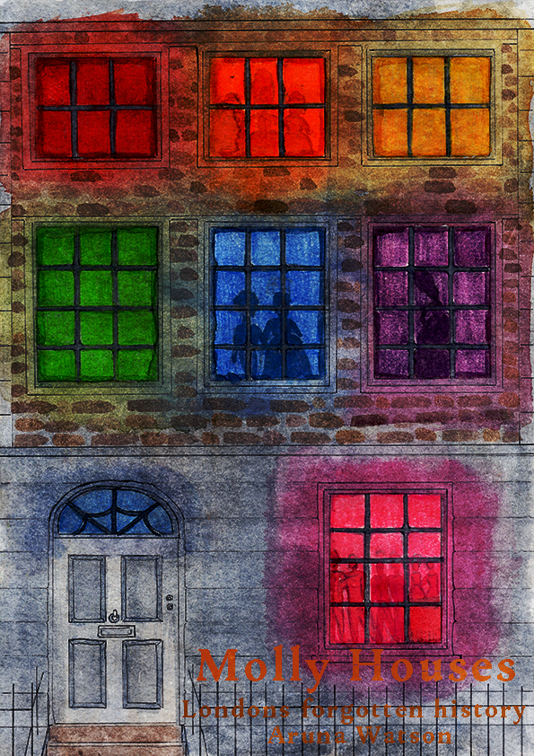
My research led me to the idea of the covers and spine looking like a London townhouse, with the setting it being at night. The windows of the house being the colours of the gay pride flag. My idea for the interior pages was for fashion illustrations of the Molly's and what they did. Like the marriage ceremonies they held, the family dynamics and the couples they produced.
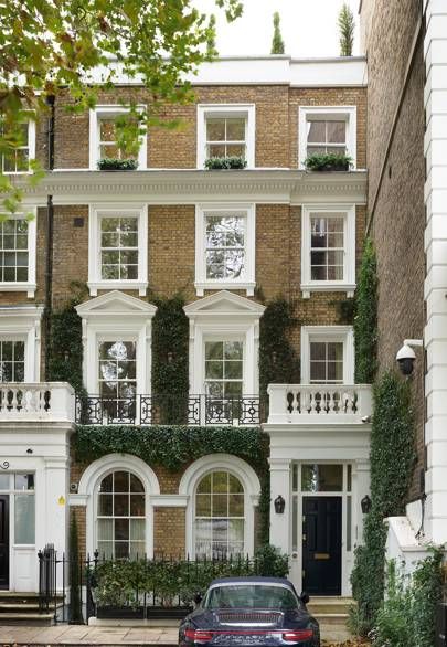
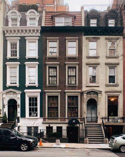
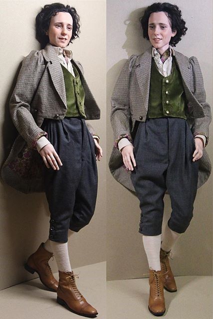
I did some quick visual research on this, I found that illustrating the facade of the townhouse to be easy, they're symmetrical and often havent changed since they were built. I did quick research on the outfits worn by both men and women at the time. Keeping in mind the Molly's were often working class.
|
|
|
|
|
|
|
|
Male fashion illustration
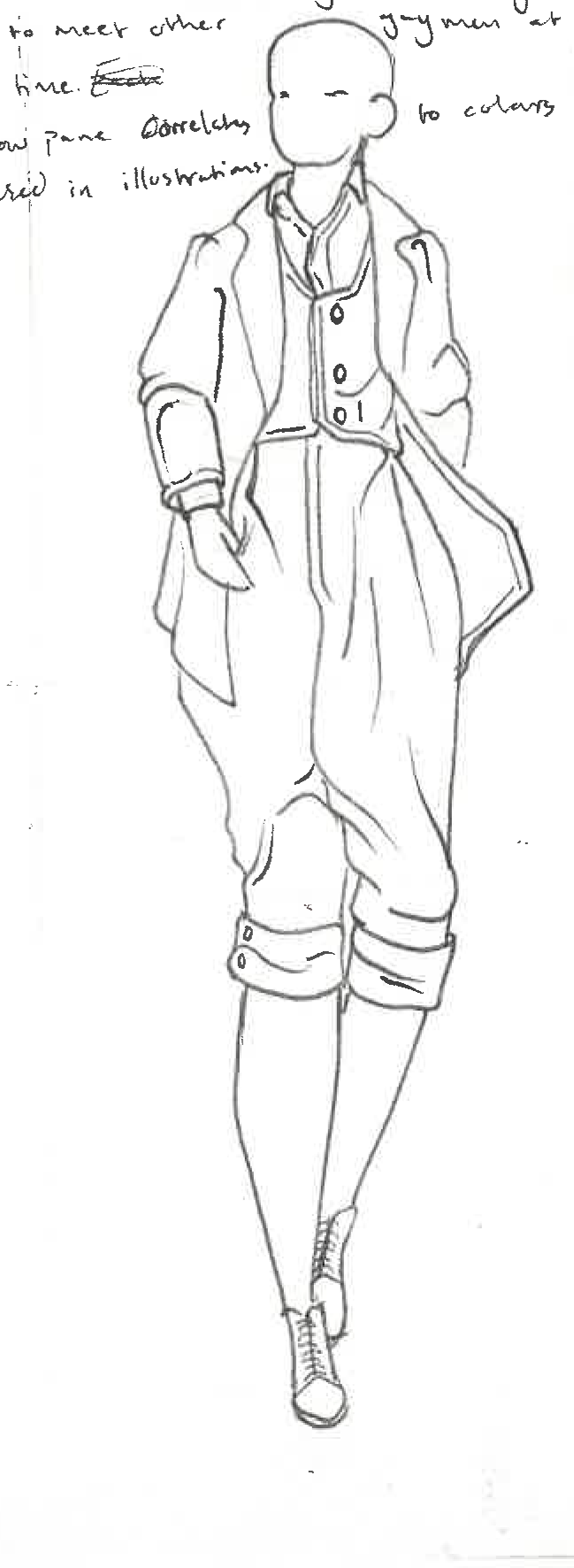
Molly houses were mainly used and occupied by men, bar the women who ran them like Margaret Clapps they mostly had men in them. I decided that I needed to learn male anatomy drawing if I wanted this project to serve the Molly's well.
|
I opted to include plus size men as well as toned and skinnier male body types. With the confirmation that often some richer men, who could afford more to eat used molly houses to avoid being found out. It was also important to show that Mollys werent just skinny twinks, unlike how're they're perceived.
|
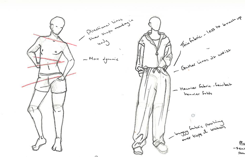
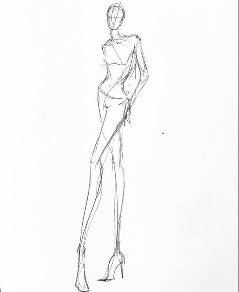
I referenced the book 'Illustrated men' by Lamont O'Neal, I found it the most helpful in terms of limited text but detailed instructions. With the basic knowledge of the body being geometric shapes I learned that a way to depict the male body is using straighter sharper lines, assuming its associated to masculinity. After drawing a few body types I moved onto how clothes should sit on the body, fabric falling differently to men than to women. I learned using a few base structure lines where the pieces of fabric meet helps visualise where natural folds in fabric occur.
|
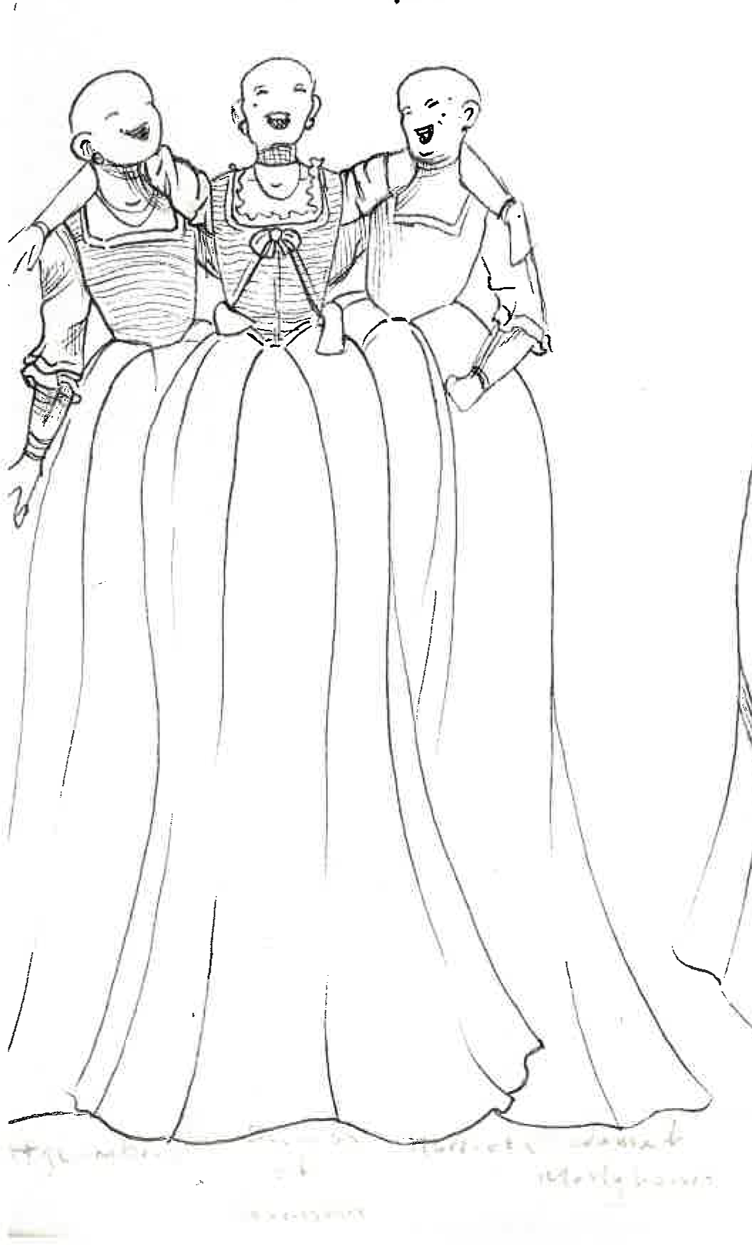
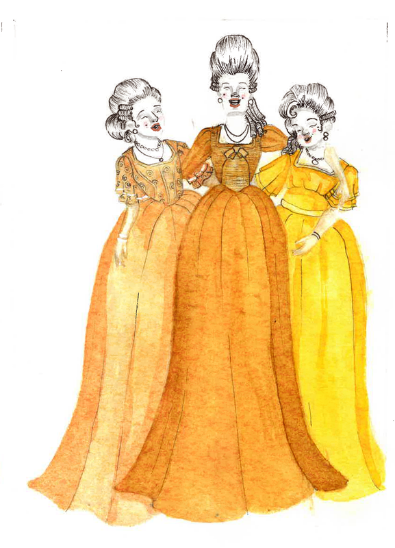
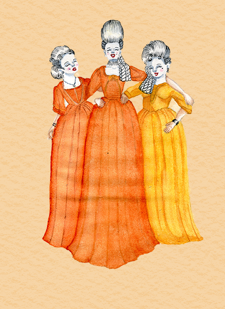
These are quick ideas I sketched out in black fineliner, theryre based more on the fashion references I could find for working class people of this era. I also found the aspect of the molly's being 'sisters' inspiring for some illustrations. The Molly's while scared and a smaller community were happy around each-other calling each-other a sister, showing a bond between them, which I really liked.
|
|
|
|
|
|
With this project I wanted to represent the community of Mollys, which obviously included how they dressed. I was a way in which for them to find eachother in other social situations, and like in modern society their appearance mattered. I found these videos helpful when illustrating Mollys fashion and makeup.
Francesco Lo Lacona
When researching for fashion illustrations I found Francesco Lo Iacono, who works with watercolour paint to replicate the fashions he sees around him. I thought the way he painted and left his brush marks wide and still visible quite inspiring. I liked how fresh they felt whilst still feeling like old illustrations. They also matched with what I was envisioning in my head for the interior illustrations of the book
Thumbnails
From feed back I got the advise to to add a coloured background to the illustrations to set them in place and to link the inside and outside. I had to also slightly readjust the placements of the characters limbs to make them slightly more accurate. For the outside covers it was just to keep the window pains more accurately scaled and the window panes to be taller rather than wider.
Painted illustrations
Interior mock-ups
I made interior page mock-ups based on Georgian books
Re-submission
I went back into this project with fresh eyes, I wasn't happy with how it turned out. I felt the watercolour's were clumsy, it didn't match was I had in my head.
There was no official expectations of what to produce for this history book, I think that's where I went wrong initially. I liked the work I produced I thought that it was a good take on the theme so I kept the same pieces and just repainted them to a better standard.
Visual research- Initial references
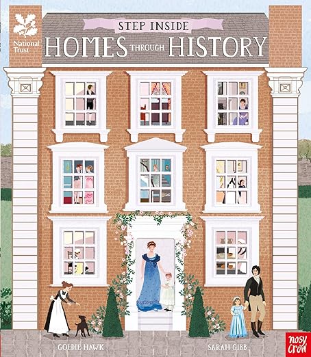
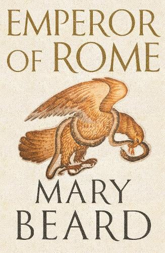
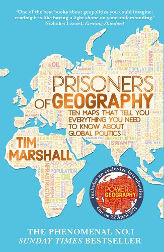
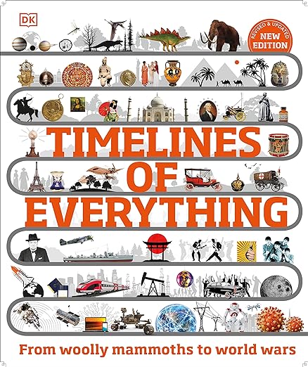
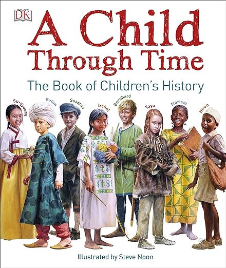
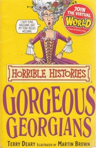
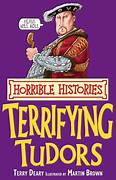
I found these books the most helpful to look at for a real life reference on how to make a convincing history book. Something I noticed was they use similar typefaces on each of the covers, a type I believe that are called Humanist. I also noticed they used colourful type to make it stand out from the background.
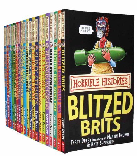
Visual research- Horrible Histories
I think Horrible Histories books make for good references on how to have a factual log of information but written in a friendly way. I wasn't sure if I wanted to repaint the project and make it for children or if I should keep it as just a general history book.
Paintings and specific references
|
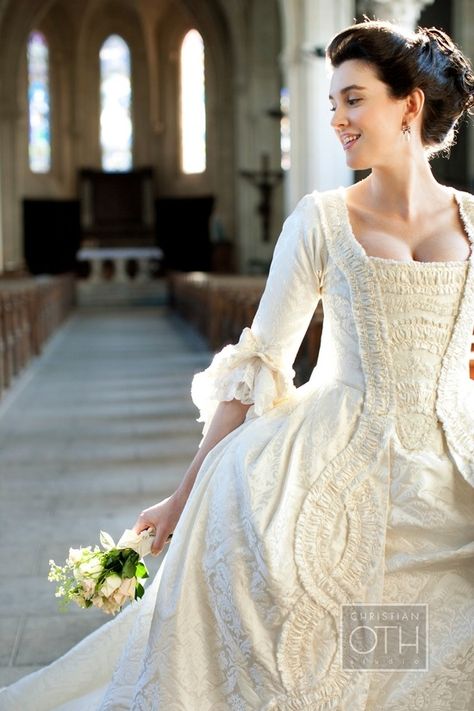
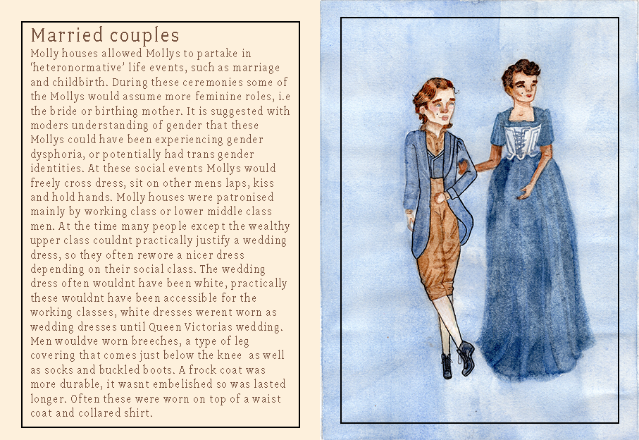
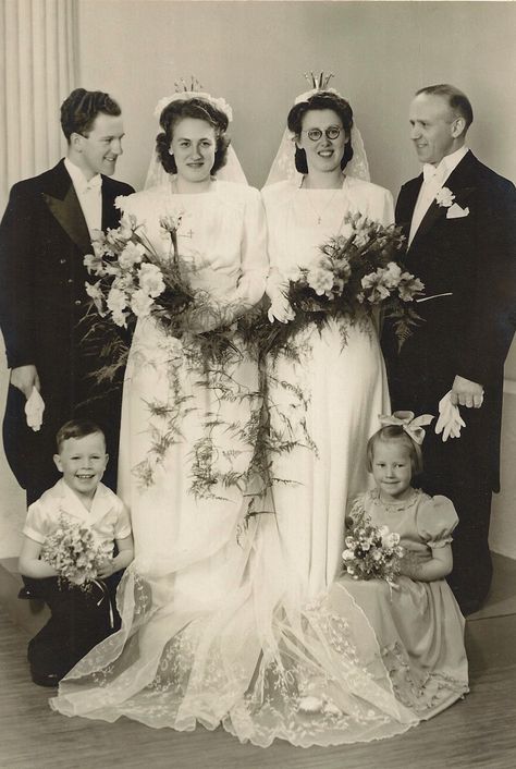
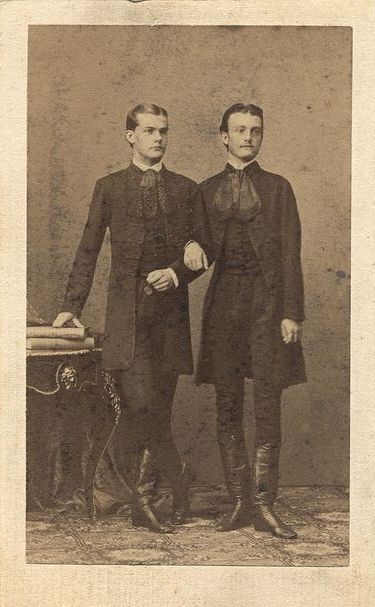
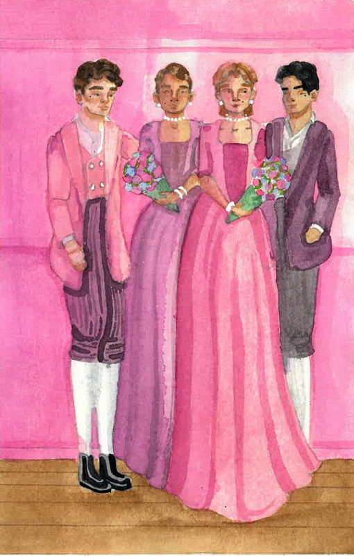
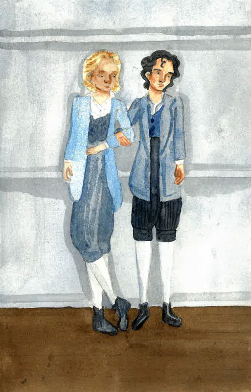
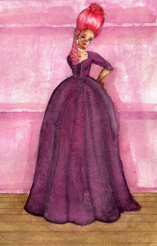
One of the interior illustrations I did was of the Molly marriage. The original illustration felt too crowded and didn't have a cohesive colour palette. I was able to find a dual wedding photograph online and replaced the two female brides for two male appearing brides. For their appearances I referenced Georgian fashion and hairstyles to get them as accurate as I could.
|
|
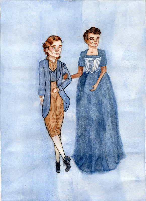
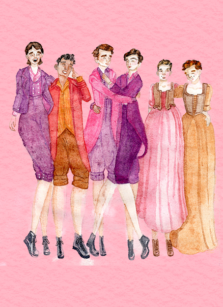
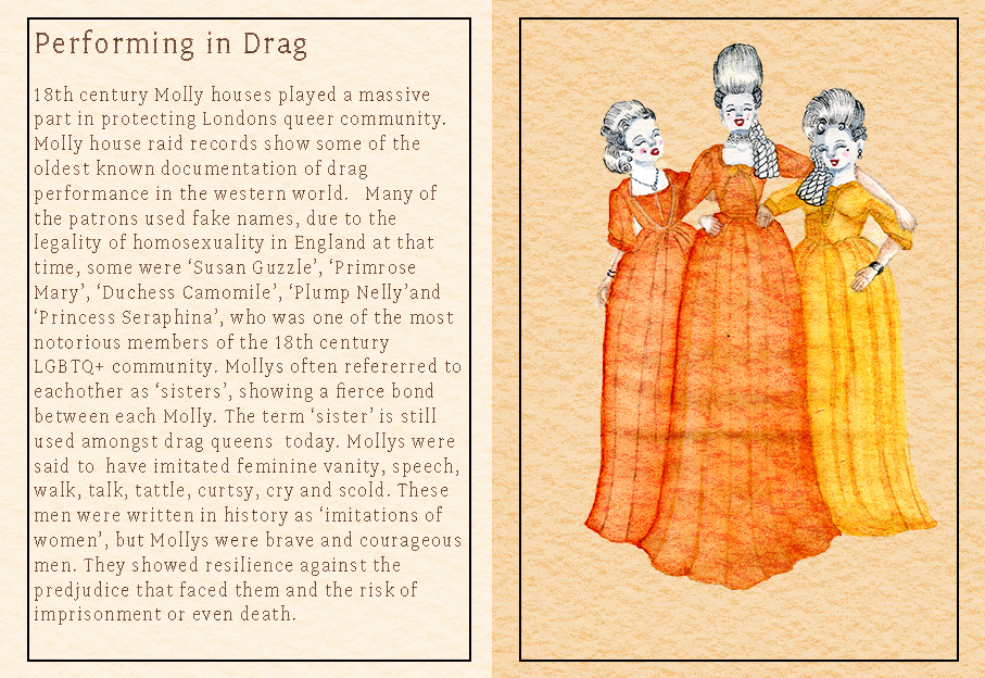
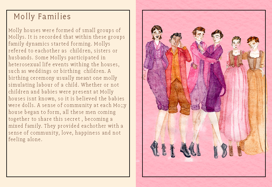
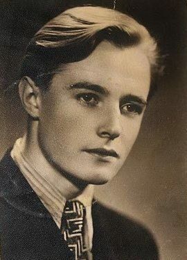
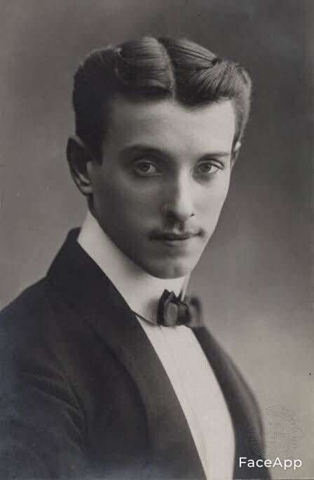
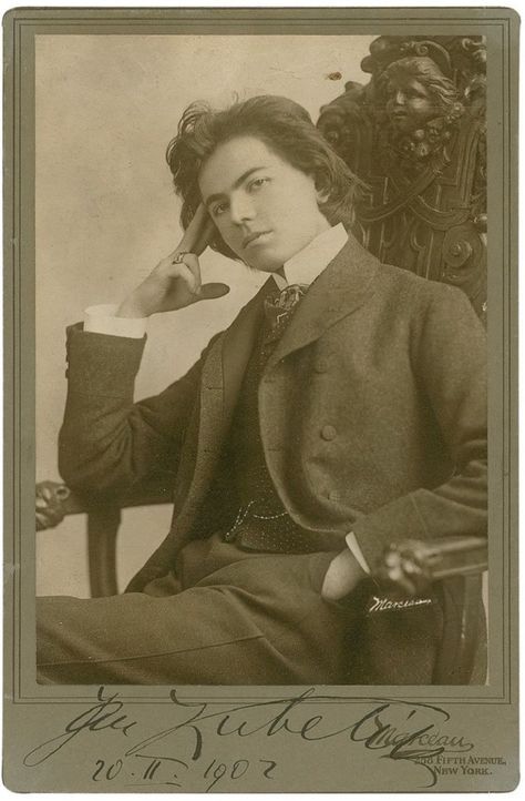
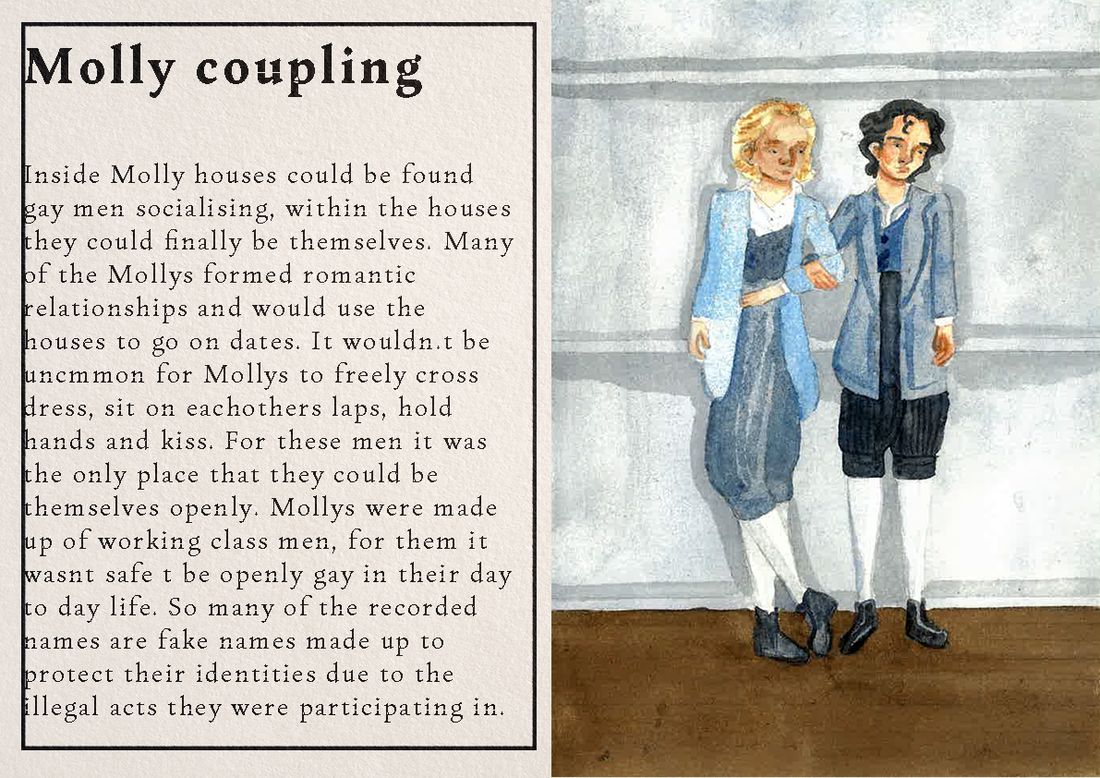
In this illustration I originally had one of the subjects in a dress. I decided to repaint this piece with two masculine presenting characters to show that Molly's were mostly gay men. I found an album of vintage photographs of queer people which I referenced when painting this piece. I decided to move the the concept of the cross dressing to another illustration so that each could be stand alone.
|
Final illustrations
Final Mock-ups
|
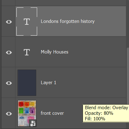
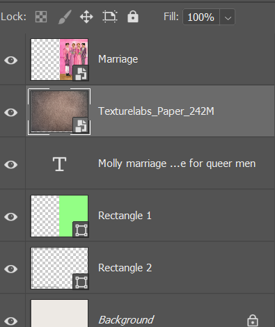
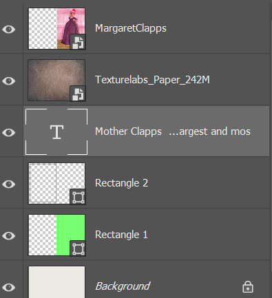
I started off by making canvas the size of 420x272mm. I made a green rectangle to split the page in half and used a paper texture to overlay it. I didnt want this to feel too digital. I then overlaid the illustration, text and a border in reference to Georgian book illustrations. The type face I decided on using is called "change" which I got from Adobe Fonts. I was recommended to use a Humanist typeface for this project.
|
Some things I learned by the end of this project is:
- The right type can help full together the essence of the illustration
- Colourful type face can work if it compliments the colours in the piece
- Mollys had some cool fashion, which was fun to paint
- I also learnt how to draw more masculine framed characters, will still practice though.
Site powered by Weebly. Managed by 34SP.com
