“I draw like other people bite their nails.” -Pablo Picass0
PROJECT ONE: CONCEPTUAL ILLUSTRATION


In this first project we were introduced to the divide between literal and conceptual illustrations, while literal illustrations tend to reference pictorial truths conceptial illustration tends to rely on metaphors whether that's to the subjects, ideas or theories. Conceptual illustration also applies surrealism, distortion and impressionism to its work.
Article: Industrial action at Amazon
For this project the article I was given was on the first industrial actions held at an Amazon warehouse in Coventry, I read the article a few times to try and properly understand why this was happening, what the action was for and who called for the action. I then reread it a number of times to pick up on key features. To me it seemed like the main issue was on pay, the warehouse staff had been offered a 50p per hour pay increase. Inline with the cost of living crisis we are entering this infuriated many of the workers. The other features i noticed was how the workers constantly felt like they were being watched, in the article it mentions there have been added security guards, managers on the floor and security cameras. I also noticed that from interviews with workers they felt like they were being over worked, with ever rising targets from management, nit-picking from management and gruelling round the clock shifts. Some noticeable quotes I got from the article were:
"Ultimately the real aim is getting one step closer to dragging Amazon bosses kicking and screaming to talk to us"
"We cant work as well at our 60th hour as we can at our 1st hour"
"I don't want Jeff Bezos' boat, I definitely don't want his rocket, I just want to live"
"Ultimately the real aim is getting one step closer to dragging Amazon bosses kicking and screaming to talk to us"
"We cant work as well at our 60th hour as we can at our 1st hour"
"I don't want Jeff Bezos' boat, I definitely don't want his rocket, I just want to live"
Research


Before I started even thumbnailing I immediately started researching information related to this project, I wanted to understand what my article meant, who would read the publication it is related to and look at what conceptual illustration actually is. My article was written by a journalist for the Guardian, a newspaper aimed at adult, politically left leaning, middle class, educated people. I thought this would be useful to know before thumbnailing ideas because I could use references targeted towards the middle classed experienced. I found that the articles subjects focused on history, the economy and trade unions. I found this research useful because I was able to properly get some ideas on illustrations that would work well the article in a way that would hopefully appeal to its readers. It also helped me visualize some ideas for the illustrations I was to do. My specifications for this were to produce a feature illustration (120mm by 150 mm) and a spot illustration (50 by 50mm) both in CMYK.
Thumbnails
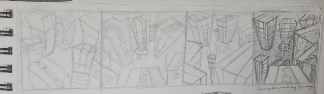
For this thumbnailing idea I wanted to reference how overworked the staff feel, in this illustration you see a worker or group of workers gazing up as stacks of amazon parcels spiral toward the viewer.
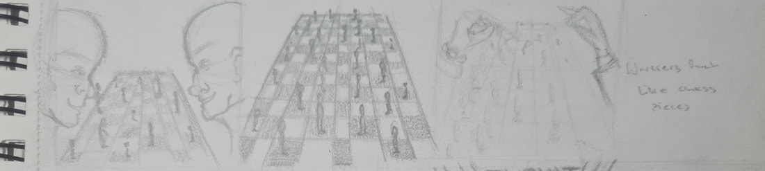
For this illustration I sort of viewed the managers as treating the staff as chess pieces, which I also thought the audience would understand.
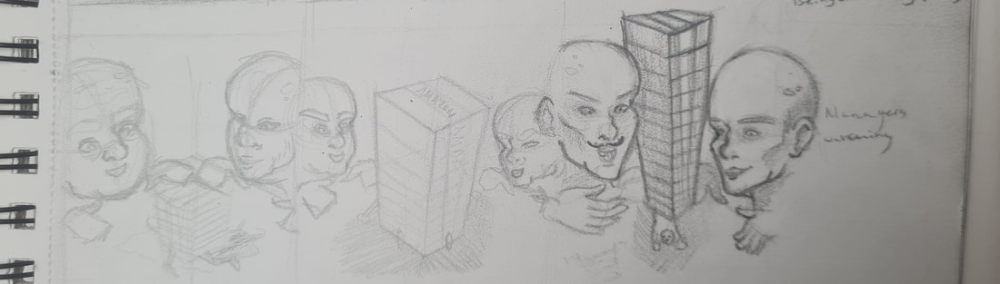
For this idea I thought that the management should be shown as not caring for their employees, by having them evilly watch as a worker is crushed under the packages.
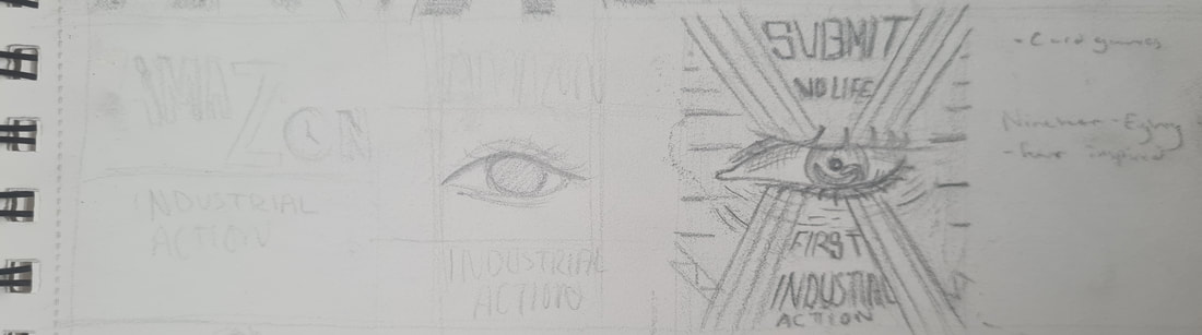
In this idea I thought of how the staff felt like they were constantly being watched by the cameras and security guards, I chose to reference artwork for 'Nineteen-eighty-four' by George Orwell.
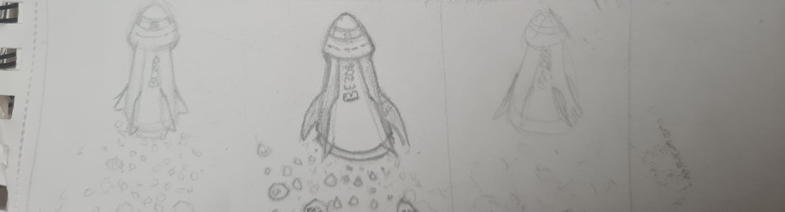
This idea was thought up by the comment of not wanting Jeff Bezos' rocket, but to live. The idea being Bezos' million dollar rocket flying away shooting out tons of 50p coins.
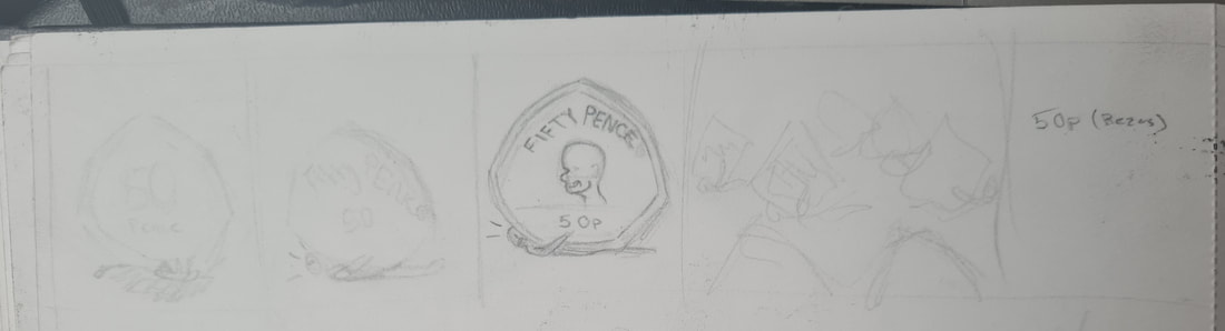
This idea came from the idea of the workers concerns, effort and energy being only worth 50p. Hence them being crushed under a massive 50p coin.
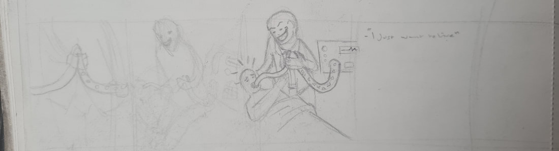
For this idea i thought that I could show an amazon worker needing the 50p's to survive but those being cut off by an evil manager (inspired by an interview in which workers can call for ambulances without proper authority so amazon doesn't look bad publicly)
For this idea I was inspired by the article mentioning that Amazon executives had decided to close 3 of their UK warehouses and 7 smaller delivery sites, costing 1,300 people their jobs.
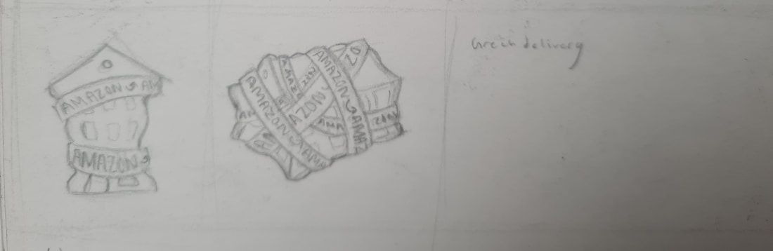
I thought that having a warehouse being wrapped and covered in Amazons packaging tape would make for an interesting illustration, showing its power over warehouse workers.
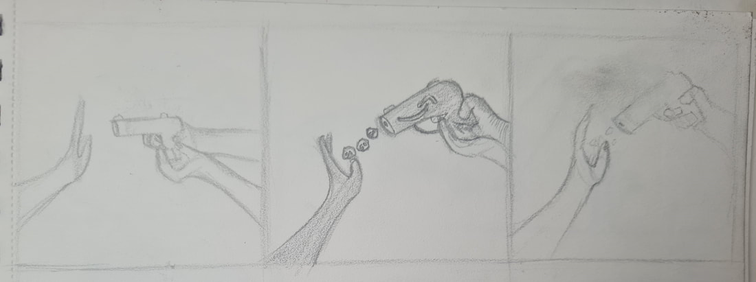
I thought that this idea could represent the call for industrial action in the first place, the idea being that managements response to workers asking for adequate pay would be shot down with 50p per hour pay rises.
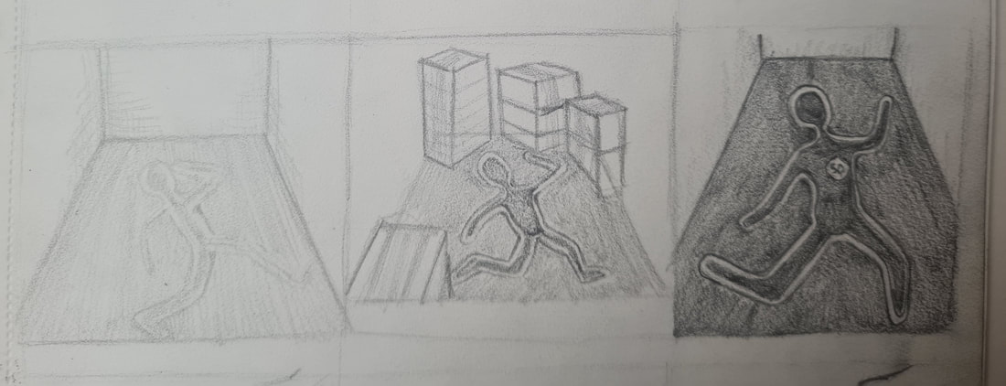
"I don't want Jeff Bezos' boat, I definitely don't want his rocket, I just want to live" this is the qoute I found most powerful, the idea being a body outline having been shot in the heart by a 50p.
This idea was from the Victorian custom of putting coins over the dead's eye so they could be brought to the after life, in this idea someone is taking the coins away.
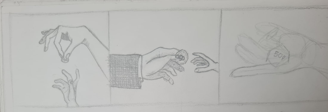
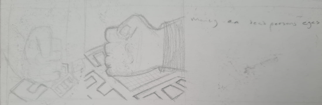
For this idea I wanted to focus on the idea of scale, the management being these big and powerful hands and the workers being viewed as feeble. To show off the power dynamic.
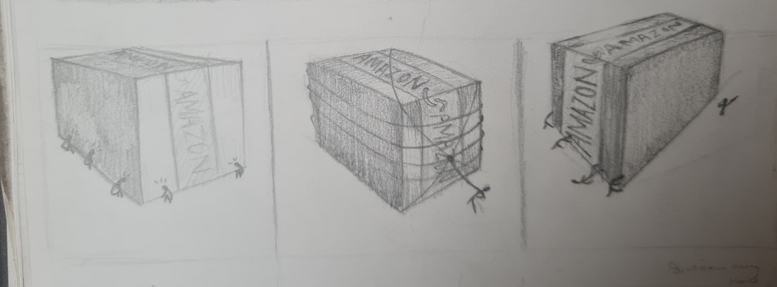
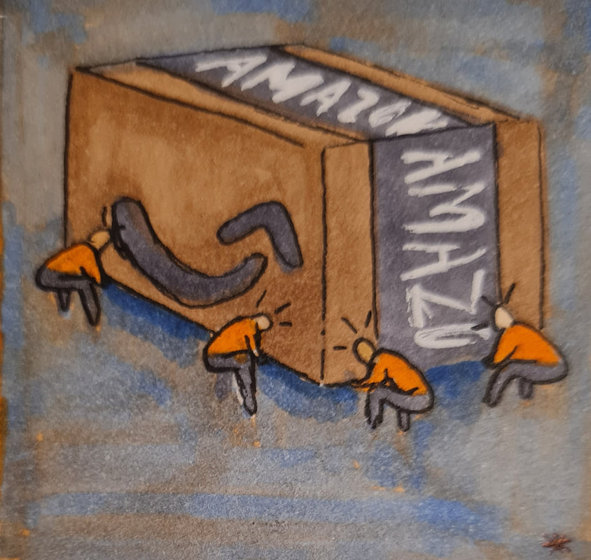
This idea was to also show scale and the gravity and power that Amazon has compared to its workers who are dwarfed by the larger box, obviously relying on the distortive and abstract elements of conceptual illustration.
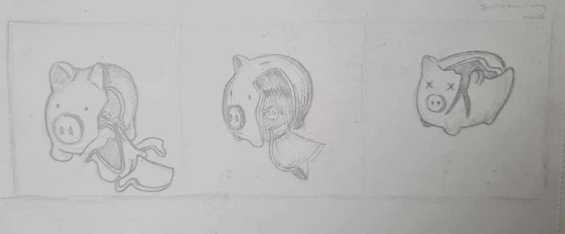
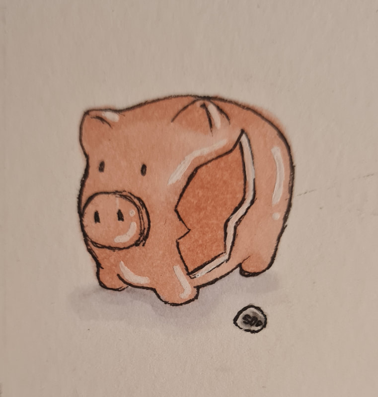
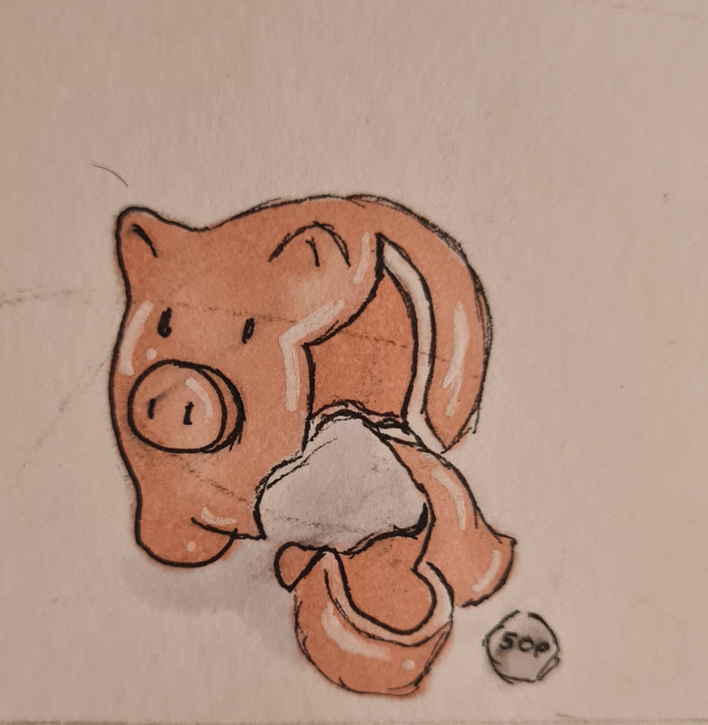
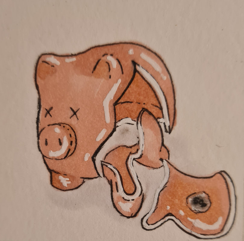
The broken piggy bank was an idea to show how little money these workers are awarded compared to how much they actually do.
Sunday sketches workshop
Our first workshop of the semester was around the concept of Sunday sketches, an idea formulated by artist Christoph Niemann. The idea is to take random objects and to create a piece that incorporates the original object somehow.
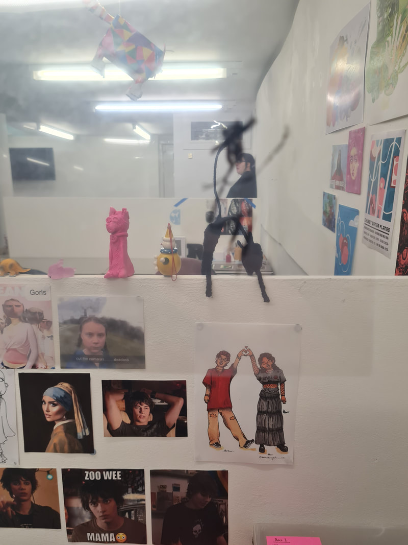


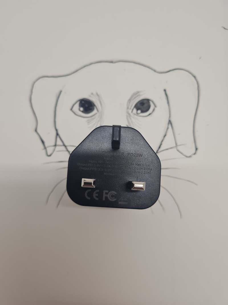


These were some of my ideas, there are very limited rules in this concept, however we were asked to consider angles in what we photographed, scale and to think freely. I think my favourite is the ghost and eraser skateboard as well as the inky boobs and the dog with a plug nose.
Looking at other artists
For this project I wanted to look at a few conceptual illustrators to get a feel for how they work and see if there was anything I could take from these artists to help make my illustrations more convincing.
Eva Bee
I found the artist, Eva Bee from looking at other articles in the Guardian her work having been used in these articles as well. I found the simplicity of her work beautiful, the message of these pieces is given clearly without her style or aesthetic taking over. Eva works in a tradition and digital mix, creating hand drawn lines in inks, scanning this linework and adding in colour digitally, with her own brushes and textures. I prefer working traditionally and implementing minimal digital aspects so I thought this would be an interesting learning opportunity.


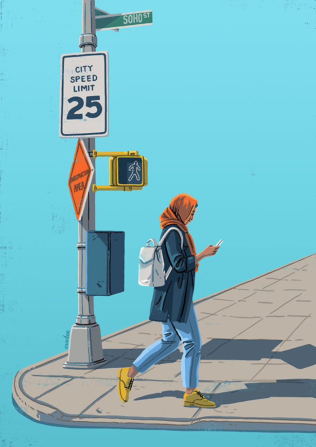

It is obvious to me that after adding the colour digitally Eva brings her illustrations into photoshop and adds textural overlays to certain parts. These illustrations typically have a set with the background being a blank colour. with this texture it gives the piece added visual interest without taking away from the main focus of the piece. I also noted that Eva uses her line art very wisely, instead of being heavily directed in lines she used them to define shapes and define certain features. Its definitely something that works in making these pieces feel more lively and not so much like drawings.
Colour phycology
There were two things I wanted to exploit in these illustrations, scale and colour. Both are important to showing the power dynamic and environment the amazon workers are subjected to. I wanted the Amazon boxes and the managerial hand to appear larger and more dominant in these illustrations compared to the workers.


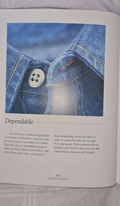
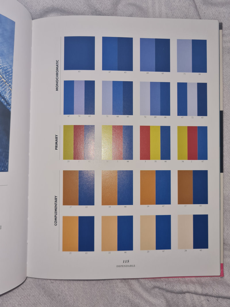

I wanted to read up on the phycology of certain colours, to help propel my illustrations in the right direction for the audience. I wanted to focus mainly on dependable colours for the workers and how I could implement a professional palette that contrasted each other. Typically professional colour palettes involve colder colours likes greys and blues to signify practicality, These grey colours work well with reds, blues and oranges which can signify power, knowledge or seniority. A dependable palette uses a lot of navy blues which reads as dependable and reliable. A warmth is added with a warm toned brown or orange.
I also discovered that yellows and oranges represent motion very well, typically these colours are associated with the sun an ever moving celestial being, These discoveries definitely informed my decisions because I was able to start visualising my concepts as a formed idea and not just in the greyscale of the pencil. it was also nice to be able to use these colour palettes more confidently.
I also discovered that yellows and oranges represent motion very well, typically these colours are associated with the sun an ever moving celestial being, These discoveries definitely informed my decisions because I was able to start visualising my concepts as a formed idea and not just in the greyscale of the pencil. it was also nice to be able to use these colour palettes more confidently.
Testing Colours


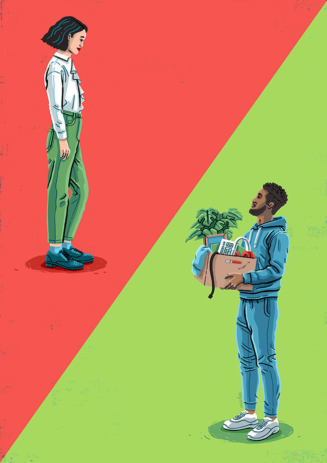
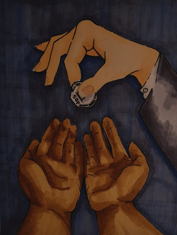
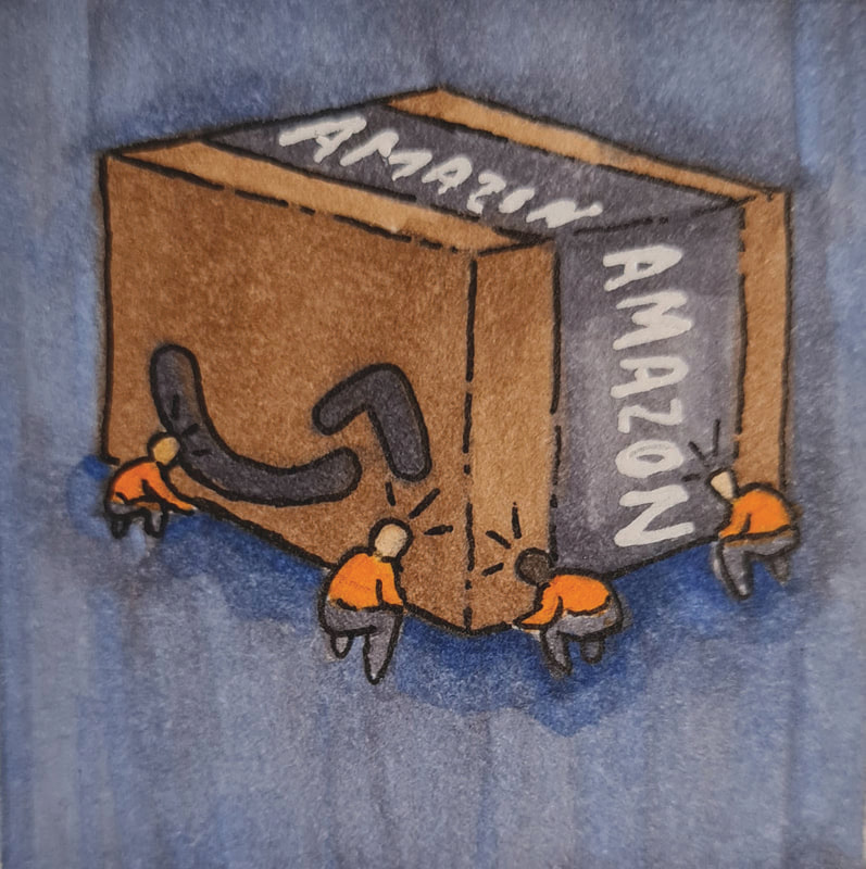
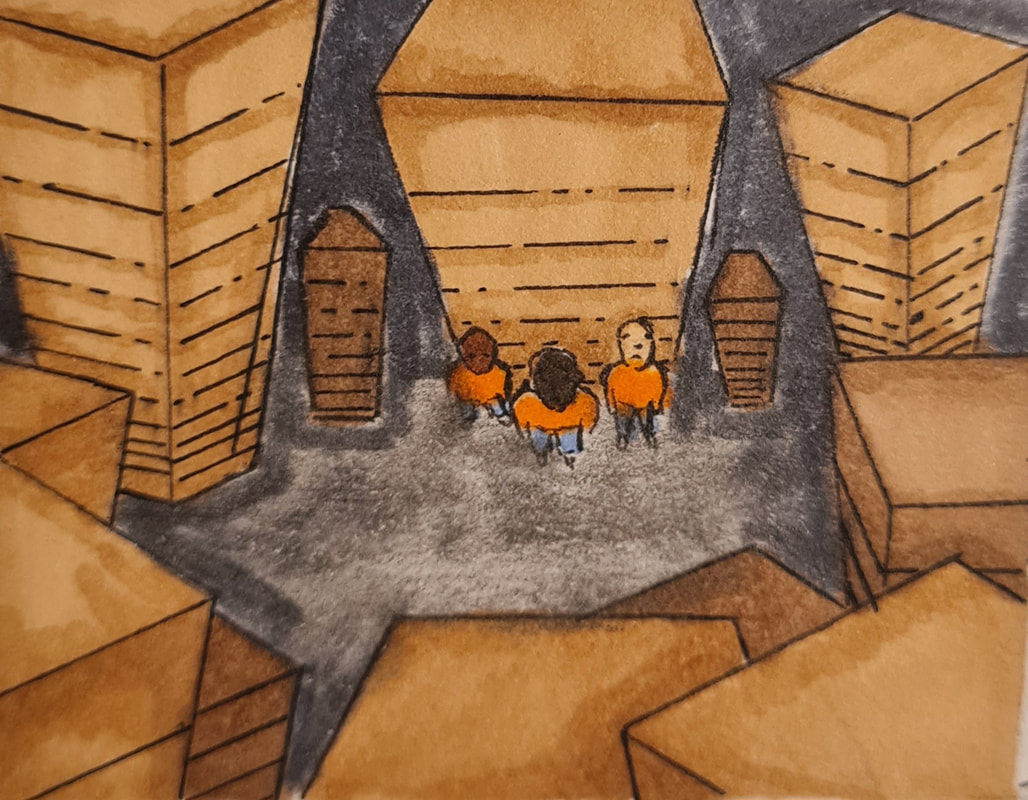
I thought that the group of workers moving the towering package together would be a cool idea for the spot illustration. These illustrations are supposed to be smaller, quicker and cheaper in cost. I tried out three pallets mainly changing background colours. I thought that blue worked best as it contrasted the brown box nicely, while also sub consciously reminding the audience of the coldness of the company. Again using unrealistic scale to emphasise.
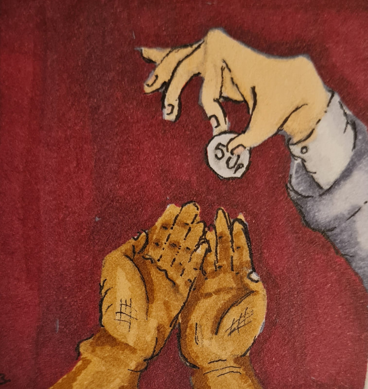
The playful hand design read more to me as a feature illustration, to me it gave off more of what the article was about. The managers playfully dangling about a 50p coin above the workers who are making the universal sign for begging. I again though the colder palette worked the best, the only warmth coming from the workers hand referencing that these people are still full of life. the manager, his suit and the background are colder to signify lack of life, warmth and compassion. Dangling the coin like it doesn't mean if the worker can live or die in the cost of living crisis.
The playful hand design read more to me as a feature illustration, to me it gave off more of what the article was about. The managers playfully dangling about a 50p coin above the workers who are making the universal sign for begging. I again though the colder palette worked the best, the only warmth coming from the workers hand referencing that these people are still full of life. the manager, his suit and the background are colder to signify lack of life, warmth and compassion. Dangling the coin like it doesn't mean if the worker can live or die in the cost of living crisis.
|
|
Finals
|
This is how the feature illustration turned out, in this I really tried to play up to the playful energy the managers hand has. to me the body language read more as if the manager was taunting the worker, like "am I gonna pay you or not". I tried to scale down the coin to exaggerate just how little the pay rise was, my only issue was making it obvious this was a 50p coin as this was the catalyst of the industrial action. I also tried to reference Eva Bee's work in this, using minimal lines and relying more on use of shapes. My one critique is the scale of the workers hands, I think it'd work more to show power dynamic if they were smaller, but they looked like children's hands in comparison.
Trials and extras |
This is how the spot illustration turned out, I enjoyed this piece a lot. It was simple to draw which meant it was a fun task, I also enjoyed the contrast of such little characters carrying a massive package. When it came to composition I tried a few times, with the allotted space being 50mm by 50mm there wasn't tons of space. The scene either looked too high up or too low down, by this attempt I got it to the mid point by up a little to give the characters a space to to move to. Allowing the audience to imagine them carrying the package. I think this little illustration does also reference the warehouse workers becoming a unified force together which I like.
|


Literal illustration

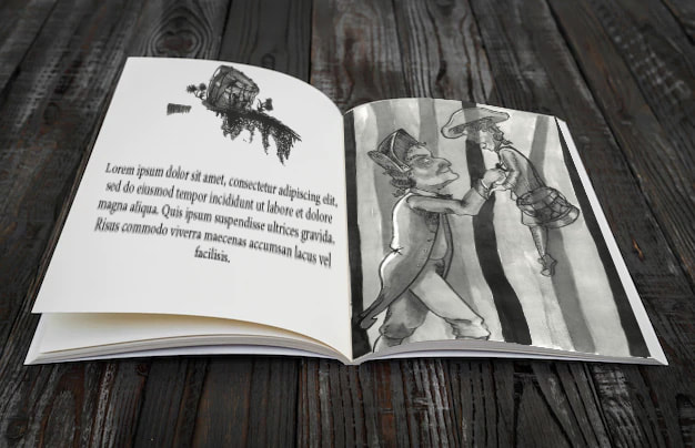
In this project we were doing the opposite to conceptual illustration, literal illustration. For this we were given an audio recording from 'The Man in Black' stories, in which we were told to illustrate a front cover, book spine, full bleed illustration and a vignette for these book form of the story.
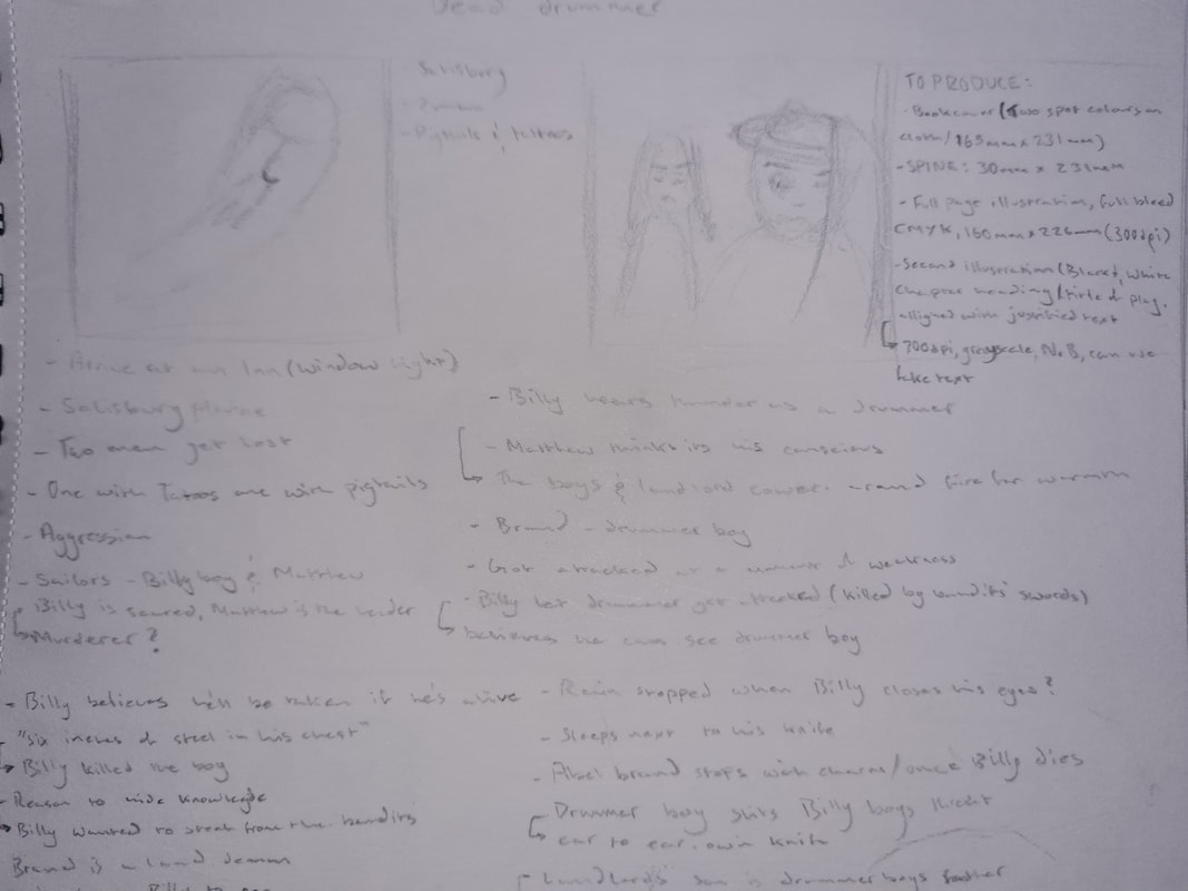
The Dead Drummer
For this project I was given the story of "The Dead Drummer", at first I listened to this audio a few times while quickly sketching out some rough thumbnails. I did this a few times and it really helped because I picked up on different things each time.
This audio tells the story of two sailors, lost in Salisbury in the late 1700s or early 1800s in the middle of a storm at night. We learn one of their names is Matthew and the other is Billy Boy. They eventually find an inn and try to bargain a way in for a discount, luckily the inn master allows them to stay for free to support the sailors defending England in the Neopolic wars. The three men crowd around the open fire and introduce themselves, the Inn masters asking the sailors about the war and about themselves. Eventually we learn that Billy boy is being haunted. While at war his drummer boy was murdered. Billy telling the story that they were attacked at a moment of weakness by bandits, Billy boy running away while the drummer is killed. A short while later the roar of thunder makes Billy jump, prompting the Inn master to ask what is wrong with him. Billy boy reveals his secret, that there were no bandits. Billy boy was the one who killed the drummer boy who objected to stealing money from the boat they both came from. Billy reveals he hasn't slept in days believing he is safer at sea then on land because the drummer boy is a "land demon". The Inn master and Matthew have a smaller conversation while Billy falls asleep, both of the end up helping Billy to bed. Matthew takes pity on Billy's fear and gives him a knife to protect himself with. Later on the Inn master goes to check on Billy Boy, he quickly returns clearly shocked about what he saw. Matthew asks him to tell him what happened but he's reluctant. He eventually tells Matthew that Billy Boys throat had been slit from ear to ear using the same knife Matthew placed with him.
The next morning while watching the undertaker bundle Billy's body away Matthew learns the Inn master has paid for the undertakers service. The Inn Master, Mr Brand appears behind Matthew. When Matthew asks why he paid the undertaker, Mr Brand reveals that hed lost a son to the war, Abel Brand. Who played the drum, the same name and job as the drummer boy. The story dwindles out there and it is eluded Mr brand avenged his late son.
Thumbnailing


Progression thumbnails


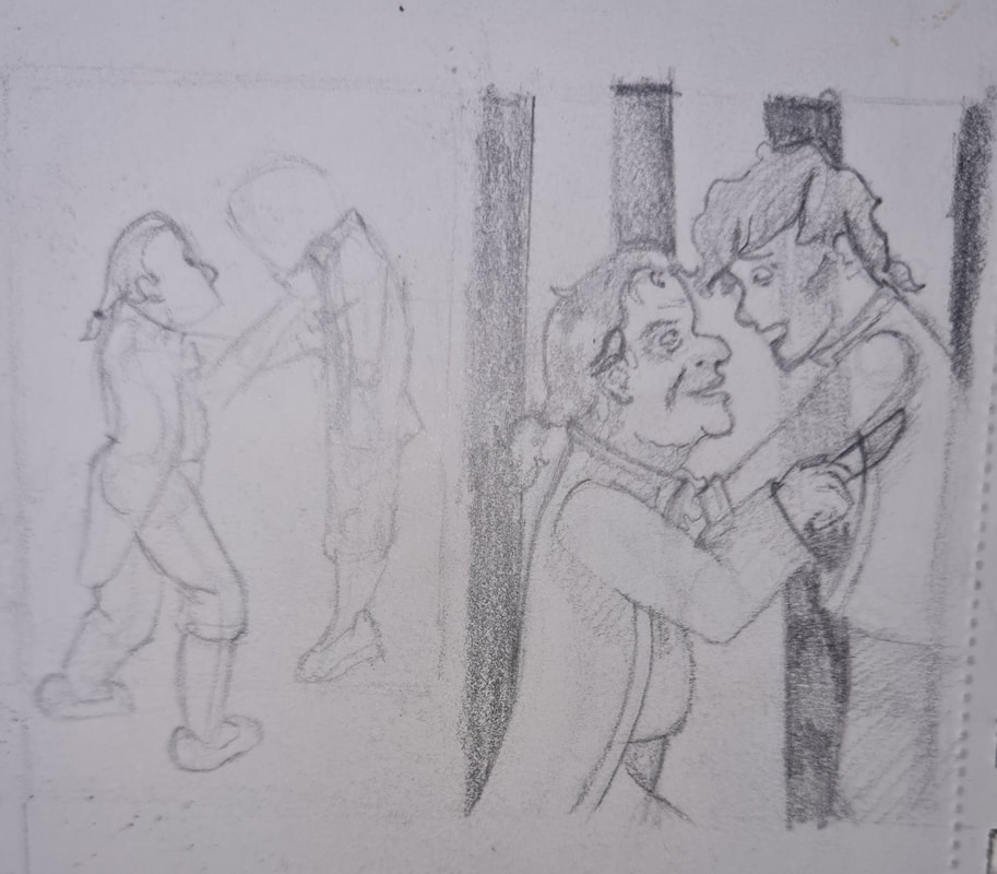
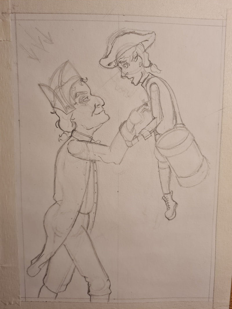
After some feedback, I decided that having the closeup of Billy murdering the drummer boy would make for a good full bleed. this was inspired by the line "six inch blade in his chest". I experimented with close cropping the scene and then pulling the viewpoint back. I thought that with the size requirements for the full bleed a knee upward composition worked well. I also wanted to play on the closeness of the action of killing the boy.
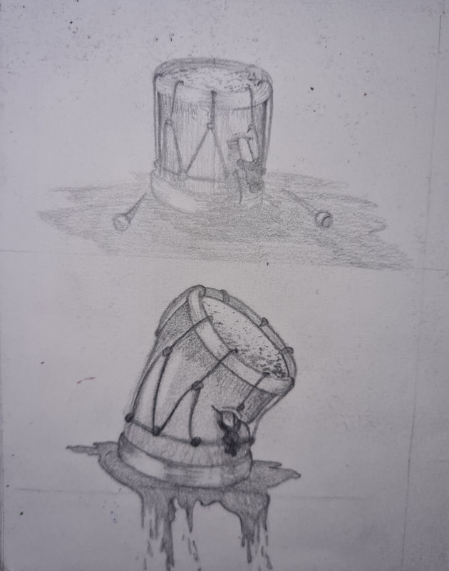
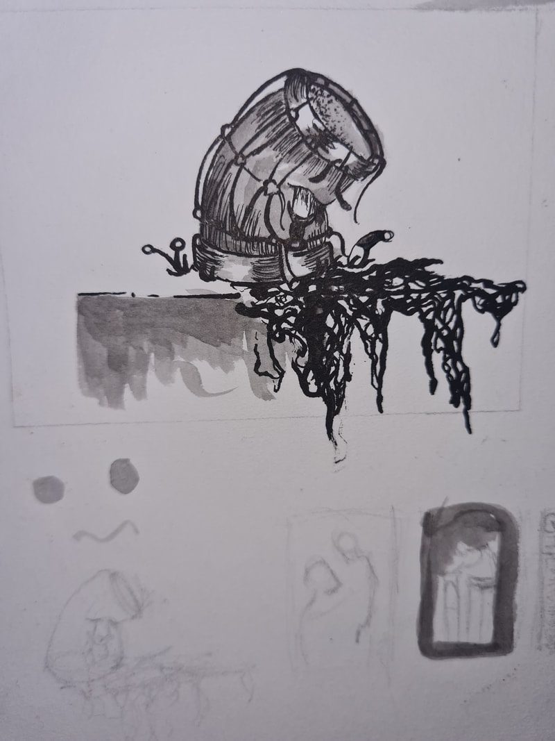
I thought that for the vignette the drum with a blade sticking out of it would be a cool idea, a vignette being a simpler illustration to go alongside text in a book. I wanted this to be a reference the drummer boy dying, something that would make sense when you got to that page and learn about the killing.
I thought that for the vignette the drum with a blade sticking out of it would be a cool idea, a vignette being a simpler illustration to go alongside text in a book. I wanted this to be a reference the drummer boy dying, something that would make sense when you got to that page and learn about the killing.
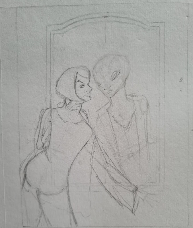
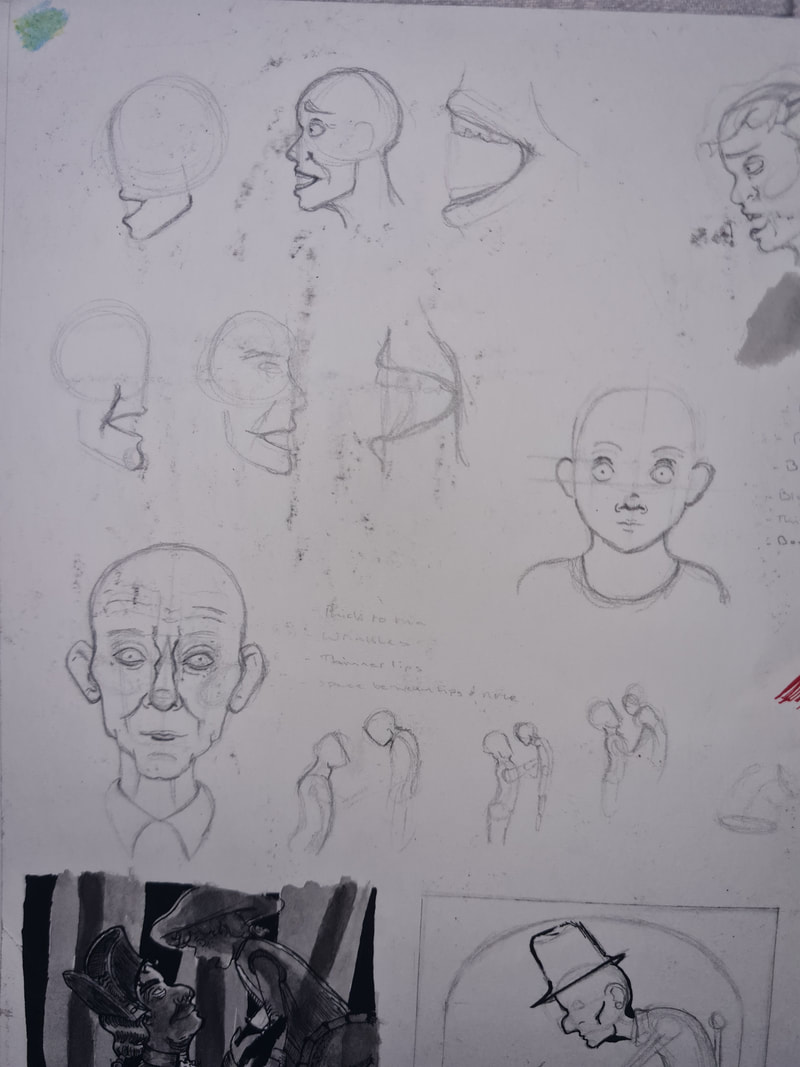
Bodies and Book covers
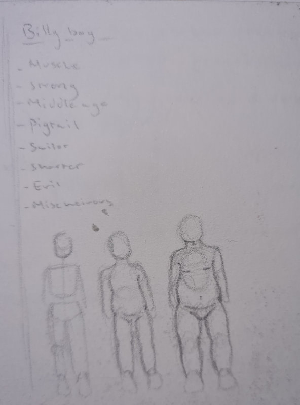


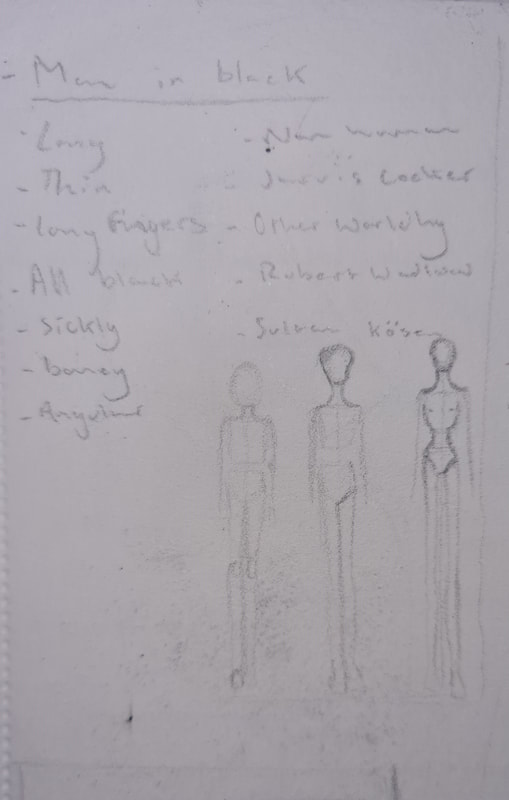

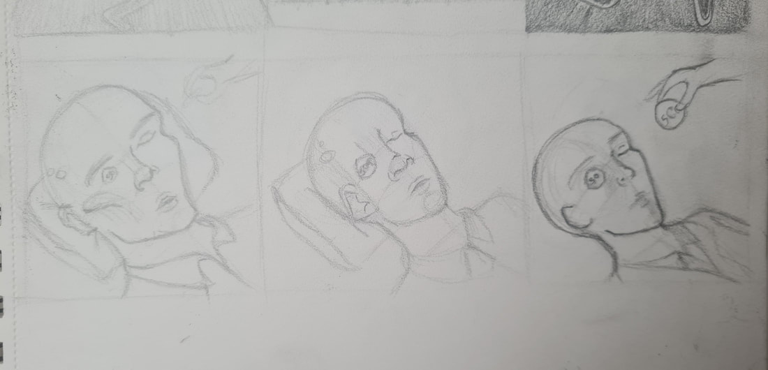
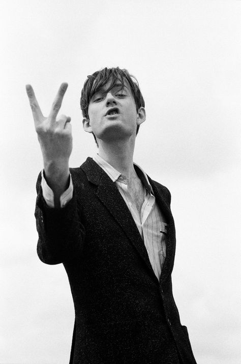
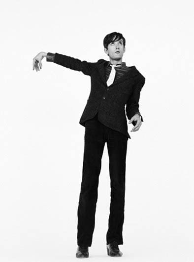
I made some initial book covers for my story, these were inspired by Victorian cloth bound books for children, it was in the brief for these covers to appear as being cloth bound. I was inspired by a few Hans Christian Andersen covers for mine. I enjoyed how simple some of these illustrations are but they're elevated by the techniques used while drawing them, materials used, I also mocked up some bodies to improve my full bleed. i was inspired by Jarvis cocker and the Ghastly Tinies book by Edward Gorey. I like the slender almost non human look these overly tall skinny models have, i wanted to push his proportions a lot. For the drummer boy I chose to interpret him as being a teenager, around 14-16 as older teens would've been listed to fight. I thought a shorter, pudgier build made sense. For Billy Boy, hes mentioned as being quite strong, so i referenced older, muscly, grumpy men. This really helped when drawing out bigger versions of each illustration.
Hans Christian Anderson Victorian book covers


Jarvis Cocker and The Ghastly tinies


Getting Inked


Here I inked my Vignette out for the first time, I really enjoyed how it turned out. I thought that having blood coming out of one side of the drum and giving it an asymmetric look would be interesting. I used the scribbling technique for the blood as in feedback people thought it looked creepier.
Practicing


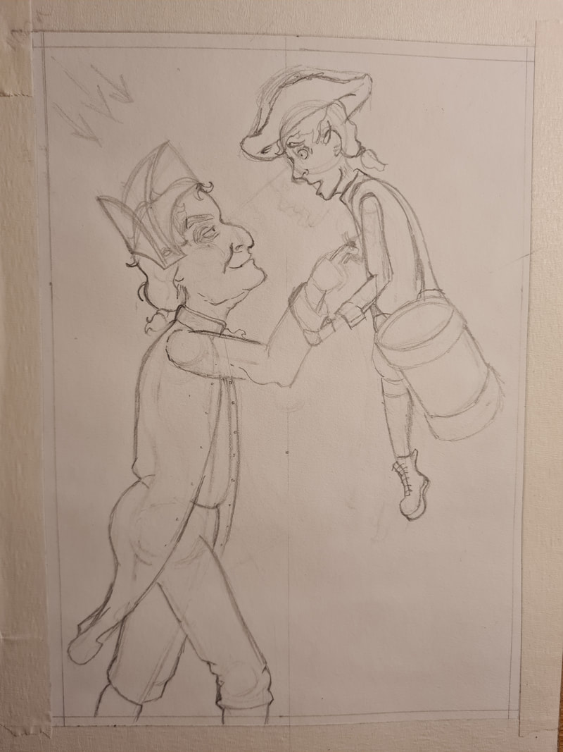

I really wanted to push certain emotions out for the characters, the drummer boy is in shock and pain while Billy Boy is excited. I also tested lighting here. I decided that night time worked best as we predominantly only shown these characters at night. I thought the light source should be from behind Billy boy and come from the moon.